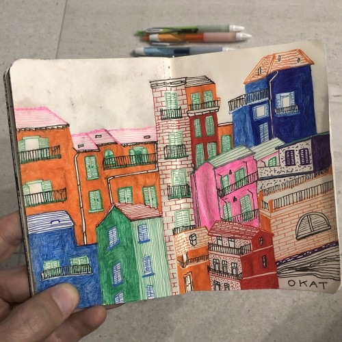
I have quite a bit of traveling planned this Summer...from NYC to Copenhagen to Venice to Berlin and a few more spots. Very much looking forward to all the different colors, cities, and cultures in the coming weeks.
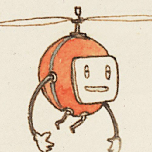
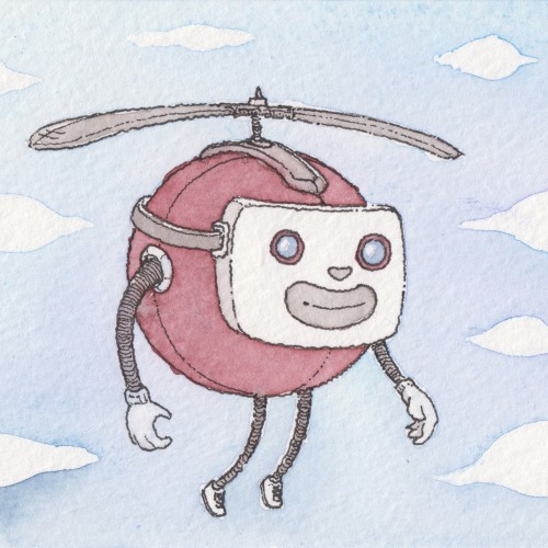
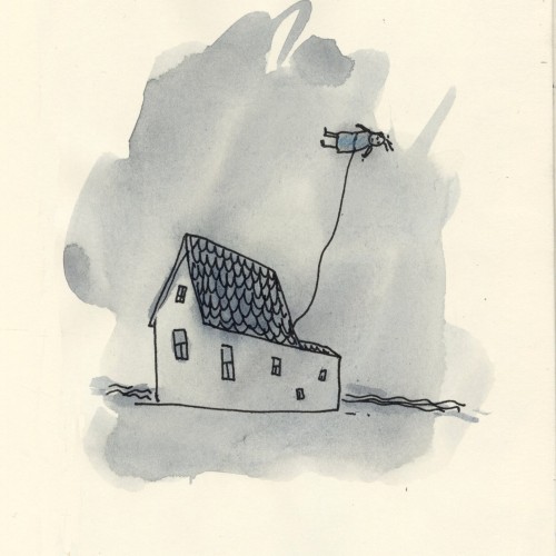
Flying Robot in the Sky, watercolor. I used my new Holbein paints. (I love them.) Drawn with a Pilot Falcon SEF using Platinum Carbon Black. A trifecta of Japanese paint, pen, and ink.
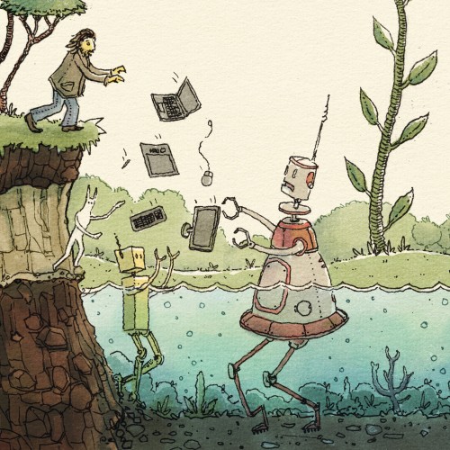
"With great frustration, the man threw his computer to the water robots." That's how I used to feel before discovering Rebelle by Escape Motions. It makes art fun!
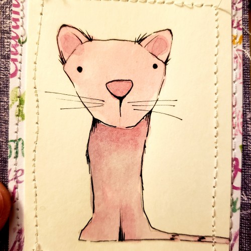
Tried sewing this guy to some colorful paper. I am not that bad at sewing, BUT the sewing machine is from 1950 and doesn't work very well, but I think the imperfections makes it look cool.
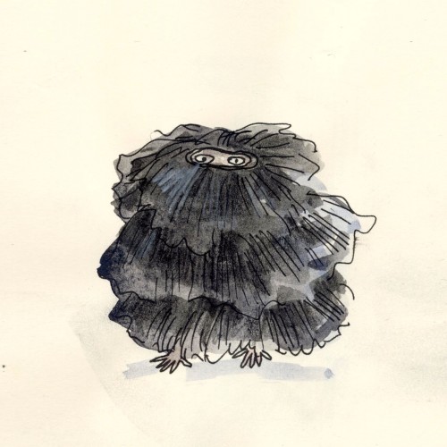
I kept my eyes on it the whole time. Now it was moving so slowly that you couldn't really see whether it was coming towards you or not. Occasionally its shape changed just slightly and its black tummy swept over the concrete floor. I could hardly breathe. I knew that I ought to run away and hide bur I just couldn't. Now it moved diagonally again towards the wall and wasn't to be seen any longer. It was in the pile of junk behind the modelling stand, it was somewhere behind the sacks of plaster and might appear again just anywhere.
It was getting dark in the studio. I knew that it was me who had let the creature out and I couldn't capture it and lock it up again.
- Sculptor's Daughter by Tove Jansson
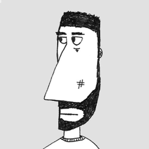
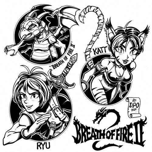
#29 Breath of Fire 2 - My fanart drawn in ibis paint on iPad pro. I recently discovered this game on the Super Nintendo. I really like the artist’s concept artwork for BoF2. I wanted to draw a few of the characters and the logo in my style. Ryu is the main character, and I like Catwoman type characters, so I thought Katt looked fun to draw. Also, I drew the logo slightly different from the original. I don't like to draw every detail exact. As usual: [No Tracing] [No Ai] [No free form line tools for inking except for the perfect circles]
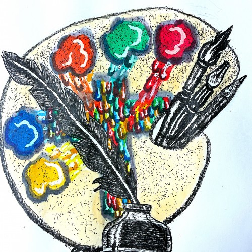
Well friends just got done creating my new logo to represent my ministry. The design incorporates symbols that represent both writing poetry, commentaries, short humorous stories. This is represented by the quill pen. My fine art, commercial art represented by the painter's palette, and illustrative tools.
The colors running to the center of the palette to from the cross, represent my Christian ministry. Going to FedExs to have business cards made. Planning to use this logo for my art fair booth
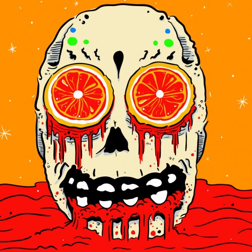
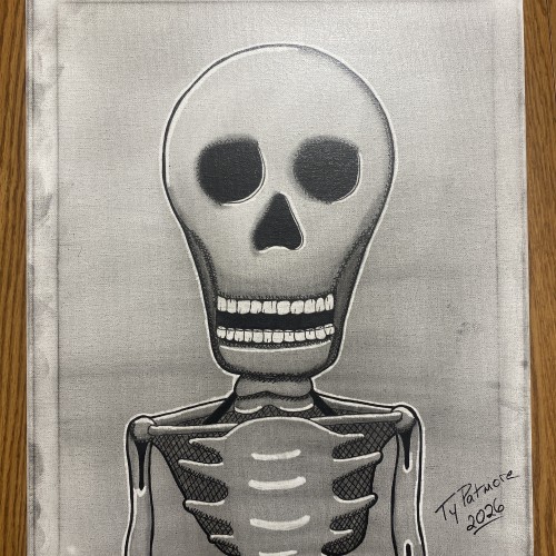
Stripped of skin, status, and story, what remains is the truth beneath it all. Bone Deep is a minimalist skeletal portrait rendered in graphite and ink on canvas, built through cross-hatching, stark contrast, and deliberate restraint. The exaggerated skull and hollow eyes confront the viewer directly — not with fear, but with inevitability.
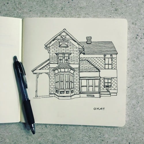
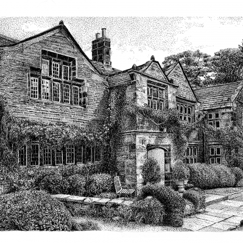
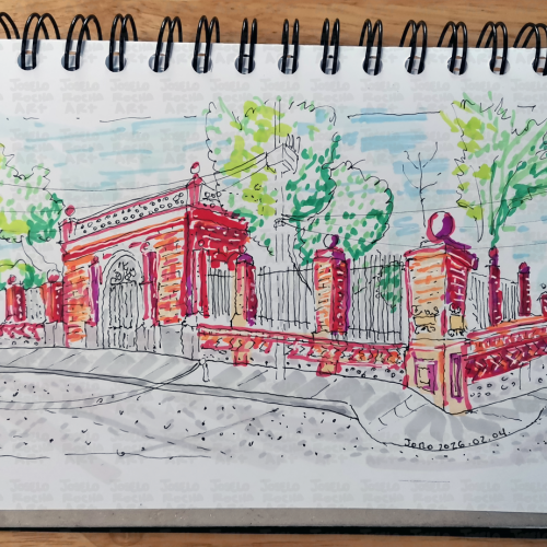
A stylized architectural illustration capturing the intricate beauty of a classic brick gateway and decorative ironwork. This design blends traditional sketching techniques with a modern, vibrant color palette, making it a perfect statement piece for those who appreciate urban history and fine masonry details.
The house is grey, the sky and the sea are grey, and the field is grey with dew. It's four o'clock in the morning and I have saved three important hours which can be counted as extra. Or perhaps three and a half.
I have learned to tell the time, although I'm not yet quite sure about the minutes.
Sculptor's daughter by Tove Jansson.
#dailydrawing #toveJansson
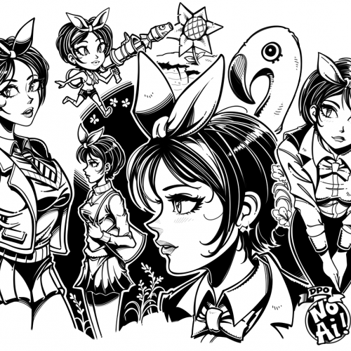
#24 Anime girl doodles - I think I drew this sometime last year 2025 - I just never bothered to upload it. Most of it was sketched on Magma.com and part of the inking process was finished in Ibis Paint, with only minor adjustments in photoshop. I do all my digital inking on an iPad pro, and I use those hollow aluminum capacitive styluses that you can get very cheap just about anywhere. I prefer them over the apple pencil because the apple pencil is too slippery and heavy. More uploads coming soon...