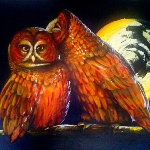
This is an acrylic painting that I made for someone I was close to. We would often take turns of one of us being overly affectionate and the other being playfully annoyed. I tried to capture this dynamic in the painting of these two owls. This painting was an experiment in portraying animals, something I don't do often, and using my paint knife as a tool in my paintings.
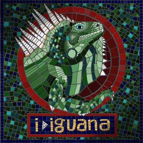
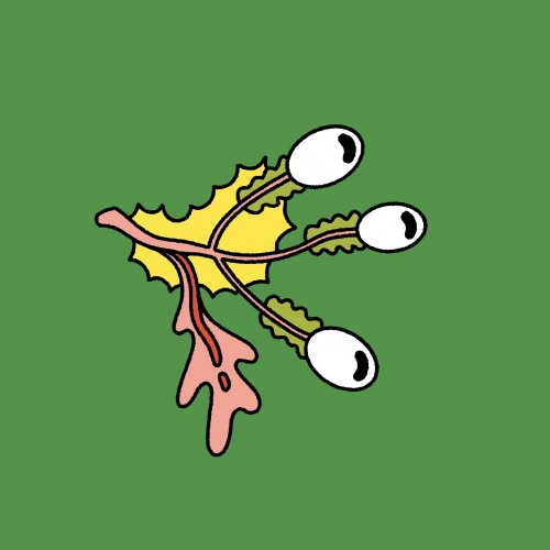
Part of a personal project I'm working on right now, to experiment with unfamiliar art styles and practice lettering skills by drawing animals. I enjoyed this foray into digital mosaic (or fauxsaic as I've seen it called).
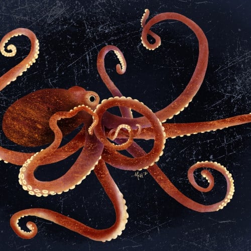
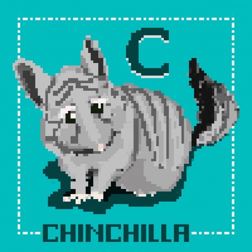
Part of a personal project I'm working on right now, to experiment with unfamiliar art styles and practice lettering skills by drawing animals. This one I limited myself to a 100 pixel x 100 pixel canvas.
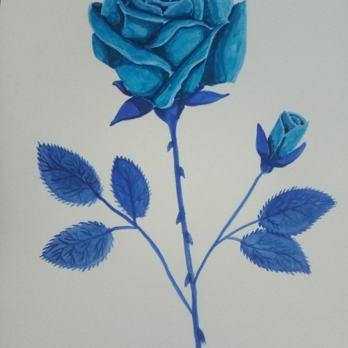
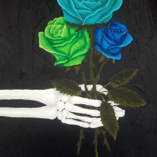
Analogous colours means the three colours next to each other on the colour wheel. Though this was just me wanting to experiment with my turquoise oil paint
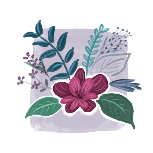
Inspired by Ruth Wilshaw and her book "Creative Gouache" I tried to get a gouache effect in my digital illustration. I think I did it. I'm nicely surprised with the final look.
That's why experimenting is so astonishing.
A painting created in one of my favourite programs Rebelle 6 pro. this was more of an experiment than a full on planned painting - the stencil feature is an interesting tool
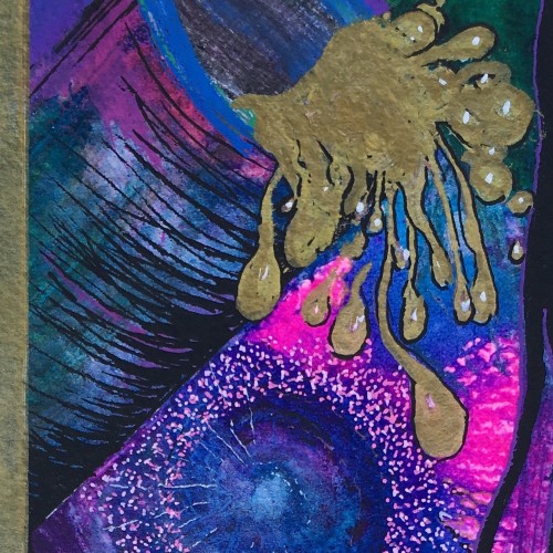
These are just some random paintings I had done a while ago when I was experimenting a lot with watercolor and I wasn't too thrilled about them at first. I have since looked back on them and actually think they are quite nice.
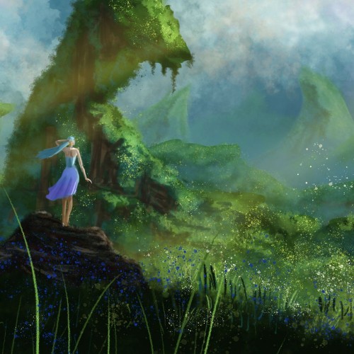
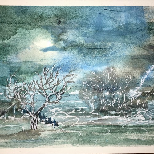
One of my first landscape experiments in Photoshop. Whereas I previously was working in GIMP. I just wanted to experiment with values and distance and fog and mist, etc. The female figure adds some story to the scene.
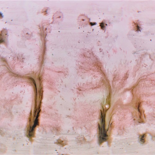
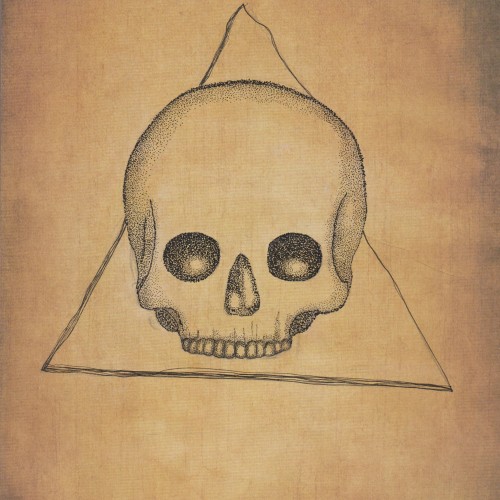
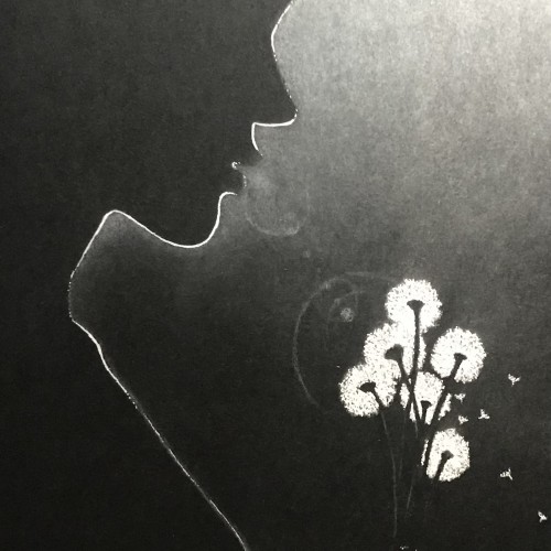
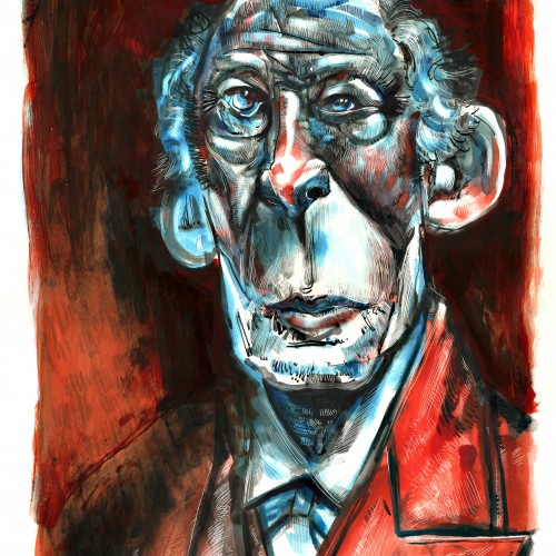
This is was more of an experiment as I wanted to see what black ink would like on paper with an "aged" like background. I think it came out quite nicely but I also think that the black ink might seem a bit too bold. I'm not really sure.
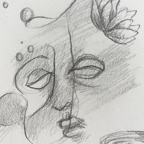
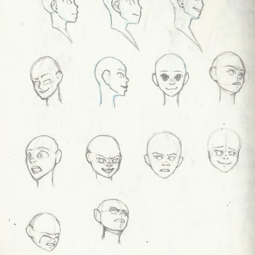
Took me very long to finally accept the fact that I can do anything, draw anthing on my sketchbook, that my sketchbook is a safe place for me to experiment, play, and explore styles, themes, mediums, and other ideas. I used to be so caught up in developing my own style, and being devoted to drawing only portraits.. Well.. now I’ll remember to “just draw!”
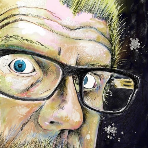
I saw other artists use a white out pen to add small details to their finished drawing so I decided to experiment. Unfortunately, it doesn't always work.
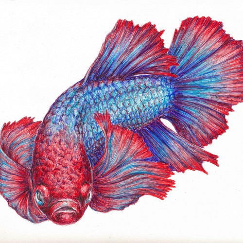
I've been so impressed with the ball point pen art that I have seen on this site, that I decided to give it a try. This is a Betta fish (Siamese fighting fish) done in red, blue, and purple ball point pens. Obviously, I have much to learn....but it was great fun and I have ordered some more colors since I plan on experimenting more. I've enclosed a photo of the work in progress and the various reference photos I used. The colors are more true to the final scan than in the flash photo of my drawing table.
Acrylic on canvas.
50cm x 70cm.
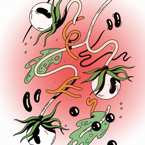
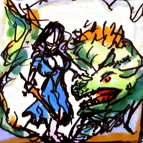
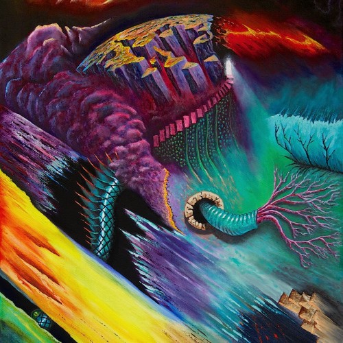
This started as a purely experimental abstract piece, but evolved to include both abstract and surreal (i.e. representational) elements.
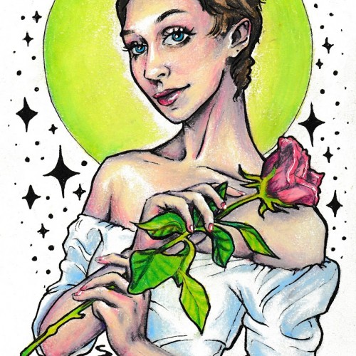
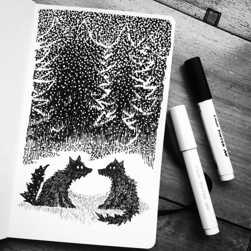
I've been experimenting with colour pallets and line width. Also trying to do LESS - my natural tendency is to add everything so cutting back is quite hard, but I think works better.
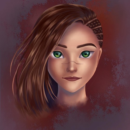
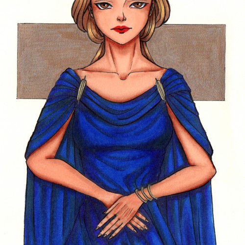
Hi! I'm new to the site, now will be getting accustomed to it, and I'll start by posting some drawings of my OC Elory here. And yeah, my style is pretty inconsistent as I'm constantly experimenting