Here is a really weird jellyfish I drew. I cannot even count all the jellyfish I've drawn over the years. I don't know what to say really other than the fact that I love them. :D Created with Ink Pen and Procreate. www.janelledimmett.com
I made a Floral Deer Skull with some mushrooms. I didn't really have a plan when I made this, so it kind of progressed on a whim. Not a bad way really. Anyway, I used mixed media on this one. A combination of pen and ink and procreate. Artwork by Janelle Dimmett. www.janelledimmett.com
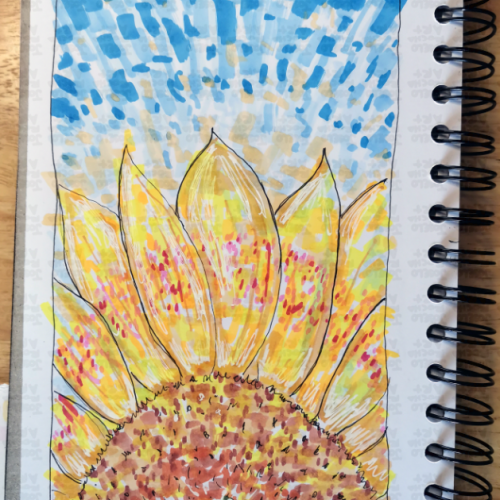
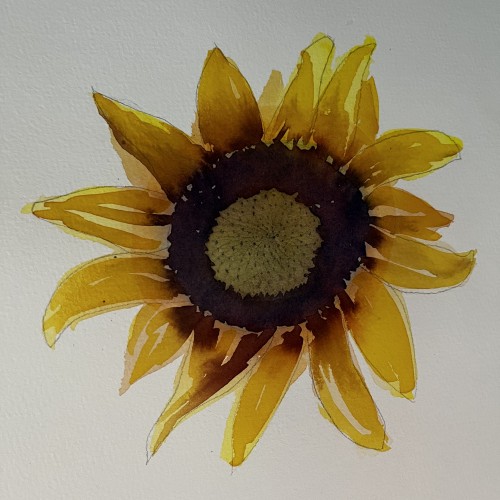
A vibrant, hand-drawn sunflower illustration featuring bold marker strokes and a rhythmic, blue-sky background. This piece captures the energy of a summer day through an impressionistic lens, blending warm yellows and oranges with cool, textured blues.
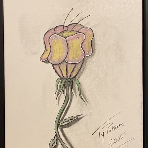
A captivating exploration of form, this work features an imaginative flower with a distinctive, almost sculptural head. The smooth, folded petals suggest a soft resilience, like a fleshy, protective helmet, while delicate antennae reach tentatively toward the light. The long, winding stem and minimal leaves anchor the drawing, creating a strong vertical movement. Rendered in a mix of colored pencil and graphite, the piece uses subtle shading to give the subject a remarkable three-dimensional quality, making it pop against the neutral background.
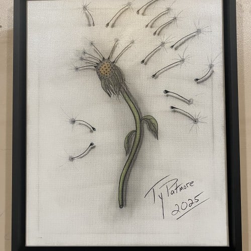
This captivating drawing by Ty Patmore (2025) beautifully illustrates the final stage of a dandelion's life cycle, transforming the common weed into a subject of elegant art. The central, spent head of the flower is rendered with intricate texture, while the detached seeds are given a light, airy quality as they float away. The subtle shading and focused color on the stem provide a grounding element to the otherwise ethereal composition, making it a perfect piece for anyone who cherishes the simple, magical moments in nature.
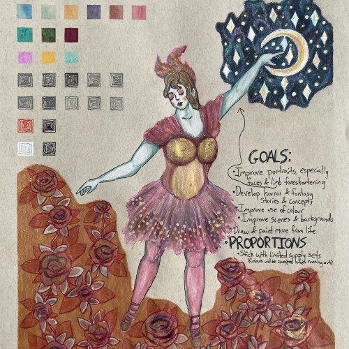
Elias Rosenshaw 8/29/2025
Mixed media on toned tan paper.
Starting next week, I'm going back to college. I'm very excited for my courses, especially art & writing. It will be a great opportunity to explore my curiosities, improve my art skills, and grow as a person. I will share my art assignments if my instructors allow it. I would also like to write a little about each piece, which may be required for my assignments anyway.
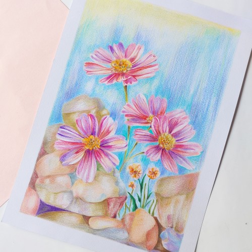
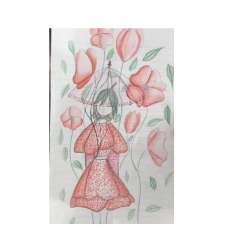
Lately, I've been inspired by fantasy & fairytale artwork. I think fantasy & horror will make good focuses for my pre-BFA portfolio. This was a little experiment with a fairytale aesthetic. One of my goals is to use limited art supply sets & swap out colours as they run out. I feel the first colours I picked out fit with aesthetic well.
I'm proud of this drawing, especially the dress & the night sky. However, I can see some areas that I should've done differently. I'm not happy with the proportions & foreshortening of the limbs. Also, I shouldn't have used a background colour for the flowers. I added the colour to cover up a smear from the watercolour. I should avoid making large areas of solid colour, especially with my coloured pencils. I am learning & improving.