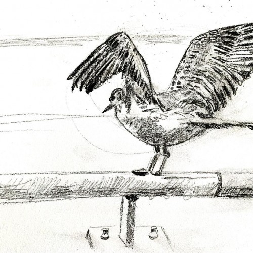
I live by the water (Torontos inner harbour) and managed to capture a seagull in mid flight. Did my best in not coloring it , and focused on the ✏️ pencil
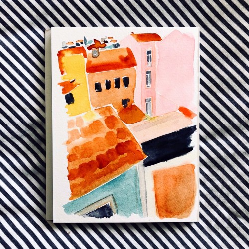
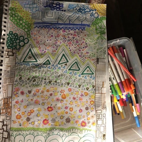
Another wobbly neighborhood. Focusing on color and composition and leaving behind perfect perfective and detail. Ultimately, putting fun first in my personal work moving forward.
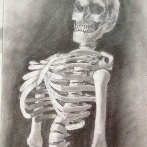
Before getting to this result, I never a actually drew a full fledge skeleton before. So rather than take on the entire thing at once, I took it upon myself to only focus on the upper half of the body. I’m still practicing human anatomy for drawing but I hope overtime, it only improves. :)
Connect with Nobody Support Art:
www.instagram.com/martin_balsam
www.twitter.com/martin_balsam
www.facebook.com/needmoney4artsupplies
www.needmoney4artsupplies.myportfolio.com
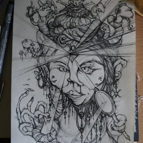
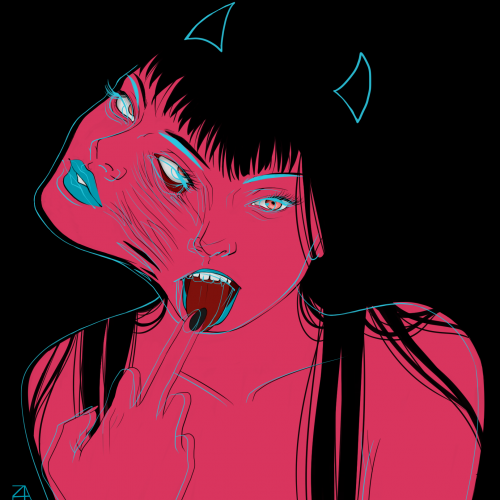
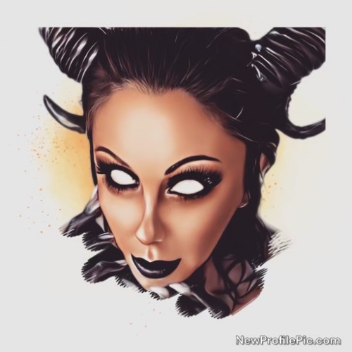
i feel to much focus is put on faces being to aesthetically perfect, or perfection in the media approach to what thats perceived to be. i enjoyed drawing a more imperfect edge to it and the use of the light beams was a cool thing to draw. the meaning was a look at self -adulation and the clamour for attention through various social platforms, being valentines day as well i feel to many people fall into that trap what promotes nothing more than a money making event. this helped form the title of "seduce her" using a medusa as a subject matter.
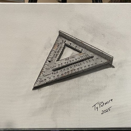
This piece continues my ongoing tool series, focusing on objects shaped by use, precision, and repetition. The speed square—an essential instrument of measurement and accuracy—is rendered with attention to wear, markings, and subtle imperfections left by time and handling.
Isolated against a minimal background, the tool becomes both subject and symbol: a quiet reflection on structure, angles, and the human need to measure and make sense of the physical world. Like the others in this series, it honors everyday labor and the overlooked beauty found in functional objects.
So yeah, I will color this image and add a word bubble. But um, this was my honest reaction to season two of Hazbin. Soooo, I will continue the roller coaster ride, but my ears will burn from the singing and my eyes will be scratched out due to the content in which I am forcing them to focus on. I might even go see a therapist and question all my life choices.
The materials that Meir uses in her works are not of the refined and so she is called an “arte povere” artist. At times she describes her work as someone dealing in alchemy - work develops as in a trial laboratory with different techniques and materials. She says, “ at times the artistic work process is a sort of puzzle demanding the filling in of all the empty squares “.
Some of her work focuses on women, and they incorporate criticism and cultural protest.
Meir has strong opinions about recycling and environmental protection that is represented in her works by use of materials and shapes. In her work she reacts to contemporary art that communicates with the eco system, waste, and she also searches for different worlds. Her works are made up of layers upon colorful layers that when we look at them it becomes clear that the mound of waste she chose is not coincidental. It actually becomes a colorful kaleidoscope of utopia.
Jaffa Meir is a multifaceted, autodidact artist working in painting, sculpture, photography, product design, carpets and furniture, painting on textile, and computer graphics.
The structural composition of some of the works is influenced also by her many years of working in the architects’ office.
Meir also worked in the developing of ideas within the field of ecosystems and recycling for factories such as Coca Cola, and during this process came up with ideas for designing parks and public game spaces using industrial waste products.
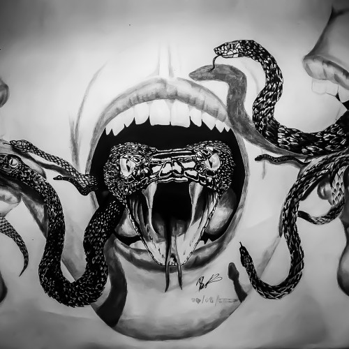
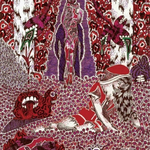
I did this artwork for a public art exhibition called "Home is where the Art is". Initially the drawing was supposed to just be a open mouth with a snake coming out of it but I felt that it lacked a story and a strong enough message so I drew the other snakes on and added the 2 other faces. The story behind this image is entirely up to the viewer but my take on it was that different people react differently to certain information, my main focus was the distribution of secrets and since many teenager refer to people that let their secrets loose as snakes I thought why not depict it in that form. The drawing displays three reactions to learning another's secret, one passes the secret on to another, the other defends it ferociously in your face but lets it slip loose when nobodies looking and the other receives the information and holds onto it
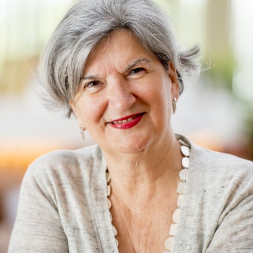
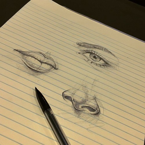
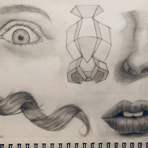
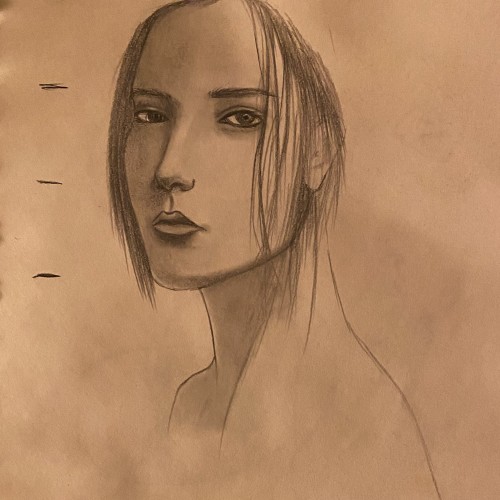
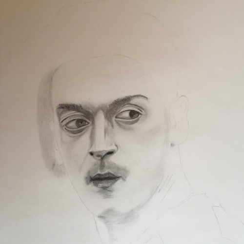
After a year of really focusing on the fundamentals I decided to try my hand at some simple studies regarding facial features and attempted hair. Any thoughts or suggestions would be appreciated, as I’m wanting to continue to learn and improve!
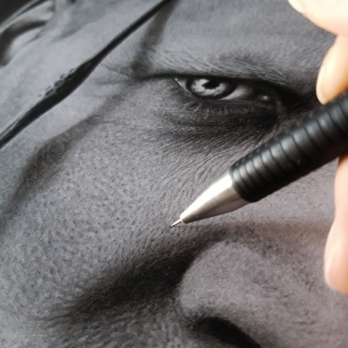
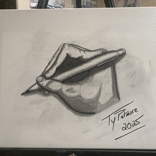
A striking, high-contrast graphite study of a hand in the act of writing. Created in a rapid 45-minute sitting through self-observation, this piece captures the intricate anatomy and focused tension of the artist's own hand as it holds the pen. The tip being pencil the top being pen and finger tips slightly smudged incorporate all aspects of the mediums used to create it.
Elias Rosenshaw 8/29/2025
Mixed media on toned tan paper.
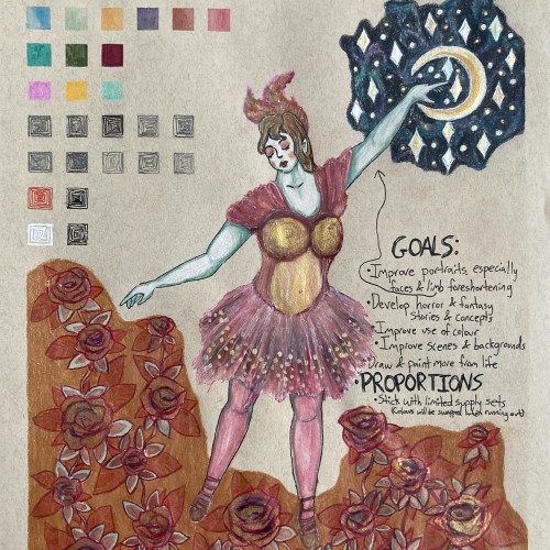
Starting next week, I'm going back to college. I'm very excited for my courses, especially art & writing. It will be a great opportunity to explore my curiosities, improve my art skills, and grow as a person. I will share my art assignments if my instructors allow it. I would also like to write a little about each piece, which may be required for my assignments anyway.
Lately, I've been inspired by fantasy & fairytale artwork. I think fantasy & horror will make good focuses for my pre-BFA portfolio. This was a little experiment with a fairytale aesthetic. One of my goals is to use limited art supply sets & swap out colours as they run out. I feel the first colours I picked out fit with aesthetic well.
I'm proud of this drawing, especially the dress & the night sky. However, I can see some areas that I should've done differently. I'm not happy with the proportions & foreshortening of the limbs. Also, I shouldn't have used a background colour for the flowers. I added the colour to cover up a smear from the watercolour. I should avoid making large areas of solid colour, especially with my coloured pencils. I am learning & improving.
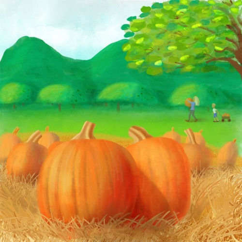
One of my favorite times of the year is Autumn. It’s a time that reminds me how blessed I am for the rich friendships I have in my life. It’s also a time I enjoy making new memories with relatives I have a deep emotional bond.
And for some reason, pumpkins symbolizes this wealth of love I have for these loved ones. Maybe because orange is a passionate color for me. Or maybe because the color orange is abundant during this season when warm a fuzzy feelings show up when I’m with my loved ones. This hue is in pumpkins, persimmons, hot apple cider beverages, cinnamon spice on pies or lattes, and the obvious autumn leaves.
But my focus for this illustration were big, fat pumpkins. I love hugging and squeezing them and feeling it’s cold flesh on my skin. I look forward to my next bite of pumpkin pie from our very good friend, Terry, who makes them very excellently!
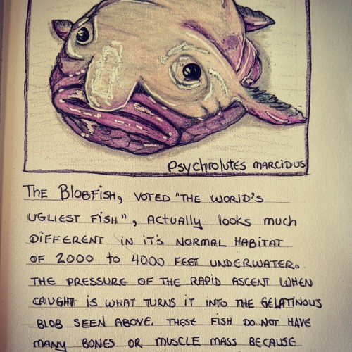
Poor blobfish!
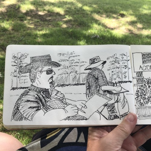
(For this series, I'm trying to hone my beginner skills by focusing on the architecture of each strange creature through reference photos, while also using it as a log for interesting animal facts.
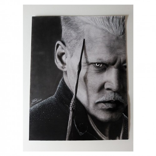
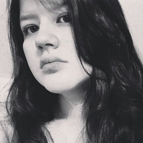
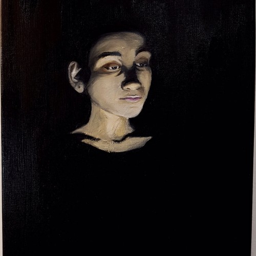
Inspired by the Neo-Classical period, I pushed myself as an artist to portray subjects in an idealistic fashion combining drama and artificial lighting. The subject is my sister who modelled as a reference, enabling me to control the shadowy effect over her face. The dim lighting and dark background resonated with the period style, focusing on the facial parts that are visible. The end result looks like she is emerging from the darkness. A somber atmosphere is illustrated through visual expression.
Adding the fast drying oil on the brushes improved the blending of the colours on the canvas which was especially useful when it came to applying strokes on the face smoothly. Visit https://www.martiaposts.com for more
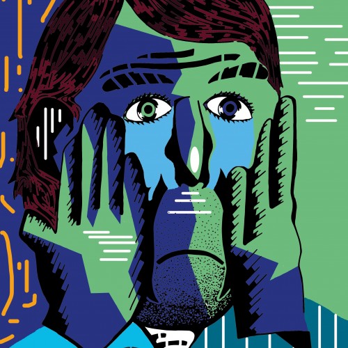
One of a Series of Manager Portraits that was used by the Zero Forty Brewery to promote the events on their social media that focused on the Premier League.
One of a Series of Manager Portraits that was used by the Zero Forty Brewery to promote the events on their social media that focused on the Premier League.
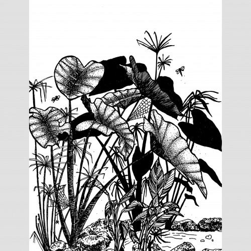
Living, breathing, and creating with nature
When you wake up to the gentle sights and sounds of the pond, trees, plants, birds, bees, and dragonflies, inspiration flows effortlessly. So, when the owner asked for a menu design for @SarayaGoa Art Café, I thought—why not let nature speak for itself?
Using pen and ink, I captured the beauty of my mornings here—each stroke reflecting the lush surroundings that make Saraya unique. Instead of focusing on just food items, I filled the cover and inside pages with illustrations of the vibrant life around us. Dining here means eating among the green, surrounded by the diverse plants of our permaculture gardens.
This study is a tribute to the beauty that shapes every meal at Saraya.
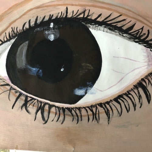
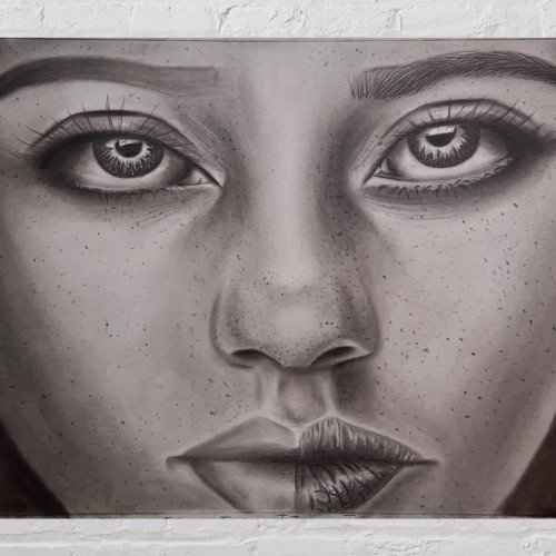
Purposely unfinished piece of work featuring a female with freckles. My focus was capturing a captivating look in her eyes. Mainly a practice/study piece.