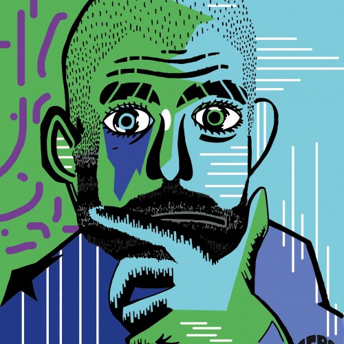
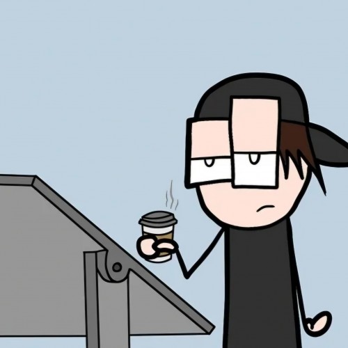
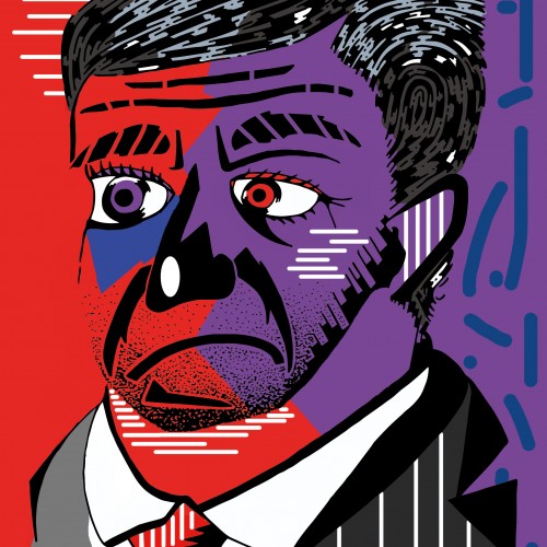
One of a Series of Manager Portraits that was used by the Zero Forty Brewery to promote the events on their social media that focused on the Premier League.
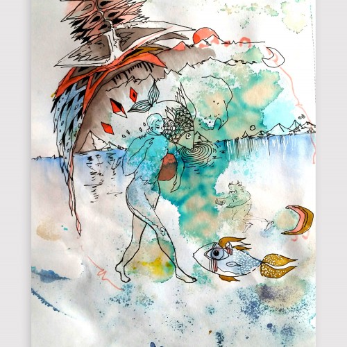
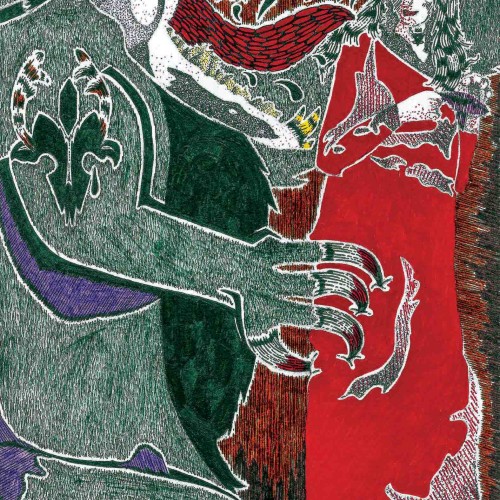
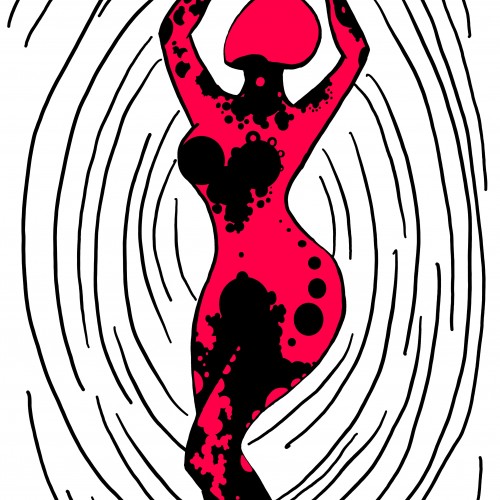
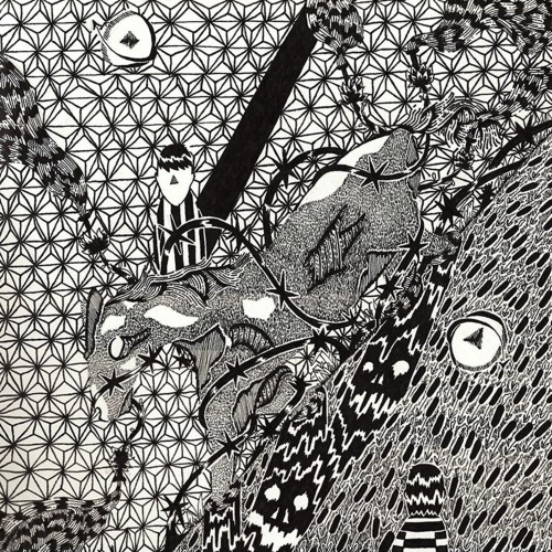
Artwork on "the other side" - playing with the bleed-through from the watercolor and intuitiviely allowing the shapes to arise. Created using watercolor, coffee, ink, graphic pens and unipen
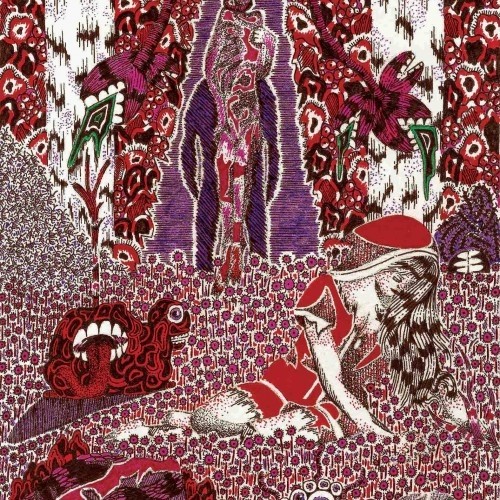
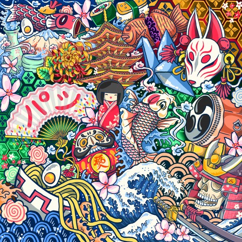
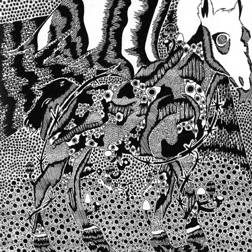
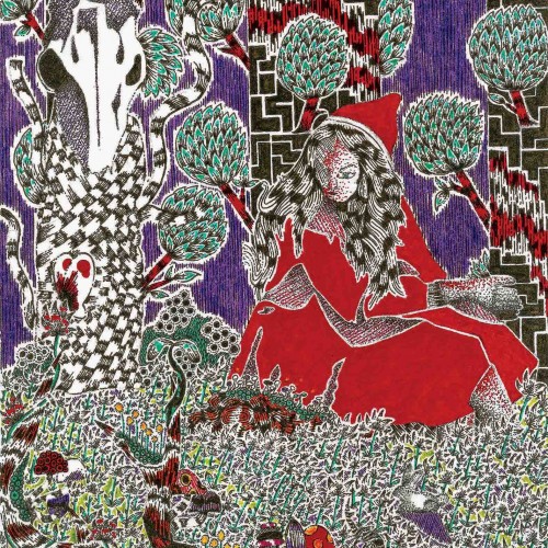
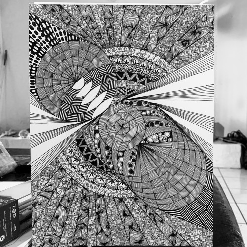
India ink on tissue paper. I had never used ink on this kind of paper before; I really liked the results! There are some folds and wrinkles on the paper that give the pattern some interesting details. The paper is also super absorbing, which plays nicely with the quantities of ink. Since it's very thin, there can easily be overlays between textures. And finally, when trying to use less ink (so that it wouldn't seep through and cause a big dot - the absorbing quality is nice, but it was also somewhat of a challenge!) I used very little ink on the lettering, causing a scratchy, dry look.
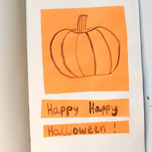
For the last day of Inktober, I drew a pumpkin with black india ink on orange paper. I had never done an Inktober challenge before, and I really liked it! I'm definitely doing it next year, too. I got very good ideas for new projects, I played with different textures and colours, and I used a calligraphic pen to draw, which I had never done before and which I loved.
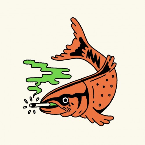
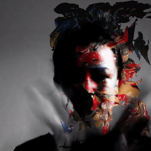
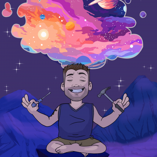
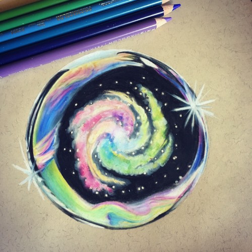
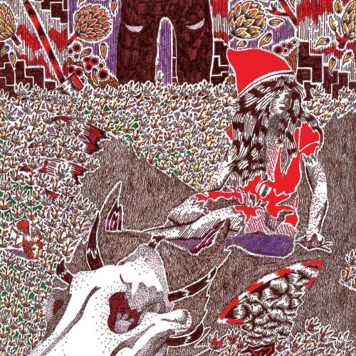
I just finished this for a friend. He is in construction and it seems like we're always talking philosophy and where we fit in the universe whenever we're working on a project together.
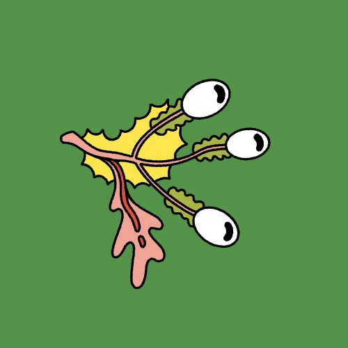
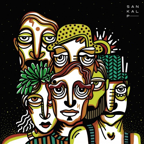
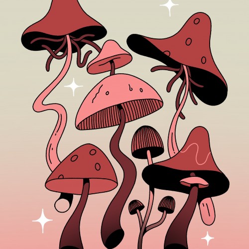
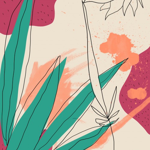
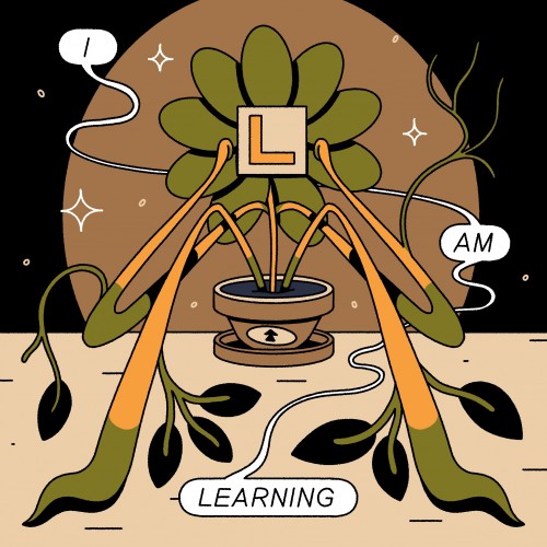
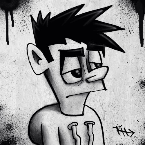
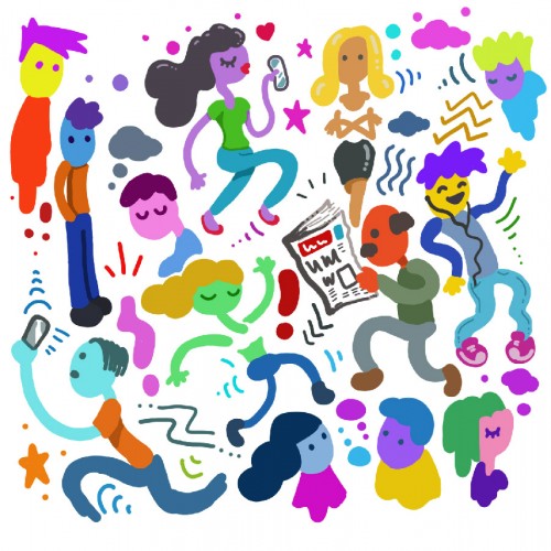
My pen sensitivity has gone on my pen tablet. I think I need to get a new one. In the meantime though, it has been interesting experimenting with the different types of art I can create without the sensitivity, such as these flat characters.
One of a Series of Manager Portraits that was used by the Zero Forty Brewery to promote the events on their social media that focused on the Premier League.