Sometimes, I re-read books and they don't have the same impact as before. Sometimes, I re-read them and they hit me harder.
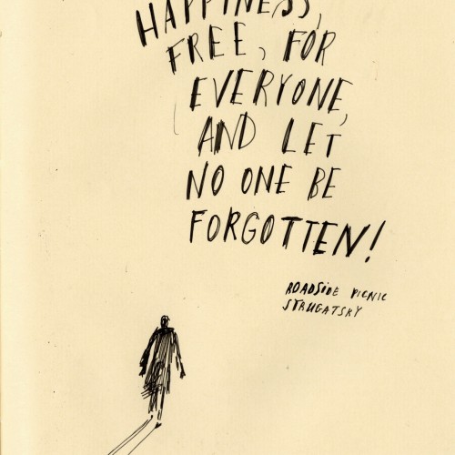
Roadside picnic by Brothers Strugatsky made me cry. This is my favorite book by them, although I do so love Monday starts on Saturday. But this book! I wish more people would read it.
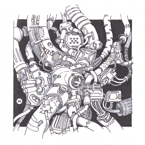
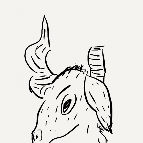
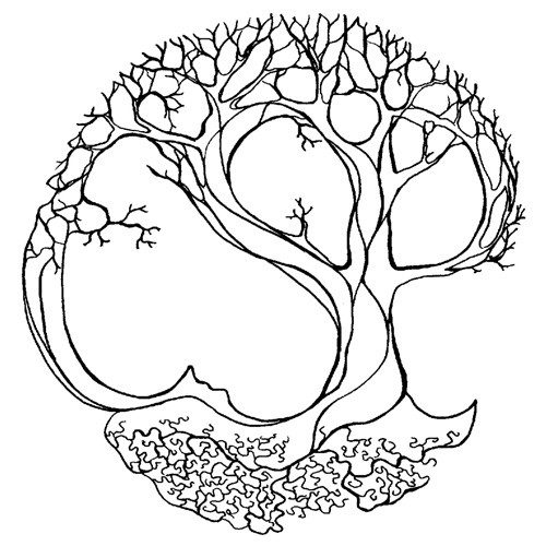
I love to come up with these mindless but interesting hard surface shapes and technical stuff. It has a meditative effect on me like drawing mandalas ^^ Inspiration comes from Tsutomu Nihei again.
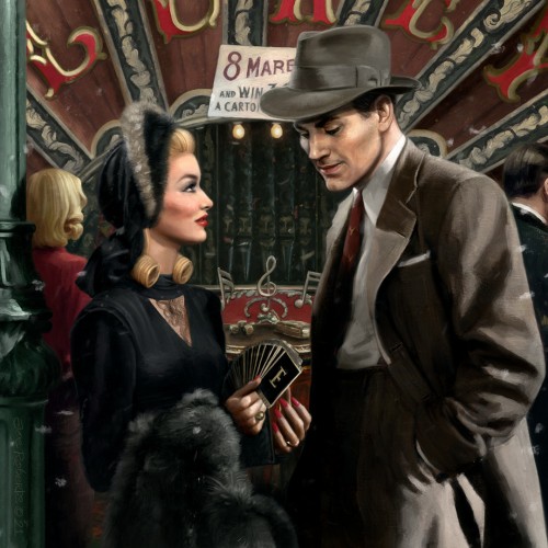
Trying to meld the moody tones of pulp noir with the playful romanticism of 1950s lifestyle illustration. Inspired by the fairground scene from the 1942 Veronica Lake classic, This Gun for Hire.
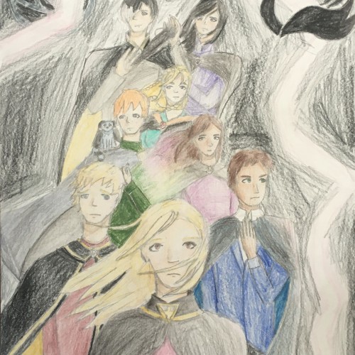
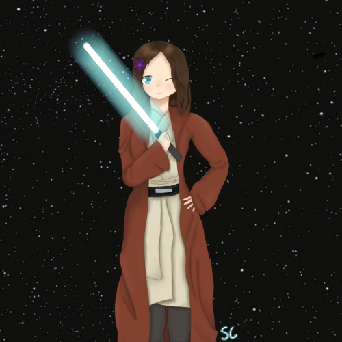
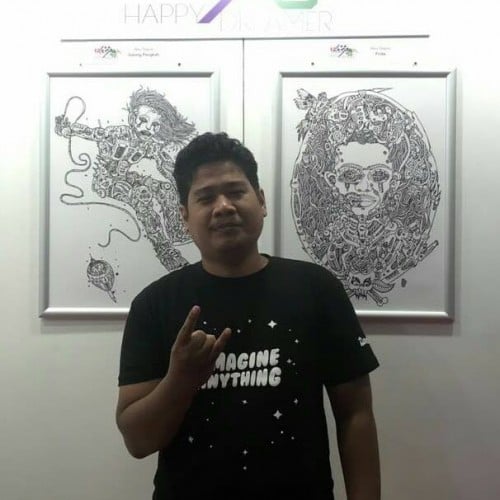
Soooo.... there's Keeper of the Lost Cities, and there's Star Wars... but what if you combine them? This is the one and only O-Biana Kenobi (Obi-Wan Kenobi and Biana Vacker). I'm actually really, really proud of this, so if you don't mind liking it, I would really appreciate it :) I plan on doing more things like this in the future, such as Emperor Palpitam (Tam Song and Emperor Palpatine) and Darth Vacker (Darth Vader and Fitz Vacker). If you haven't seen Star Wars GO BINGE-WATCH THEM!!! If you haven't read KotLC GO READ THEM ALL!!! I myself am only on 6/8.5 books in that series... anyway I hope you like this... because I worked really, really hard on it.
Hello All, Hope everyone is keeping well......I started another ' Lockdown' doodle this week. Working on Mixed Media paper with Pen & Ink and Aqua spectrum Noir pens. The Spectrum pens are really chunky and take a while to get used to handling , but they are very useful for colour blocking larger areas and the colours are intense. I've been using these all year now and love them. The Flamingo Garden Doodle , I turned into a repeat pattern for my collection of Printed Ladies accessories for my new website which I'm working hard on and hoping to Launch very soon. :-)
Lo-fi inspired art. Used one of my favourite albums from hanni el khatib in the drawing. I have been traveling so it's been hard to find the time to draw but I'm glad I managed to finish this one.
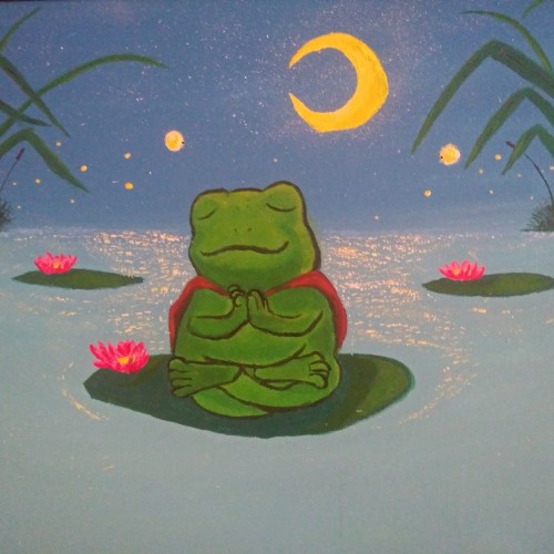
Taking this pic was challenging finding the right light for the moon and the stars pop up more imo and my frog was hard to color but I love how the lake came out with the shines from the moon and fireflies. I even took the time to paint some tall grass and reeds in the background ^^ hope you like!
If red is for hardiness and valor, may we show courage and resilience. If white is for purity and innocence, may we help protect the young, disadvantaged and helpless. If blue stands for vigilance, perseverance and justice, may we put a mirror to ourselves and learn persistently.
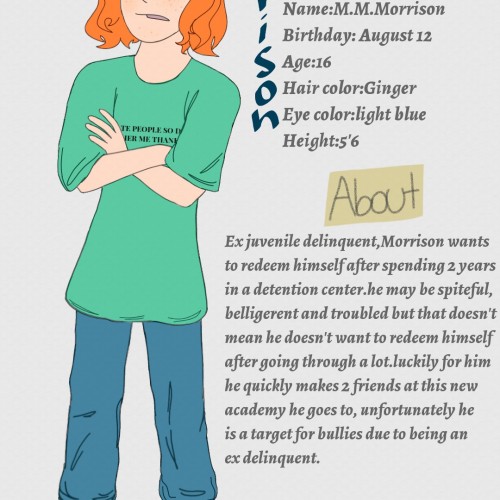
I'm finally finished with drawing Morrison again (this time more better than before) and I must say I'm actually pleased with it considering he's hard to draw.speedpaint:
https://youtu.be/WrDSbuIB6Pk
Sometimes we just need a bit of encouragement to push us along the way. Sometimes life is hard and it does more than give you lemons. Cry, vent and release your frustration in a healthy way, but try and stay strong. You will be glad you did :)
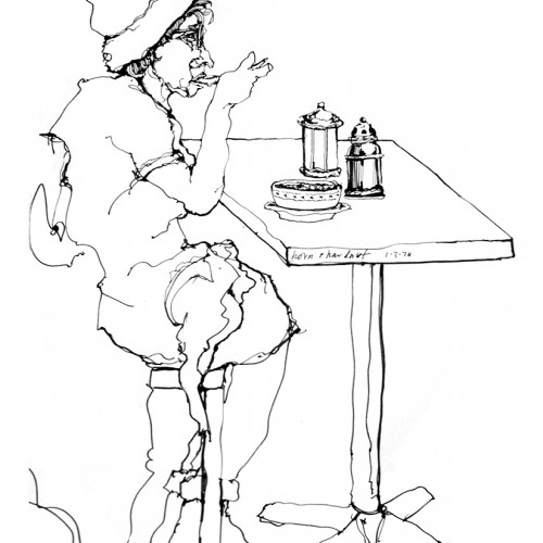
Just another test - working file to try and establish the feel of the book - problem i am having is book for adults, tweens, or kids - is it too scary? In the end there are a million things that harbour self doubt so better to just "do" instead of think too hard about it. - again just a test.
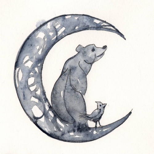
These are the results from a request to create a piece based on a fathers son's nicknames. The older brother is the moon, second the bear, third the bird. Added the stars as the parents.
His first request was of a tattoo of sorts ...but I struggled and my drawings kept turning into children illustrations. I so enjoyed the challenge and it gave me an opportunity to honor the love of family. At the same time, it was hard to associate them into a tattoo:) .
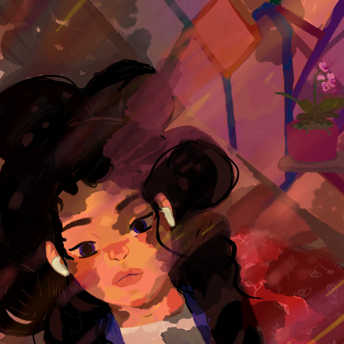
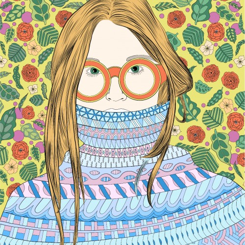
One of my girls with lots of patterns. The girl keeps in blue and purple and the background and sunglasses is kept in green, orange end yellow tones. I have always had a hard time using less color and this is my practice in keeping a more stringent color theme.
Another dream I had once, but lately I have been feeling....yuck. Its hard to feel good when you live in a world thats shallow. All the negative thoughts scream at you.
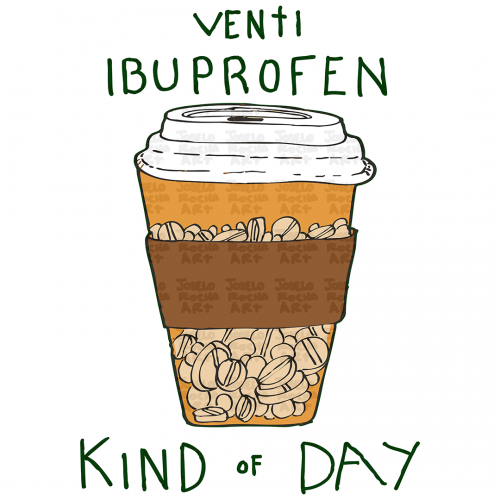
A hand-drawn illustration featuring a classic to-go coffee cup overflowing with ibuprofen pills instead of liquid. Perfectly capturing the essence of a rough morning, a long shift, or just the reality of "adulting.", text that reads: Venti Ibuprofen Kind of Day
I have painted this art when I was in 8th grade as a homework, but my teacher wasn’t see my sketch from some reasons and I came to sad cuz I work hard for it. So I upload it to show at least to you!
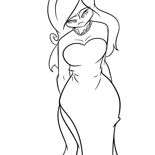
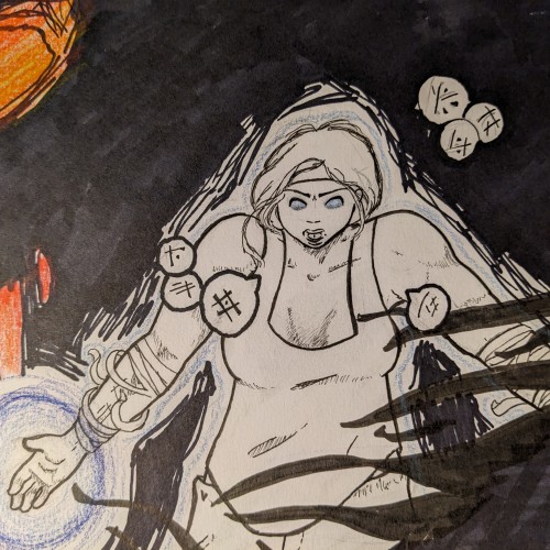
This is a major redesign of an OC that I came up with a while back. She's a hardened battle general, fighting on the worst day of her life. The assault has failed, soldiers have been lost, and the darkness has used memories of her husband to lure her to her doom. She's not going to go down easy.
Don Cutter (Full name Cookie Cutter) relishes in making their last name self evident. [This was done as a trade for a friend!!!! At present, she has no socials for me to link to, but I will update this if that ever changes!!!! (P.S. the name is *unofficial* but I am campaigning hard for her to canonize it!!!!)] P.P.S. this is the first image I am uploading of my (admittedly rather limited) backlog/body of work, so expect more updates in the near future [followed by a WHOLE lot of nothing for a while (I work SLOW ;-;)]!!!!
The second page of Steel Cloud has our heroes, Hardball and Riley with their band going on the road to perform. Little do they know they're going to have some trouble.