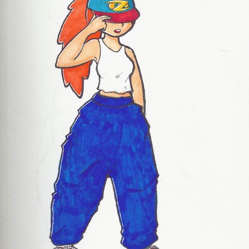
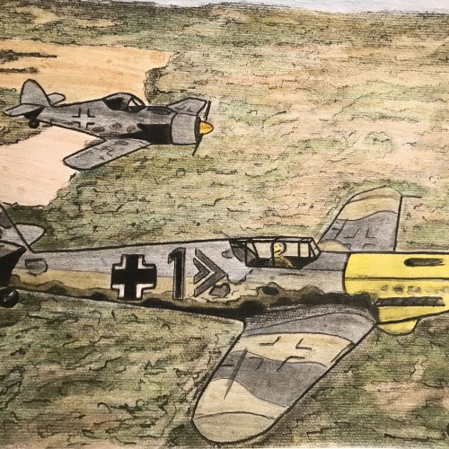
I decided to practice posing with a character that has a certain style. I also wanted to test a design for my artist logo. I will definitely be making a digital version of this character in the near future. Colored with Artify alcohol-based markers, and a white Gellyroll pen for highlights.
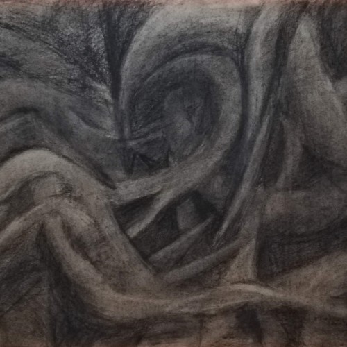
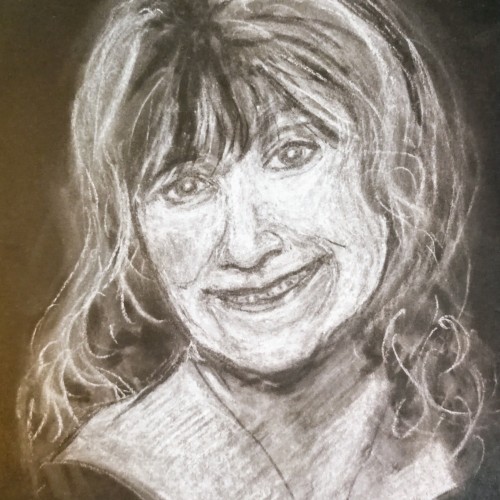
My tribute to my good friend who died earlier this year. Another white pastel on black paper. Not my favourite media but I love the effect of it. I need to practice more as I can't get my head around working on negative lol, erasing to get shadows and filling in to get highlights etc. I used a chunky white stick and a white pastel pencil but detail still eludes me lol. It's a technique I need to refine. It's the second picture of a dead person I've put on, apart from humph, so I'm a cheery little soul aren't I lol? Thanks for looking
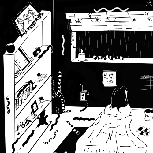
The five part illustration series Don't Lose Yourself. You can lose yourself in many ways; Consumerism, Heartbreak, American Culture, Loneliness, Giving In, Giving Up, Settling. The five part illustration series, “Don’t Lose Yourself” highlights the chaos we don’t notice around or within ourselves when we’re disconnected away from reality. Sinking so deep, we forget our own values or who we are. The collection reminds us to stay within ourselves by showcasing the dangers of what happens when we don’t.
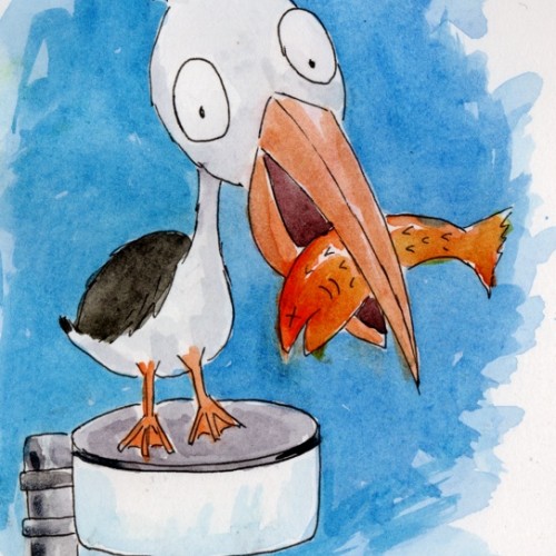
According to our fun daily calendar, April 8th is "Draw a bird day". So I drew my favourite bird (the pelican), perched on a streetlight as we often see them on the bridge over a local lake. Pen and watercolour.
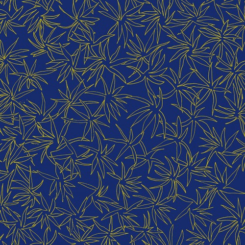
Exploring the opportunities of my only three colors: ultramarine deep (pb29), cadmium yellow medium (py35) and madder lake red light (pr187)
P.s. and my waterbrush too
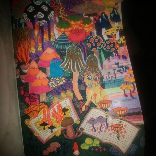
The cat in this doodle is inspired by "The Beast" from a cartoon that ran when I was a kid. The abstract mushrooms are a slight deviation from my usual botanical abstracts.
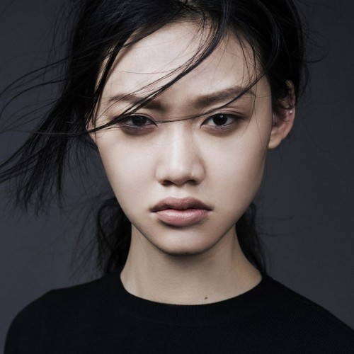
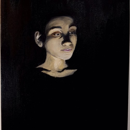
Inspired by the Neo-Classical period, I pushed myself as an artist to portray subjects in an idealistic fashion combining drama and artificial lighting. The subject is my sister who modelled as a reference, enabling me to control the shadowy effect over her face. The dim lighting and dark background resonated with the period style, focusing on the facial parts that are visible. The end result looks like she is emerging from the darkness. A somber atmosphere is illustrated through visual expression.
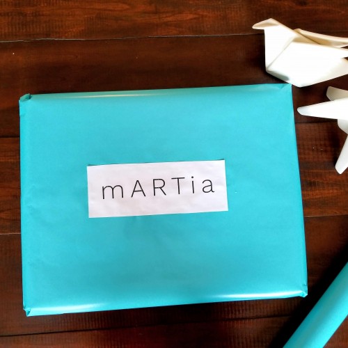
Adding the fast drying oil on the brushes improved the blending of the colours on the canvas which was especially useful when it came to applying strokes on the face smoothly. Visit https://www.martiaposts.com for more
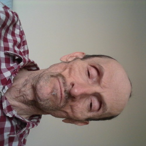
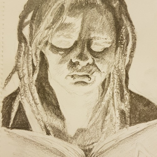
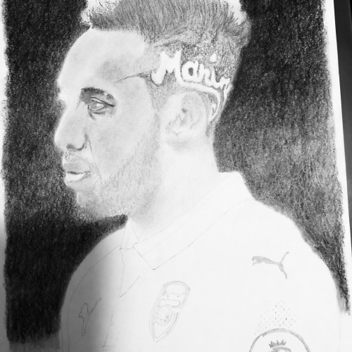
Progression 2 of 6. Spent some time here in the hair, beard, and eye. The transition in the hair from light to dark was done mainly by not adding in graphite in heavy amounts and using the pencil eraser to define the hair.
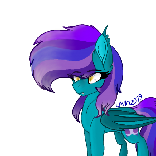
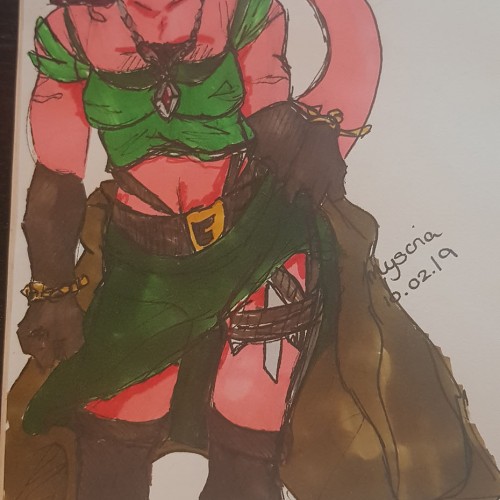
This is my character Myscria - level 10 druid, tiefling and looking older than she should because...well, I haven't quite mastered drawing specific age ranges yet. She's only about 22/23.
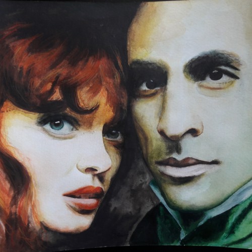
Reference photo taken during the performance of Les Miserables. It has its darkness from the evil and misery and bright light from the hope and love as in the story. It is done with watercolors and coloredpencils.