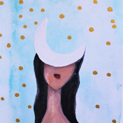
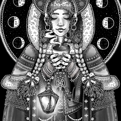
Daughter of the Moon: An Artsy Drawing by Brianna Eisman is an ink drawing with painting overlay of a woman with the face of a moon. This surreal portrait has an ethereal feeling of loneliness and mystery.
This picture, among my many others, was created by following the doodle lines made in a minute. The figure and composition was FOUND from the loops in between... without alterations. https://youtu.be/xOa42BwxOx4
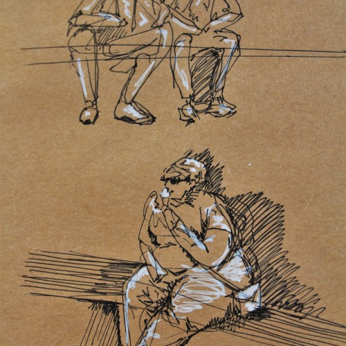
These are some gesture drawing sketches I did in ink with white pen highlights on brown paper. I was in Europe and sitting around a fountain watching people go about their lives. This was a really fun figure study and I think people make for great works of art.
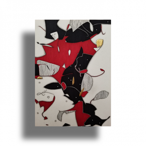
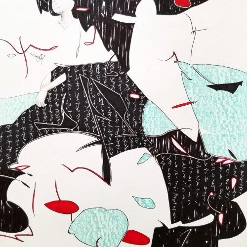
The idea is to show a figure crossing over two ` scripts’ with a bilingual suggestion. By standing in between worlds, we see opposing viewpoints.
Many artists have incorporated typography as symbols in their paintings since the 60s, but no one has attempted to approach lines in this `written’ manner. How different it is are the two writing styles of the East and the West; one with angular lines while the other in a smooth flow! This work juxtaposes the symbolism of cultures – script. At the same time, it questions the need to grasp the full meaning of the script to appreciate the aesthetic flow of calligraphic lines.
Since the dawn of l’automatisme, the floating shapes of Miro and Klee were praised as musical suggestions. Unlike the Masters, my groundwork of flowing lines speaks melody and rhythm from a musical score perspective. The flow of lines ties the art elements into a composition. It also reflects a concept from Chinese paintings, which says, ` as a line moves into the invisible, the idea continues.’
Whether the script in the background is an actual sutra is not the concern, even if it is, would it be readable to most? I question the use of lines in Calligraphy. Without the recognition of the exact words or meaning, can we still appreciate the quality and skills involved? Armed with a Chinese writing foundation, I adapted the use of the eight strokes (the basis of construction to Chinese character). The `writings’ resembles Chinese/Japanese writings but in fact, they are not. I needed a texture. With language as a symbol of culture, by visually adapting these kind of lines endears us to the image.
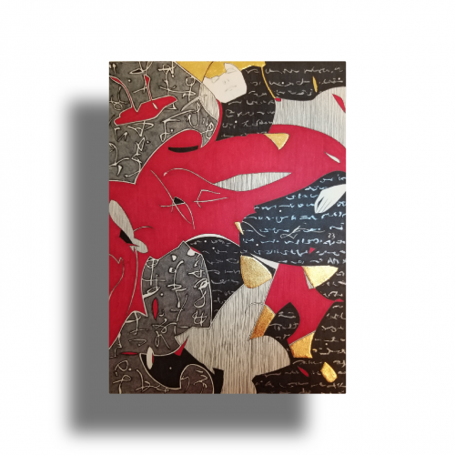
Some works were born to be prodigious. Once the preliminary lines were laid within the first minute, the quality of the shapes, the diagonal composition and the weight were balanced out.
With the black mass as the hood, a face, hidden underneath, is unveiled. With the addition of the black fingers and the white hand, the full figure surfaced naturally.
The black fingers are the minimal suggestions to add character. The title `Remorse’ came about because of the bowed head and the pose.
utube clip: https://youtu.be/mb48rCx-lYI
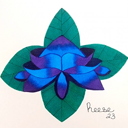
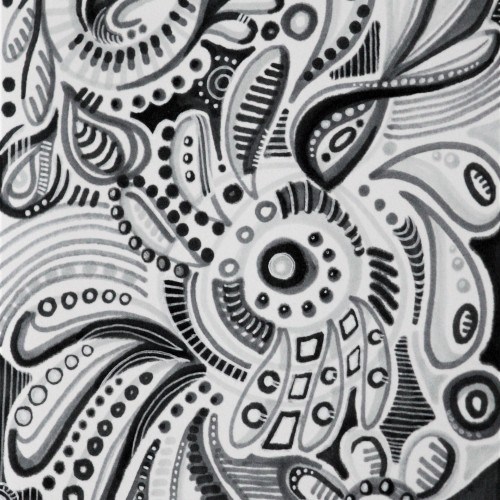
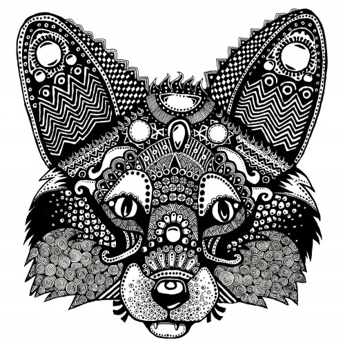
This drawing is titled "Greyscale Doodle" and was created by Brianna Eisman, Artsy Drawings. The pen and ink drawing is a fun doodle of organic blobby shapes with circles and floral patterns and lines. It's drawn in greyscale using grey, black, and white ink tones. The doodled image features an abstracted floral mandala type pattern. For more like this, please visit my website at ArtsyDrawings.com
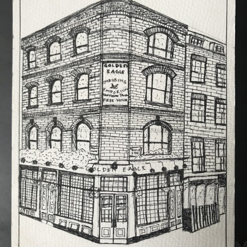
I drew a London Street Building, source from pinterest using the freehand sketch method. The story behind this sketch is that I drew it with a hesitation feeling, you can feel it when you see how my lines were drawn to create the brick texture.