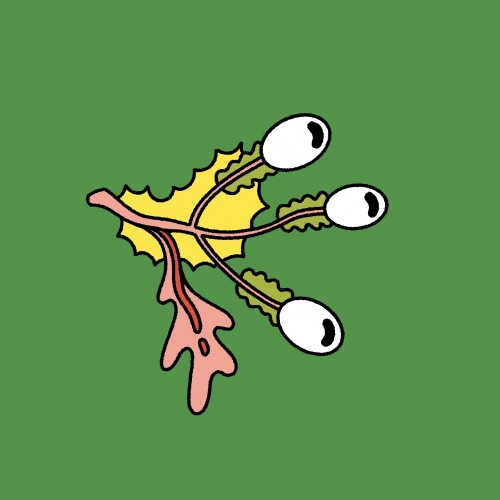
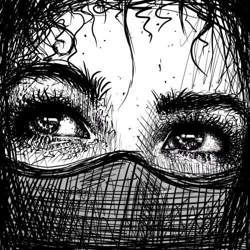
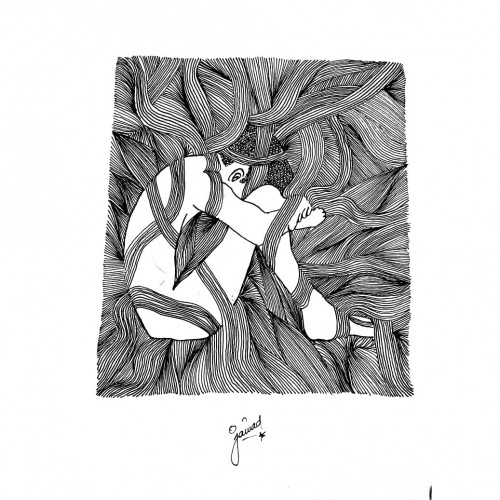
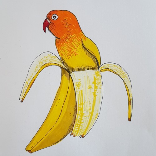
I've spent recent lockdown days watching far too many Youtube videos about attachment styles and honestly it makes a lot of sense. Here is a little message for my anxious preoccupied self
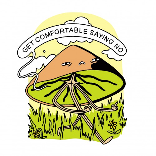
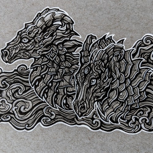
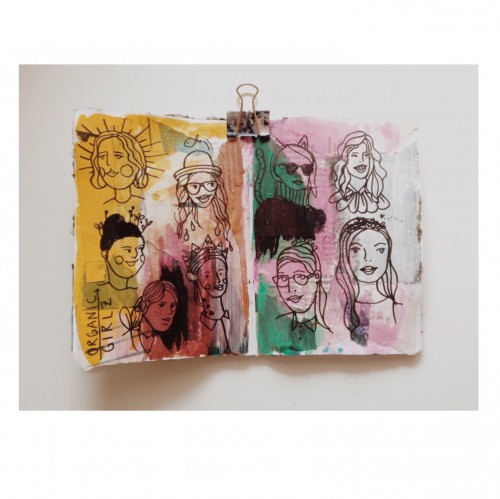
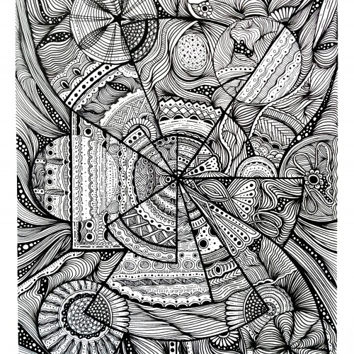
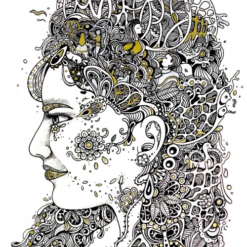
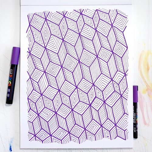
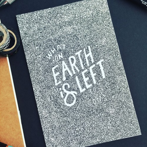
I've been experimenting with colour pallets and line width. Also trying to do LESS - my natural tendency is to add everything so cutting back is quite hard, but I think works better.
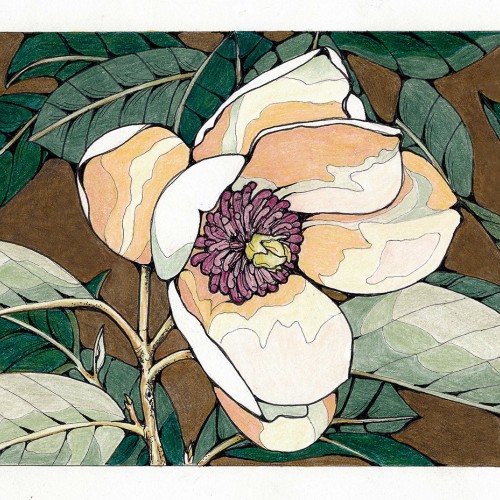
Magnolias are spring harbingers in our garden, as well as our annual ornamental cherry display. Star magnolias are over, tulip magnolias are in full swing, and the occasional Southern magnolia is starting. Perhaps I should have done this with a gouache paint, but I used colored pencils. Oh well. Outlined after with various sizes of Pigma Micron pens.
Our garden: www.edgewoodgarden.com
Inspired by nature. Background layer of the pages are covered by Greenpeace's newsletter papers and used mixed technique with acrylic, ecoline and markers.
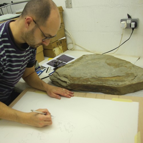
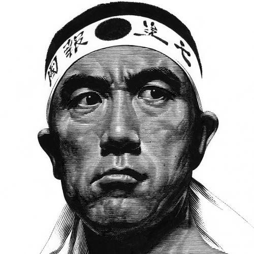
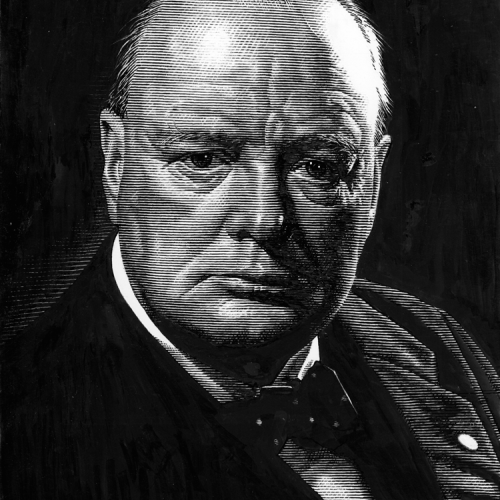
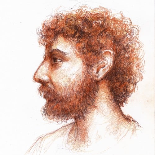
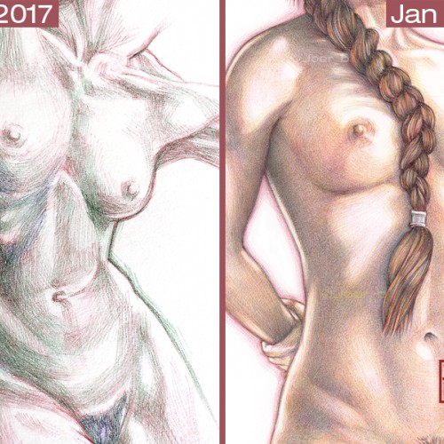
I’m often asked about my Bic pen drawings and how I do them. It starts with a good foundational drawing, the ballpoint pen part is just trying to colour within the lines. I try to do my best to explain the process, but the best way to show my progress is by posting my efforts to master pen drawings over the span of 3 or so years. I have been doodling/drawing with ballpoint pens as far back as I can remember - they were cheap, readily available and always lying around the house. It wasn’t until I was bored during a particularly long team meeting-conference call (around 2016-17) that I started to think about the possibilities of ballpoint pens as serious portrait illustration tools. My first experiments with full colour ink portrait drawings were rather crude, but that’s the point of learning new techniques—as long as the curiosity and the love of drawing is there, you can transfer that skill and passion into any medium. Remember, the most exquisite drawings and paintings you see didn’t materialise fully formed, they started out as failed experiments. Failure after failure after failure. It’s important to remember this when you get discouraged (I've failed spectacularly over the years). The only difference between the accomplished artist and the beginner is hundreds of hours of practice. Talent can only get you so far. It’s the hard work that you do behind the scenes that makes your work look effortless. Keep doodling. Keep learning. Stay curious.
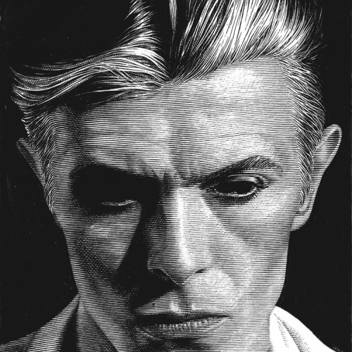
It's been an interesting week, one of which had events I didn't expect to affect me as much as they did. I'd like to say something that occurred was surprising, but quite frankly, it wasn't. It's concerning how far things have gone and how some seem to feel indifferent to or even support them. We'll see what will happen, 11 days can't pass soon enough... besides that, time ticks on. A bit too fast in my opinion, but it is what it is. I know this drawing isn't my usual style, but something about drawing like this feels mindless for me, it lets me zone out and disconnect.
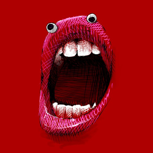
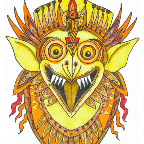
Oh boy, markers (NOT a go-to), least favorite color, and a subject that isn’t on my radar. This was a hard one what with 3 negatives going for it. But, hey, it’s a challenge, right?
Choosing a subject came first….we have a house full of Indonesian masks and sculptures. (My husband studied gamelon music in Indonesia.) Garuda, the “mount” of Vishnu and popular with Balinese artists seemed a good choice, esp. since he can be green, red, yellow or orange.
I rarely choose yellow/orange for anything---artwork, décor, clothing...though I do have a soft spot for sunflowers.
First I drew a bunch of images based on one of our wooden Garuda sculptures and then made a simplified marking pen outline and colored it with markers.
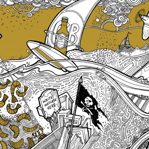
Beer Label design incorporating lots of local facts/things to do with the area it's brewed in. Sailing, windsurfing, big lake, spitfire plane, invading shrimps, highland cattle, sunken church, snakes, beer swilling octopus (ok I made that one up).