The logo is based on art and illustration. The logo Artist drew and modified the logo concept of the rough client's drawing.
More about our latest work visit
https://en.evenflowstudio.com
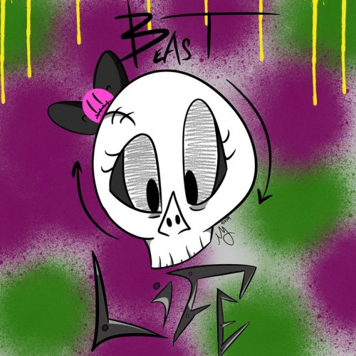
I was very happy with this one until I erased the pencil lines! All my line work smudged! Oh well. I'm still happy with it. So this is a logo I'm designing for my Tabletop RPG I've written. I'm so excited for this! This will be my DM screen!
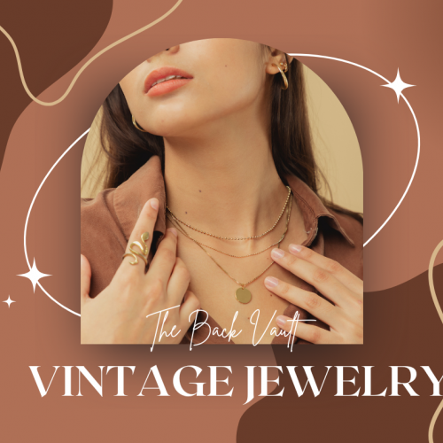
I am a professional logo and graphic designer. This piece is for one of my clients at https://thebackvault.com. How will you rate this piece? It is designed for public display and banner display.
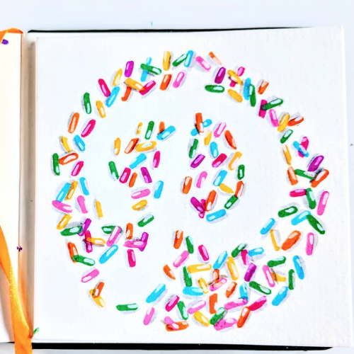
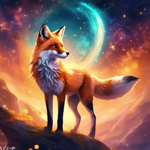
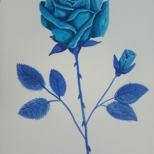
Analogous colours means the three colours next to each other on the colour wheel. Though this was just me wanting to experiment with my turquoise oil paint
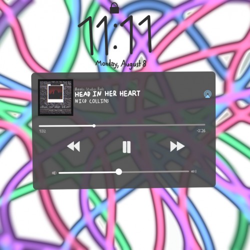
Music is something that comforts me. And this song is my favorite of all. I drew everything except for the song logo. The background was the hardest to draw. I hope you guys like it!!
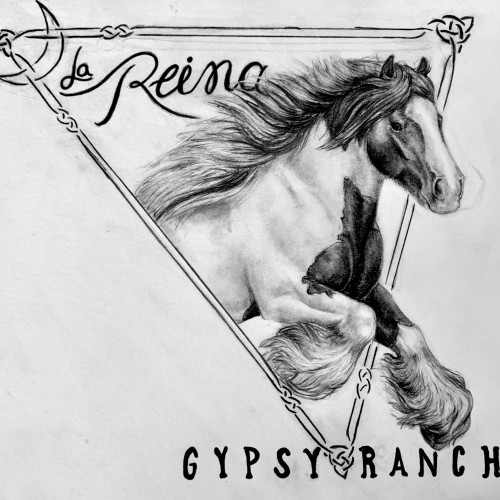
Here is a commissioned logo re-design I did recently for La Reina Gypsy Ranch, owned by Lori Knott (you can find her here : https://www.facebook.com/lori.kott)
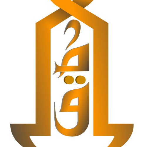
A LOGO design of the word "Mostafa" written in Arabic Calligraphy using Al Kufi writing style. The design is made via Adobe illustrator initialy to be printed as a laptop sticker.
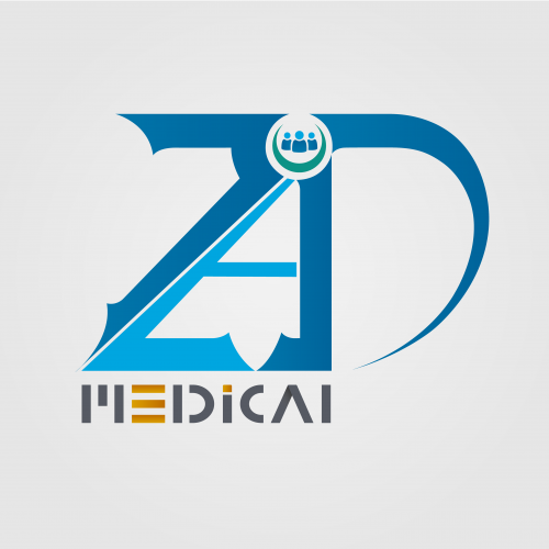
The logo is for a medical supplies company. I hope you like it. The name of the company is written in English and Arabic at the same time. You can read it from left to right in English, and from right to left in Arabic. I will leave it to you to guess the name of the company. Besides, I also hope that you can find the word in Arabic. I am so excited to see your comments.
Another icon or logo of Jester's restaurant, "Ringmaster's Pizza Hall". This one is more sinister, and looks more like a FNaF teaser, especially for Sister Location. Though the Altitone animatronics were based off of the funtime's designs, the resemblance between Jester and Ennard is completely coincidental --- but I've kind of embraced it now. Drawn with FireAlpaca.
My first serious project - logo and mascot for Apapers.com service. Done in cold blue pallet. The main character - letter A is supposed to bring more life and a sense of adventure and curiosity to the serious service and give customers, especially students, a sense of empathy and general good spirit about Apapers
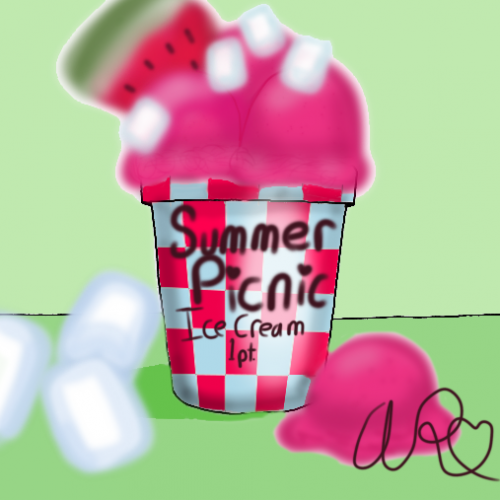
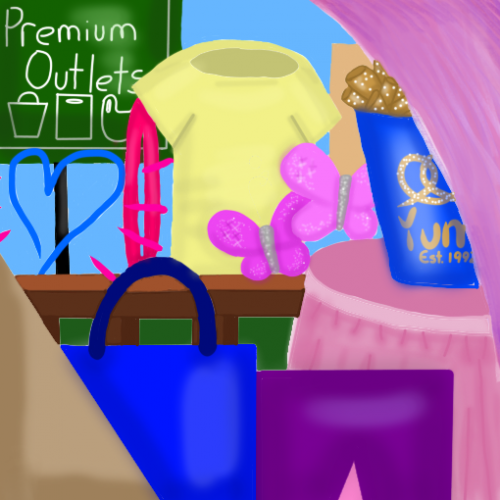
Ta-da! Finally done! This was inspired by my annual back to school shopping trip in August with my mom, my siblings, and my grandma. The sign is a bit of a clue to that, the heart is similar for he logo of one of my favorite stores (until they closed last month), and the tan thing in the corner reminds me of the dusty playground we stop at between stores. The hair clip, butterflies, and purple corner (it's really a hair extension) are all from my favorite accessory store. The railing is for the walkway between stores and I don't really have to explain the shirt, skirt, pants, and shopping bag. No trip is complete without a bucket of pretzels to eat on the way home! Anyway, I hope you like my art!
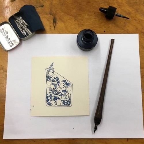
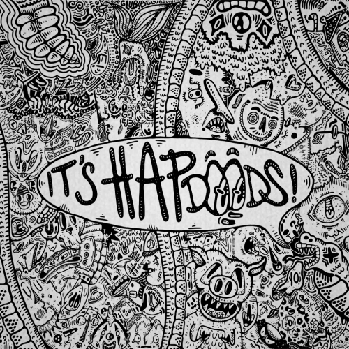
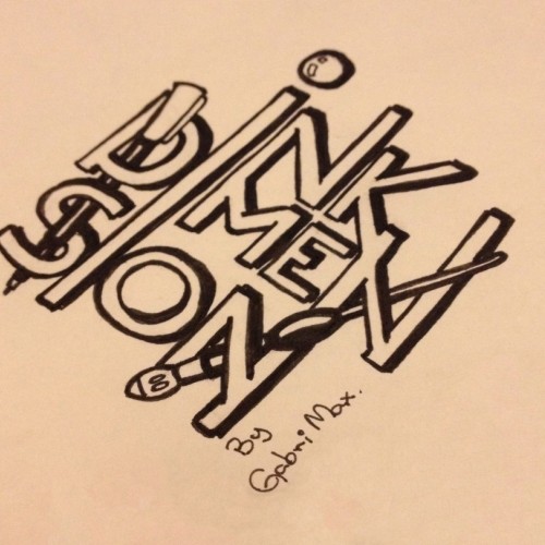
The logo from my folder of ink doodles.
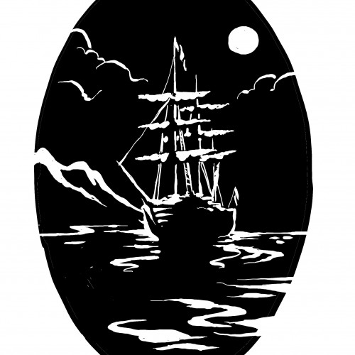
By Gabri Max - 2017.
www.instagram.com/gabri_max/
mydimensional.tumblr.com/
gabrimax.deviantart.com/
http://gabri-max.newgrounds.com/
https://www.doodlersanonymous.com/user/25012-gabrimax/
http://doodleor
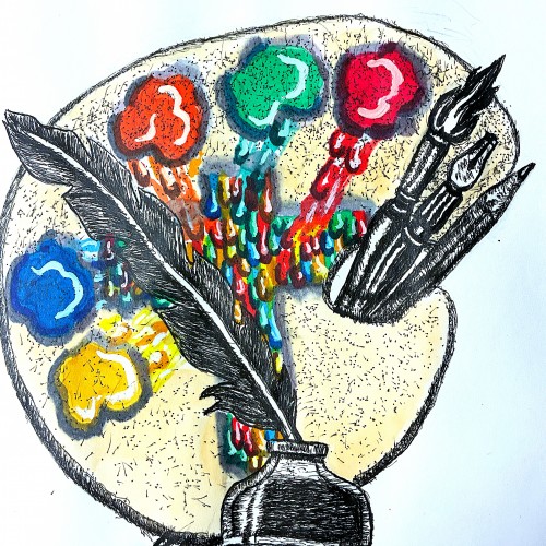
Well friends just got done creating my new logo to represent my ministry. The design incorporates symbols that represent both writing poetry, commentaries, short humorous stories. This is represented by the quill pen. My fine art, commercial art represented by the painter's palette, and illustrative tools.
The colors running to the center of the palette to from the cross, represent my Christian ministry. Going to FedExs to have business cards made. Planning to use this logo for my art fair booth