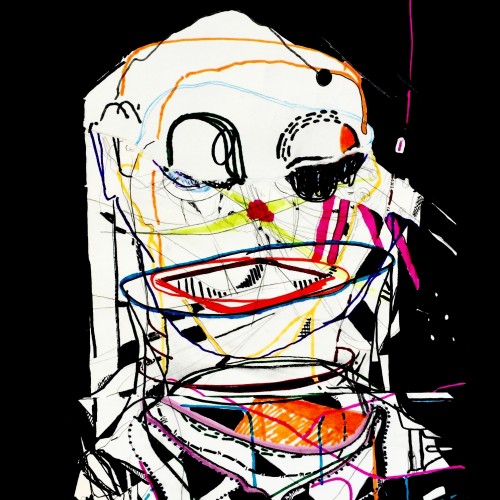
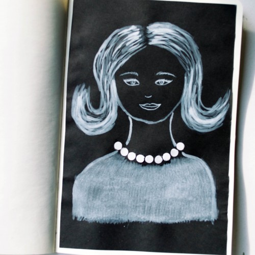
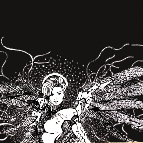
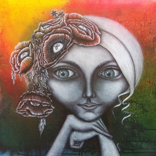
The idea for this portrait came to me when I was looking at a packaging of soap - it was very glossy and it looked like it could look like pearls. As well as the soap packaging, I used white ink mixed with acrylic paint (for opacity) on black paper.
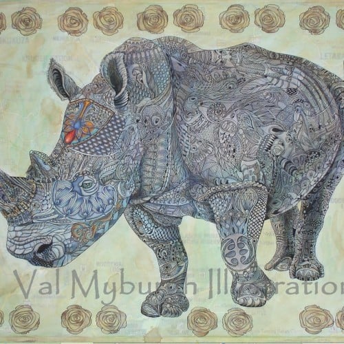
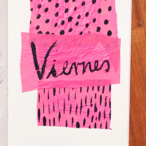
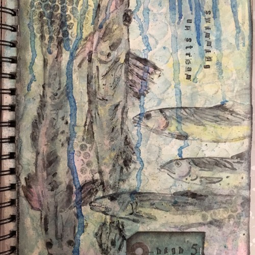
India ink on tissue paper. I had never used ink on this kind of paper before; I really liked the results! There are some folds and wrinkles on the paper that give the pattern some interesting details. The paper is also super absorbing, which plays nicely with the quantities of ink. Since it's very thin, there can easily be overlays between textures. And finally, when trying to use less ink (so that it wouldn't seep through and cause a big dot - the absorbing quality is nice, but it was also somewhat of a challenge!) I used very little ink on the lettering, causing a scratchy, dry look.
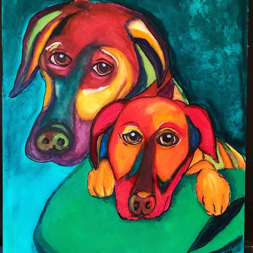
This was a commission for portraits of 2 dogs using watercolor for the dogs and acrylics for the background. Painted on Aquabord which makes the watercolor so saturated that they appear opaque
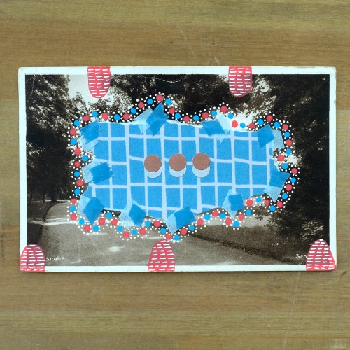
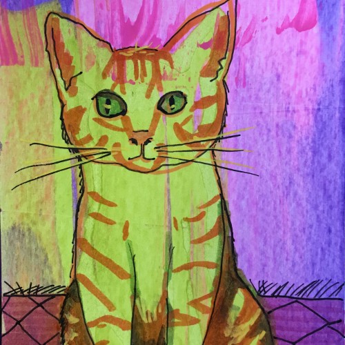
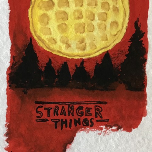
This is part of a series of postcards that I have been creating to mail to my mom everyday. She is in assisted living about 3 hours away so I can’t see her every day. I mail her the postcards to give her something to look forward to.
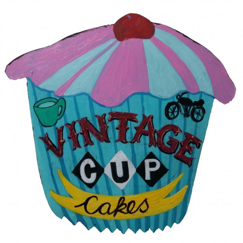
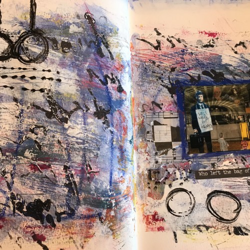
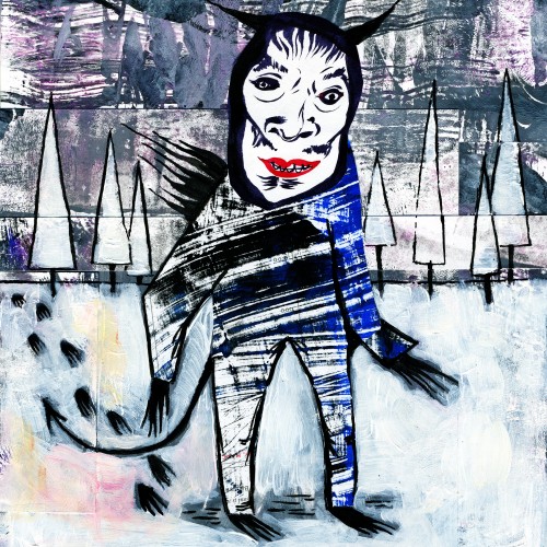
I collaged "Krampus is Coming For You" together with my own monoprints as well as one of my drawings of Japanese Noh masks that I cut out of an old sketchbook. For the second piece, I had a drawing of Marie Antoinette as an ice cream cone, so I gave her a dress, put a background of my monoprints on her, etc. Then I added more cherries, and the circle reminded me of a clock, so I inked in the arms accordingly.