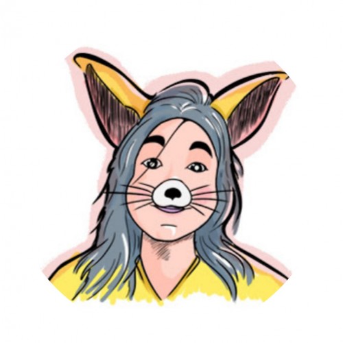
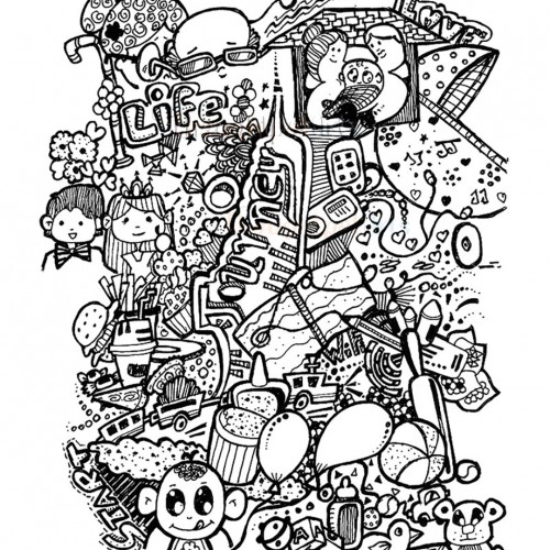
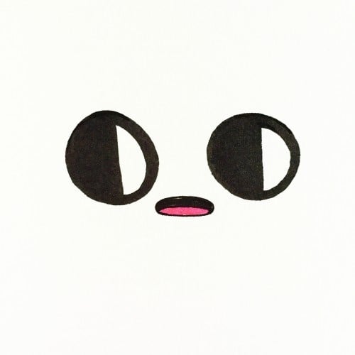
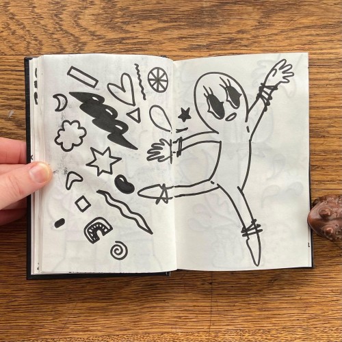
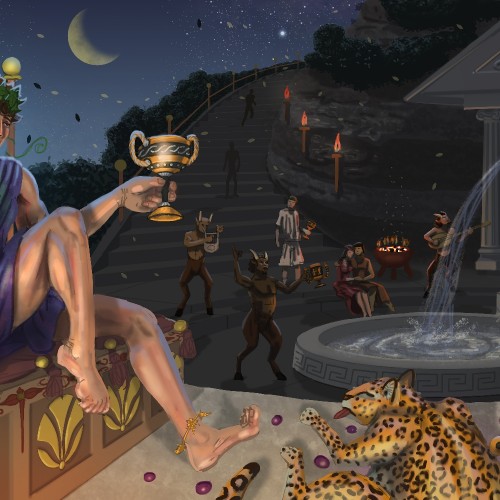
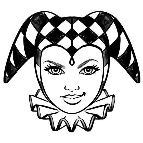
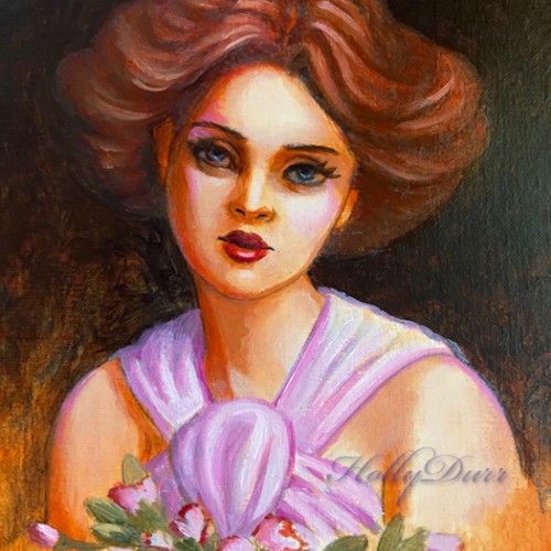
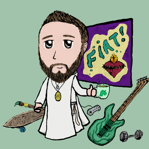
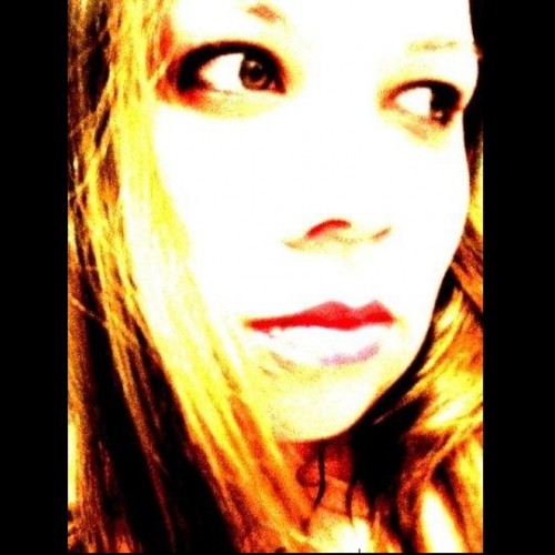
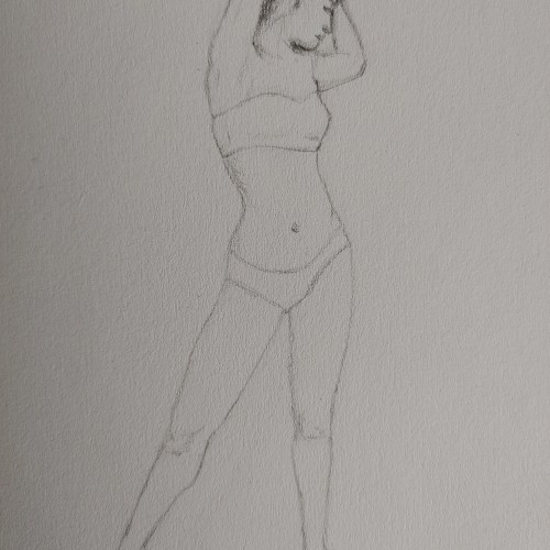
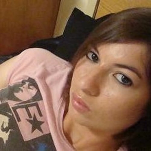
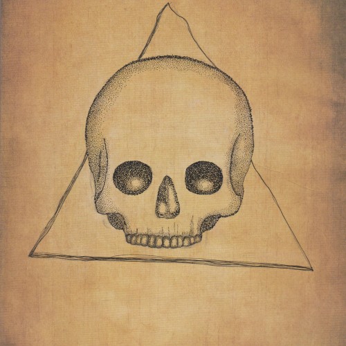
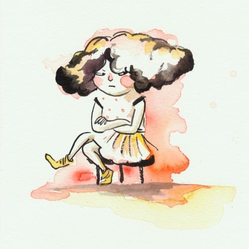
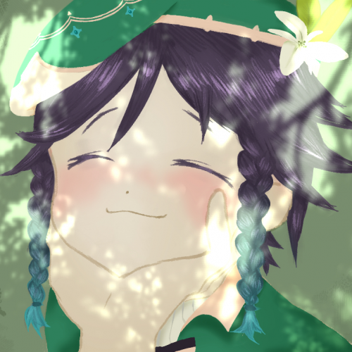
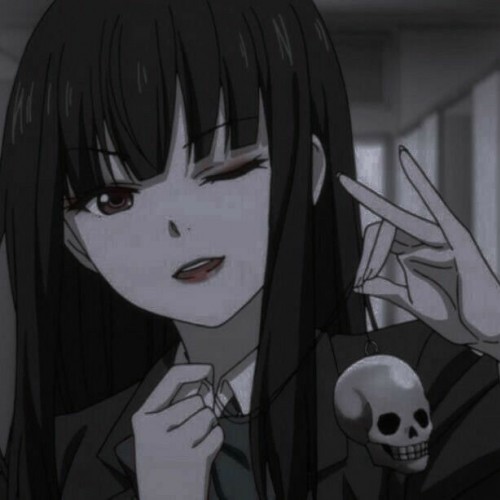
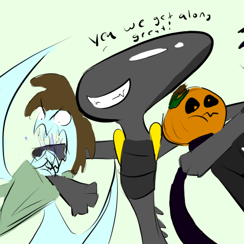
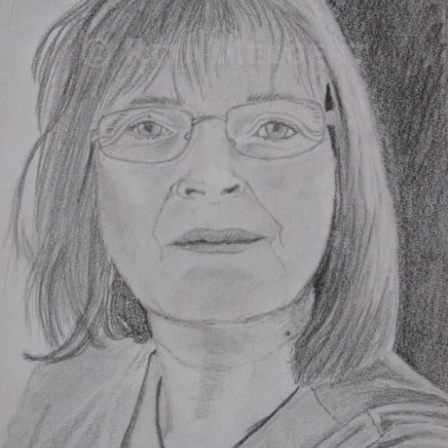
Life is full of difficulties and hurdle. A mixed bag of happy and sad days. But when it comes to measuring them, we tend to weigh them towards the difficult ones more forgetting or avoiding the happy ones. This illustration is a composition to share how small or short life is to worry about tough times. Instead we can focus on being positive and happy and live every moment fully
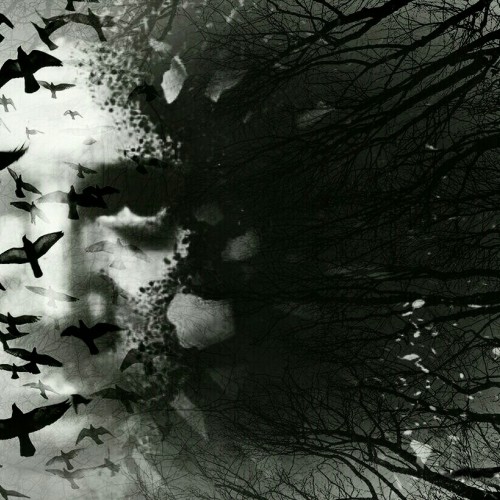
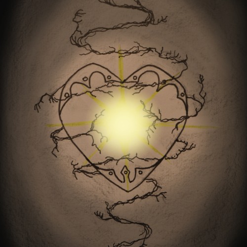
No matter how dark things get, hold on to the Light of Hope! Even if you seem to be surrounded by shadows, know that you have people and spiritual beings that care about you. Your Guardian Angel is always by your side and your Father is always watching you, silently, lovingly. All you have to do is reach out. Cry out and listen in the silence of your heart. Nourish the light inside and it will grow until your eyes are healed from the blindness this world gives. "The light shines in the darkness, and the darkness has not overcome it." (John 1:5) The darkness has not and will not overcome it, you are in my prayers and God loves you. ^_^ I'm feeling more energy now to draw and study, please pray for me as well, I must pray or else the waves of depression will tear me down. I care about you, let's walk together and overcome all the obstacles we have been given. We won't stop! Onward!
#Light, #darkness, #shadow, #sketch, #heart, #love, #hope,
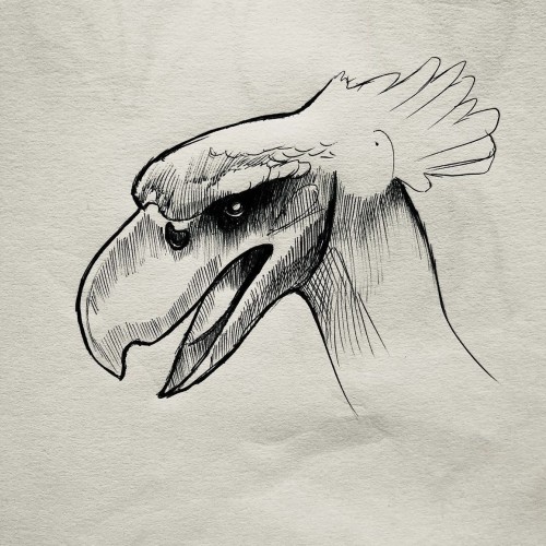
This is was more of an experiment as I wanted to see what black ink would like on paper with an "aged" like background. I think it came out quite nicely but I also think that the black ink might seem a bit too bold. I'm not really sure.
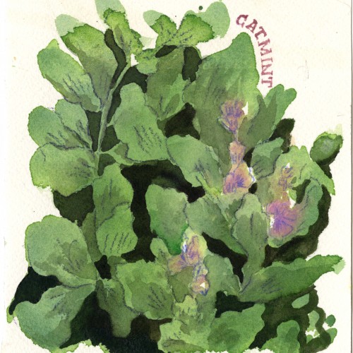
Catmint - also known as catnip and catsworth.
Male cats tend to like catnip more because the same chemical can be found in a female cat’s urine.
https://www.instagram.com/p/CTFuP_-rxWA/?utm_source=ig_web_copy_link
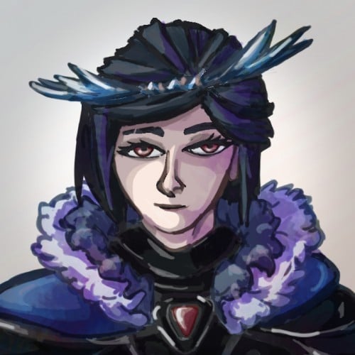
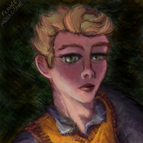
Spent some time last week trying to work through a new digital painting/colouring technique . It needs some more work and I haven't decided if I like It yet or not. One of the images turned out blander but the original skin tone was very orange I did like the brush textures a lot better on the orange skin but the lighting feels better on the purple-toned image.
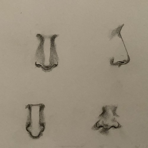
To be honest, wasn’t too happy with how this turned out but it’s just practice. I know I’ve got to draw like a thousand more noses to really get something decent lol. If you have any tips on how I could get better, let me know!
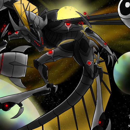
Galacons are these giant space robots, and there's two variants. The Solar Galas are much larger and thinner, and sport huge solar sails like frills along their necks and tails, a few even have sails on their long limbs, somewhat like wings. The Solar Galas are surprisingly passive, despite hosting hundreds of concealed turrets (some with EMP missiles), blue/white laser flames from their mouth cannon, and smaller lasers from the lights down their body and limbs. The Solar Galas can hold fleets of cruisers in their chest-like docking bay, and smaller ships down the rest of its body to the hips. Solar Galas are still dangerous though, as their diet consists of metallic asteroids, and small ships can be mistaken as food. Magma Galas (not featured in drawing) are much more bulky, sporting massive drills on either side of the head, as well as drills instead of front claws. They also have much larger and more powerful lower jaws, also used to tear through planets to eat the cores. Though they're much smaller, most have huge tails to store lava/magma, and most can spew superheated laser-like blasts of white magma from their mouths and tails. Magma Galas also have extremely tough armor all down their body, the largest having plates nearly 80 miles thick. They are hyper aggressive until they find a planet to bore into and slowly devour, however if attacked while feeding they won't hesitate to vaporize their enemy.
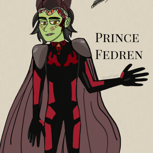
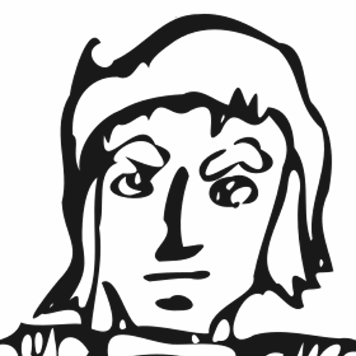
Im finally working on another drawing of him,it's that he's quite difficult to draw and it takes forever to finish unlike some other ocs you can draw in less in an hour,can anyone relate to this?forgot I still had this lying around in my phone.Still need a name change since "Fedren" doesnt fit him and I just made it up.He does look somewhat the same except now he has a squarish chin instead of a pointy round one, he's muscular instead of being slim,he also doesn't wear a pointless gaudy helmet anymore and his hair is less voluminous
So here is the fanart I promised. Gonna try doing more of this however I am gonna take a break from digital drawing for a small bit. Not saying I won’t. Just saying a bit less digital drawing. Nova is from the renegades trilogy and is a fantastic character. Marissa Meyer does best. I thought I wouldn’t face head on because I got inspired from some other artists doing poses so I thought it would be cool!
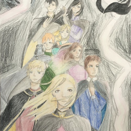
This is the basic, uncolored sketch of a project I'm doing for art class. It's a little different from my usual style because I tried to go for a more realistic style. I bet nobody will be able to guess who my favorite KotLC character is (hehe)... Also ignore the horrible lighting, my room is not the best when it comes to that kind of thing.
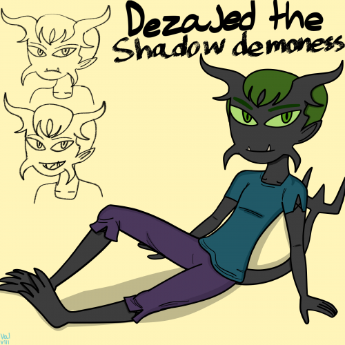
Another OC redesign along with a new name,she still looks somewhat like her old design except now she has short hair instead of poofy long hair,green eyes,different horns,two lower fangs instead of one and lastly the sharp horns on each side of her face.she also doesn't have a hourglass body shape anymore (I don't want two female characters having the same body type)She is a good friend of Tenebris,they often challenge each other and have fights to see which who is stronger than each other,she is athletic,loud mouthed and mischevious and she is skilled in flying unlike Tenebris.
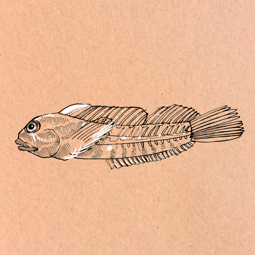
Coralliozetus clausus, a new species of chaenopsid blenny, endemic to Isla del Coco, Costa Rica. More like this on: https://www.instagram.com/camilojulianc/
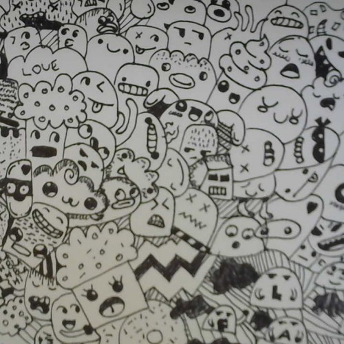
if you like these piece go and check out https://www.youtube.com/channel/UCvleZuYXOPYJCXTXmygQJNQ to see more doodle work if you like in the end make sure to doodle along with me if you like my channel make sure to subscribe just copy and paste the link
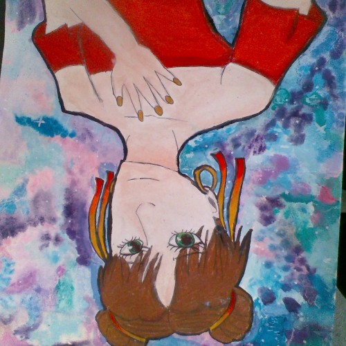
This is more of a test than anything, but I thought this would be go a good one to test uploading with. I basically just created this character from my head. If you're interested in the materials I used, I created it with a basic watercolor set using a wet on wet technique for the background, A sharpie outline, and the color on the character was created by using Prismacolor colored pencils.
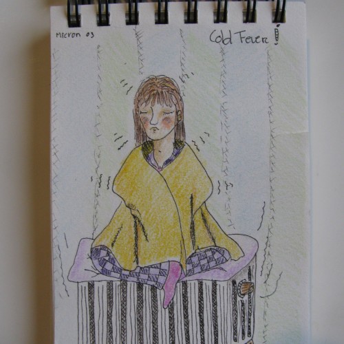
Art Promt: Fever. Being ill for more then a year and this is one of the last drawings I made back in 2019. Hope to be back with more very soon. Have a wonderful and creative 2021
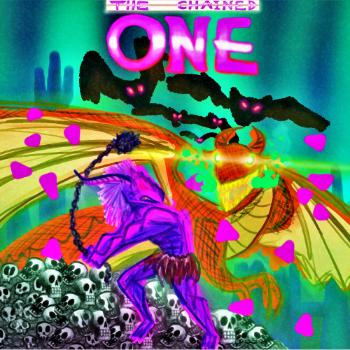
I never told ya'll . I have chronic depression . I am chemically imbalanced, I have to keep moving, otherwise , My MIND will kill me ,. Check out MegaJeff1989 on Deviant Art and his big Metroidiva Project ! More info in link , thank you .... https://www.deviantart.com/untitledhero700/art/Chained-One-Death-Screen-862613618
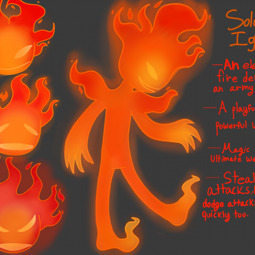
Soluto is Princess Neera Veera's archnemesis,just like how Qasaherim is Elvarelyn's archnemesis.He is a fire demon warlord who has an army of his own to destroy anything and anyone on his path mostly weaker demons since he cannot fight stronger,more dangerous demons because that would result in not only his armys elimination but his.He is not terrifying,vile or deadly like a lot of demon warlords because 1.he be defeated easily and 2.he is moody and skittish and 3.he has only killed a few demons.Snidecious and him are very alike,even though snide doesn't want anything to do with him.Soluto Ignis literally means fire warlord in Latin thus why I named him as such.He was difficult to color since I have never colored fire digitally I even tried to search for character speedpaints similar to Soluto's design to get an idea on how to color him but nothing helped however what did help me was looking for similar character designs on google images and getting not only an idea how I colored him but inspiration too.
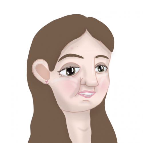
I haven't posted on a while but here's more digital art! I think I shaped the eyes wrong so now they just look sad but hey, I'm learning! I didn't have time to give details to the hair since I was focused on the face, but I like the shape of it. What do you think? Let me know if you have any suggestions to improve this, thanks!
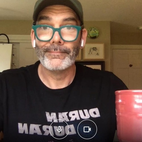
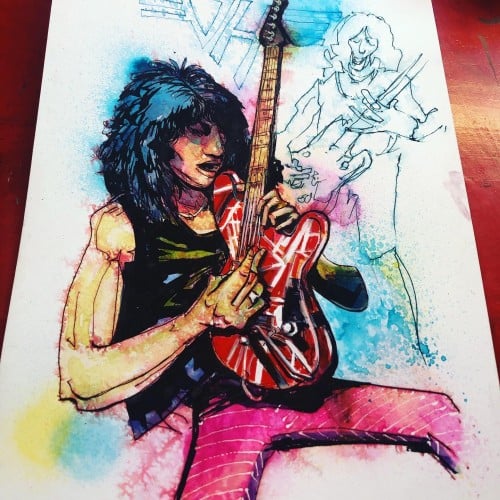
From the soundtrack of my youth. RIP.
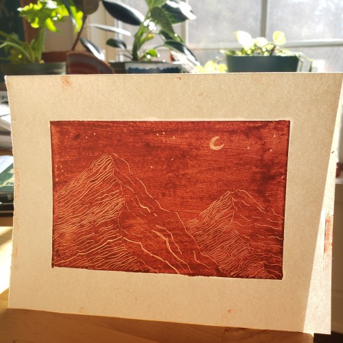
10” x 15” Original ink and watercolor illustration on Strathmore 500 Series 4-ply Bristol illustration paper.
Signed by the artist. Unframed.