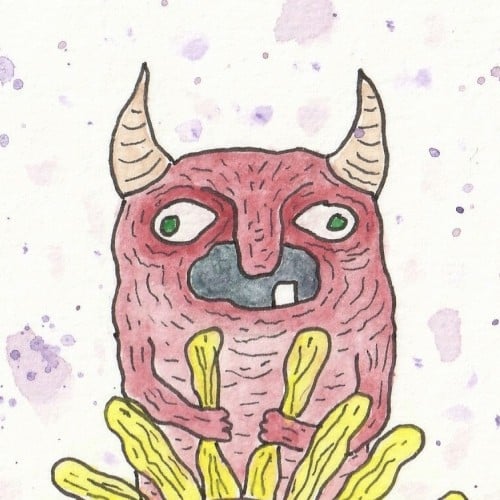
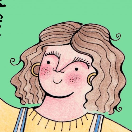
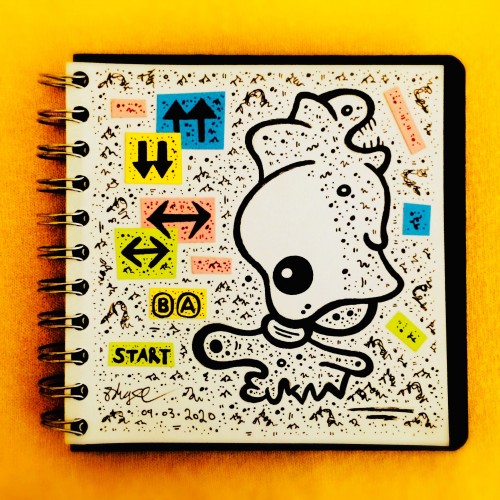
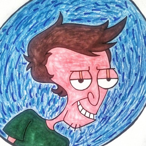
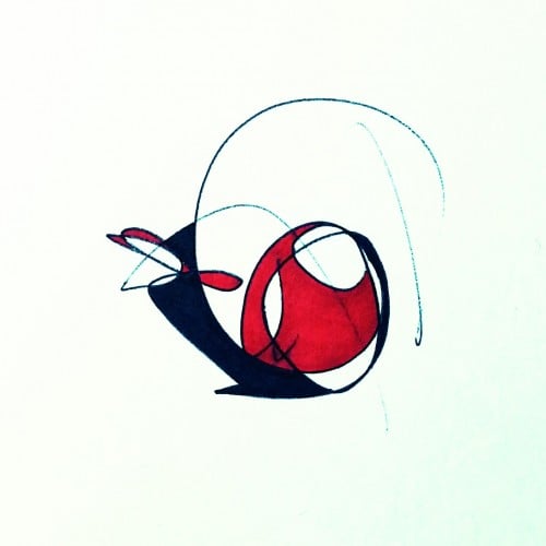
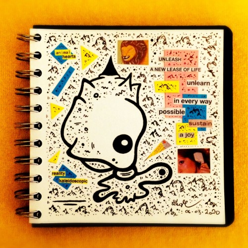
Created a few years ago, this little one has become my personal symbol. I often wear a button with this image on it without the background. Illustrated in pen and ink, colored in photoshop, and lettered and layed out in Illustrator.
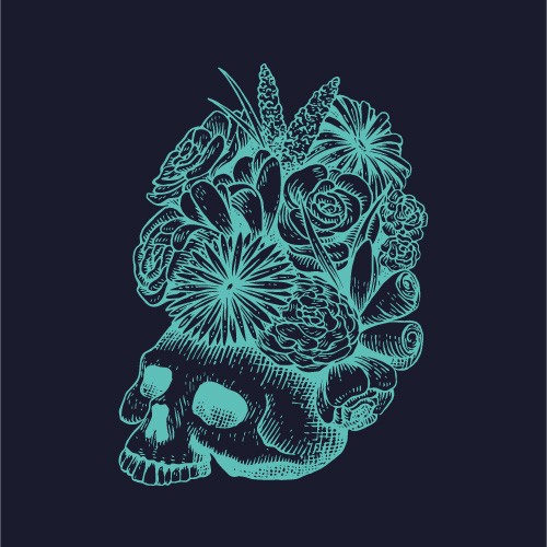
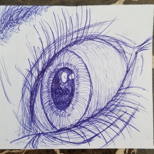
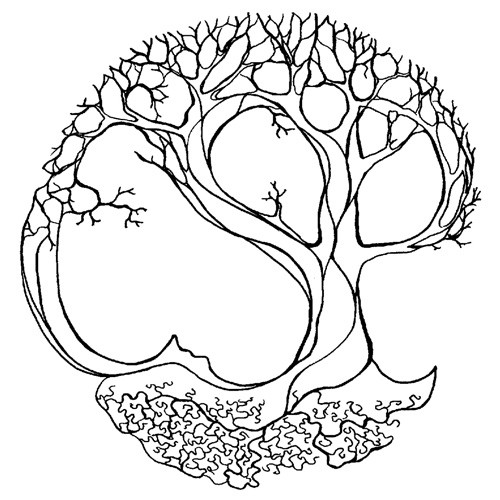
I tried using blue again, i like it better when it comes to these types of drawings (eyes, trees, buildings) but i will definitely be using black for creature and animal drawings. Let me know what you think, comment any tips for improvements, or even just to say what you do like about it; feedback is welcome on all my art.
The finished piece is 24 x 32 inches on 300lb. hot-pressed watercolor paper ~painted with watercolor and ink. There were a lot of components I wanted to incorporate in this piece. Then, the painting kept "going". It moved of its own accord in places I did not anticipate, and I kept going with it....people that I know/have known intertwined in my mind as I painted the tree branches. Overall, the painting took on so many meanings to me as it matured
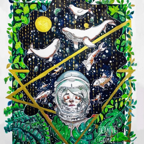
"Beauty of Hope" as one of the original painting I donated to charity and it was auction in exhibit. It was one of my favorite painting so far.
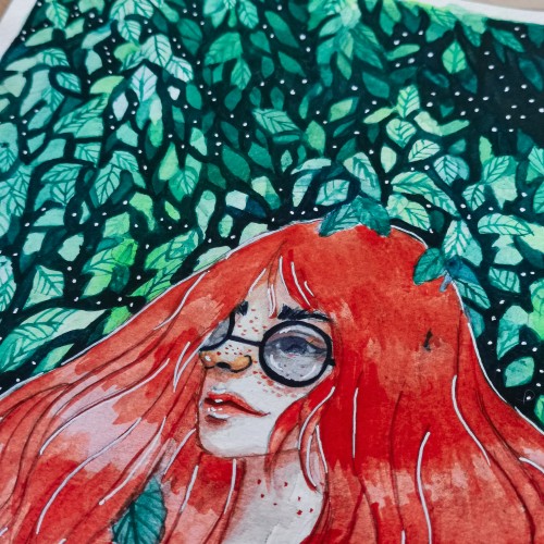
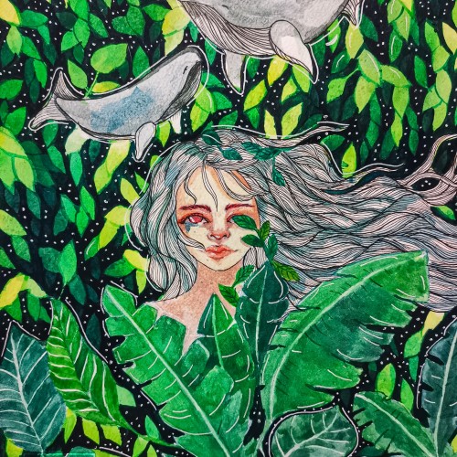
I used koi watercolor and a fabriano 200 gsm paper. Most of the color I used are blue, green, light green and yellow and a bit of orange. The metallic gold paint was one of the color that added flavor to the painting.
Abstract drawing of a structure shaped like a spiral. Colours and shapes added to amplifies the natural movement of the drawing. Raw art, pen and ink on paper.