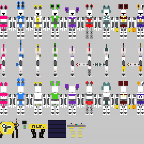
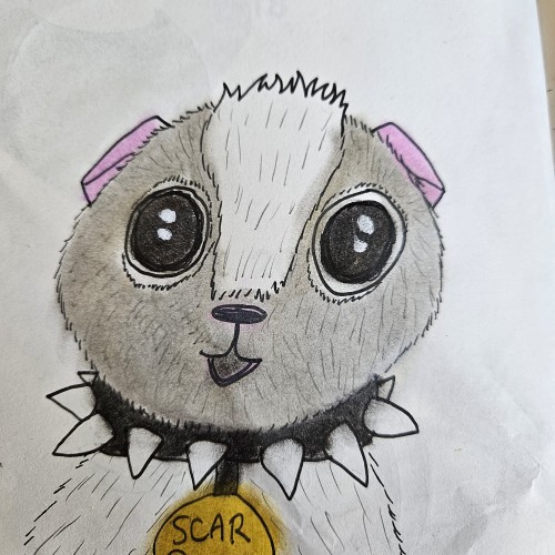
I figured it'd be a while until I draw (in full detail) ALL of the Altitone band members, so I made each one a sprite. Their names are (from left to right): (The first one is a base), Elizabeth the hot pink cat, Preistor the sky blue rabbit, Altor the golden bear, Bruce the green mouse, Lexibo the violet elephant, Mary the short red fox, Dexter the blue-gray Racoon DJ, and the three cheerleaders: Rosette the crimson mouse, Oopsie the russet fox, and Pastelle the cotton candy short-eared rabbit. On the very bottom are the instruments. In order, they are Elizabeth's mic, Preistor's guitar, Altor's drum set, Bruce's mic, Lexibo's piano, Mary's oil drum (not an instrument, but Mary hides her bottom half in the oil drum, sort of like Looney Bird from The Rock-afire Explosion (which is why she has no legs)), and Dexter's DJ board. The last three are cheerleaders, and their hands have been replaced with cheerleading pom poms. On stage left, we have Dexter and Mary. On the center stage, we have Preistor, Altor, Lexibo, Elizabeth, and Bruce. On stage right is Rosette, Oopsie, and Pastelle. Made with Piskel. (If you're wondering where Jester and Dellusion are, they aren't band members --- but rather seperate attractions (and Jester doesn't even perform.))