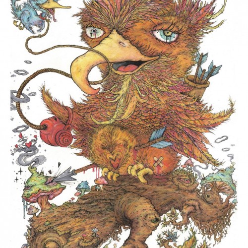
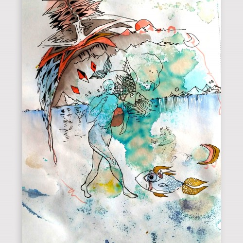
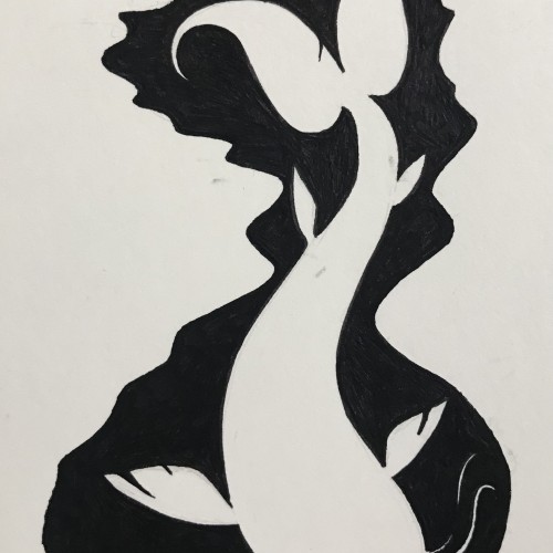
This piece was done with watercolour crayons, crayons, fineliner, acrylic paint and a touch of posca. I was showing that love can be blind and sometimes almost arrogant and selfish, the arrow has hit the spot on the second attempt but the scars are still to be seen. Although the person playing cupid aint always an outside force. I enjoy playing with the titles and am constantly changing and thinking of what it will be called when doing the piece, but i do like my wordplay. this one was a play on horticulture and felt it all tied in to the final design :))
This is available as an a3 sized print.
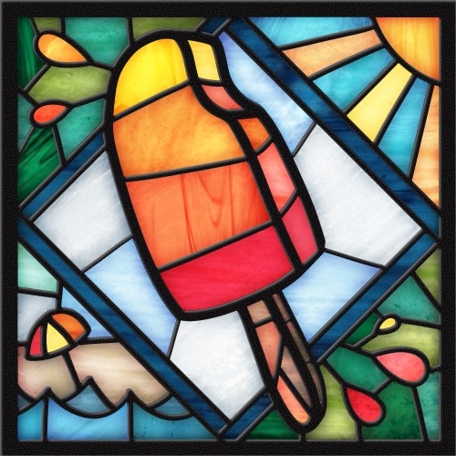
Playing around with digital stained-glass effects, and thought it would be fun to portray tropical summer vibes in a medium where you don't usually find them. Shout out to Lisa Bardot at bardotbrush.com for the basic digital technique.
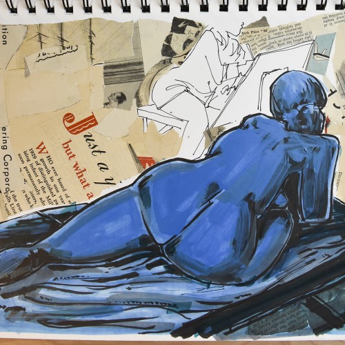
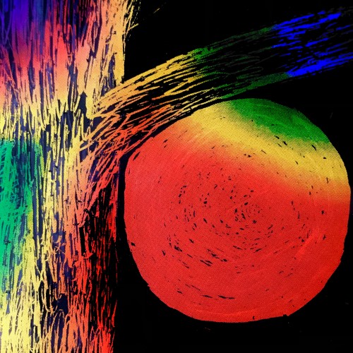
Once again playing with shapes, colours, marks, and loads of squiggly, smudgy ink lines. No pressure. Just trying to get back into splashing around with paint and seeing what emerges.
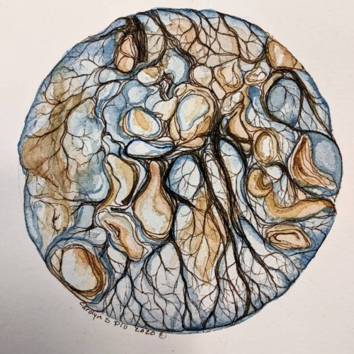
Artwork on "the other side" - playing with the bleed-through from the watercolor and intuitiviely allowing the shapes to arise. Created using watercolor, coffee, ink, graphic pens and unipen
I printed my black and white zentangle drawing on marker paper and colored it with alcohol markers. At first it was a bit to garish with too much contrast, so I painted a warm grey over the whole piece. That gave me what I was looking for. Of course, THEN I completely undermined that with making a bunch of wild colored ones (two shown here) by playing with them in Photoshop. I shall be using this (along with my Zentangle koi posted la while back) for printing blank cards that we sell for charitable (mostly foodbanks) organizations.
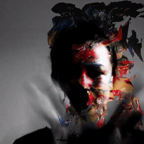
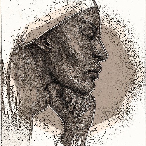
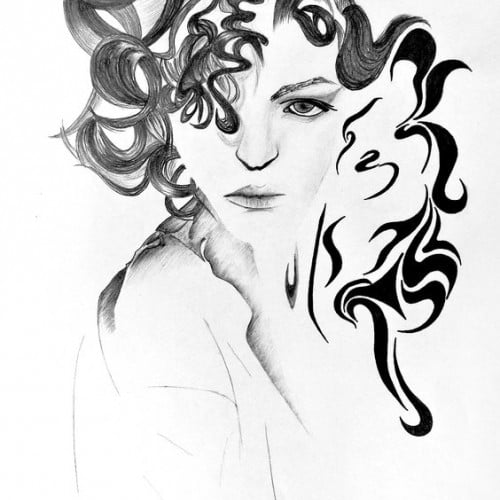
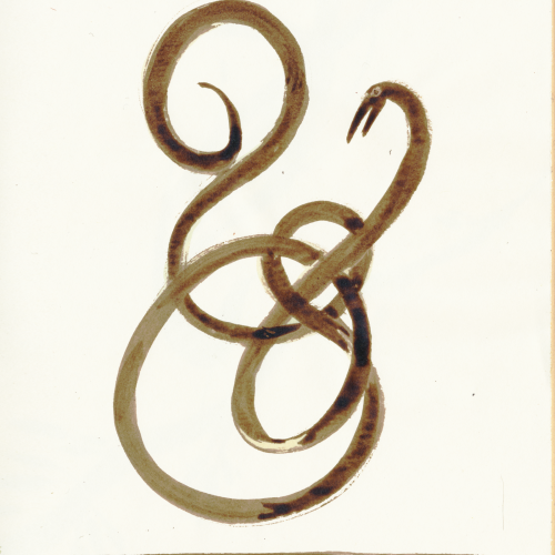
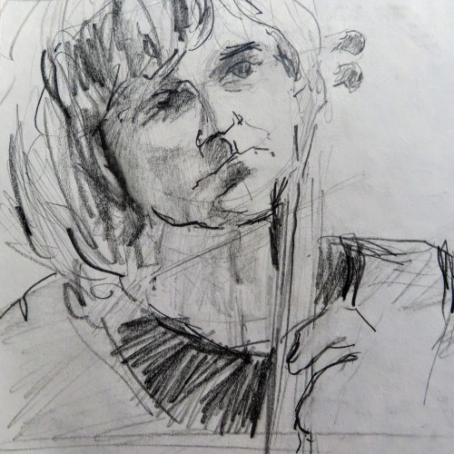
This started as a pencil drawing (see the 2nd image) that I scanned and put into Photoshop. I tried various filters including: Smudge, Ink Outline, some Splatter, changed the Exposure and added a Sepia Photo Filter. After a couple of hours of playing (I’m not very knowledgeable about digital possibilities and just use trial and error) I ended up with a dramatic image with which I am quite happy. The reference was a magazine advertisement.
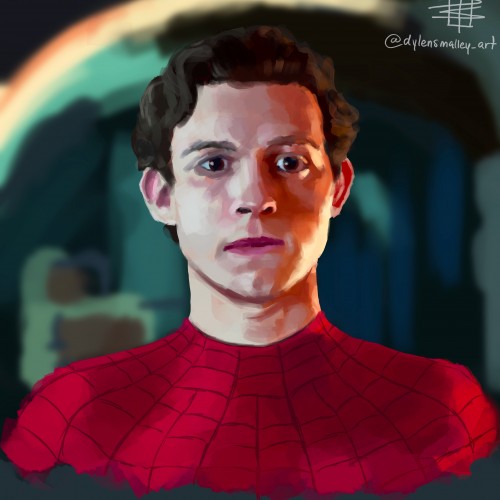
A few weeks ago I was playing around with color application on the default flat brush in Procreate, and developed a sort of choppy, layered application that I really enjoyed!
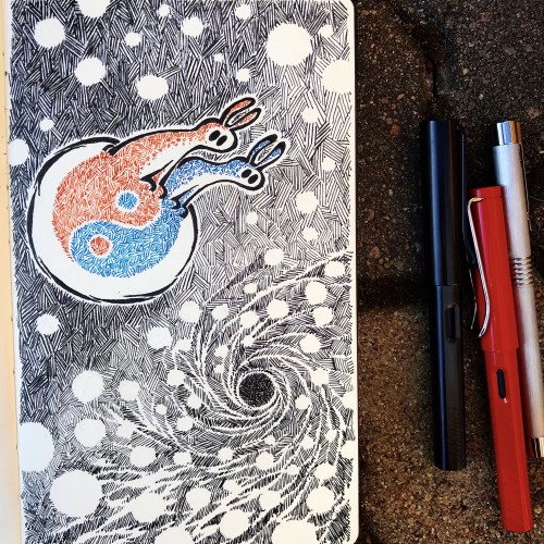
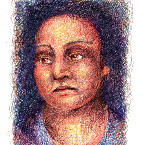
Still playing with ballpoint pens. This time, I tried a “scribble” drawing, holding the pen way back on the shaft and making little circles and scribbles….then layering them over and over. It was actually very liberating and fun. I did this on a Canson sketch paper….which didn’t wear through, but did buckle a little towards the end.
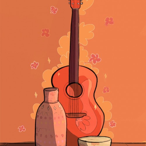
hello ☺️ my friends and i went to a really nice pottery workshop and we had so much fun. I also started to learn playing the guitar some time ago. so i felt really inspired to make this study. really enjoyed drawing it ☺️
thaank you and wish you a wonderful day!
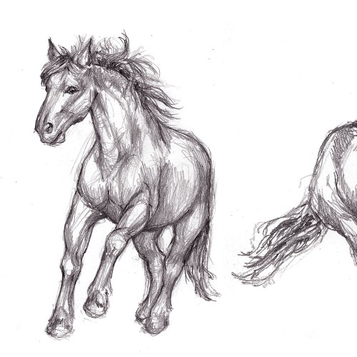
I've been playing with gesture drawing of humans and animals. Here are some quick pencil sketches of horses in motiion. 2B and 6B pencils on Canson sketch pad paper.