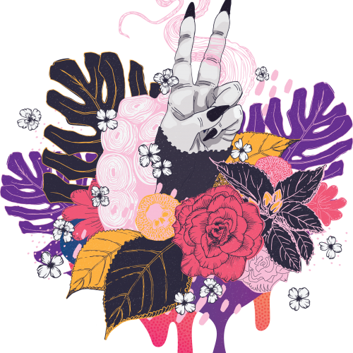
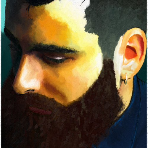
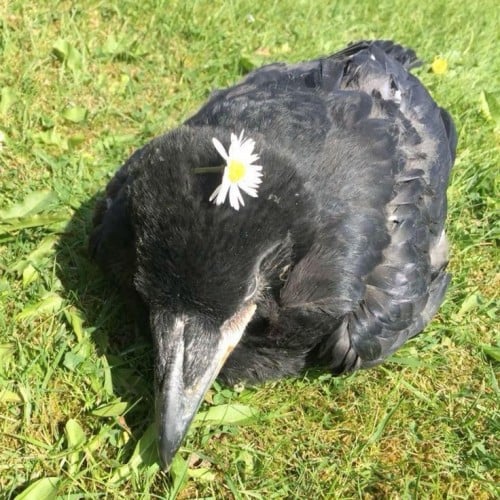
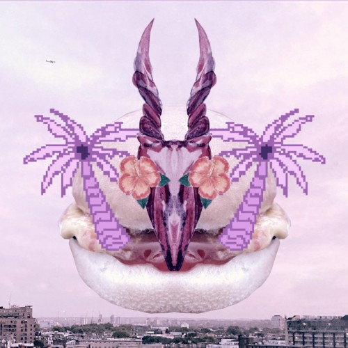
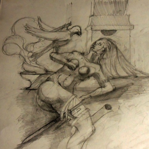
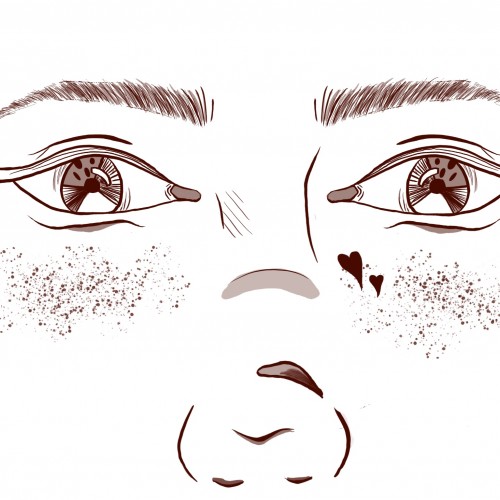
I want the composition to be thoughtful but on the sad side. My skill practice was brush strokes and blending (but not overdoing the blending) as I try to figure out how I stylize as an artist. Still working in the realm of realism and proportions as I am a newbie, but wanna flex into stylization a bit more. I did this through Rebelle 5, which is absolutely amazing, IMO.
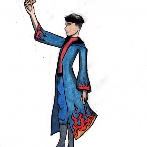
Kuwei... He's so underrated. Can we stop hating on him for kissing Jesper for one second to appreciate how naughty and charming an act that was? Like, he just smirked. He was like, "Yup, I just got Wylan mad at you and mad at himself for that and mad at me! Isn't it funny? You're a good kisser." Like that scene- that was amazing. Kuwei is amazing. Anyway, this was a little doodle of Kuwei as a solemn inferni. Little did I know that he would be setting fire to forests in KoS lol! Yup, I liked the surprise of "pretend I'm Wylan to kiss Jesper and set forests on fire at Os Alta" Kuwei better than this pensive Little Palace student, but I drew it and it came out okay, so here it is.
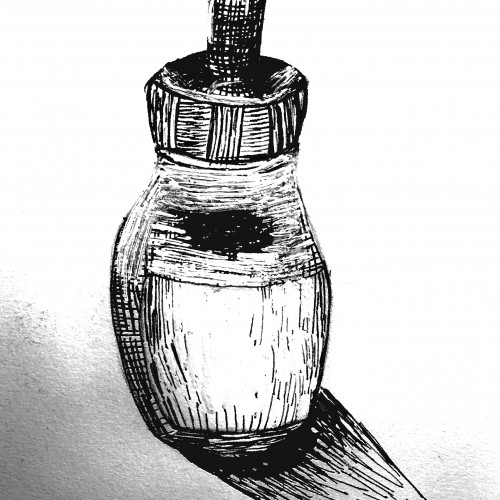
Some more practice with crosshatch shading and the proportions are a bit off. I also somehow made the left side of the bottle fat and it drives me nuts. ヘ(。□°)ヘ Other than that I think it came out ok.
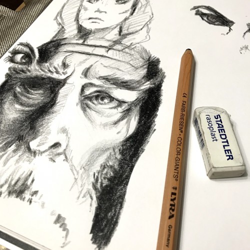
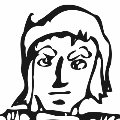
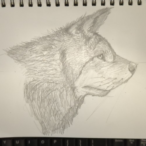
Life has been BUSY! Managed to get in a bit of practice today, slowly getting better at facial proportions which has been a real struggle for me. My next challenge is trying to find a pencil sharpener big enough for this Lyra Color Giant pencil I have been using :D
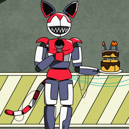
So, the shorter animatronics that I posted earlier were actually the second versions of those animatronics. I redrew them because of... how they looked, I guess. Their proportions were way off. This animatronic is the third version of one of the animatronics, Elizabeth. I was planning on making more of these guys, to update them all, but it takes hours to make these guys, because I also have to make the endoskeleton for them. So, right now, Advanced Elizabeth sits in Jester's workshop, where she'll be alone for as long as I don't make another advanced animatronic. Personally, I think these look a lot nicer, but the second versions (the ones I posted) have a certain charm to them. I'm also working on the right stage animatronics, the red fox and the DJ. Drawn with FireAlpaca. Don't expect any more of these advanced guys.
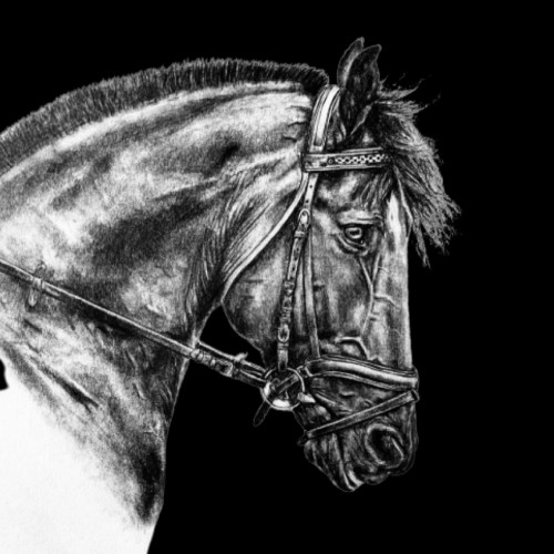
All Done! I’m pretty happy with how it turned out, but a few of the proportions are way off... but oh well. And I absolutely suck at manes(hair) soooo ya. Also I was curious, I’m thinking about getting some prints made of my artwork to sell, do any of you think you or someone you know would be interested in prints? Just curious, thanks! Hope you all are healthy and well! Photo by: Photography by Kelly and Kelly
Elias Rosenshaw 8/29/2025
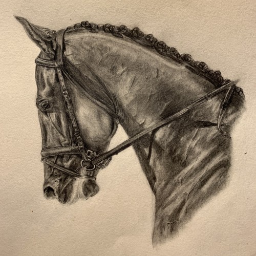
Mixed media on toned tan paper.
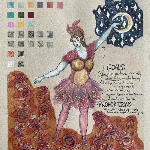
Starting next week, I'm going back to college. I'm very excited for my courses, especially art & writing. It will be a great opportunity to explore my curiosities, improve my art skills, and grow as a person. I will share my art assignments if my instructors allow it. I would also like to write a little about each piece, which may be required for my assignments anyway.
Lately, I've been inspired by fantasy & fairytale artwork. I think fantasy & horror will make good focuses for my pre-BFA portfolio. This was a little experiment with a fairytale aesthetic. One of my goals is to use limited art supply sets & swap out colours as they run out. I feel the first colours I picked out fit with aesthetic well.
I'm proud of this drawing, especially the dress & the night sky. However, I can see some areas that I should've done differently. I'm not happy with the proportions & foreshortening of the limbs. Also, I shouldn't have used a background colour for the flowers. I added the colour to cover up a smear from the watercolour. I should avoid making large areas of solid colour, especially with my coloured pencils. I am learning & improving.
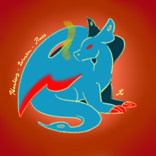
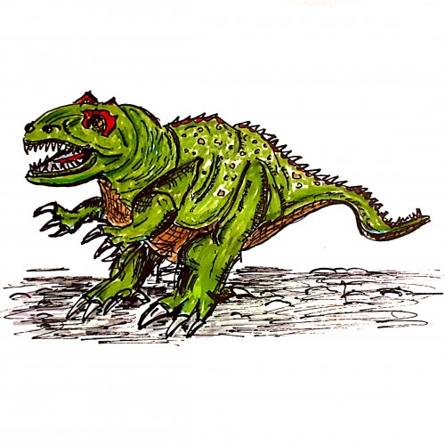
I named it "fictional dinosaur" to cover that I'm not able to manage proportions and perspective of a real T-Rex. Naming can be as powerful as a pen :-)
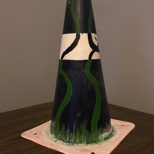
I’m gonna start reading more on human proportions and the human anatomy and how to draw it so for today I have some cones from when I was trying to teach my brother how to drive. I first painted the entire cone in two coats of gesso and then afterwords I painted the background first, put on a clear gesso and then a painted on the vines. I was trying to go for a positive space negative space look I do have other cones so I hope to try doing more of this in the future but for today this is what I made. #365daysofart #workinprogress #painting
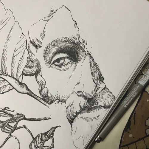
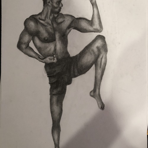
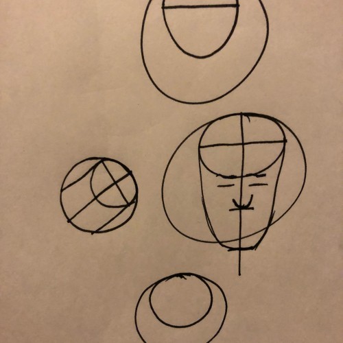
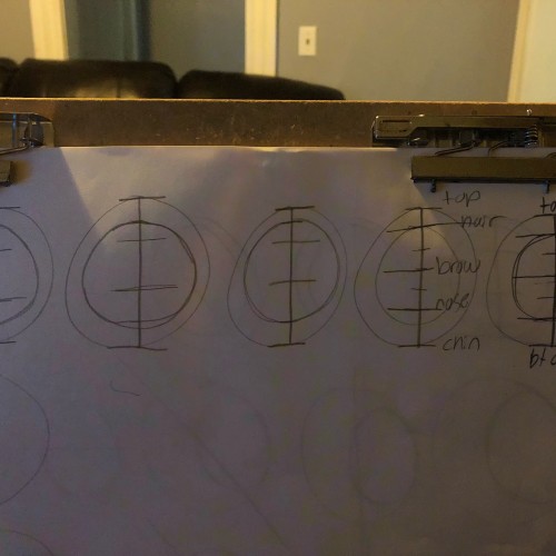
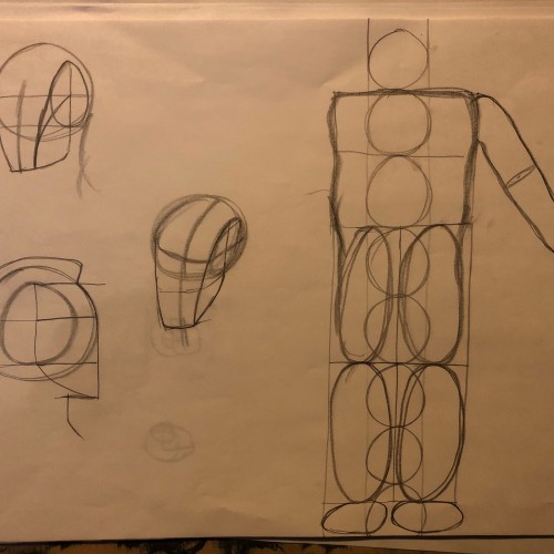
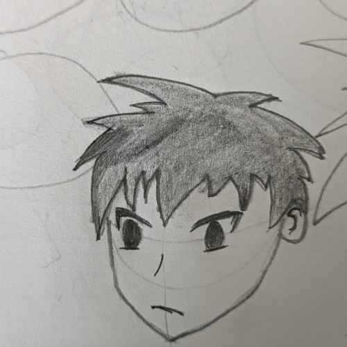
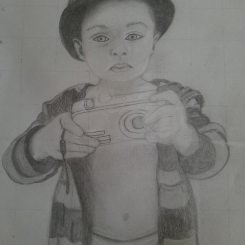
Drew more head proportions and did a practice run with the proportions of the human body. I remember doing this years ago when I went to community college; it’s been a while so a lot of things that I have to re-learn but ready to learn
After 1.5 hrs of experimenting...
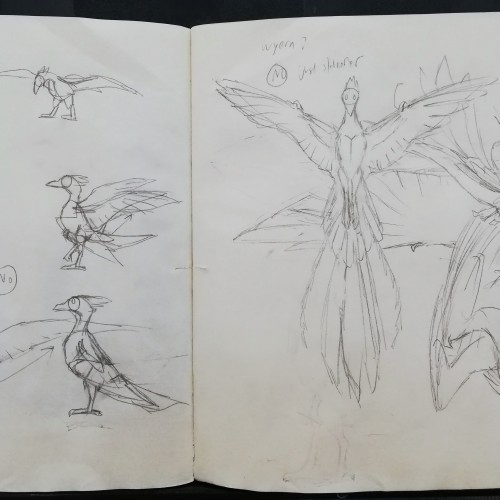
It wasn't easy to decide on what body shape my character should have. Through an "intuitive approach" of shifting anatomical proportions, it was still decided to remain on an avian's concept instead of a wyvern's. Wyvern can be kept to the wyvern... The phoenix needs something more like an bird's, after all.
p.s: I also have to remember to keep the neck shorter...
its hard to keep good proportions in this turn or shift of the female body, n its more tridimentional by the wey,,,tell me what youthink please,,,,,,,,,,,pencil no reference,,
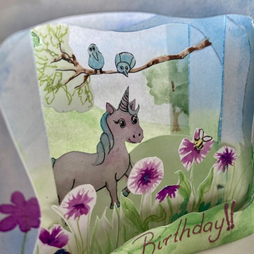
My first attempt at a concertina birthday card. While simple to make, it can be a bit fiddly and getting the proportions and placement of objects right for each layer is important so that everything can be seen once the layers are overlapped. It reminds me of printing processes, where each layer is gradually added. It was quite an enjoyable process.
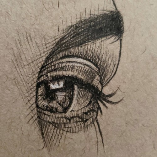
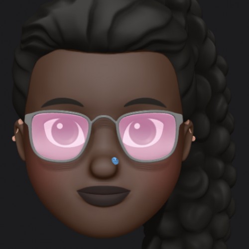
I was experimenting with new brushes here, and also learning to draw eyes in different styles. I struggled a lot with the nose in this painting, because it was hard to figure out proportions without the rest of the face. Feedback always welcome!