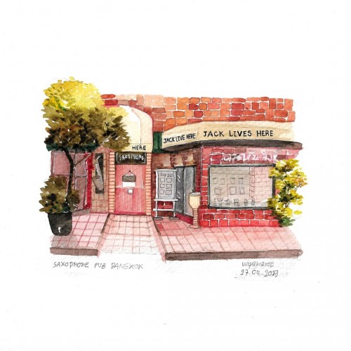
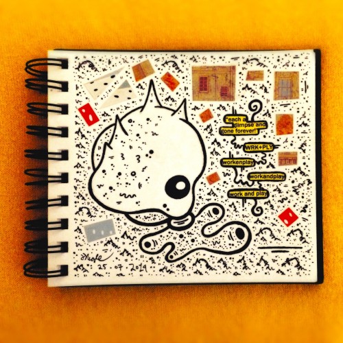
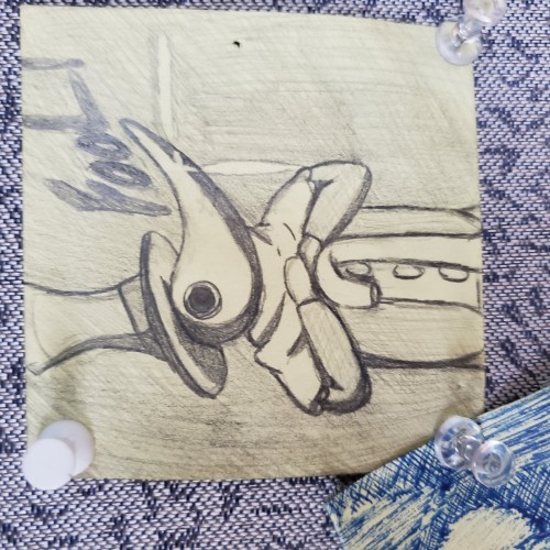
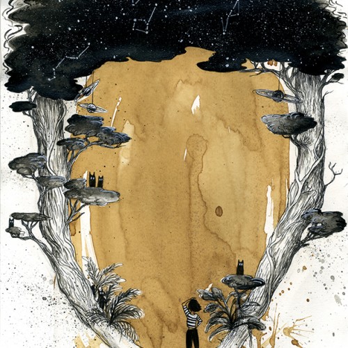
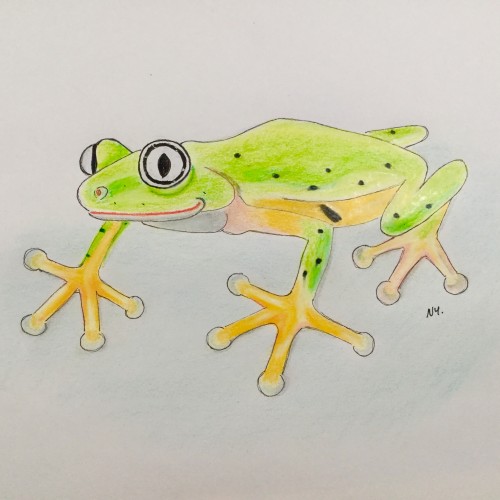
After 1-2 week ago i had a lot of work and had a stress.So on this weekend in a evening i went out for relax time with my closefriend and enjoy with jazz song night. Then I come back to sketch with watercolor for my memory.
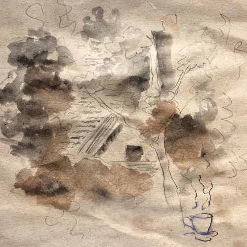
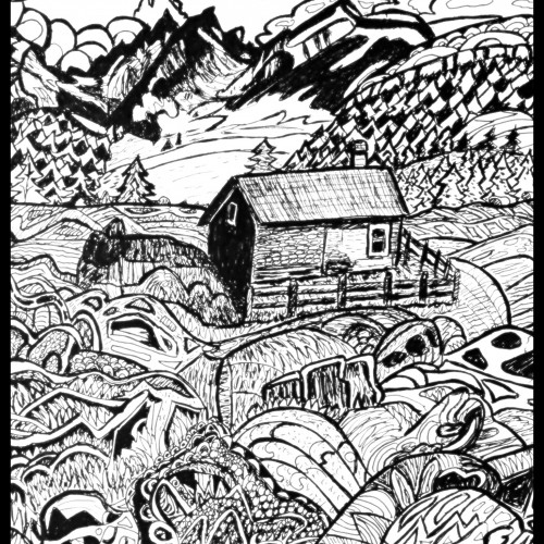
The leaves have grown so much you could barely see the house, as if it's hiding, as if it's not even there. I could only see bits and pieces of it out my kitchen window.
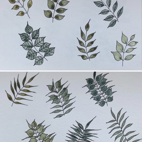
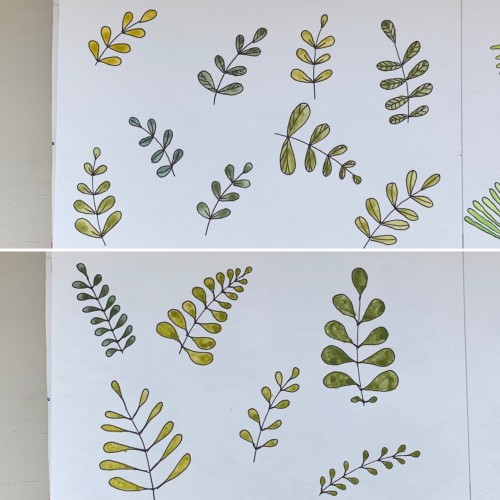
This time, again, two combinations. I believe the hues are very nice and calming. I used yellow ochre as the yellow color (PY 43, PY 1). On the upper part, the cobalt blue (PB 28) is used, on the lower part - it's ultramarine (PB 29).
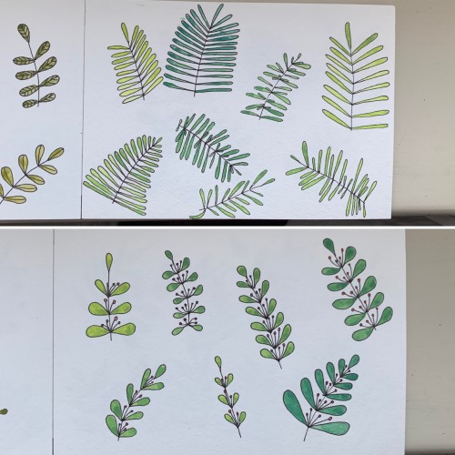
Again, mixing some colors to get greens: 1) cobalt blue (PB 28) plus cadmium lemon (PY 35); 2) ultramarine (PB 28) and cadmium yellow. Didn’t see much difference. In the first case there seem to be more hues, though. Funny, cadmium yellow medium and cadmium lemon have the same label: PY 35
For some reason I tried some floral drawings, of different shapes, and I also used mixtures of different colors to produce hues of green. The first page - it’s a mix of the cobalt blue (PB 28) and cadmium yellow medium (PY 35). On the second one there is ultramarine (PB 29) for the blue color and the same yellow paint. To me, it seems the difference is very little but I’ve got the color closest to the ‘normal’ green using Cobalt rather than ultramarines. The latter gave either to yellowish to olive hues or too blueysh