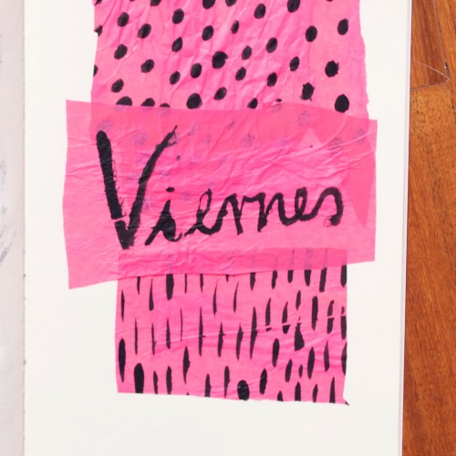
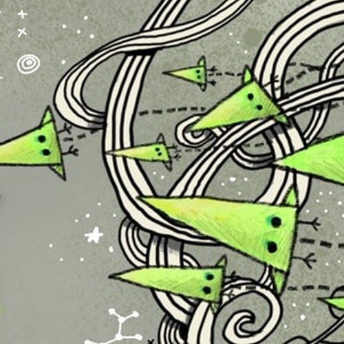
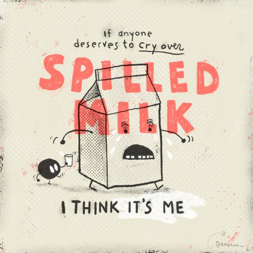
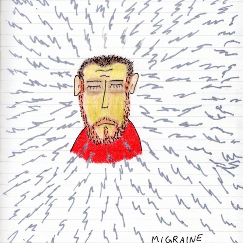
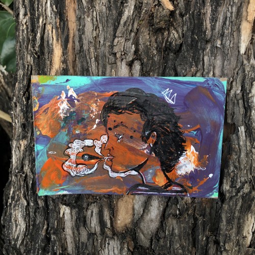
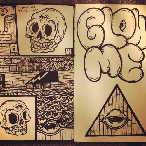
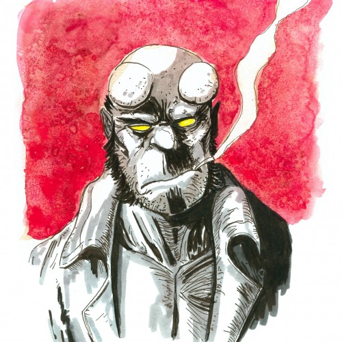
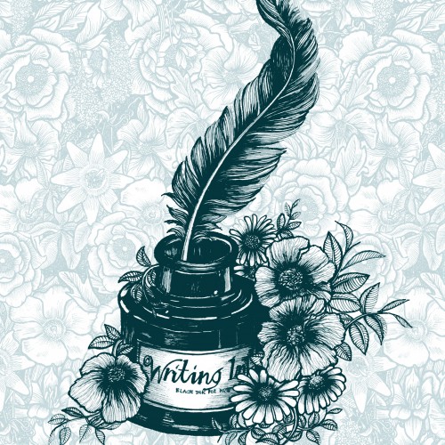
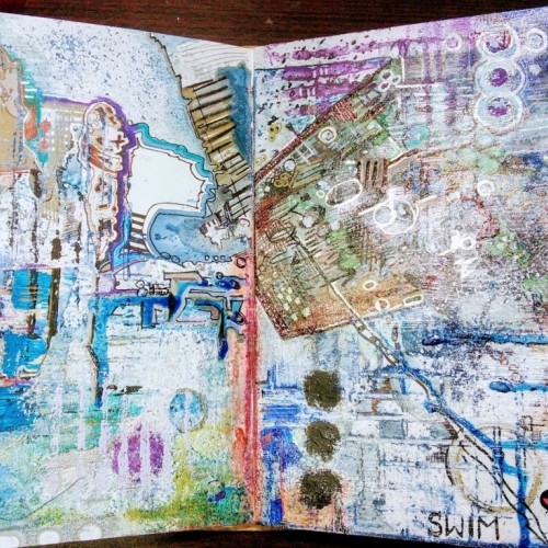
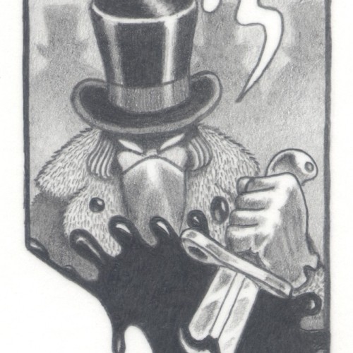
India ink on tissue paper. I had never used ink on this kind of paper before; I really liked the results! There are some folds and wrinkles on the paper that give the pattern some interesting details. The paper is also super absorbing, which plays nicely with the quantities of ink. Since it's very thin, there can easily be overlays between textures. And finally, when trying to use less ink (so that it wouldn't seep through and cause a big dot - the absorbing quality is nice, but it was also somewhat of a challenge!) I used very little ink on the lettering, causing a scratchy, dry look.
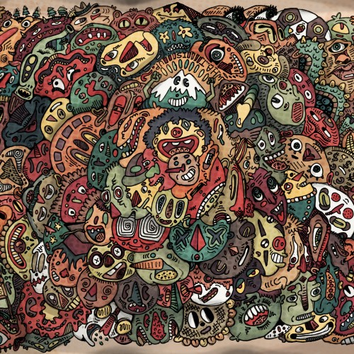
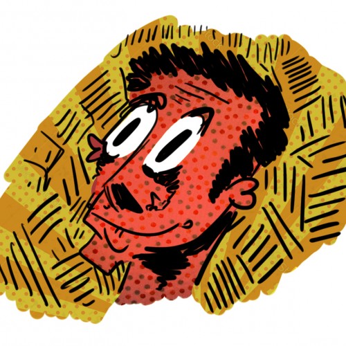
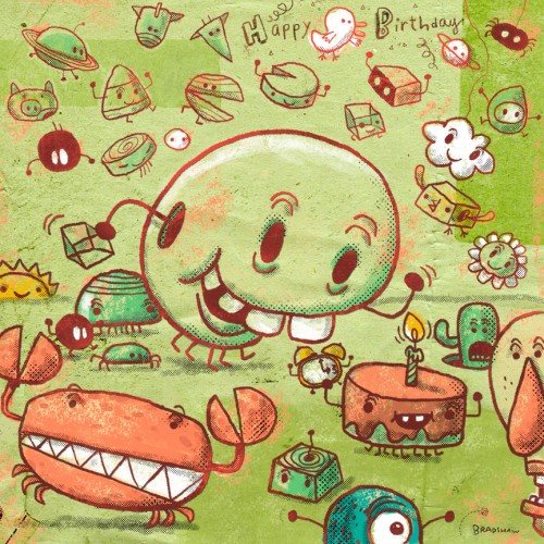
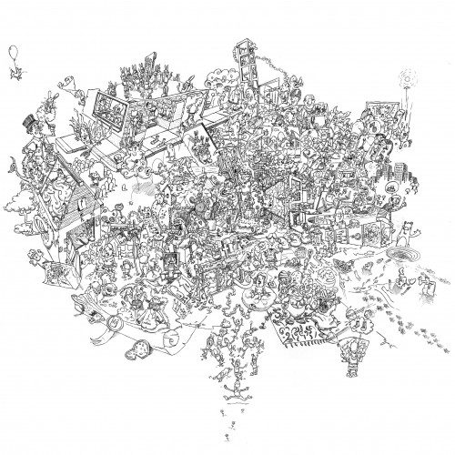
An old-style doodle, with many parts to look at! This took a few days, from the initial drawing, to inking, to uploading to my computer and digitally coloring and adding textures and detail! Lots of fun, and definitely different from my normal doodle-style. Thanks for viewing!
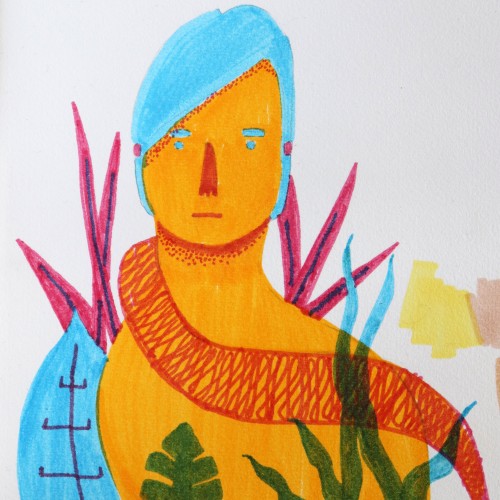
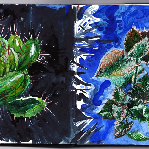
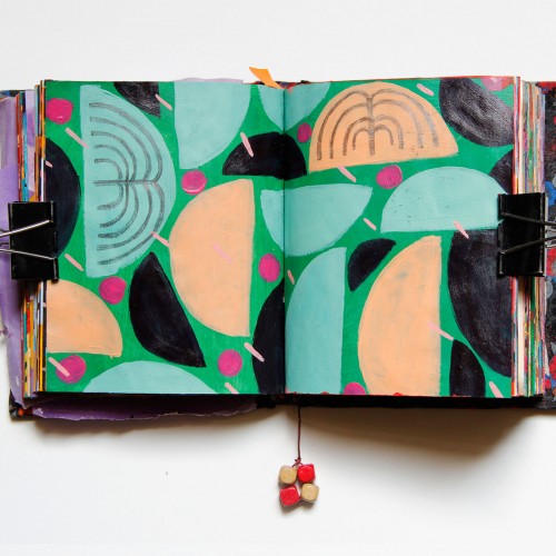
My sketchbook spread. This is actually a moleskin watercolor album which I'm mostly using to draw from life. This is sharp and spiky versus soft and fluffy. The models were the two of my house plants, and aim was a texture and light study.
From Sketch to Final Water Coloring Stages, this is a spread from Tide Day! A lot goes into making a good composition, taking into account the center of the image where the binding is, and how to play with size and negative space. One of my favorite things to do is explore contrasting expressions between characters and highlight their emotions through physical stances and expressions. This was a tough challenge with the lack of limbs and the watery context, but Pearl's stubbornness and attitude shines through!
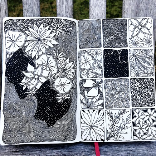
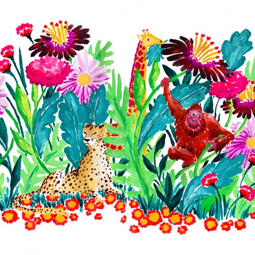
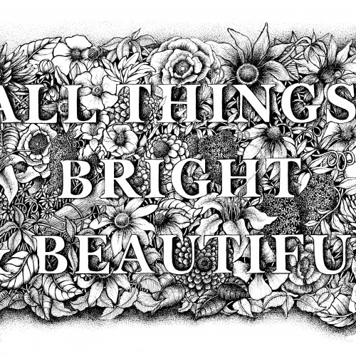
A floral botanical illustration around the words of the famous poem and hymn by Cecil Alexander "All Things Bright & Beautiful'. Drawn in pen & ink with another on the way...'All creatures great & small.
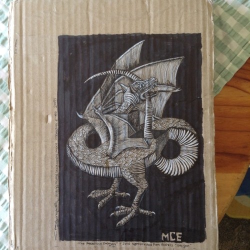
The cardboard sleeve in which my year 12 mathematics textbook lives, not sure if the teacher knows it's there, no cardboard cover goes unscathed not while there's a pen in my hand and a song in my heart.... the hills are aliiivve with the sound of muuus
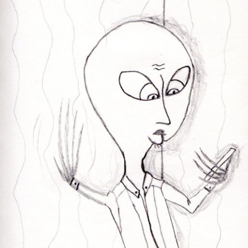
(2B pencil on a 125mm x 75mm notecard) Another juxtaposed artwork that shows an everyday phrase used against a completely out of context comic book frame.
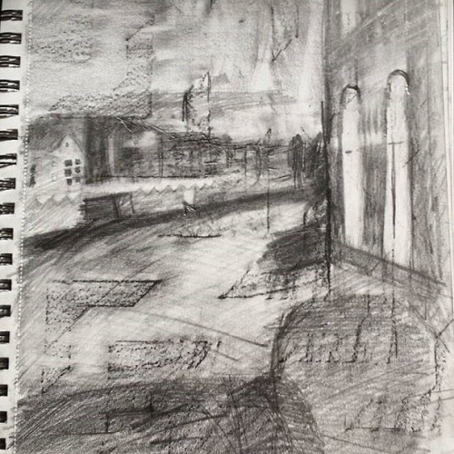
This is a piece of work of a canal in Amsterdam. i made a rubbing with pencil of a interesting patterned wall to create a base tone and then worked into it. This helped focus on tone and create interesting textures.