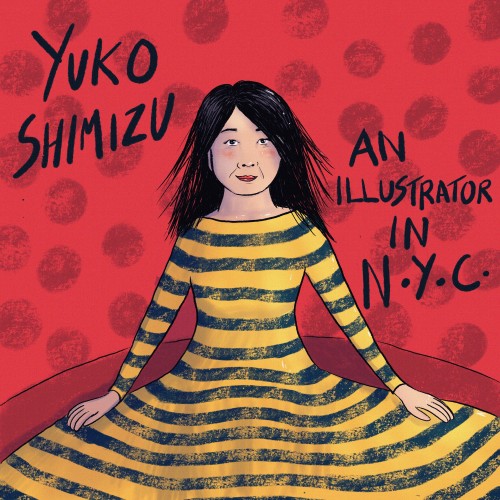
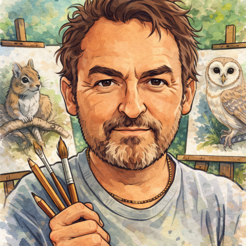
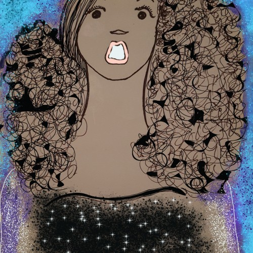
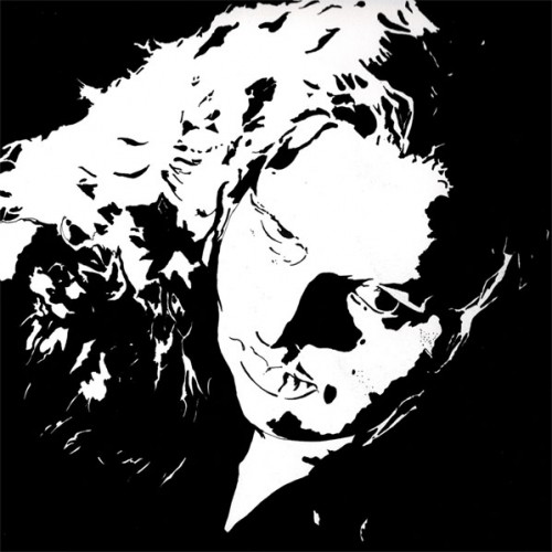
Here's a portrait of Yuko Shimizu that I'm working on for an IlloStories project (check the group out on Facebook).
I took her pose from one of her photographs, then used colours, patterns and textures that were inspired by her artworks.
This could be a front page for a book about her, or maybe a page for when her story reaches this point!
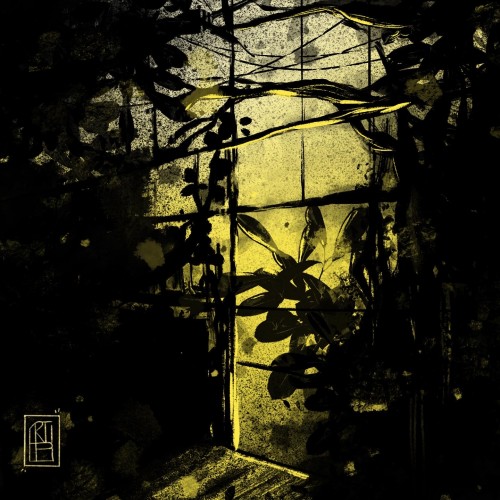
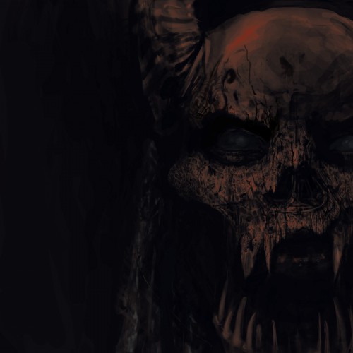
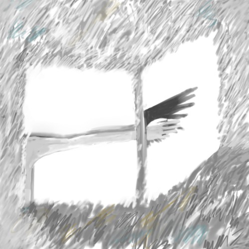
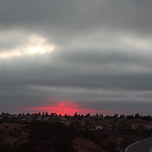
Quick 1 hour sketch working with a limited palette for a moody, gritty atmosphere. I always like to think of the story behind a piece before I start, and this one was a reflection of where I see the world going - a dystopian world in which many parts of the city have been abandoned, taken over by urban foliage, and left to ruin as people flee.
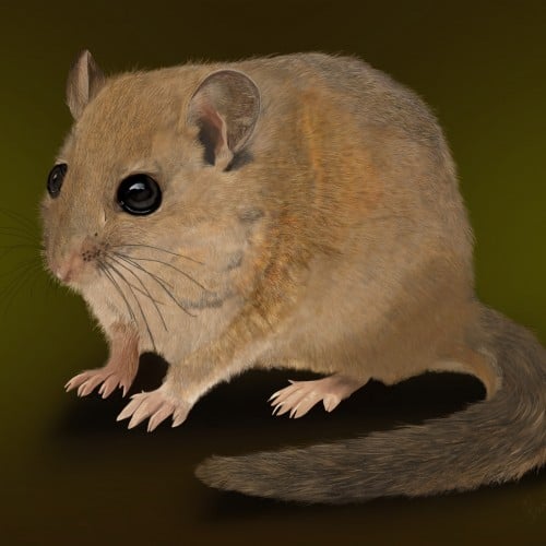
This delicate digital illustration captures the quiet charm of a hazel dormouse, portrayed with soft textures and warm, natural tones. Every fine hair and subtle contour has been carefully rendered, bringing a lifelike sense of warmth and vulnerability to this enchanting woodland mammal. The dormouse’s glossy, expressive eyes and gentle posture invite the viewer into its secretive world, hidden among hedgerows and ancient woodlands. Created using digital drawing apps, this piece blends realism with a tender, almost storybook quality — a celebration of one of Britain’s most beloved yet rarely seen native species.
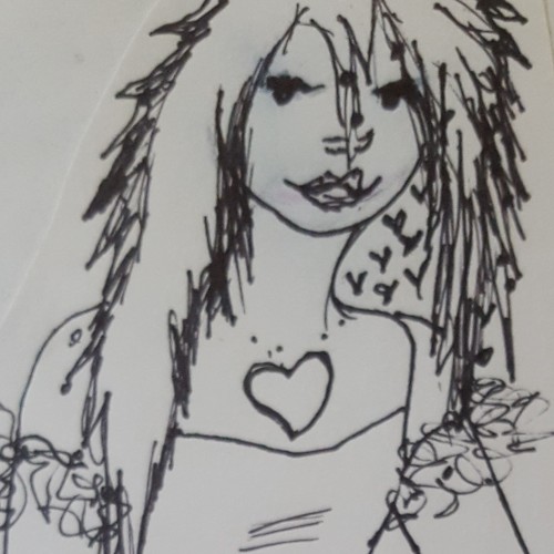
I rarely add colors to my drawings but am dabbling in unfamiliar territory with the Krita app. I am enjoying the ability to add textures as well. For me, it is similar to drawing left handed. This is the same drawing with a different technique.
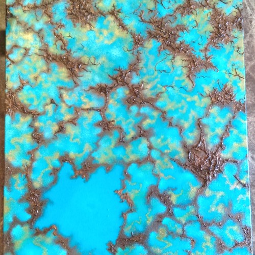
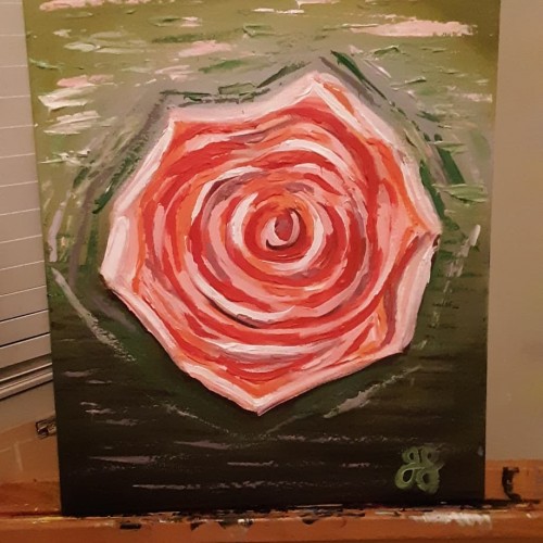
Golden acrylic on canvas. This is the second abstract I've attempted. It's not fully finished but it's looking pretty cool so far. I used the palette knife to create texture and metallic paints in my color mixes
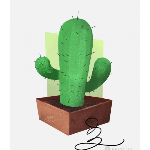
Part of Paintable's intro to digital painting course; quick exercise on layering, masking, color choice, and texture. Was provided line art of a cactus and brushes. Source: https://paintable.cc/
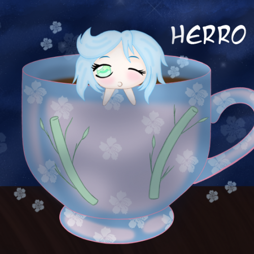
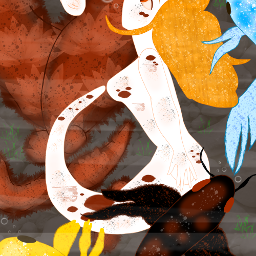
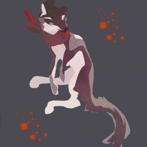
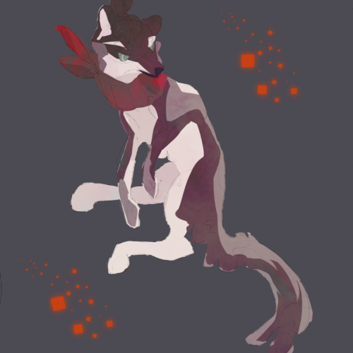
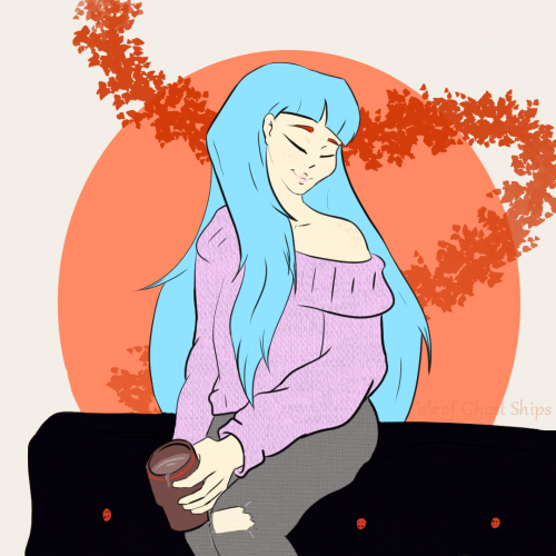
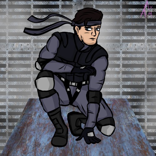
Went off a different prompt list today because I really wanted to draw something chill. Also I wanted to do some reference pose practice. PIntrest is a god send for trying to figure out how body's move. XD. This one is much more simple since I wasn't too focused on finishing the full color. Instead I played around with a few of my drawing programs tools. Tried to use its coloring mask, patterns, and texture brushes to get a simple yet readable mood.
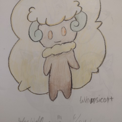
Because of the texture the sketchbook's paper, I couldn't use my regular mediums of choice. I decided to give crayons another go. It's a rather old piece (older than the other ones I've posted here) so not giving this a watermark.
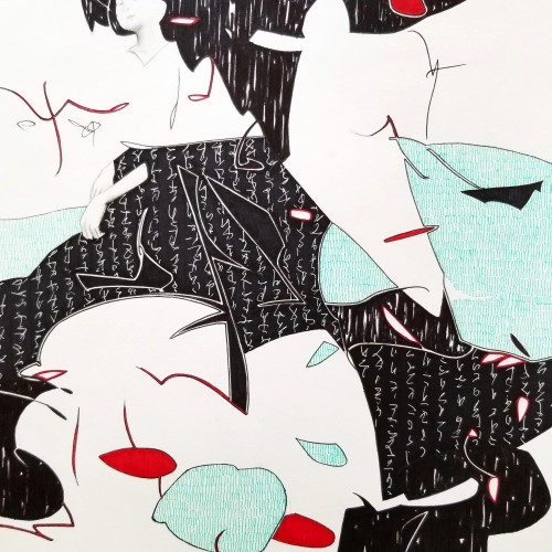
Whether the script in the background is an actual sutra is not the concern, even if it is, would it be readable to most? I question the use of lines in Calligraphy. Without the recognition of the exact words or meaning, can we still appreciate the quality and skills involved? Armed with a Chinese writing foundation, I adapted the use of the eight strokes (the basis of construction to Chinese character). The `writings’ resembles Chinese/Japanese writings but in fact, they are not. I needed a texture. With language as a symbol of culture, by visually adapting these kind of lines endears us to the image.