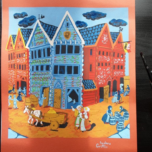
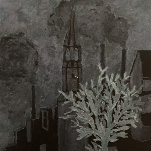
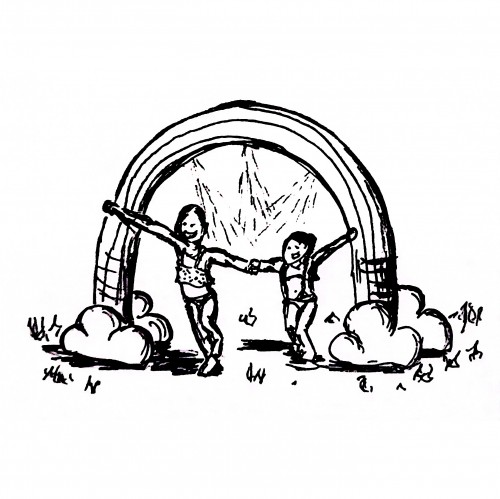
This looks simple, but i spent days researching to get the buildings and clothing right. There was also a lot more layers than i planned for. This buildings are still in use, there are different shops in them now. Sadly they no longer have those colorful decorations,
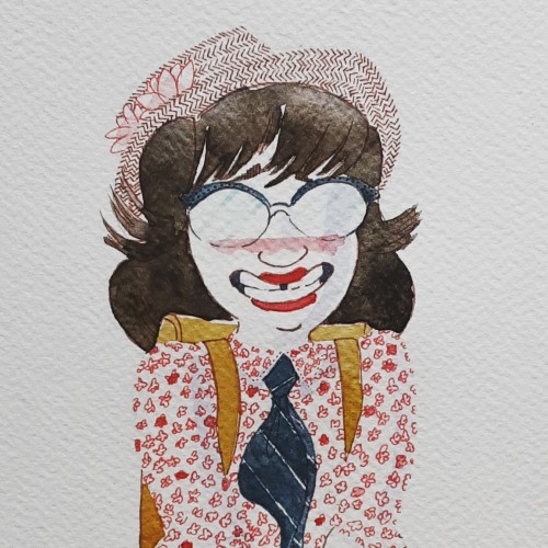
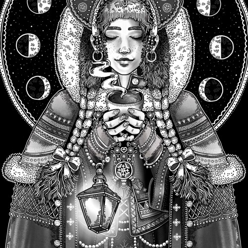
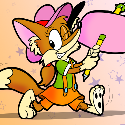
The painting im working on is taking a lot more time than i expected, so here is one i painted last winther. I love Beatrix Potters paintings where the animals look realistic, but they wear miniature clothing and behave humanlike.
Since the dawn of l’automatisme, the floating shapes of Miro and Klee were praised as musical suggestions. Unlike the Masters, my groundwork of flowing lines speaks melody and rhythm from a musical score perspective. The flow of lines ties the art elements into a composition. It also reflects a concept from Chinese paintings, which says, ` as a line moves into the invisible, the idea continues.’
Whether the script in the background is an actual sutra is not the concern, even if it is, would it be readable to most? I question the use of lines in Calligraphy. Without the recognition of the exact words or meaning, can we still appreciate the quality and skills involved? Armed with a Chinese writing foundation, I adapted the use of the eight strokes (the basis of construction to Chinese character). The `writings’ resembles Chinese/Japanese writings but in fact, they are not. I needed a texture. With language as a symbol of culture, by visually adapting these kind of lines endears us to the image.
The form of Martial Arts introduced by Bruce Lee embraces `being formless’ as a central idea. Sharing this belief, my works do not start with an intention of what to make, but rather the process is to follow-through to what the works wish to become. In Jeet Kun To, the practice is to `be water’, to react and to blend. Instead of following the artist’s desire to direct the brush, I enhance, without an intention to change or render. The composition dropped from elsewhere as a message and is polished to shine.
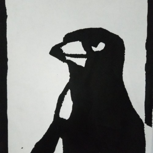
This is NOT my artwork, this was given to me as a graduation gift from my brother. This was during the drought so not a lot of us could get a bouquet of flowers, my brother asked our art teacher to do an extra print for me. When I found this in my gift bag I was already emotional and almost cried. This was better than a bouquet of flowers, one of my favourite birds in my favourite medium.
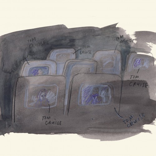
On the airplane, on my way home, I lifted up my head and there was a Tom Cruise on all the screens. Different movies, or the same movie, but different scenes. Absolutely unreal.
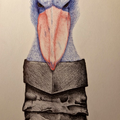
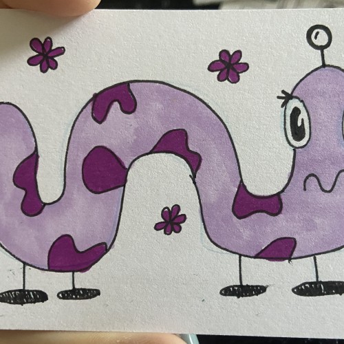
This Is a cousin to the Shoebill Stork, his name Is Bootstrap Bill. (My Imagination for this one Is through the roof, and I'm extremely funny right??) Hahah.....ahahah?... .... .
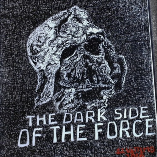
This is my study of the destroyed Darth Vader mask.from the movie Star Wars, "The Force Awakens. This ink rendering was my design for the pumpkin carving contest held every year at The Chadds Ford Pa Historical Society headquarter.
I chose to do this mask because it illustrates what is the ultimate destination for all who chose to live in the darkness of sin,in stead of living in the the light of righteousness.
The mask belong to the villain Darth Vader , who die while trying to force his son to join the dark side of the force. So I thought the destroyed mask over the letters "The Dark Side Of The Force." reflect the Biblical principle " Sin gives birth to death."
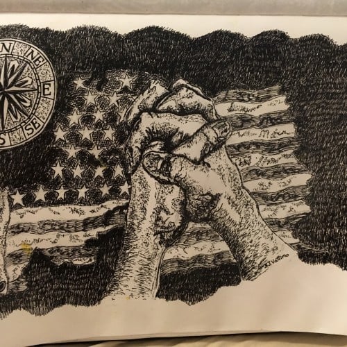
Written by Stephen J.Vattimo
Oct 24,2016