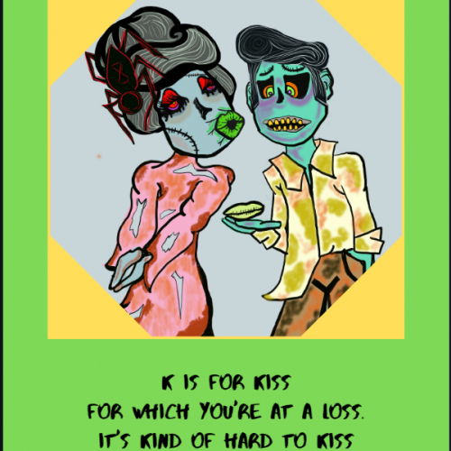
My kids are fascinated with zombies, so I created this zombie alphabet for them since it is difficult to find kid-friendly zombies. The concept itself seems to be an oxymoron.
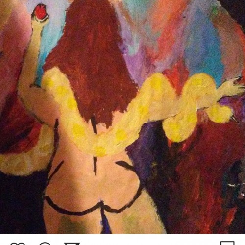
Its a very rough draft to a painting i have in mind. I didnt really intend for it to have any biblical meaning to it but i could see how that could be something people take away from this
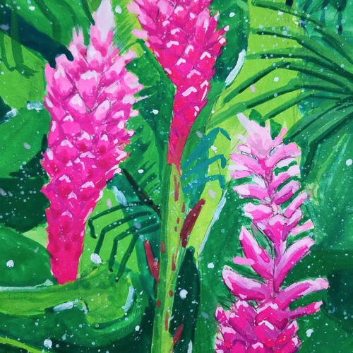
This is a quick painting I did in my sketchbook in order to help kickstart me back into painting. It is painted in Arteza brand gouache on Canson watercolor paper. I've gotten into drawing plants lately and I think these ginger plants are a new favorite of mine.
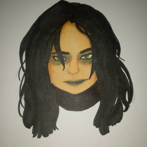
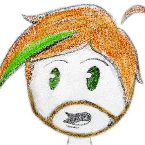
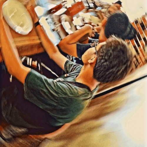
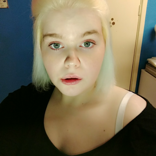
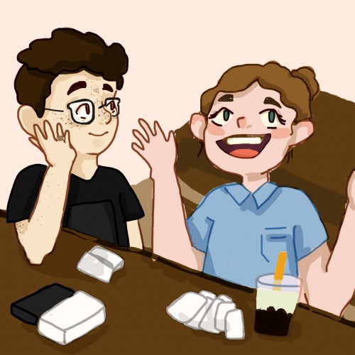
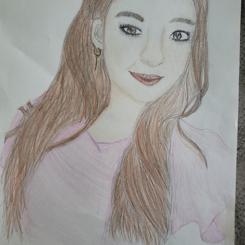
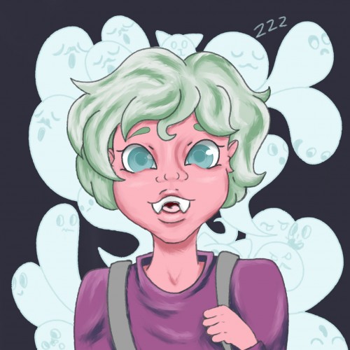
hey friends! sorry for not uploading in a bit - swamped in schoolwork. take this for the time being :). a very small little portrait of me and my friend from summer (when i still had long hair!!) when he first tried boba and we played cards against humanity in the shops. he's the best listener :))). have a good evening! xoxo honey
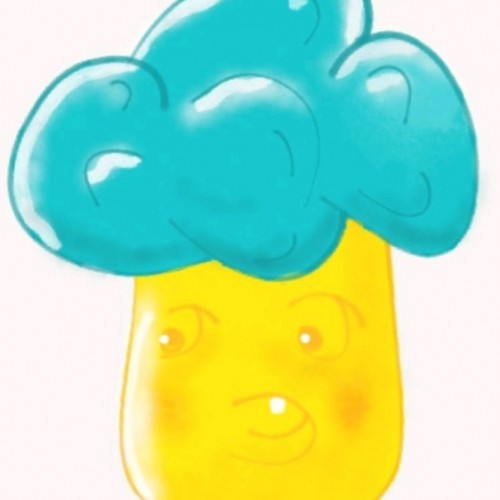
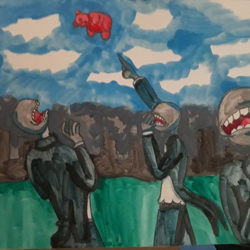
The actual title is: "Several Faceless People In Business Suits Outside Of A Smog-Filled City Scream In Terror As A Giant Gummy Bear Descends Menacingly From The Heavens"
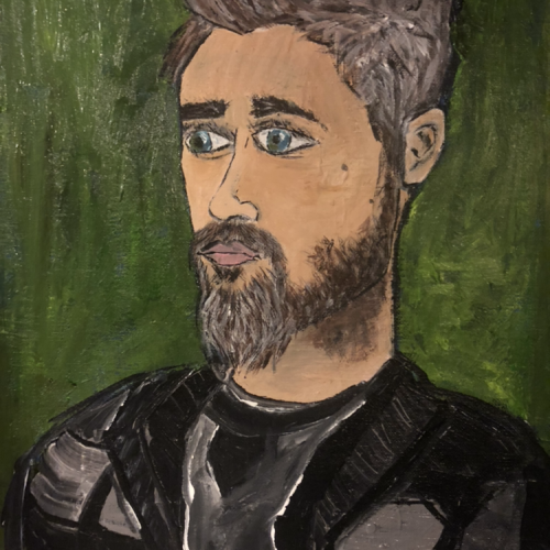
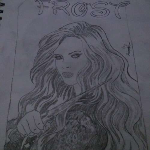
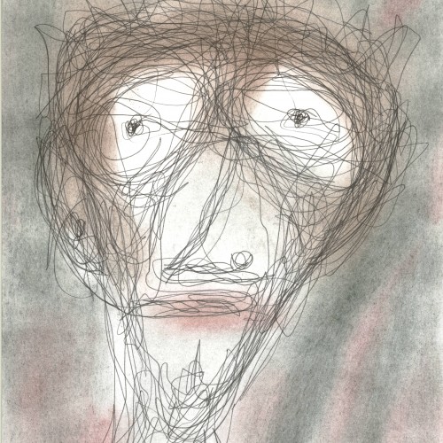
This is a drawing of a particular actor. It is not very representational so you probably will not be able to guess who it is, but I like the way he turned out anyway.
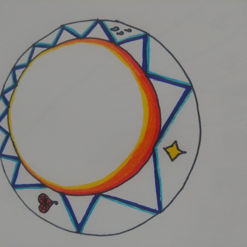
A ring inspired by this year's prompts for Inktober. Can anyone tell me why it keeps uploading sideways? Also sorry I've missed the last three days, I was driving home, regular updates will continue!
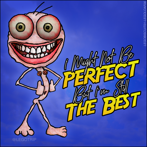
Every working day, I post what I call a #legobiscuit to my Instagram here: instagram.com/legotrip
The best of these eventually get the full Photoshop treatment.
I Might Not Be Perfect But I'm Still The Best. It's funny because it's true.
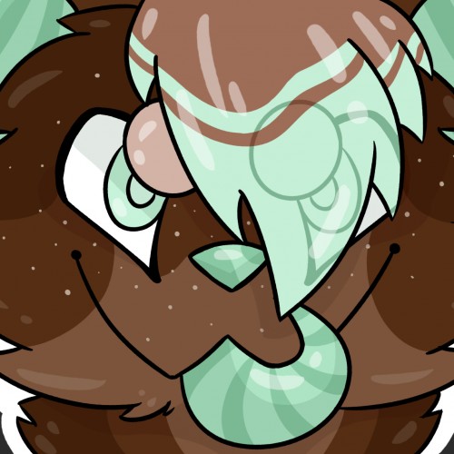
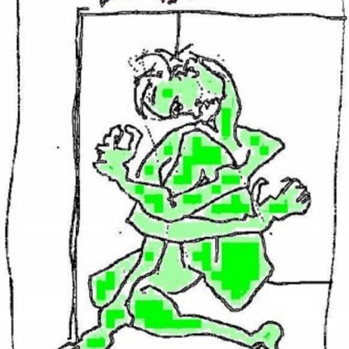
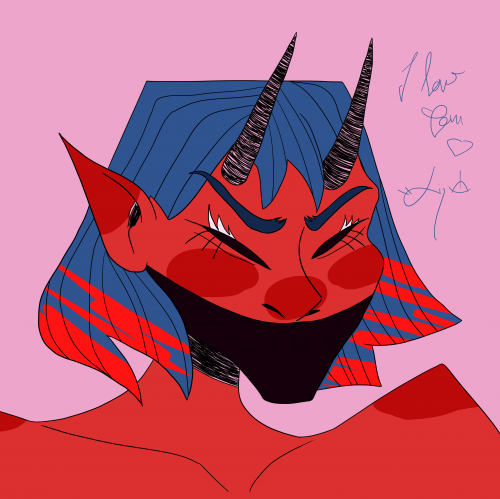
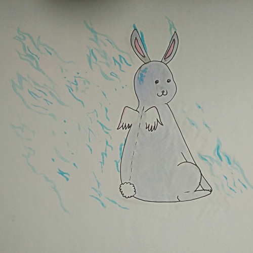
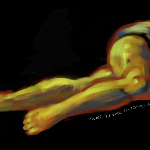
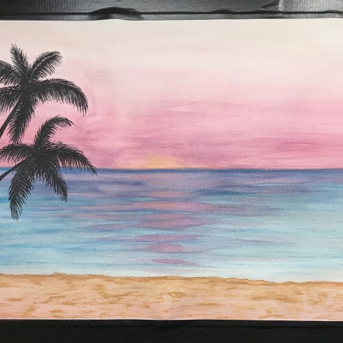
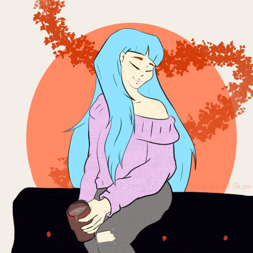
Went off a different prompt list today because I really wanted to draw something chill. Also I wanted to do some reference pose practice. PIntrest is a god send for trying to figure out how body's move. XD. This one is much more simple since I wasn't too focused on finishing the full color. Instead I played around with a few of my drawing programs tools. Tried to use its coloring mask, patterns, and texture brushes to get a simple yet readable mood.