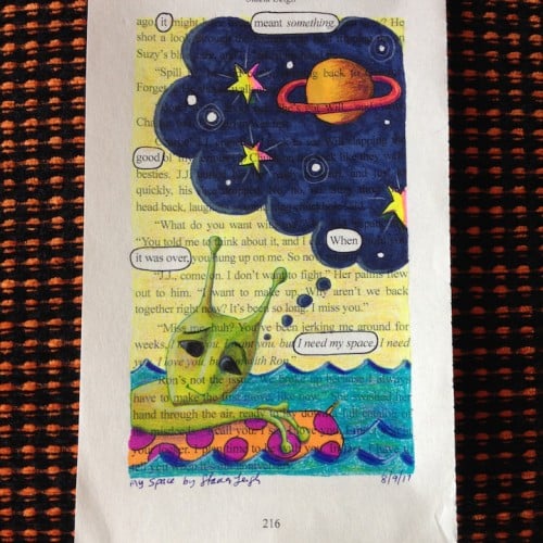
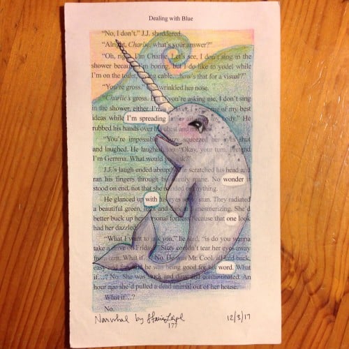
"It meant something good when it was over. I need my space." ~ A blackout poem from a recycled page of Dealing with Blue, a YA love story with small town fun.
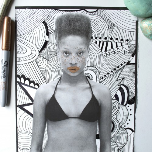
I found a Gap ad in a 90s Vanity Fair magazine; the background was completely white, perfect for doodling a background on it. I also highlighted the woman's freckles and lips with a bronze Sharpie.
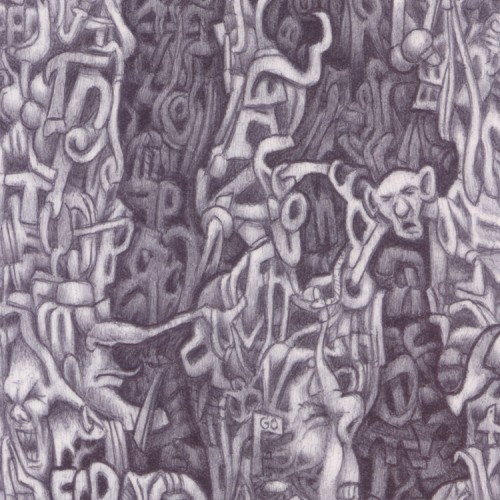
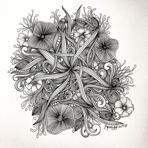
(Black biro on a 139mm x 89mm postcard). Another dreamscape piece that uses automatic drawing techniques to produce random imagery. I was going to call this one "bloodlines" due to the shaded central areas which developed, but the lettering in the bottom-left corner began to take shape and so I highlighted them and used them as the title.
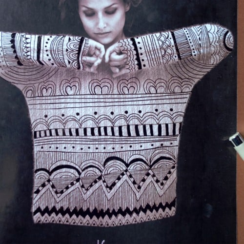
I was skimming through a 1990s Vanity Fair magazine and found a sweater ad. It was a perfect shot to intervene it with doodles! Now it looks like a very Christmas-y sweater, perfect for sitting in your favourite sofa and drinking a cup of hot cocoa.
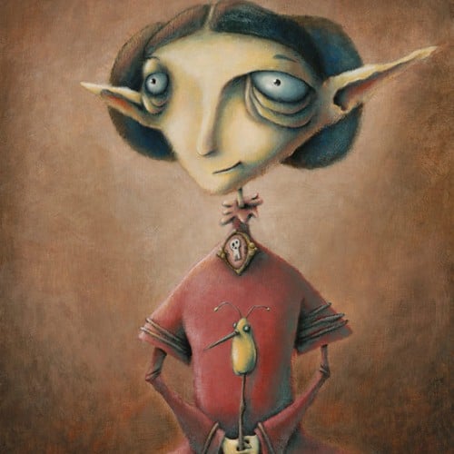
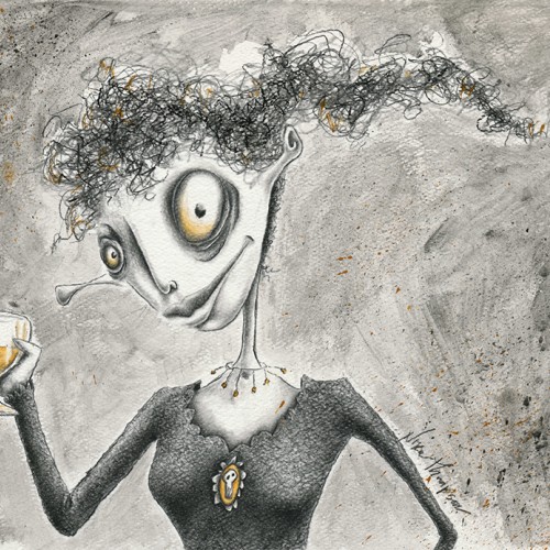
One of a series of illustrations done for a book of poetry. The poetry was in Dutch so I have no idea what the poems are about! However the designer, the late Baer Cornet liked my work!!
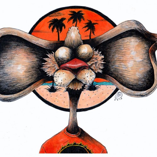
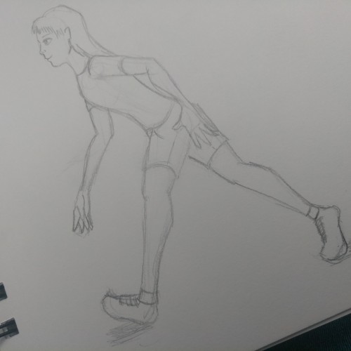
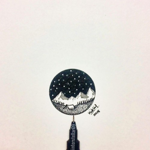
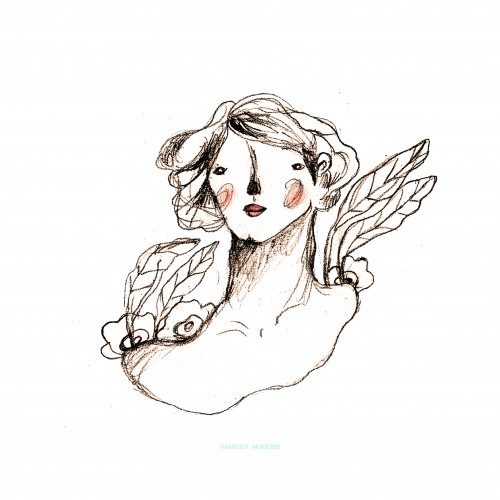
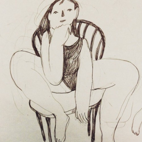
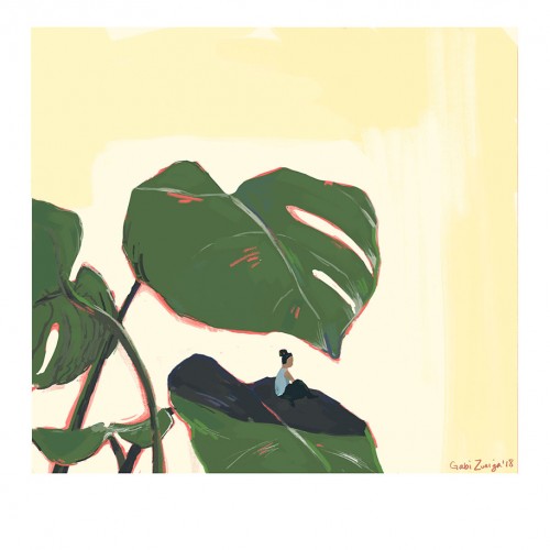
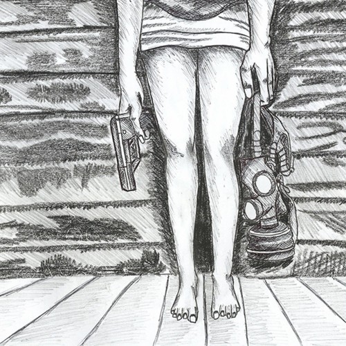
gabizuniga.com | @gabizuniga - It's funny how a warmup did to take a break from my usual work turns into a piece I actually really like. This represents how I often need to take a break from my own overthinking to clear my head and function.
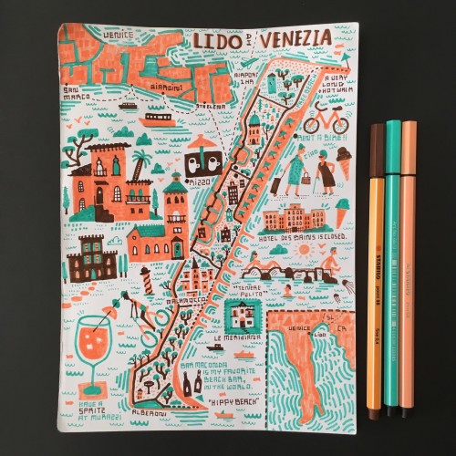
While Venice has surrendered itself to unadulterated tourism, Lido remains a tiny bastion of slow life. Lounging on the piers, biking on empty roads, sitting for hours in cafes...