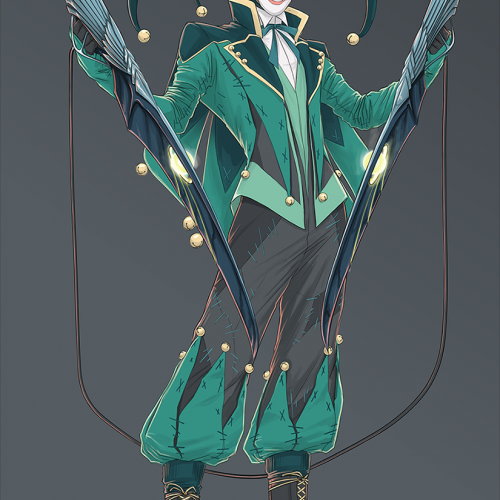
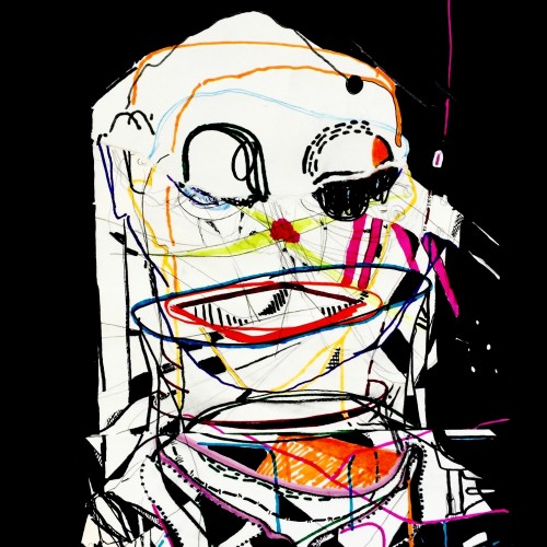
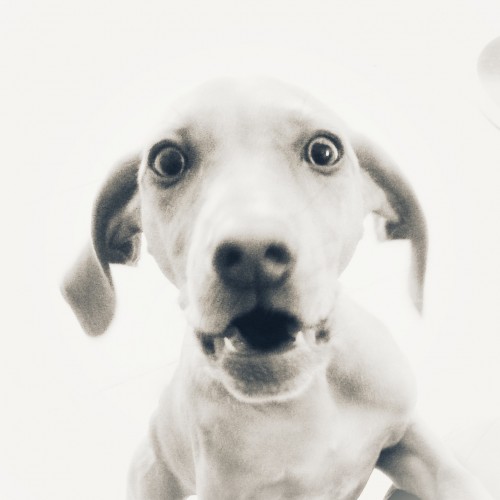
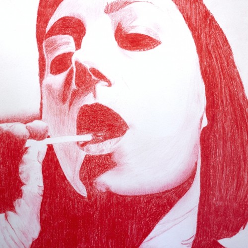
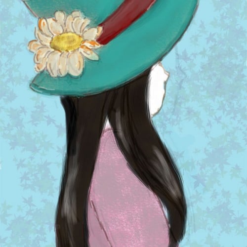
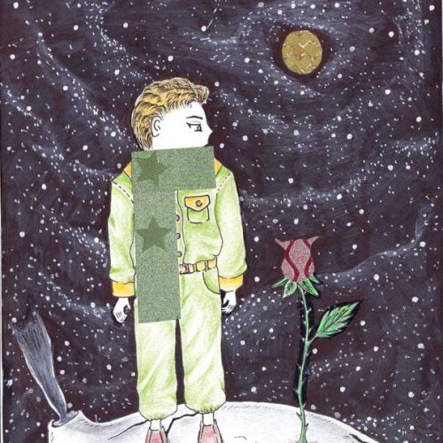
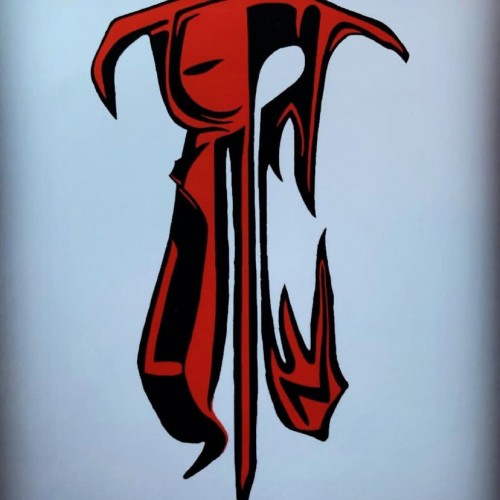
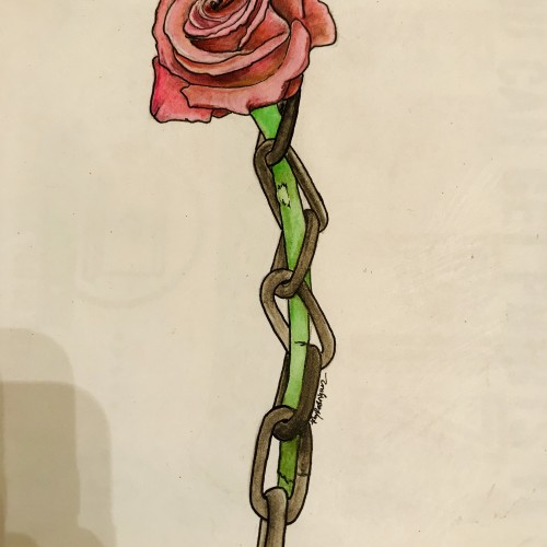
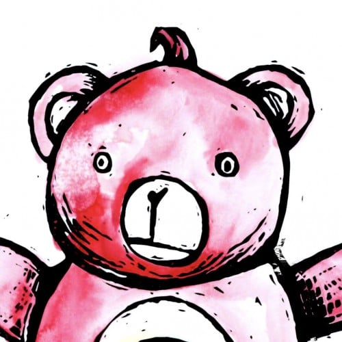
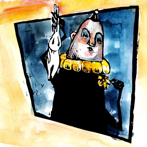
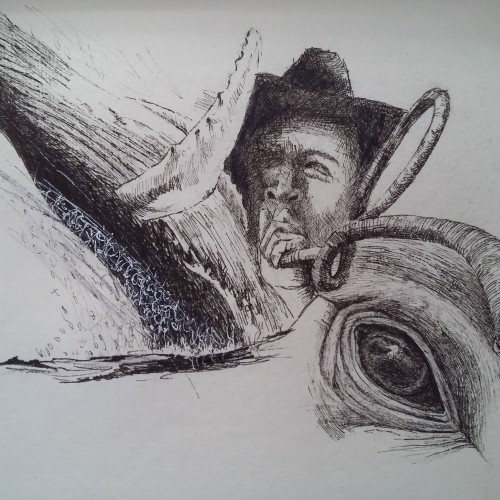
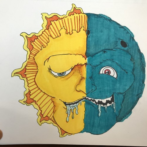
Just some time wasters I did. I would explain it, but it would require me to go into way too much comic nerd information. Its essentially a comic character that I redesigned (no its not the Joker). I really love concept art, and character design. I'm really not good at it, but I delve into it periodically for fun.
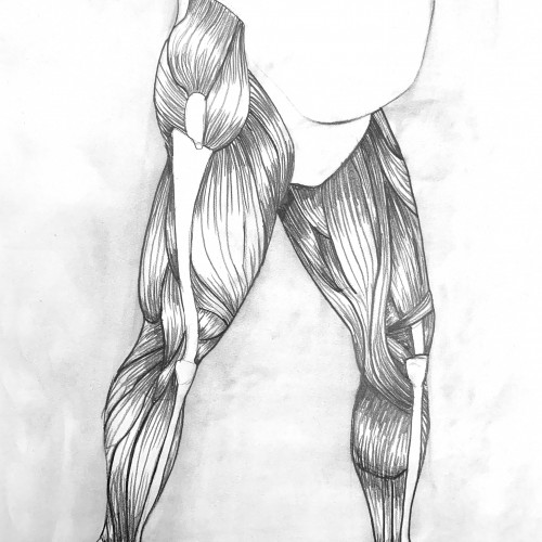
A little messy, but still, turned out...sort of okay. An echorche (cut away drawing) of the legs for my figure drawing class. We had one hour with a model to. Time: 1 Hr. Medium: Charcoal and graphite on paper
It was both fun and challenging to compose this doodle around the letters of Google. I hope that I get to create more such artworks.i used watercolour on cartridge paper detailing with micro tip pen.
dear little universe ///
even just a tiny bit / and you / open up. /
peer out into the nightless
sky /
feel the stars, that /
“you, dear little universe” /
are always coursing /
through
your
veins.
— Neon Spencer
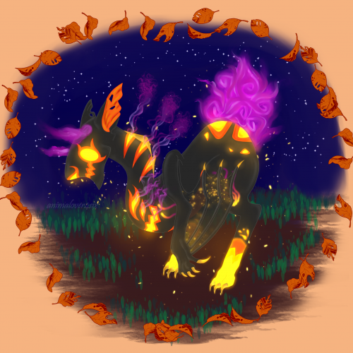
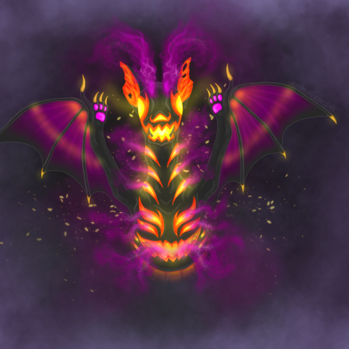
This piece was an entry for a mystery baby contest on DA, where you design the adult based on the given egg and its I theme. The creature belongs to a made-up species(Byubuu) that the host created.
This piece was an entry for a mystery baby contest on DA, where you design the adult based on the given egg and its I theme. The creature belongs to a made-up species(Byubuu) that the host created. //reuploaded with signature/username//
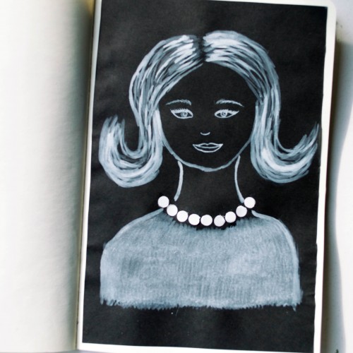
The idea for this portrait came to me when I was looking at a packaging of soap - it was very glossy and it looked like it could look like pearls. As well as the soap packaging, I used white ink mixed with acrylic paint (for opacity) on black paper.
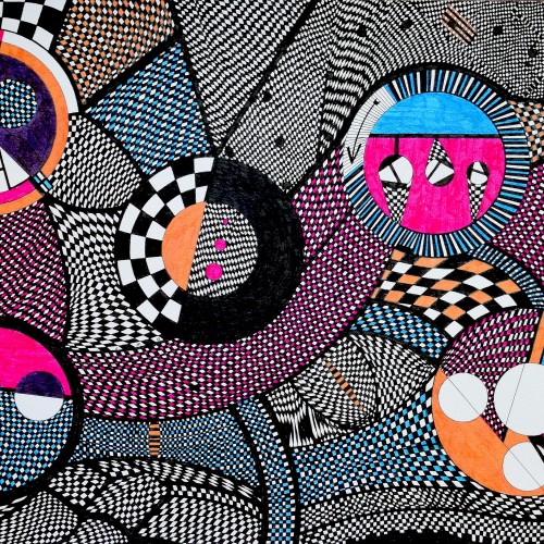
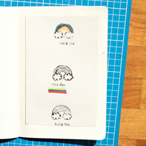
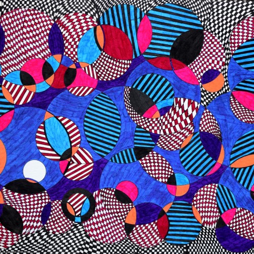
For Inktober 25, I played around with a rainbow rubber stamp and markers. Simple but it was a lot of fun! And isn't Inktober all about experimentation and practise?
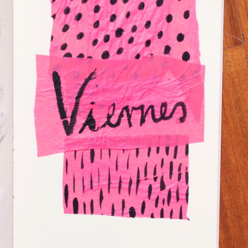
India ink on tissue paper. I had never used ink on this kind of paper before; I really liked the results! There are some folds and wrinkles on the paper that give the pattern some interesting details. The paper is also super absorbing, which plays nicely with the quantities of ink. Since it's very thin, there can easily be overlays between textures. And finally, when trying to use less ink (so that it wouldn't seep through and cause a big dot - the absorbing quality is nice, but it was also somewhat of a challenge!) I used very little ink on the lettering, causing a scratchy, dry look.