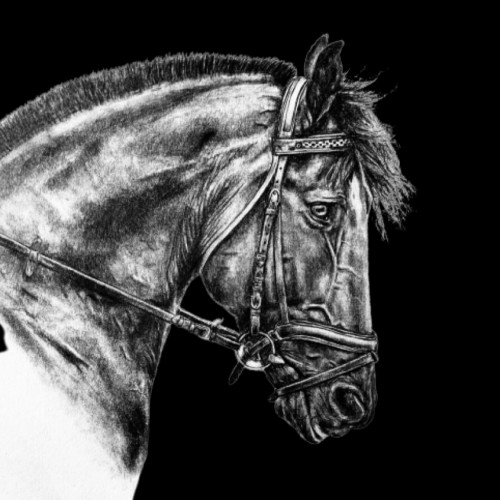
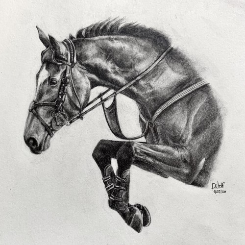
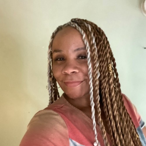
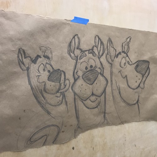
I’m finally done! ‘Veronique‘ is done in pencil, on Medium 80 lb drawing paper. She took me about 8 hours to complete. If you are interested in purchasing prints, please visit my website at this link:
https://imagineitvirtual.wixsite.com/sedonaequineart and contact me. Any opinions or advice would be greatly appreciated!
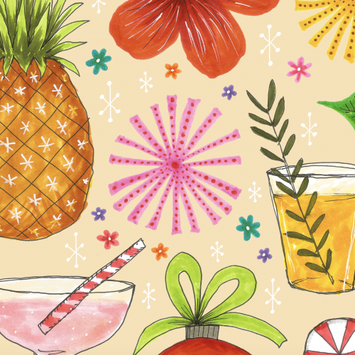
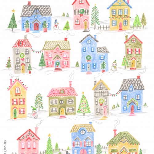
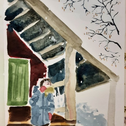
From our little part of the world to yours, warmest winter wishes! This piece was created 'Just For Fun' with Colored Pencils. It was so relaxing and enjoyable to doodle one house each evening!
Weirdly enough, I never used to feel bothered by winter. A sign I’m “getting on a bit” as they say? I’m 32 come April, not 102 for feck’s sake! Whatever the case, roll on spring and general warmth, long overdue I have to say…
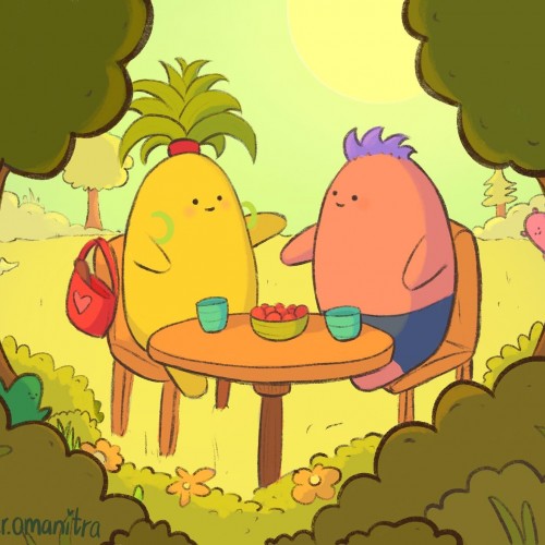
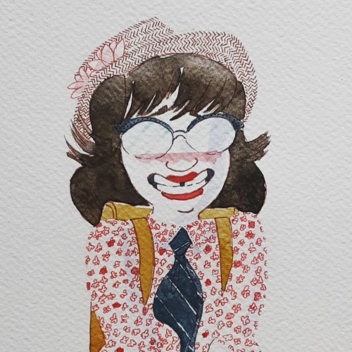
Helloou! my mum and I did a fun design in the train. She said she wanted me to design a little friend that represents her. She wanted it to have fun green hair and a pink bag. She told me what the design would look like and i sketched it out. Then we designed a little friend that represents my dad. My mum said that showing the tomatoes are really important, because he loves to take care of the tomatoes in the garden. Some time later I decided i wanted to draw the two little friends enjoying a warm day together. Drawing it was soso much fun. I absolutly wish you a goood day!
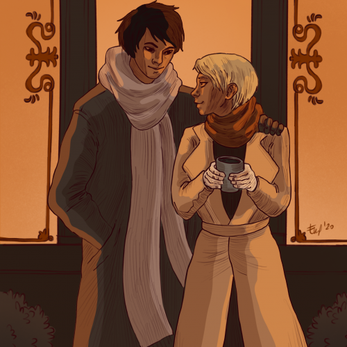
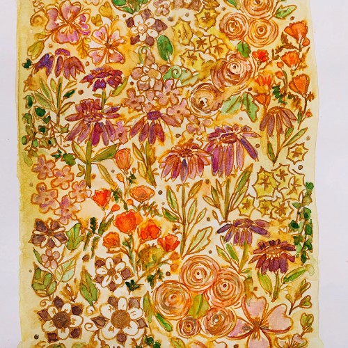
Something warm coloured for the incoming spring. Also befitting of the feelings a lot of folks in my life (and myself included) seem to be feeling right now! Much cobweb detangling figuratively speaking this month past, that much is true...
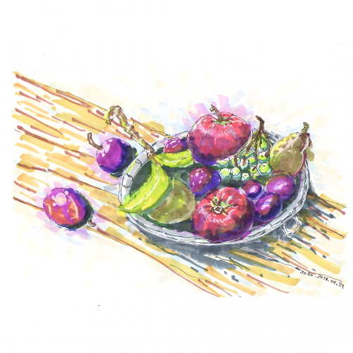
A vibrant piece of art depicts a fruit arrangement still life with various colorful fruits such as grapes, pomegranates, and figs resting on a plate. The background is a wash of warm yellow and earth tones, highlighting the freshness and diversity of the fruits.
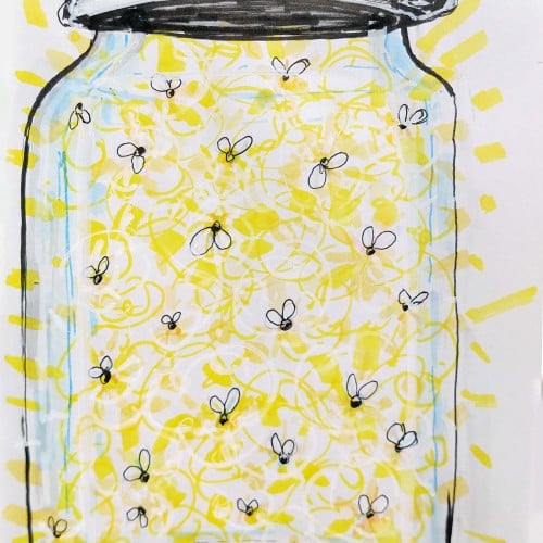
A mason jar filled with glowing fireflies casts a warm, bright light. The playful arrangement of the fireflies creates a whimsical and enchanting effect.
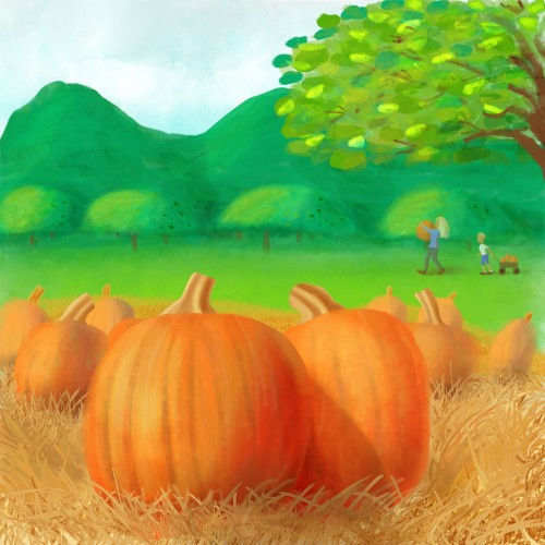
One of my favorite times of the year is Autumn. It’s a time that reminds me how blessed I am for the rich friendships I have in my life. It’s also a time I enjoy making new memories with relatives I have a deep emotional bond.
And for some reason, pumpkins symbolizes this wealth of love I have for these loved ones. Maybe because orange is a passionate color for me. Or maybe because the color orange is abundant during this season when warm a fuzzy feelings show up when I’m with my loved ones. This hue is in pumpkins, persimmons, hot apple cider beverages, cinnamon spice on pies or lattes, and the obvious autumn leaves.
But my focus for this illustration were big, fat pumpkins. I love hugging and squeezing them and feeling it’s cold flesh on my skin. I look forward to my next bite of pumpkin pie from our very good friend, Terry, who makes them very excellently!
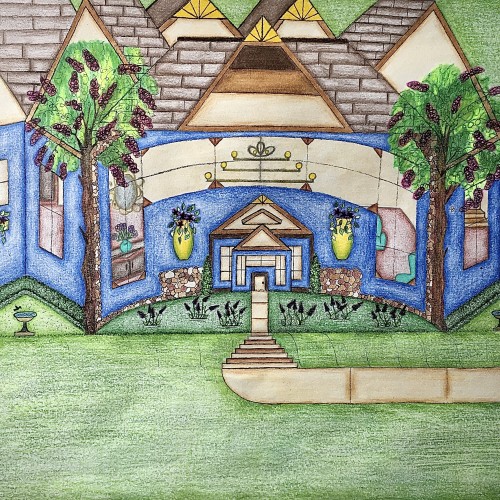
I designed this house. It has a really pretty blue exterior, and it has a slight curve to it that gives it a more warm and inviting feel. I like how the walkway kind of curves into the stairs and transitions back into the walkway before arriving at the front door. I like that there’s plenty of yard space with some really nice landscaping. The birds can even come and get a birdbath. I thought that was really cute. I used the multicolored stones to add detail for a more distinguished look. The hedges are neatly cut in a square and follows along side of the house. Looking through those gorgeous windows you can see the house is fully furnished. There are some really pretty chandeliers in there that adds character. There’s a stairway that leads to another level of the house as well. I love how there’s a touch of yellow that highlights the points on the rooftop. Furthermore, the swing in the backyard adds an inviting feel to the scenery. Also, it’s a nice place to sit and enjoy the view.
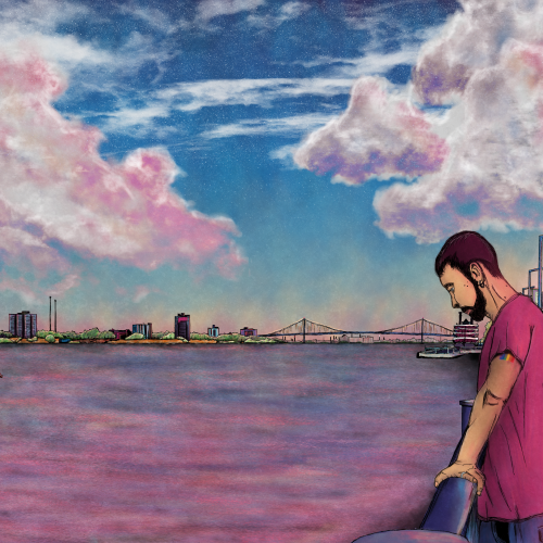
I wanted to capture an introspective feeling and show the Detroit River's expansiveness. I went with a late summer sunset vibe with lots of warm pinks and cool blues.
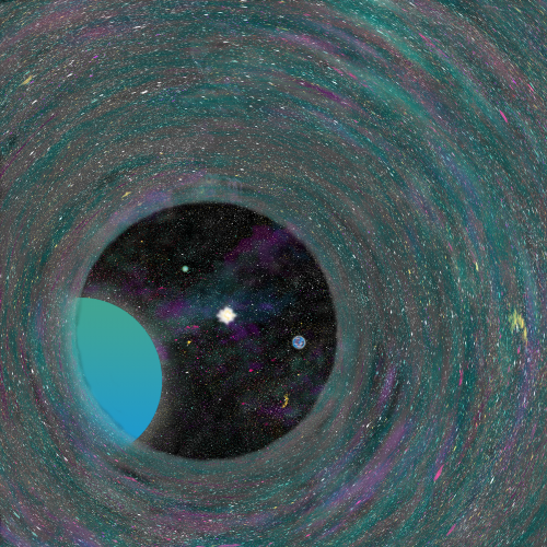
I have been watching a lot of sci-fiction lately. Like so many others my age or younger, the weight of global warming sits on my shoulders constantly. I imagined the final trek through a wormhole as someone sees their new solar system for the first time. I enjoy the bright colors and such but wish I conveyed a more bittersweet emotion.
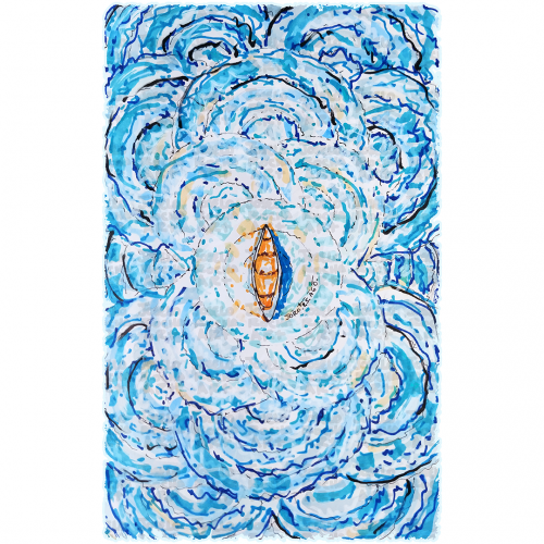
A boat floats at the center of swirling, vibrant blue waves, creating a sense of motion and energy. The contrast between the warm tones of the boat and the cool hues of the water highlights the image's dynamic composition.
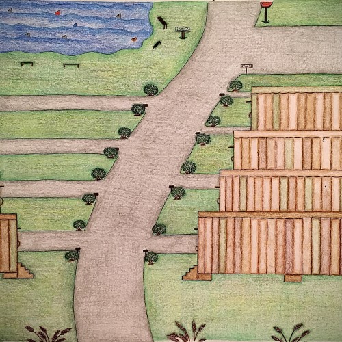
I designed these multicolored trailers using different shades of color only in a different pattern for each trailer. I felt like this color scheme would give the trailers a uniform look yet their own distinct look. The roads look freshly paved with small shrubbery on the corners of the entry ways of the driveways. There are some pretty brown steps that leads to a door on each trailers. Also, as you can see the trailers have been topped off with the same flat style roof only with a different solid color which is one of the colors used on the sides of the trailers. There’s a fishing area with plenty of fish in it as well as places to sit. There’s even a place to use the restroom close by the fishing area so you can continue to enjoy your day catching fish with minimal interruption. This trailer park has a fresh look to it. It has a warm, inviting feel to it and is perfect for living a more simple lifestyle.
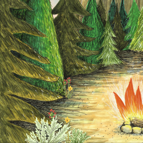
Trying to make sharp shadows without having everything blend toghether. My goal is to convey the warm, pinkish sunlight on the first day of spring, and light is not something i have given enough care to earlier. Removing colors from a photography is an effective way to get an idea of how sharp shadows actually are!