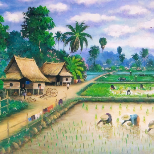
- Oil painting of a countryside of Vietnam. When observing, it is easy to see an image erected when people are working in the field, along with the early morning time, so it has created a beautiful picture. Each object in the picture has its own highlight, full of attractive looks. Although it is a picture of a simple landscape about people in the countryside, every little detail is meticulously painted by the author. This painting is owned by the author "Uilliam Potter". This picture was drawn and uploaded to show everyone the inherent beauty of a rural village, if you have the opportunity, come and feel it. Get the beauty here in the most realistic way.
- Please contact me via Email: williampotterowners@yahoo.com
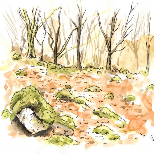
A bit of a departure from my usual style. I wanted to try something a bit messy, fast, and loose. The scene is an ancient woodland in Pembrokeshire called Tŷ Canol, an atmospheric place and full of inspiration for artworks. Pen and watercolour in Seawhite sketchbook.
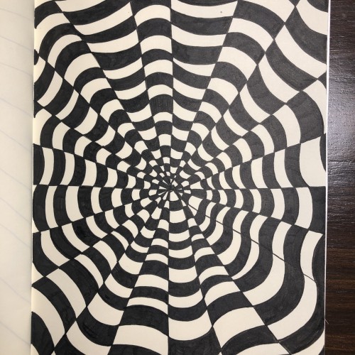
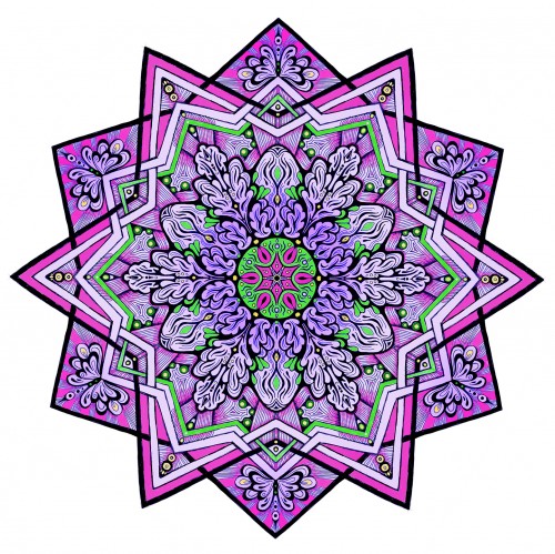
This was drawn in Spiralty (a free Windows program) and colored in Photoshop. Great fun and very relaxing. I am definitely going to be making more mandalas during the rest of the pandemic.
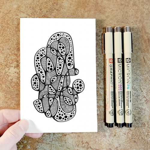
"Whirlwind 22”, an original drawing. Micron pens on archival paper. Size: 4” x 6”. Title, signature, and date in the back of the drawing. This drawing is the 22nd in a series of drawings posted over a period of 100 days. The original post date on this drawing was September 22, 2020.
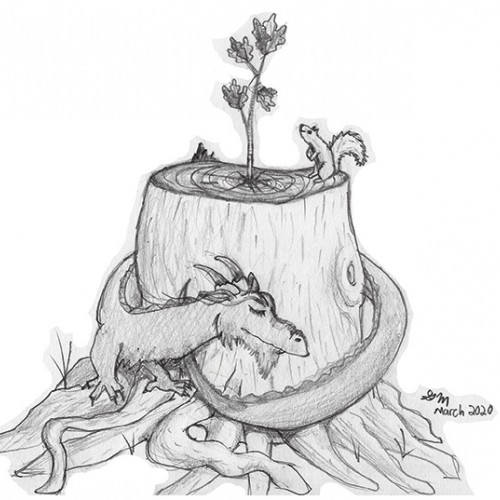
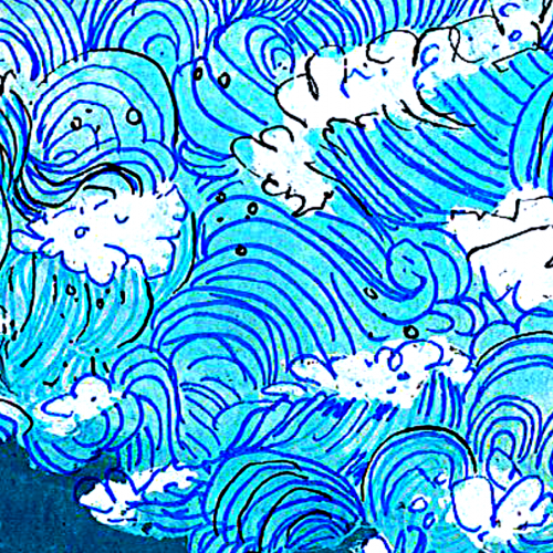
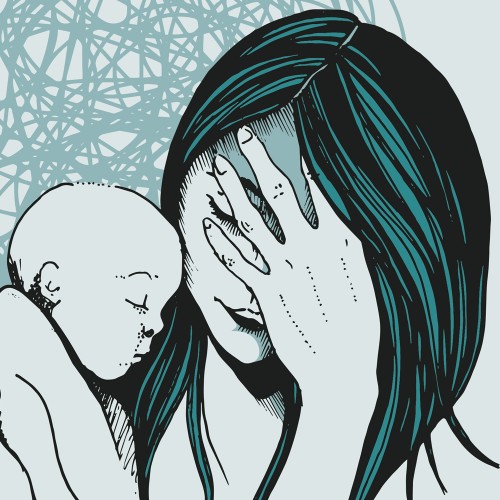
have you ever seen the part in a bug's life where he flies into the wall, shows a thumbs up and says "I'm okaaay". that's how I imagine saying the title of this image. I added some bruises and stuff so I didn't have to explain to my younger sisters that I was referring to an emotional state of mind
“Whirlwind 9”, an original drawing. Micron pens on archival paper. Size: 4” x 6”. Title, signature, and date in the back of the drawing. This drawing is the 9th in a series of drawings posted over a period of 100 days. The original post date on this drawing was September 9, 2020.
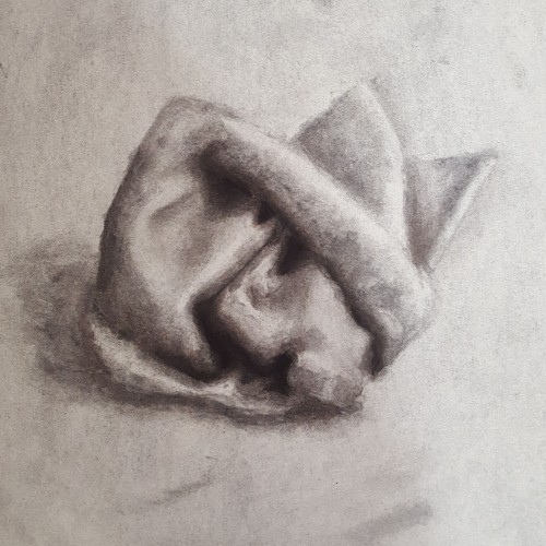
I suppose this was just a tester/practice piece? My first actual still life from observation and my first time actually using charcoal (yes, I've never truly used charcoal before. Charcoal and pastels are two things I avoid. Their looseness and freeness scare me, considering how rigid I can be). Not sure how to feel about this one. I'm my worst critic, and I've known that for a long time now. There's a lot of practice and progress to be made, but it turned out half-way decent.
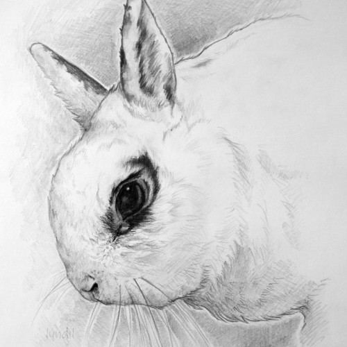
I drew it with "Derwent" a graphite pencil, the drawing is A4 size. Upon request, I drew the bunny based on a photo. I wanted to introduce the bunny personality traits, which I did. The owner was very happy for him. :)
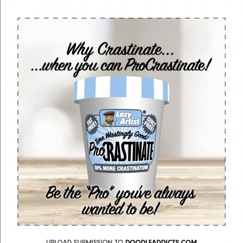
I was too late and missed the entry deadline…eating too much ProCrastinate?? lol. Anyways, couldn’t resist and fired up Adobe Dimensions, Illustrator and Photoshop for this quick and dirty advert.
This is my first plant abstract in over six months because college takes up all my time during the school year now. This one was supposed to be more pastel, but the scanner washed out some of the lighter colors.
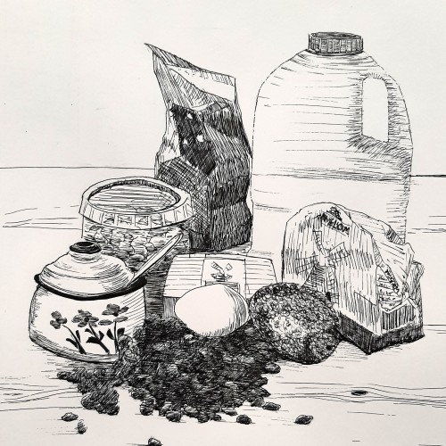
I did set up the ingredients for an Easter bread with raisins and nuts, so i could make a sketch of it before i made the dough. While the dough was resting i worked it out in pen and ink.
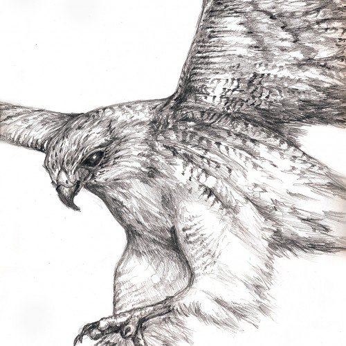
This is a graphite pencil drawing of a hunting hawk somewhat loosely based on a photo. The reference photo is from: Birds of Prey by Paul D. Frost (Paragon Books Ltd 2006) and credited to Martin B Withers/FLPA. I found the book in the Goodwill a couple of month ago and was much inspired by the beautiful photographs.
A few weeks ago I was playing around with color application on the default flat brush in Procreate, and developed a sort of choppy, layered application that I really enjoyed!
Yet another plant abstract. This one was built around the red outlined flower in the semi-center, and that’s where it gets its name. Colored pencil and pen on paper.
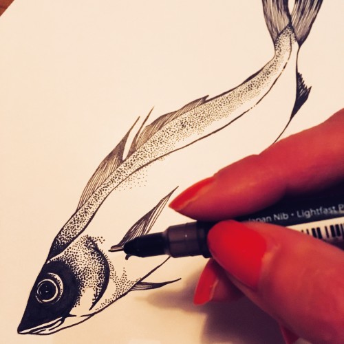
Pen and ink drawing. This was the original which I reworked digitally for an EP cover, business card and sticker. Search up Three Word Stories band if you want to see the final artwork... (I may upload it here at some point ;))
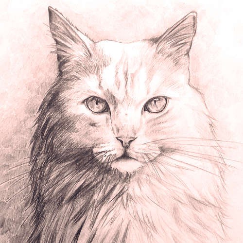
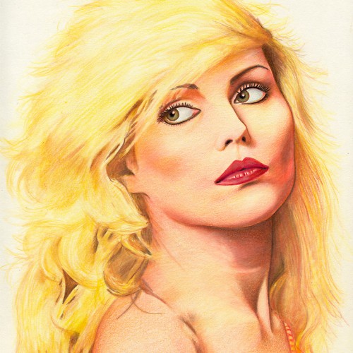
A color pencil drawing of Debbie Harry - singer with the group Blondie. Reference used was from back in the 1970's. Derwent Artists color pencils on thick cartridge paper. Many thanks for looking.
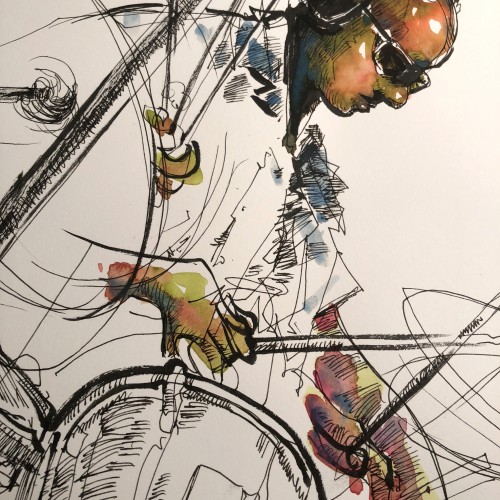
Wow! I was invited to spend the day in the recording studio drawing the creation of a jazz album. I will be going back to my studio to create the album cover art for the project. Included are few photos of my process drawings from the session. It was an amazing experience to spend time with these incredible musicians. I will share the final results at a later date.
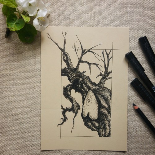
It was supposed to be a blooming cherry tree but somewhere in the proccess it turned toward a scary dead tree like from Sleepy Hollow of Tim Robbins ;)
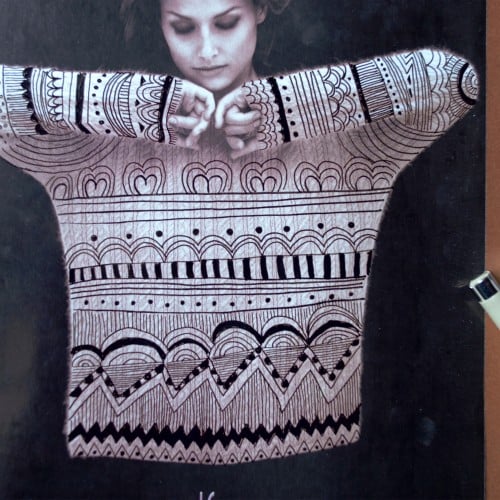
I was skimming through a 1990s Vanity Fair magazine and found a sweater ad. It was a perfect shot to intervene it with doodles! Now it looks like a very Christmas-y sweater, perfect for sitting in your favourite sofa and drinking a cup of hot cocoa.