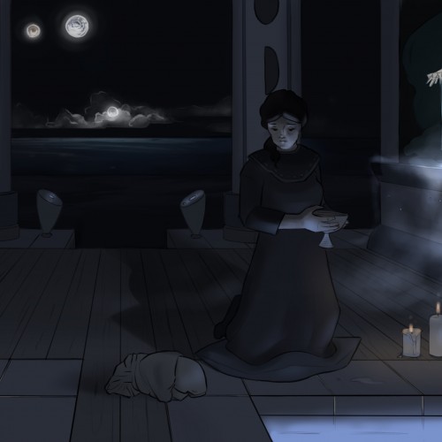
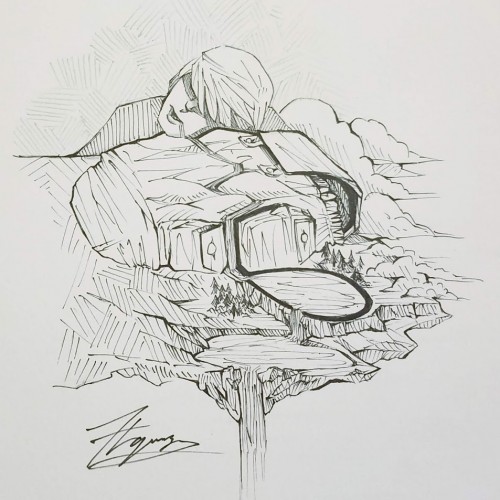
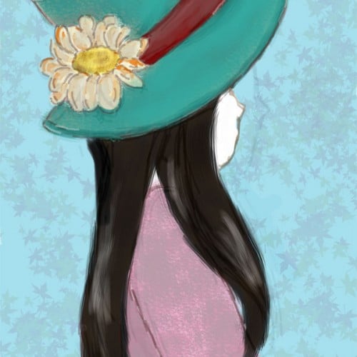
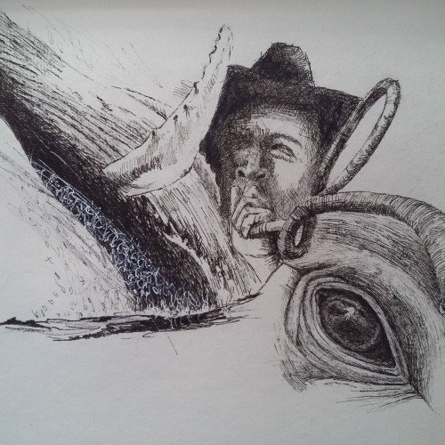
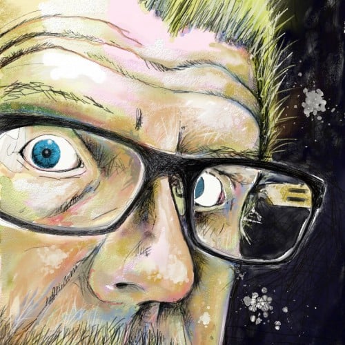
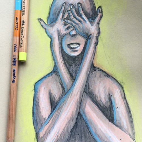
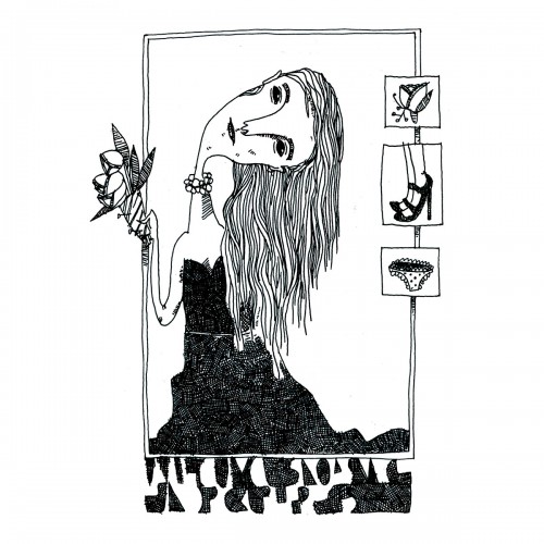
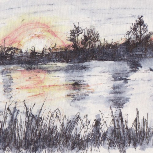
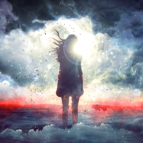
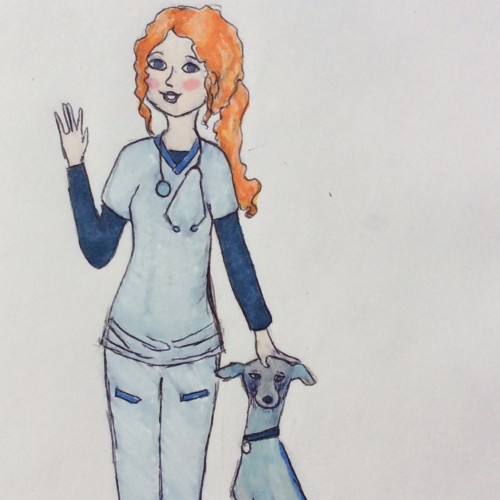
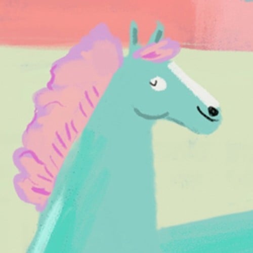
This was a final assignment for my most recent figure drawing class. There's some things I'll probably play around with but for now I'm definitely ready to set it aside for a bit. Time: 8 hrs Medium: Procreate on iPad.
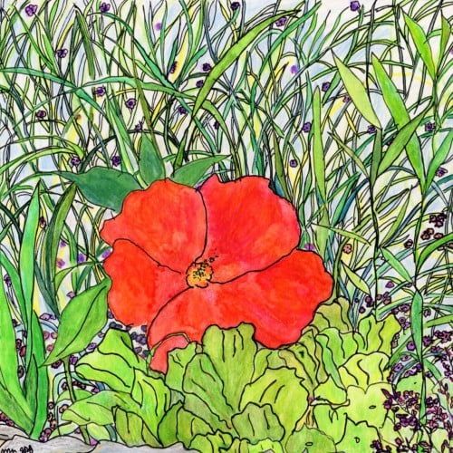
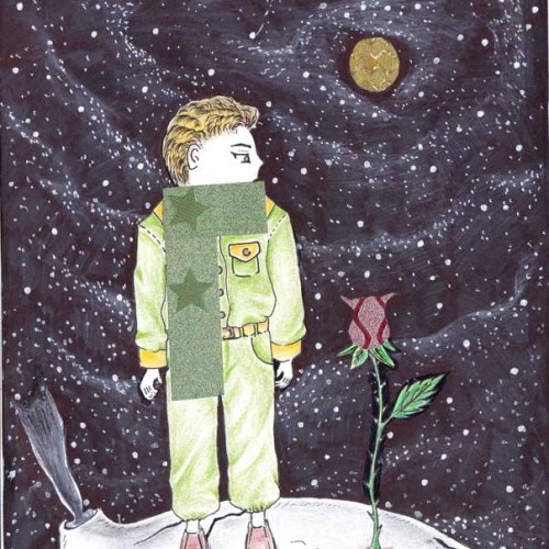
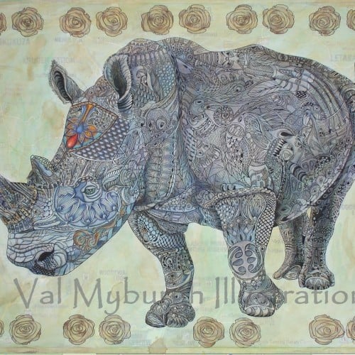
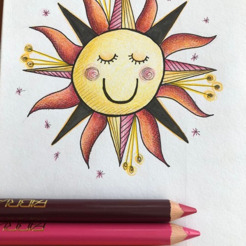
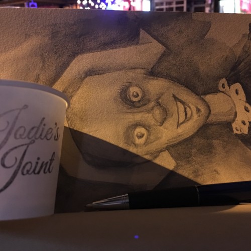
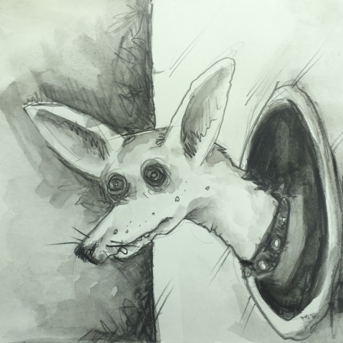
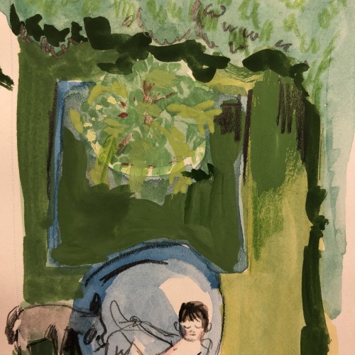
pen, gouach and water color on paper
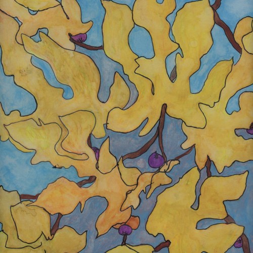
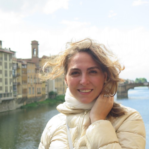
This has been one of the most spectacular falls I can ever remember in Paris, the golden leaves blowing gently in crisp clear blue skies really inspired me.
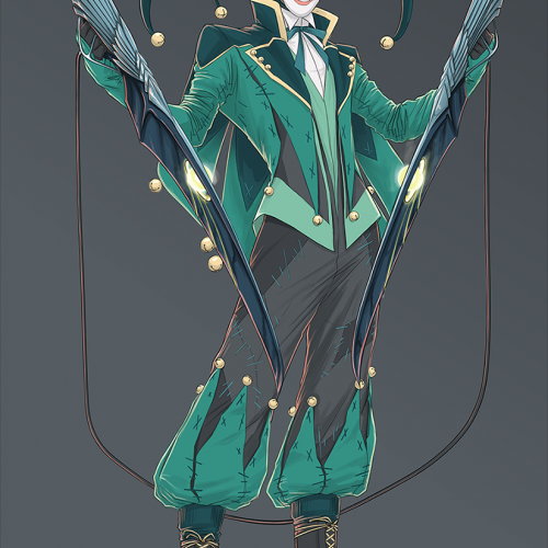
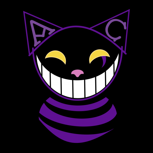
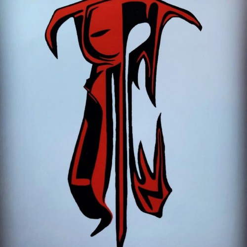
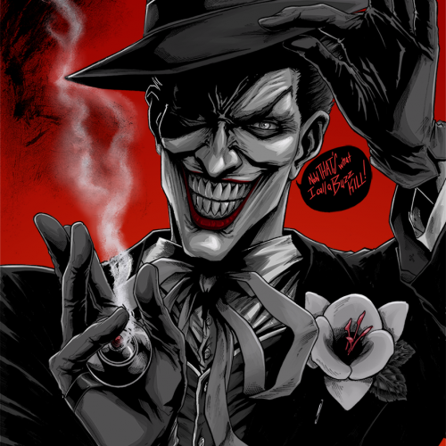
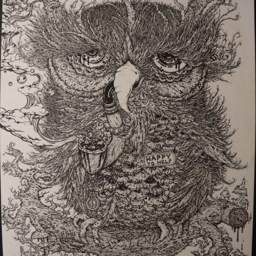
Just some time wasters I did. I would explain it, but it would require me to go into way too much comic nerd information. Its essentially a comic character that I redesigned (no its not the Joker). I really love concept art, and character design. I'm really not good at it, but I delve into it periodically for fun.
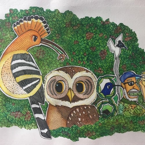
It was both fun and challenging to compose this doodle around the letters of Google. I hope that I get to create more such artworks.i used watercolour on cartridge paper detailing with micro tip pen.
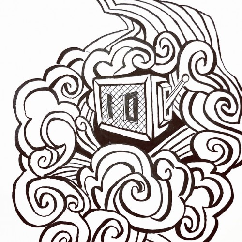
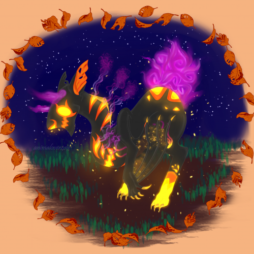
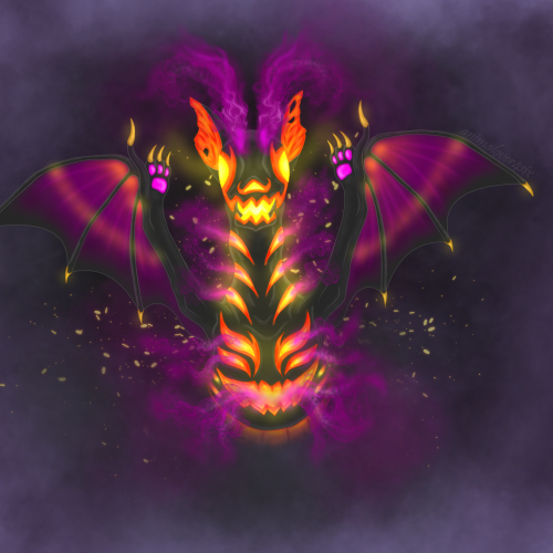
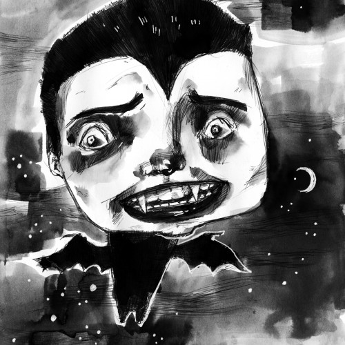
This piece was an entry for a mystery baby contest on DA, where you design the adult based on the given egg and its I theme. The creature belongs to a made-up species(Byubuu) that the host created.
This piece was an entry for a mystery baby contest on DA, where you design the adult based on the given egg and its I theme. The creature belongs to a made-up species(Byubuu) that the host created. //reuploaded with signature/username//
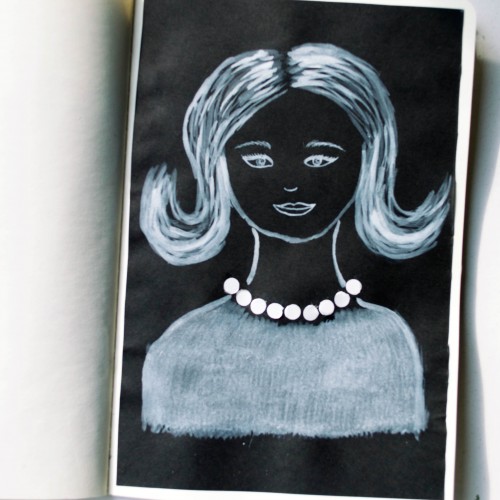
The idea for this portrait came to me when I was looking at a packaging of soap - it was very glossy and it looked like it could look like pearls. As well as the soap packaging, I used white ink mixed with acrylic paint (for opacity) on black paper.
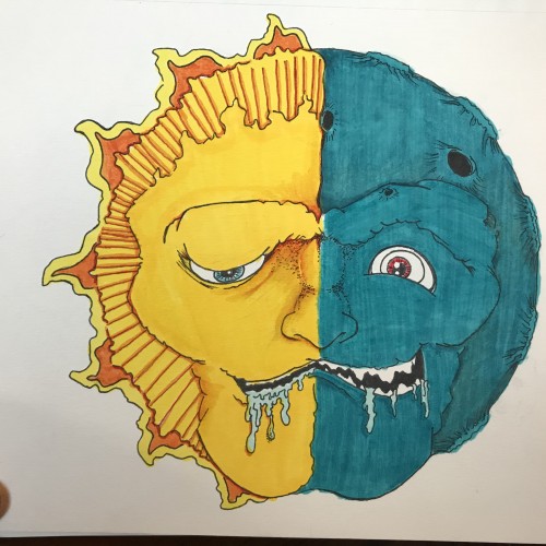
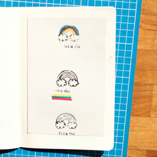
For Inktober 25, I played around with a rainbow rubber stamp and markers. Simple but it was a lot of fun! And isn't Inktober all about experimentation and practise?
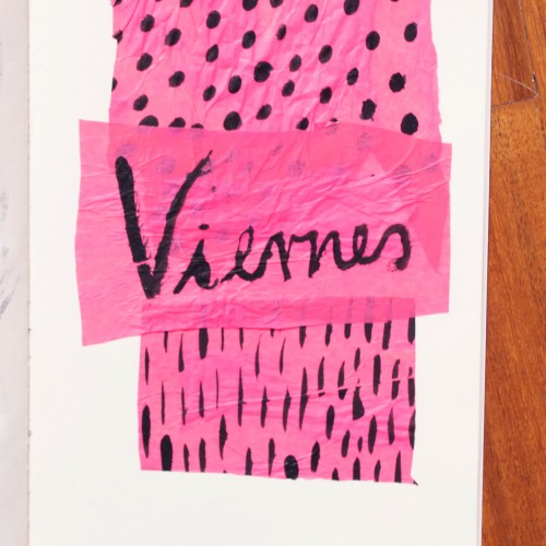
India ink on tissue paper. I had never used ink on this kind of paper before; I really liked the results! There are some folds and wrinkles on the paper that give the pattern some interesting details. The paper is also super absorbing, which plays nicely with the quantities of ink. Since it's very thin, there can easily be overlays between textures. And finally, when trying to use less ink (so that it wouldn't seep through and cause a big dot - the absorbing quality is nice, but it was also somewhat of a challenge!) I used very little ink on the lettering, causing a scratchy, dry look.
Here are 5 #Inktober paintings. I've been painting every single night and loving it. I think that my high school art teacher might have been right when he said doing a daily painting was key to his being an artist.
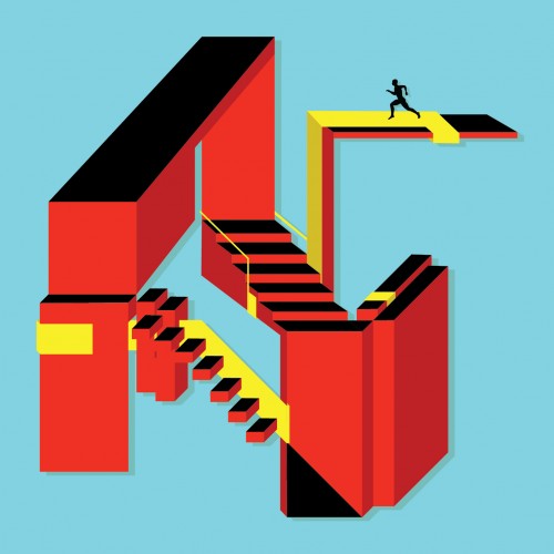
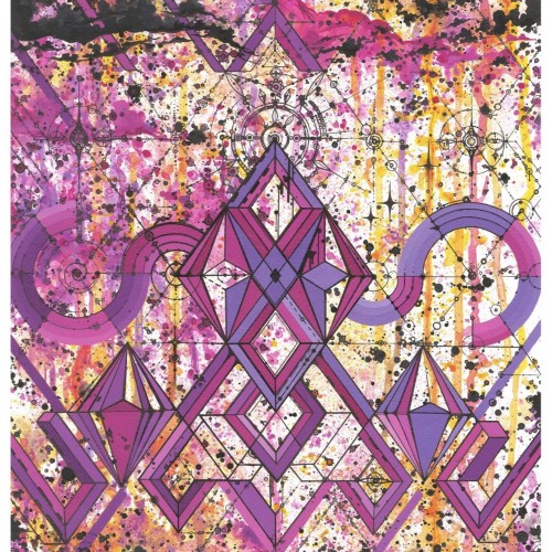
"Ups & Downs" explores the nature of basic shapes/colors and how they interact to tell a story. This piece focuses on an infinite recycled energy, meaning there is no end point to its structure. The aim was to keep it simple yet structurally complex to the eye.
After my high school boyfriend and I broke up, I went to prom with a group of single friends. While I was in the bathroom, I overheard someone saying, "Leah Budin put in no effort at all." Ouch.
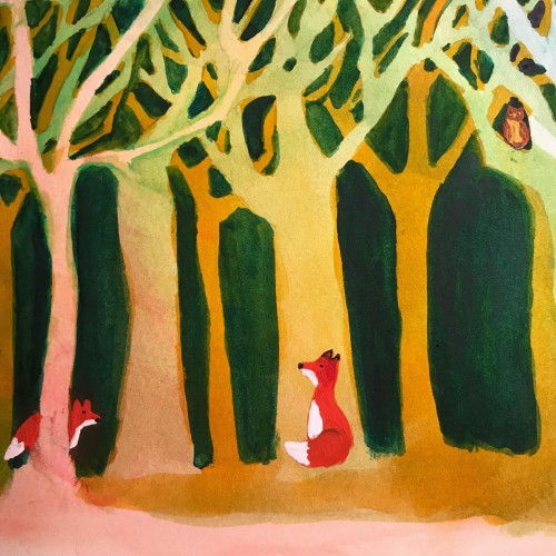
This is watercolor using the negative painting technique where you paint around your subject using multiple layers which creates depth. This has greater than 8 layers of watercolor washed around the tree shapes
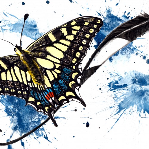
Butterfly # ?? : The Swallowtail
this was hard! Firstly trying to illustrate a swallowtail without decapitating a poor swallow... then trying to fit these two together.
More paint splatter effect for a bit of zing
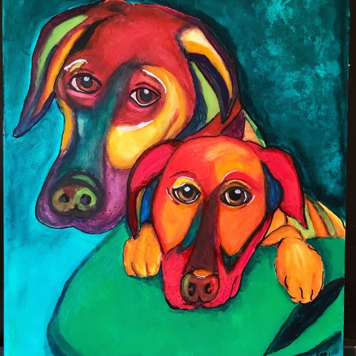
This was a commission for portraits of 2 dogs using watercolor for the dogs and acrylics for the background. Painted on Aquabord which makes the watercolor so saturated that they appear opaque
I do enjoy doing geometric pattern based work, this one was done in satun thailand. I also have some prints available of this piece if anyone is interested. Thank you ✌️