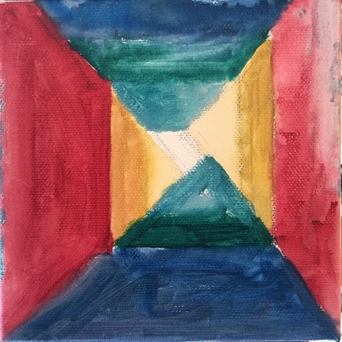
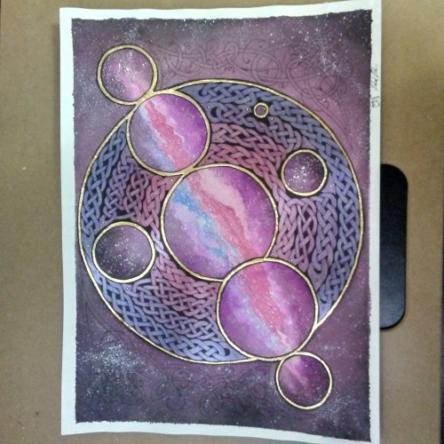
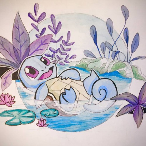
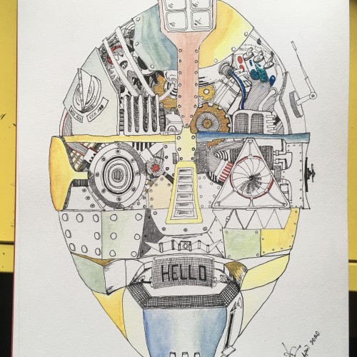
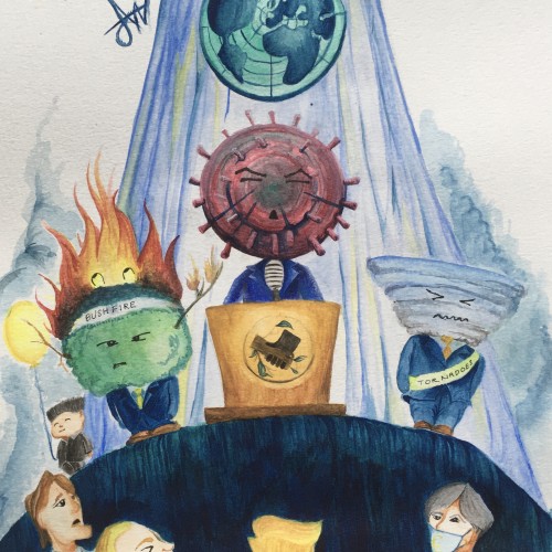
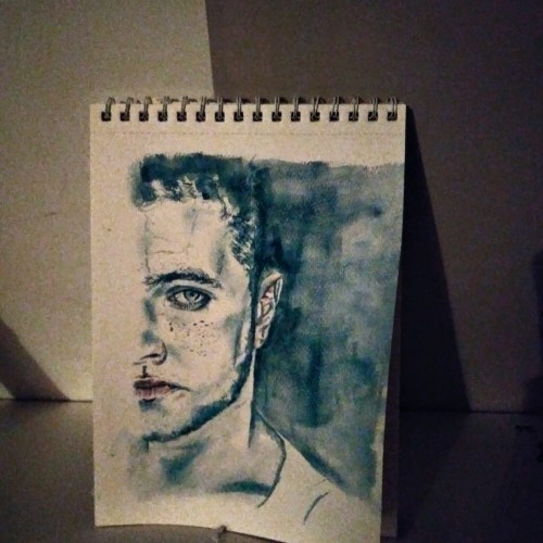
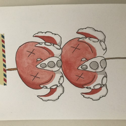
Squirtle: no more no less. Actually more about it, my lighting is bad, aka the yellow tint. Also color picking is really hard, and i might have to do a bit more outlining to the piece to make it look cohesive. But overall the composition is balanced i think, even if i slacked off with the execution a bit towards the end
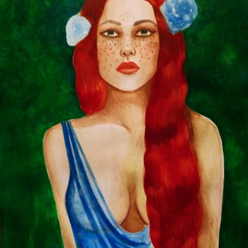
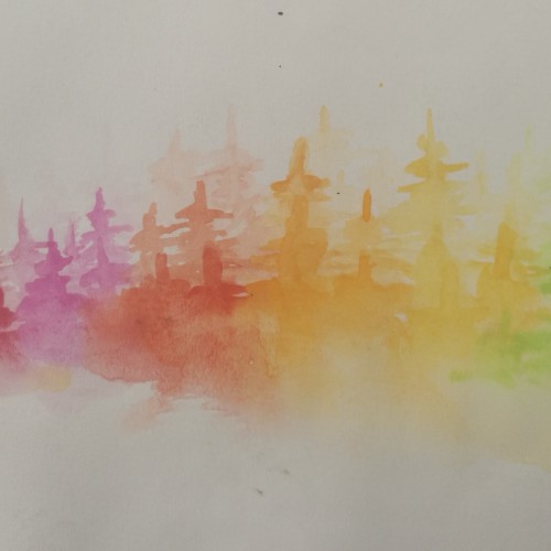
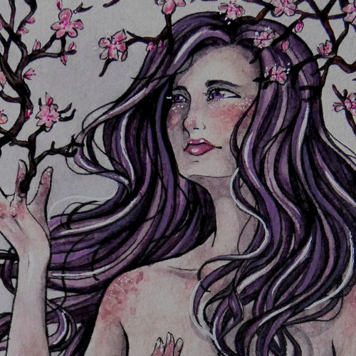
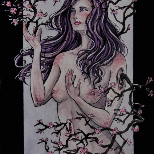
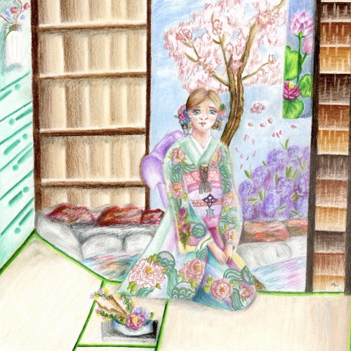
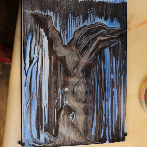
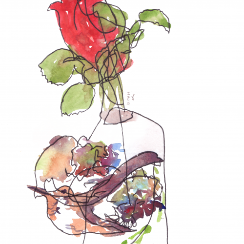
Spring is coming, A time of change and new beginnings. - This is the first time posting something on this platform. I'm very curious about this community. If you have critique on this piece I would be happy if you tell me, so i can improve my art :)
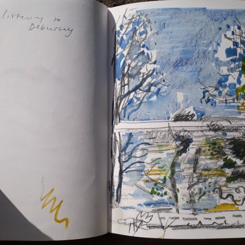
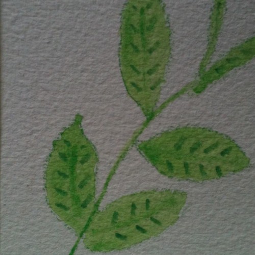
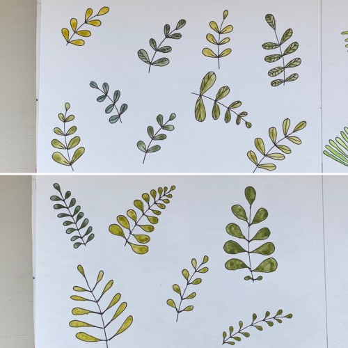
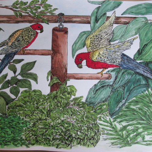
For some reason I tried some floral drawings, of different shapes, and I also used mixtures of different colors to produce hues of green. The first page - it’s a mix of the cobalt blue (PB 28) and cadmium yellow medium (PY 35). On the second one there is ultramarine (PB 29) for the blue color and the same yellow paint. To me, it seems the difference is very little but I’ve got the color closest to the ‘normal’ green using Cobalt rather than ultramarines. The latter gave either to yellowish to olive hues or too blueysh