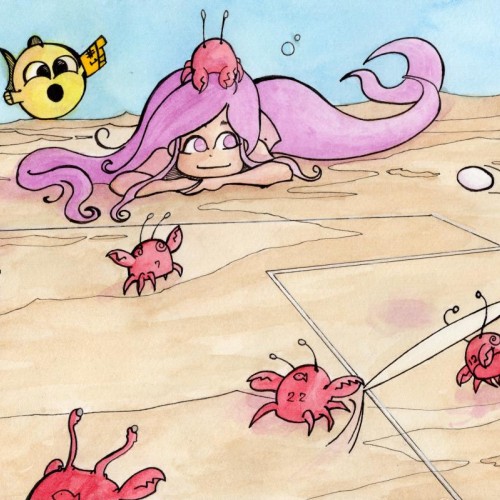
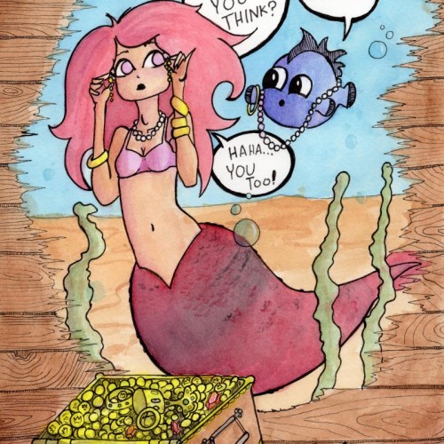
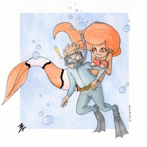
Mermay Day 6: Clawball (aka football aka soccer) watercolor and pen...forgive this americans lack of knowledge of footsoccerball if anything is weirdly wrong lol
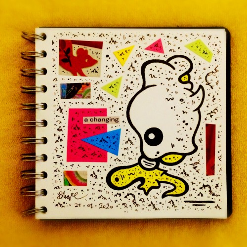
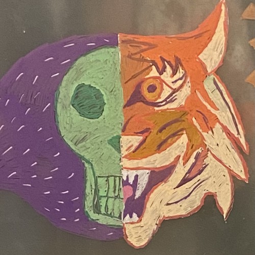
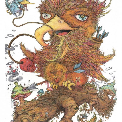
This piece was done with watercolour crayons, crayons, fineliner, acrylic paint and a touch of posca. I was showing that love can be blind and sometimes almost arrogant and selfish, the arrow has hit the spot on the second attempt but the scars are still to be seen. Although the person playing cupid aint always an outside force. I enjoy playing with the titles and am constantly changing and thinking of what it will be called when doing the piece, but i do like my wordplay. this one was a play on horticulture and felt it all tied in to the final design :))
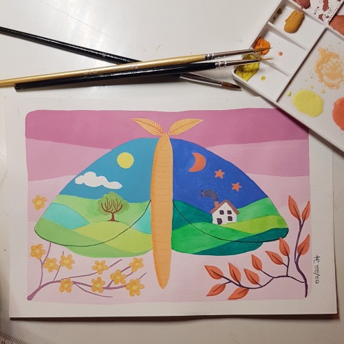
This is available as an a3 sized print.
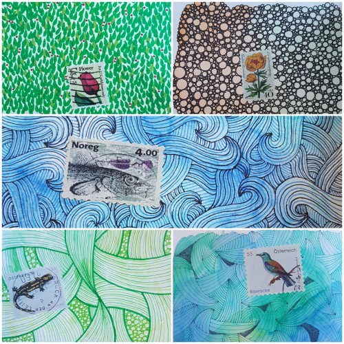
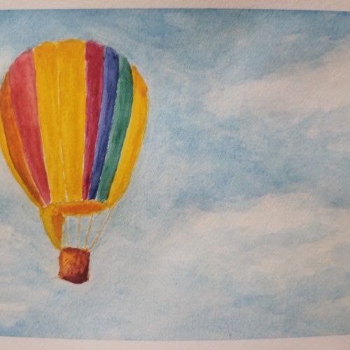
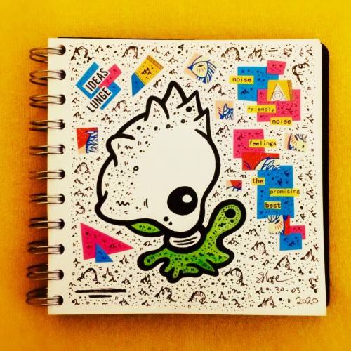
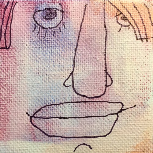
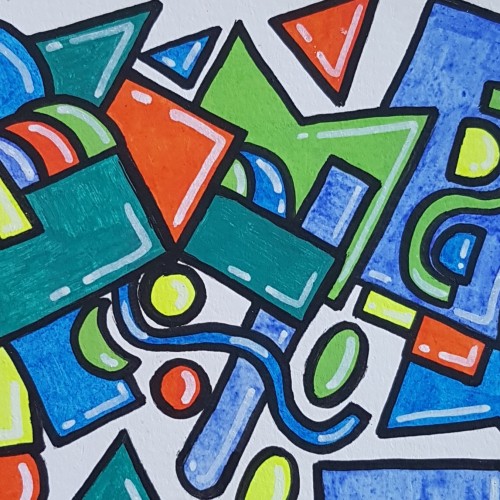
This was my first try using paint pens. Played around with shapes to get used to the texture of the paint and how it feels to use the pens. Done in a watercolour sketchbook.