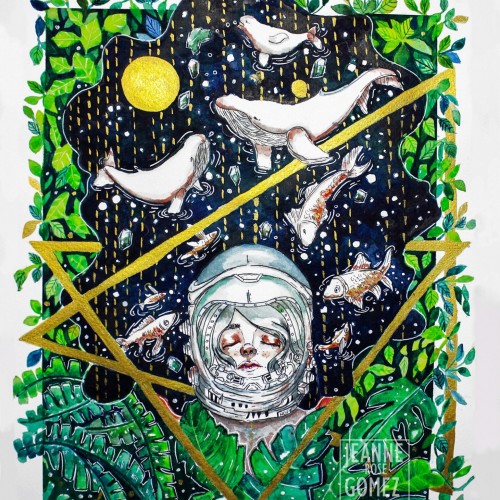
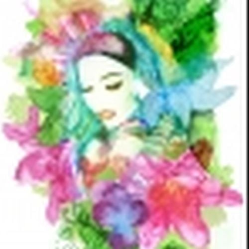
"Beauty of Hope" as one of the original painting I donated to charity and it was auction in exhibit. It was one of my favorite painting so far.
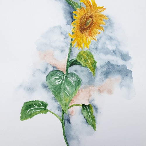
I used koi watercolor and a fabriano 200 gsm paper. Most of the color I used are blue, green, light green and yellow and a bit of orange. The metallic gold paint was one of the color that added flavor to the painting.
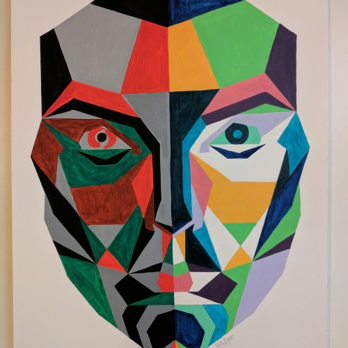
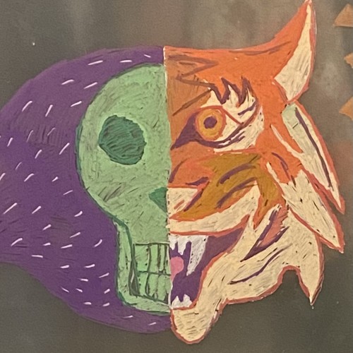
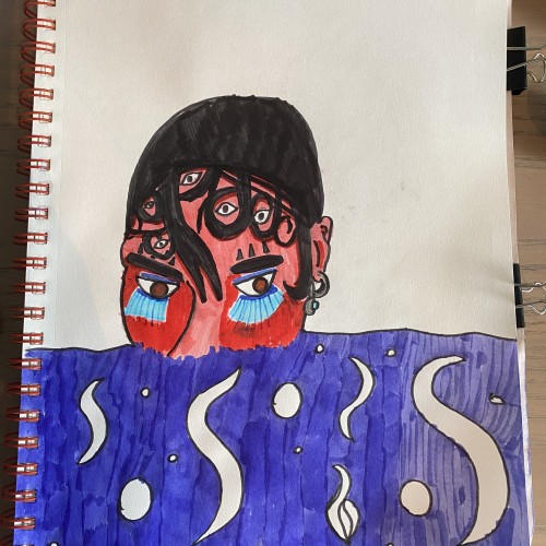
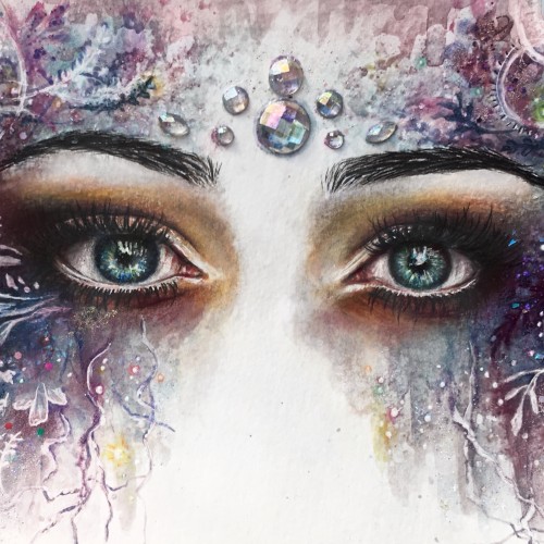
13 young, Indian adults, struggling with mental health issues, explained what colour represented her/his fear and which represented hope/happiness. The left half of the face has all the colours associated with fear, while the right shows hope/happiness.
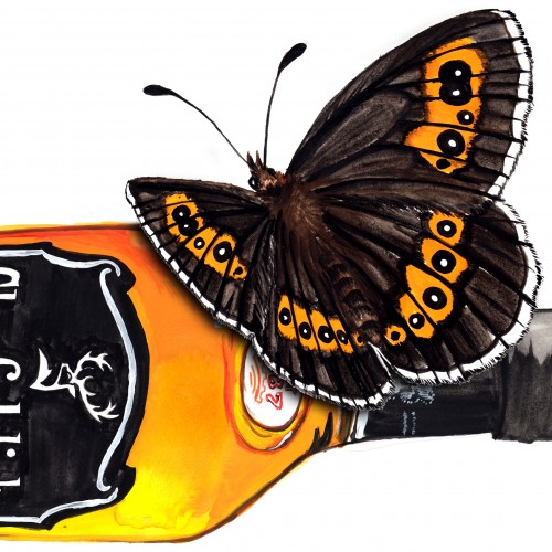
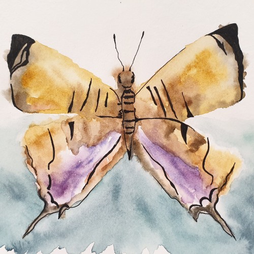
Butter # Who knows ny more? : The Scotch Angus. I gotta say, bottles a NOT easy subjects!.... And neither are butterflies. So a tricky one whichever way you look at it. This was certainly one to have fun with :)
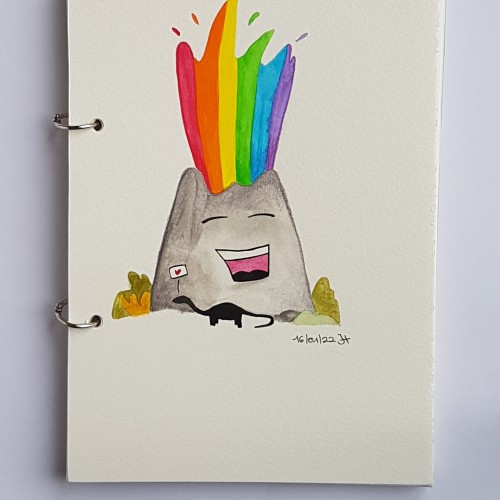
New slightly improved version here : https://www.doodleaddicts.com/uploads/13873/
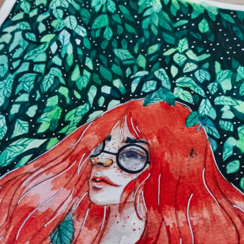
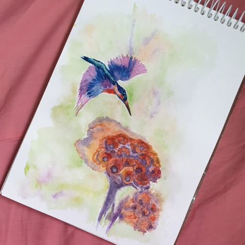
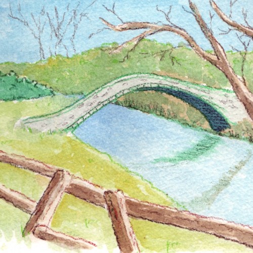
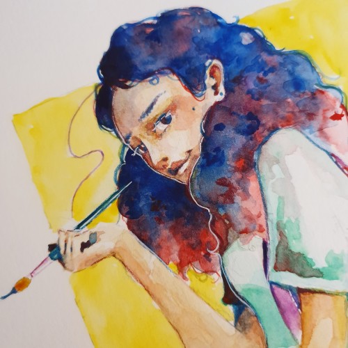
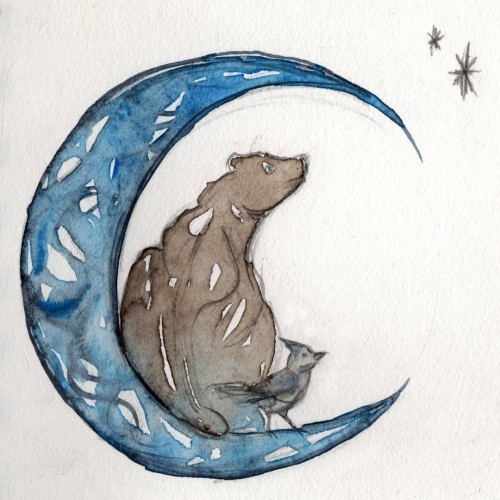
This was an exercise in taking a photo that was quite dark and foreboding and turning it into a happy looking illustration. I'm slowly getting my head around how to make my work look like illustration instead of "fine art". This is watercolour and colour pencil.
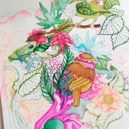
I don't know why I love drawing birds so much, I just do, and it's always small ones like Finches and Canary's...here I added some froggies coz they're fun to paint too...
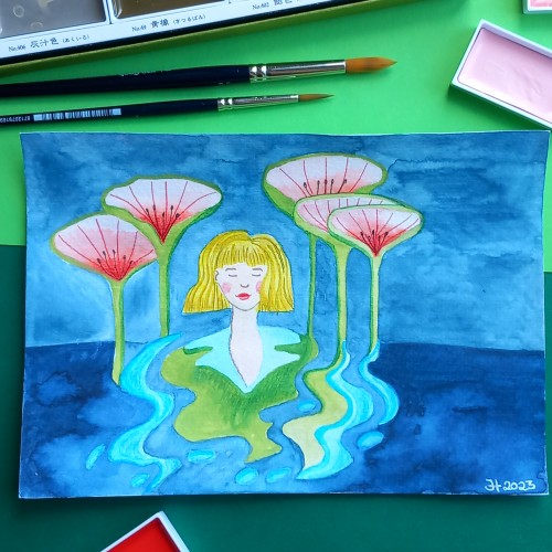
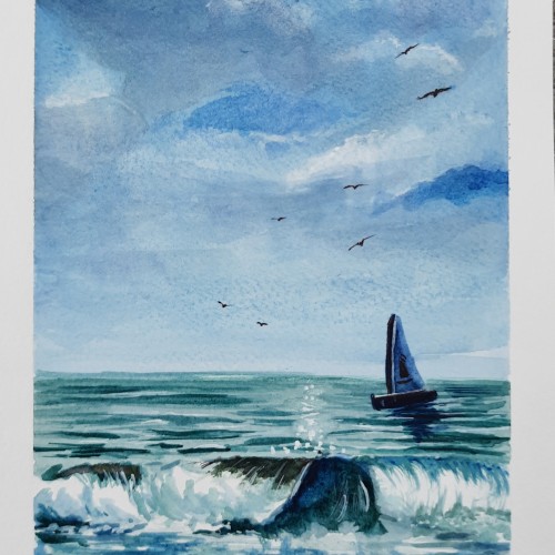
A watercolor painting about Seashore. We sit and enjoy the Sweet sounds of sea waves and birds chirping. They are soo much relaxing. It is a Watercolor painting.