This time, again, two combinations. I believe the hues are very nice and calming. I used yellow ochre as the yellow color (PY 43, PY 1). On the upper part, the cobalt blue (PB 28) is used, on the lower part - it's ultramarine (PB 29).
8
2
0
7
2
0
7
2
0
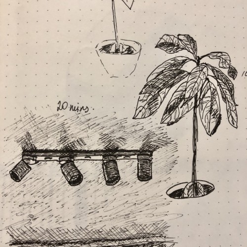
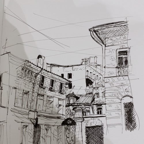
The trees shouldn’t pop up on you like this. But, still...
3
2
0
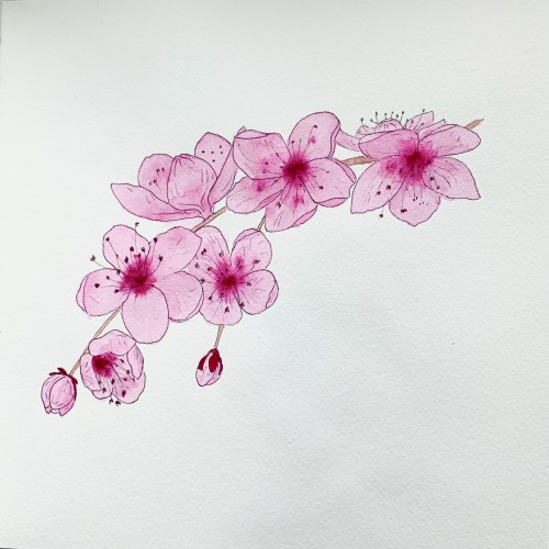
The sketch is based on reference photos of different blooming trees. Guess, no botanical realism here.
5
2
0
5
2
0
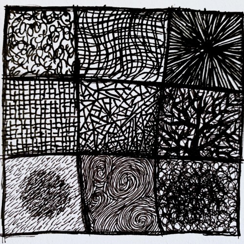
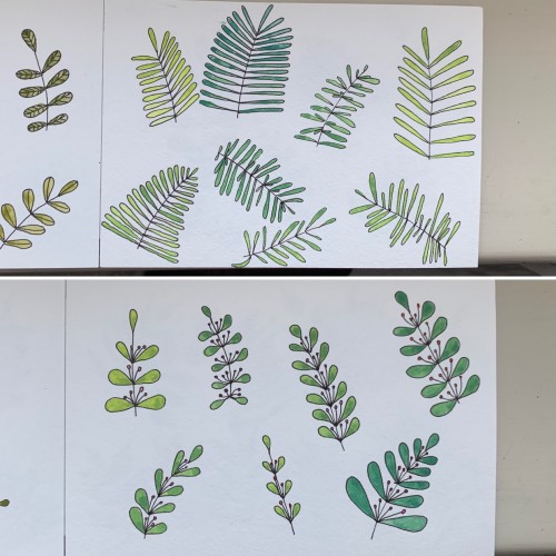
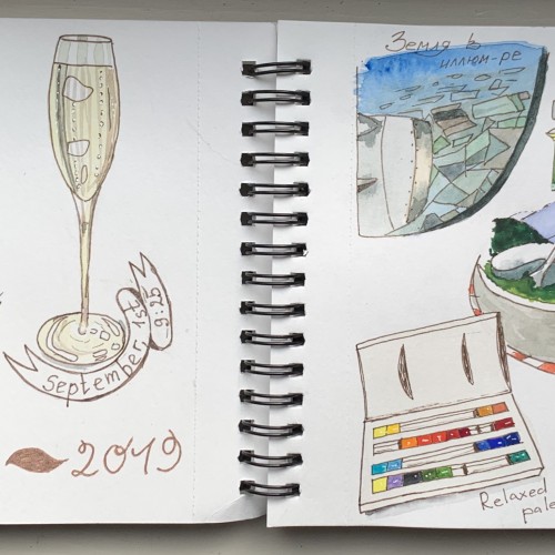
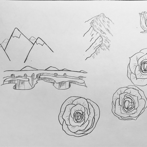
Quick random sketches
9
1
0
5
1
0
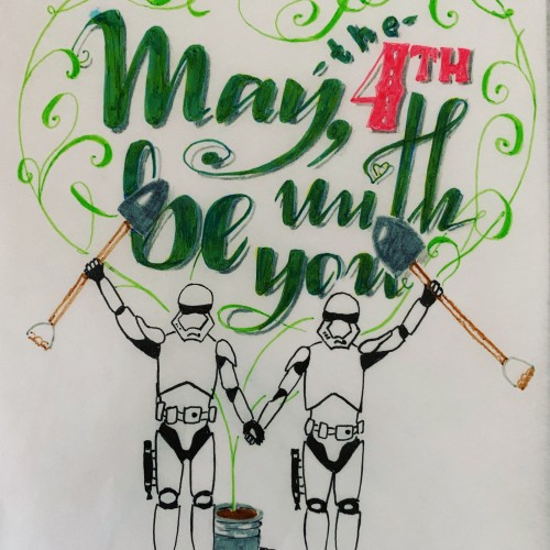
It’s like the first «stand-alone” work (meaning not as a part of the lettering course). Btw I haven’t made it to the faux calligraphy lesson yet being stuck with the serifs. Used the tracing paper on top of the initial sketch.
P. S. As for the shovels: in Russia we have long holidays at the beginning of May and that’s when the whole gardening thing starts
11
1
0
Alcohol markers
10
1
0
17
1
0
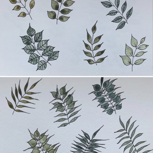
Again, mixing some colors to get greens: 1) cobalt blue (PB 28) plus cadmium lemon (PY 35); 2) ultramarine (PB 28) and cadmium yellow. Didn’t see much difference. In the first case there seem to be more hues, though. Funny, cadmium yellow medium and cadmium lemon have the same label: PY 35
4
1
0
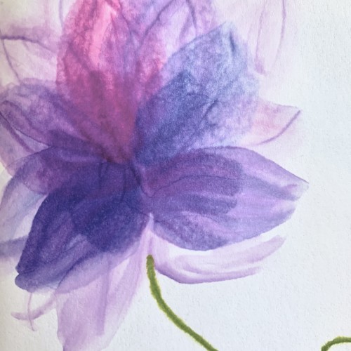
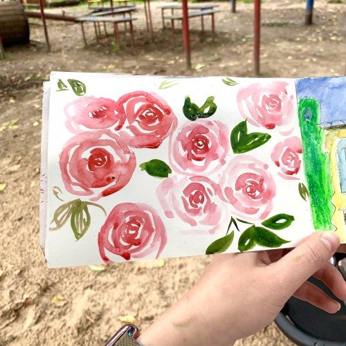
More watercolor flowers practice for a postcard
6
1
0
The layout and the lettering suck, I know. But that’s the first time I’m making it. So excited
3
1
0
8
1
0
The initial intent was to make a complete sketch with watercolor. But. I just couldn’t. (Made another sketch like that though)
7
1
0
It was an exercise to get to know the Procreate app a bit
8
1
0
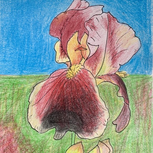
Thie sword lily flower is a mess. It’s hard to figure out what is what when drawing with a ref photo. I made this study as a stage of réparation for a final watercolor piece (more like ink and watercolor). I used cheap watercolor pencils