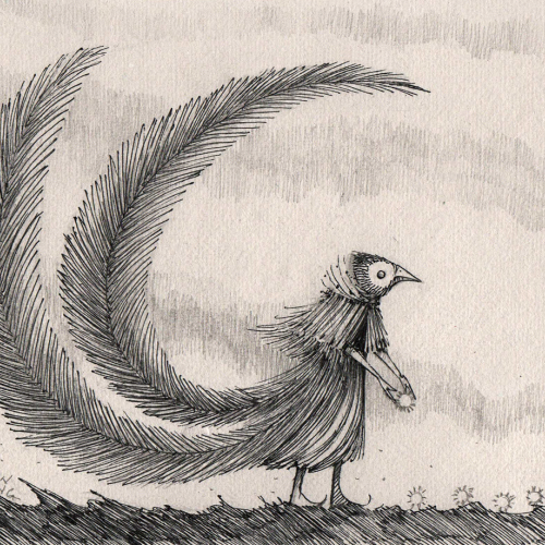
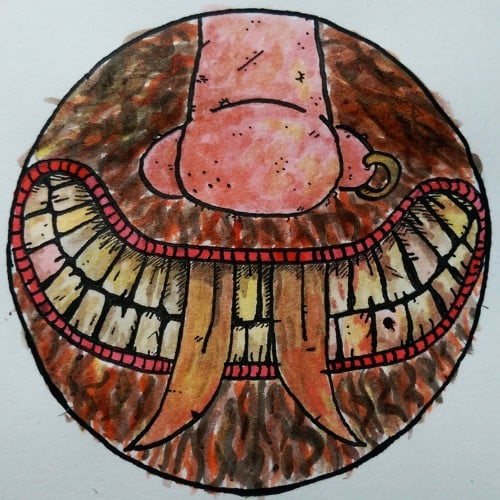
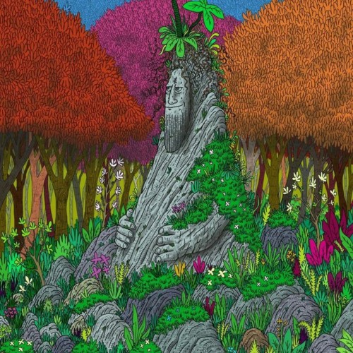
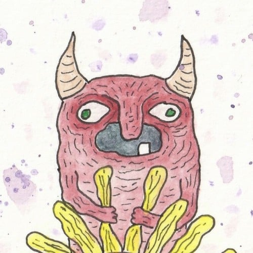
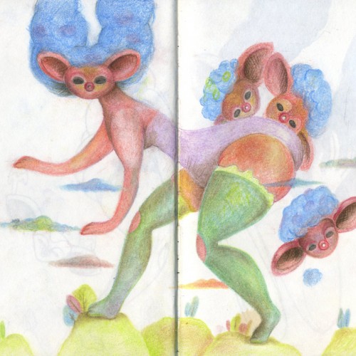
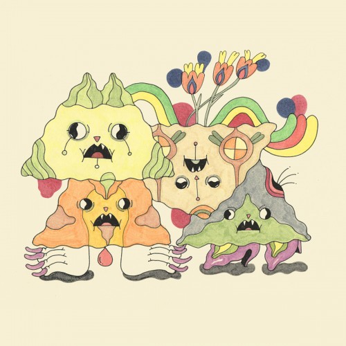
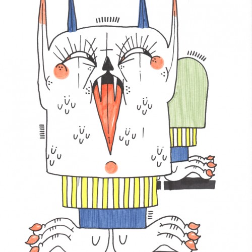
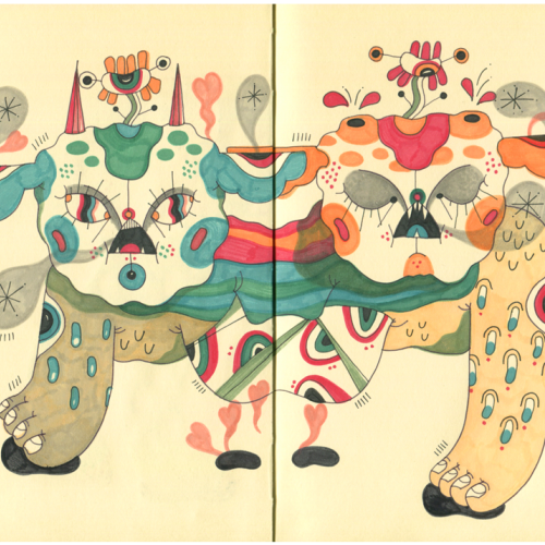
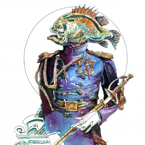
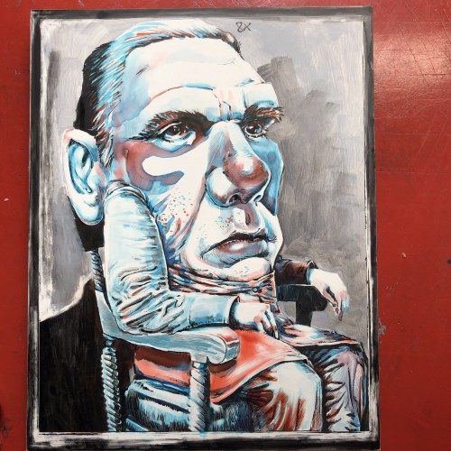
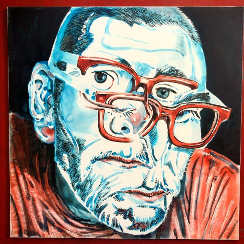
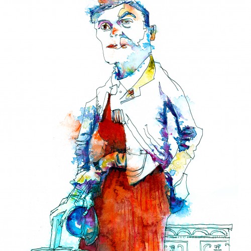
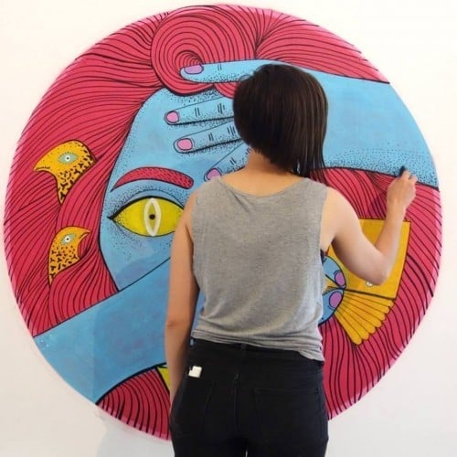
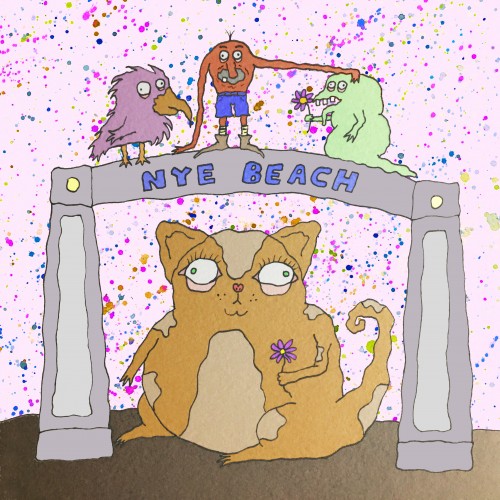
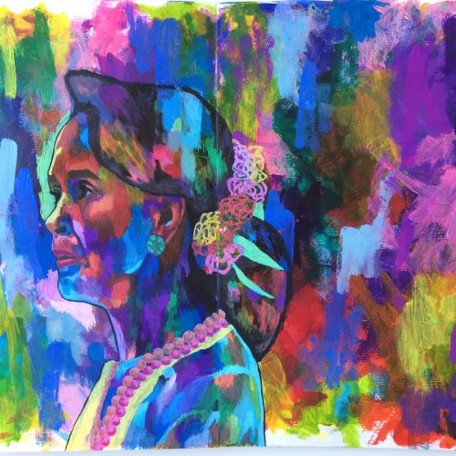
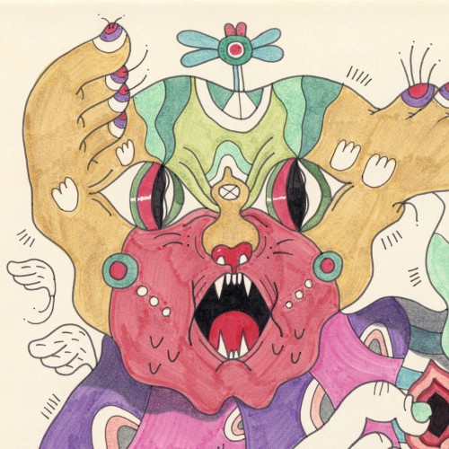
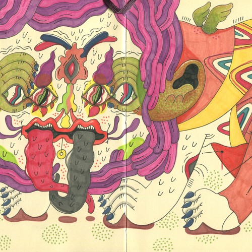
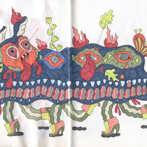
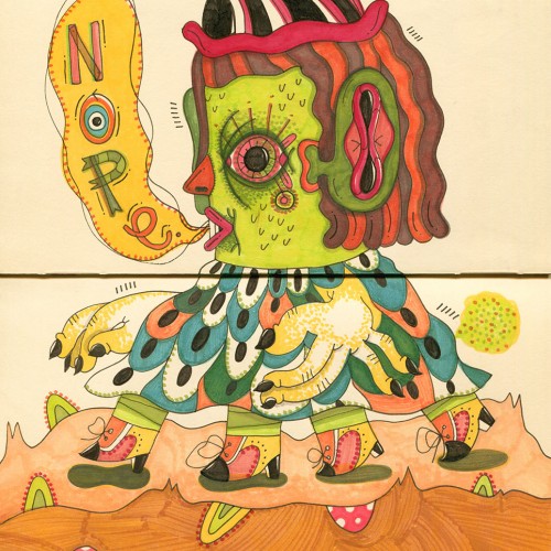
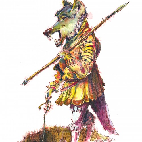
I'm a graphic artist with passion for illustration.
My style varies through strange creatures and wiggly figures, taking inspiration from nature, cinema and surreal narratives.
I got a pack of loose watercolour paper from eBay in 2018. The side this was painted on had a really strange pitted texture on it. I thought it might be interesting but I didn't like the way the paint gathered in the pits. I just use it for sketching and testing colours these days.
One of my early oils from 2017. I was still getting used to the medium. I liked how the oils worked well for the misty distant hills, and I used glazing for the first time on the clouds.
My first venture into artist grade colouring pencils - and I'm smitten! I never thought I could achieve such boldness and blendability with them! I'm still getting used to them and will think about choosing smoother paper with less tooth next time. The texture and weight was more for the water-based gouache along with alcohol inks (which are very unforgiving to even primed heavy paper!). Apologies for the unevenness of lighting between the 2 sides of paper; will correct that when I'm making proper image files.
First post on here and I didn't mean for it to be political! But this is probably one of the pieces that I'm most proud of in their use of bold colours. And I've not really been able to recreate it since.