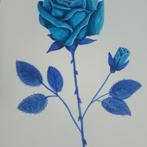
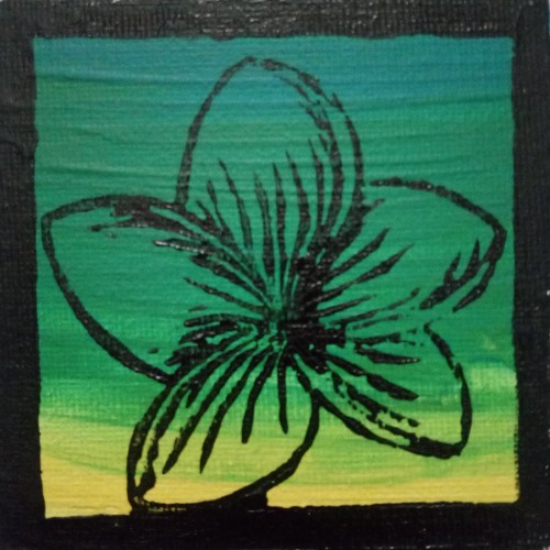
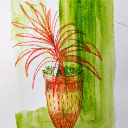
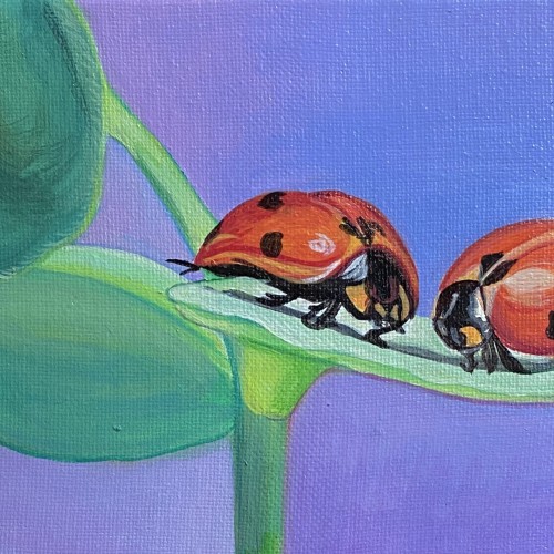
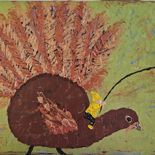
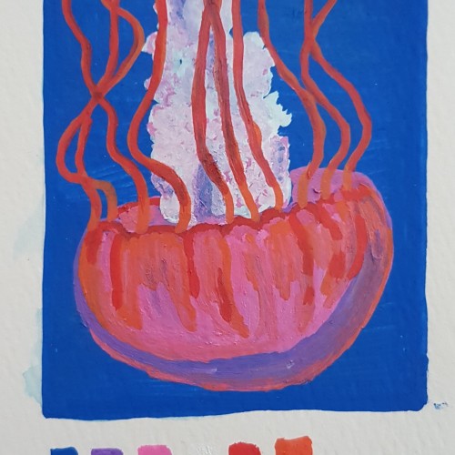
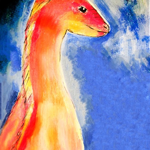
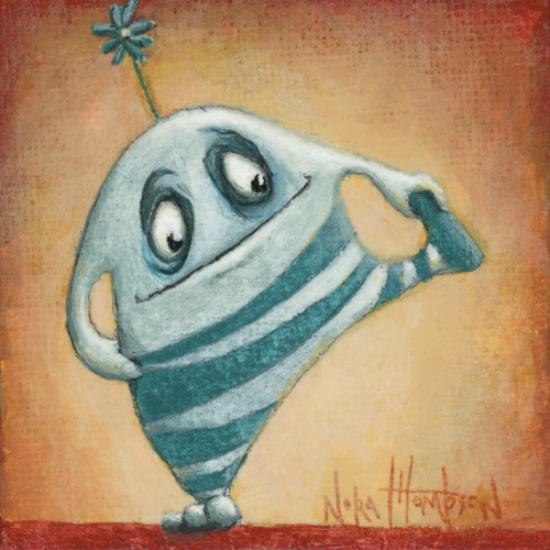
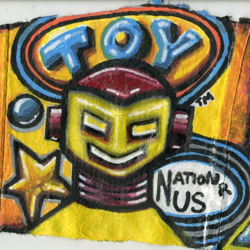
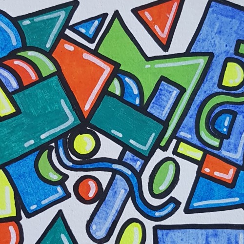
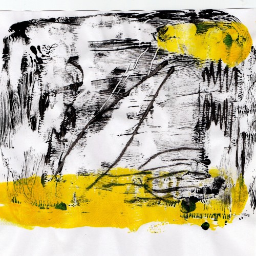
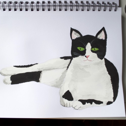
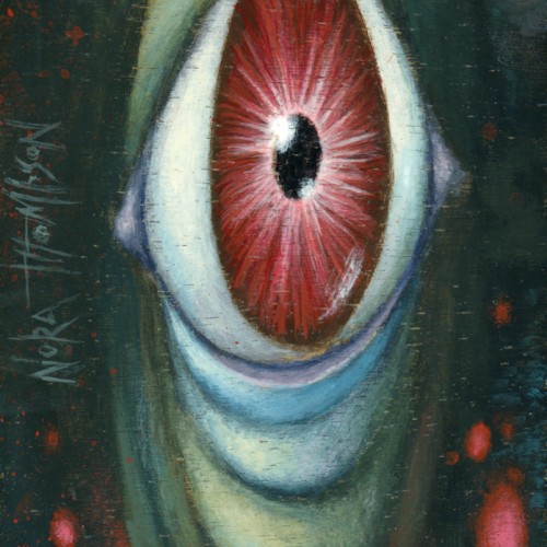
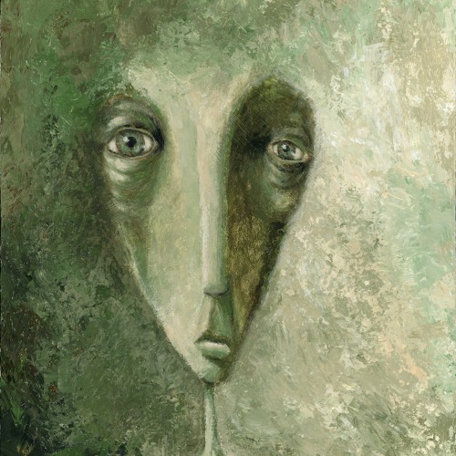
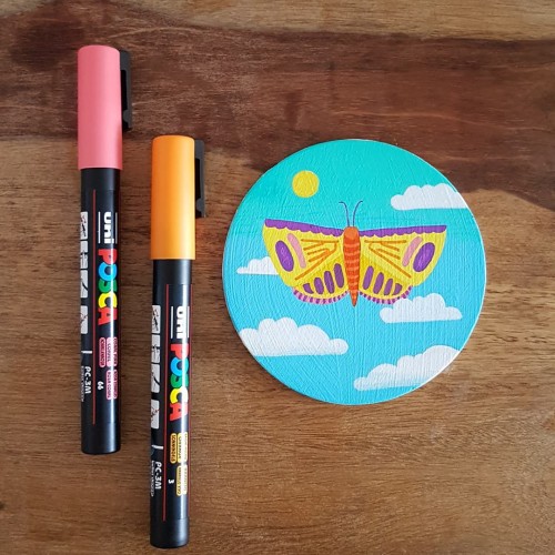
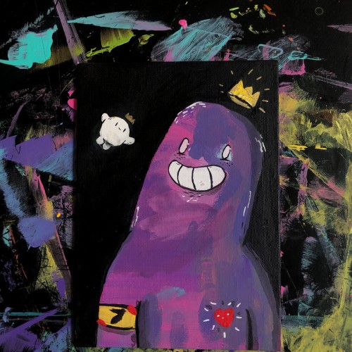
Acrylic markers in mixed media sketchbook. This one is a bit rougher because my markers have medium sized nibs. I still enjoyed the process and the feel of the paint flowing onto the page.
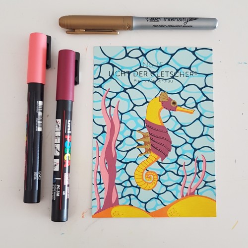
I did the water texture according to a tutorial by James Chapman, found on Instagram. The steampunk seahorse was an idea from a lady I am following on Instagram as well (look for @carrieisartsy) This piece is done on a paint chip card with poscapens, a gold marker and fineliners.
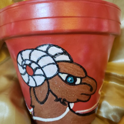
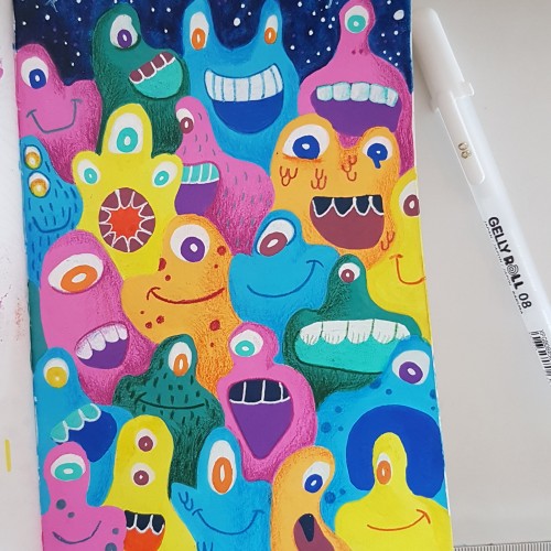
I wanted to draw a crowned animal with a crest on top of its head. Originally , this was colored with colored pencils but I didn't like how it looked so I tried to save it by painting over it with acrylic paint.
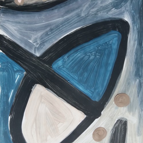
This was my first try using paint pens. Played around with shapes to get used to the texture of the paint and how it feels to use the pens. Done in a watercolour sketchbook.
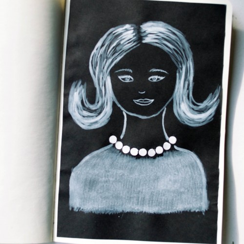
The idea for this portrait came to me when I was looking at a packaging of soap - it was very glossy and it looked like it could look like pearls. As well as the soap packaging, I used white ink mixed with acrylic paint (for opacity) on black paper.
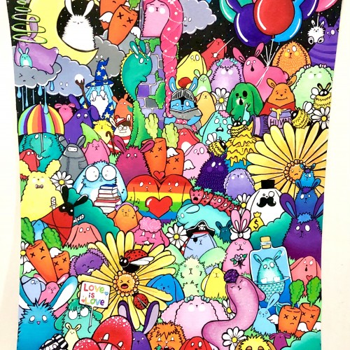
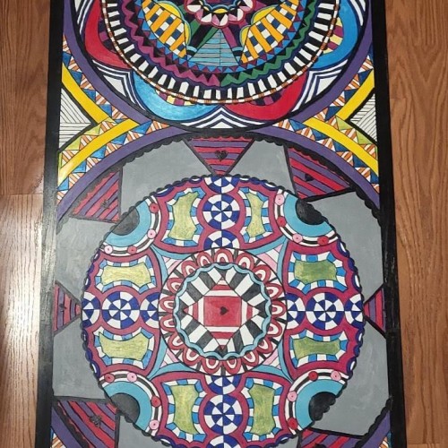
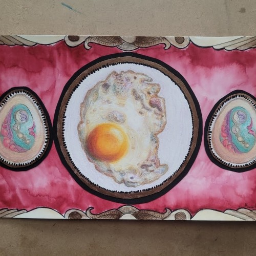
Close to a month ago, I had found out my design was selected for the Art Stop Program, and, yes, this is mainly what I've been working on since. I've never worked on a piece this large before, 72in x 24in, and I rarely make sketches of pieces before creating the final work. It's definitely a cool feeling to look at the finished board and see how the drawing actually came to life. (The Art Stop Program selects a handful of entered designs for the artists to create on a larger board, and these boards will then be inserted into bus stop benches around Niles, IL.) I can't wait to see the bench this will be in, and I'm so lucky I got to be part of the program.