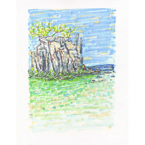
An illustration of a Thailand coastal scene is depicted with loose, expressive strokes, showcasing a rocky outcrop and the meeting of land and sea under a blue sky. Sparse vegetation sits atop the rocks, adding touches of green to the predominantly blue, green and beige tones.
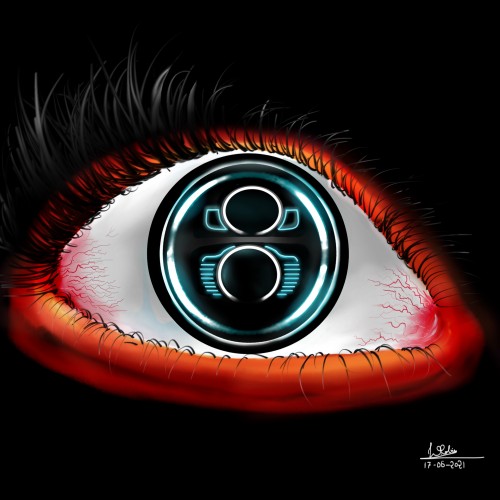
A Digital Painting with the theme is "Eye".
I decided to Make an Artwork from "Volkswagen Beetle Headlights + Human Eye" . This is combo Eye of car and human .
Medium: Digital Artwork;
Software used: Autodesk Sketchbook Pro
I hope you liked my imagination and the artwork :)
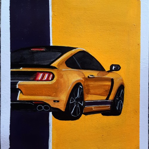
Sometimes people just don't understand that "It's not just a car ". It's MUSTANG GT.
I was in love with Mustang since first drive. Lol not in Real Life . My first sight was in NFS Most Wanted. After watching Razor's modified look. I was soo in love . Thats how it started.
It's an Acrylic Painting. Its been almost a year I haven't tried Acrylic. So thought to paint an automobile and there I found my love Mustang
Looking forward to make more automotive paintings.
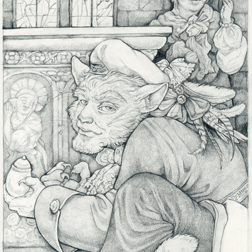
An illustration for a Grimm's Fairy Tale in a Moleskine notebook. This one is for a kind of obscure story called The Companionship of the Cat and the Mouse. Just graphite.
Graphite drawing in a Moleskine notebook - illustration for Grimm's fairy tale. I'm posting both the raw graphite version and the one I painted in Photoshop b/c I never know which I end up liking better!
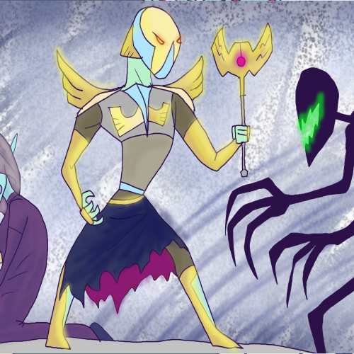
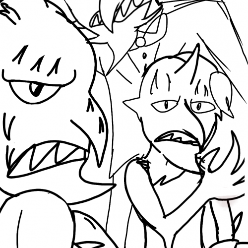
Not much to say other than it's the ugly and soul searching (literally) norgal demons who stalk and terrorize the peasant teenagers.
Gresaltz (the leader of the bunch)
Gron (the buff one)
Gritz (the only female one)
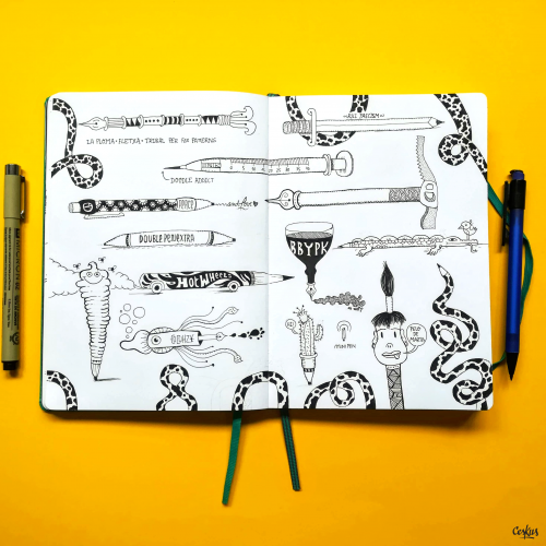
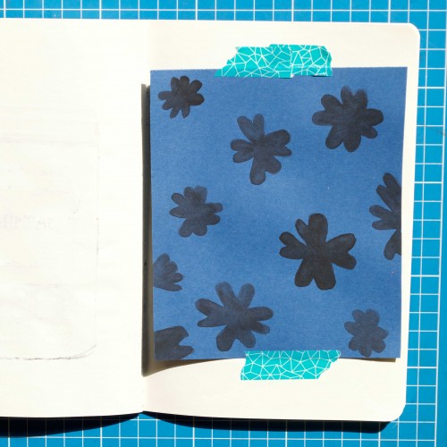
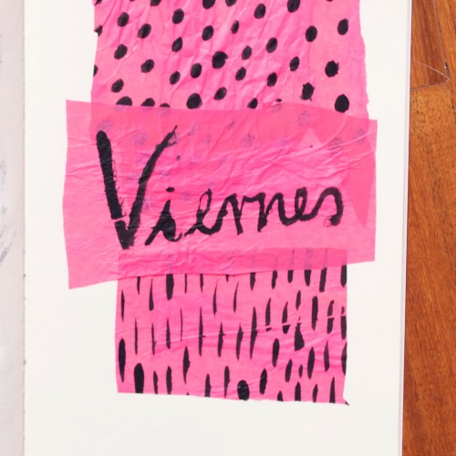
India ink on tissue paper. I had never used ink on this kind of paper before; I really liked the results! There are some folds and wrinkles on the paper that give the pattern some interesting details. The paper is also super absorbing, which plays nicely with the quantities of ink. Since it's very thin, there can easily be overlays between textures. And finally, when trying to use less ink (so that it wouldn't seep through and cause a big dot - the absorbing quality is nice, but it was also somewhat of a challenge!) I used very little ink on the lettering, causing a scratchy, dry look.
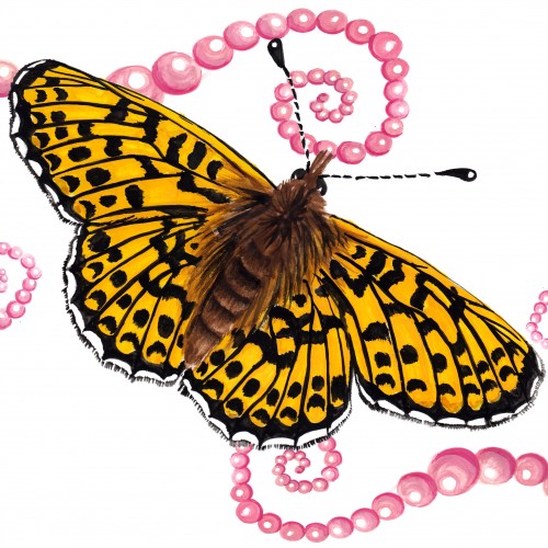
The (i think) 12th and final butterfly for the Literal Butterflies Project. Wow! thats a lotta flutterflies. This one was certainly tedious with such elaborate markings, she wasn't easy! ... That said, none of them were. With such beauty, and intricate wing pattern and design, butterflies are a very difficult subject to work with. But somehow we managed to get through all 12 with some of my hair left! Loved every step of this journey :)
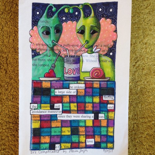
"He ordered a large side of feeling and the avoidance maneuver roll since they were sharing a can of love." ~ A blackout poem from a recycled page of Dealing with Blue, a young adult romance.