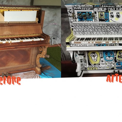
Doodle piano by Cédric la touffe. Superforma and The Silo asked me to customize the old piano that was outside at the silo. I first started during the concerts of 10lec6, Loire Valley Valypsos, The Green box and Ineige then finished at Silo after 22 hours of work.
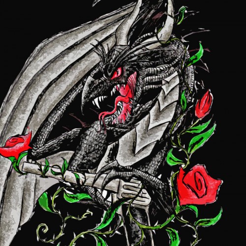
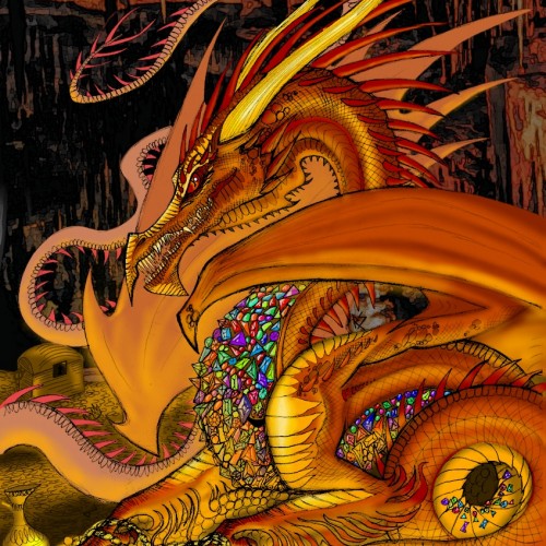
My vision of the character ‘Smaug’ from J.R.R. Tolkien’s ‘The Hobbit’.
Pencil sketch, coloured digitally on IbisPaint X.
Here is a passage from The Hobbit describing Smaug’s appearance: “There he lay, a vast red-golden dragon, fast asleep; thrumming came from his jaws and nostrils, and wisps of smoke, but his fires were low in slumber. Beneath him, under all his limbs and his huge coiled tail, and about him on all sides stretching away across the unseen floors, lay countless piles of precious things, gold wrought and unwrought, gems and jewels, and silver red-stained in the ruddy light. Smaug lay, with wings folded like an immeasurable bat, turned partly on one side, so that the hobbit could see his underparts and his long pale belly crusted with gems and fragments of gold from his long lying on his costly bed.”
Inktober day 1, Poison. I drew a octopussy on his head, but then he forgets to keep his mind on the really dangerous thing, the poisonous snake coming from the corner. Be aware out there..
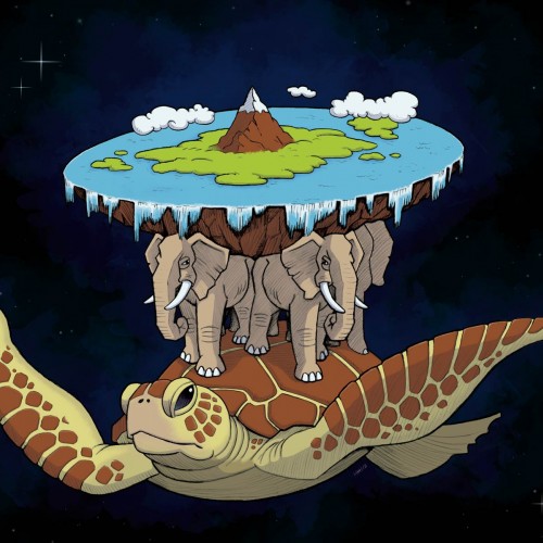
Recently, I was asked to illustrate the Discworld as imagined in Terry Prachett's work. The illustration (24 "X 24") was printed on a self-adhesive vinyl and applied to the mandator's car.
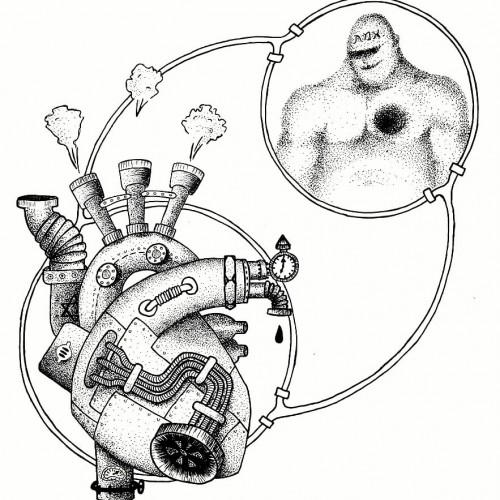
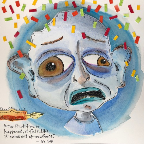
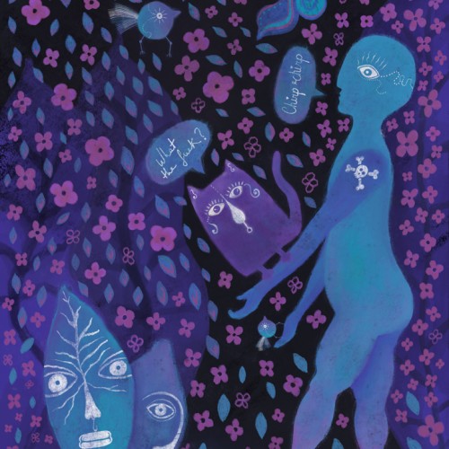
These illustrations are part of an ongoing series on anxiety I started in early April 2018, as part of #The100DayProject. (See @helloanxiety_illustrated on Instagram to see more complete stories of each individual). This project is an extension of the fear illustrations I've been creating since 2012 (www.fear-illustrated).
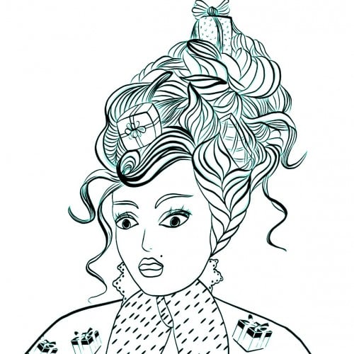
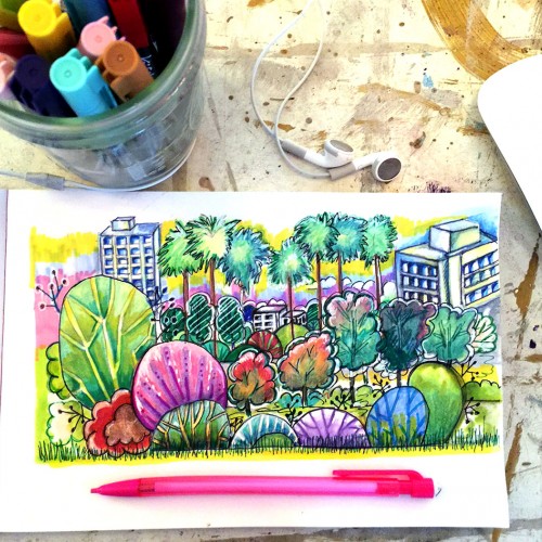
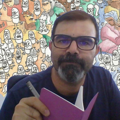
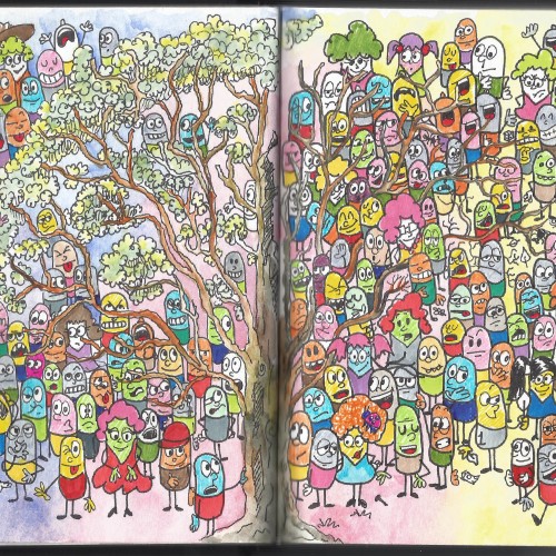
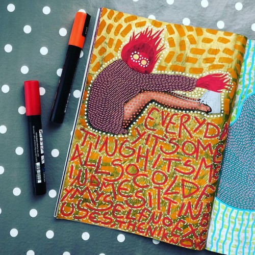
This is one of my daily contributes to the 100 days project. I am doodling over a fashion magazine and documenting my journey on Instagram. Anyone of you are participating to this challenge?
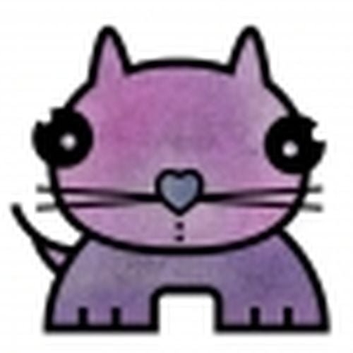
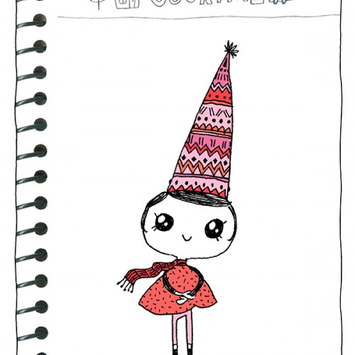
This is the first little 'Thumbodies' character that I designed during the holidays. She has many other kind, creative & adventurous friends! Online comic & doodles @ doodletowncomic.com