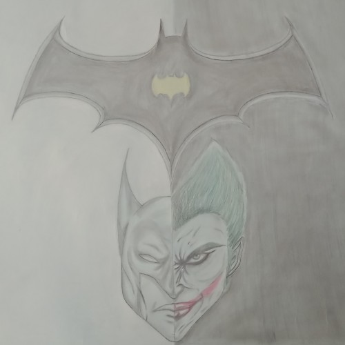
A couple of months ago, my English teacher asked us to make a film review of any type of film. So, we picked up this one. Then, I tried to make a poster for the film using a pencil and some colors. I hope you enjoy it....
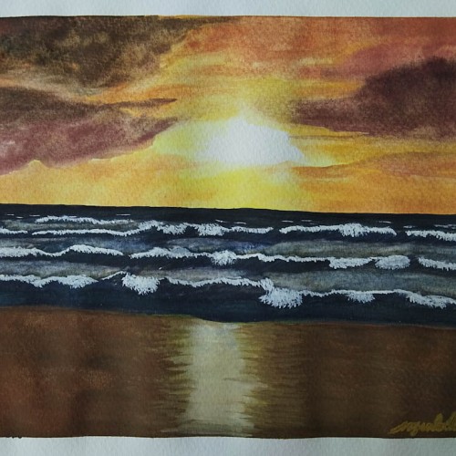
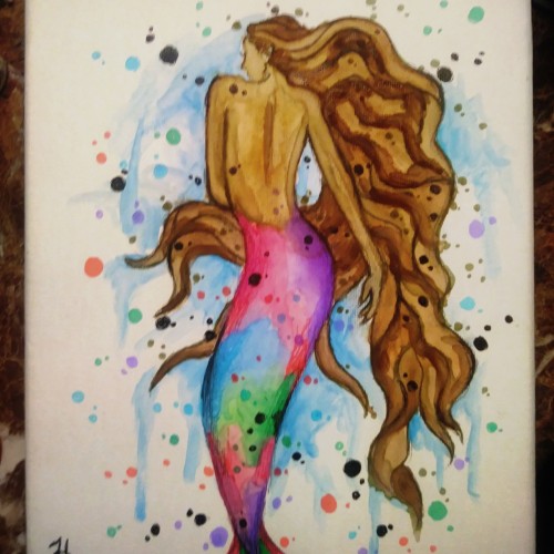
It was the first time I tried using a Fabriano 200 gsm cold pressed watercolor paper. And I had learned different techniques in watercolors through the process of creating this painting. It was also fun painting the waves. Thank you, Maria Raczynska.
One of my favorite pieces I did for Inktober a couple of years ago. The prompt was juicy. I went with an NBC Hannibal aesthetic. You would not believe how much fun I had coloring those pomegranates.
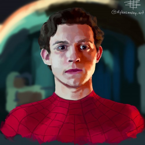
A few weeks ago I was playing around with color application on the default flat brush in Procreate, and developed a sort of choppy, layered application that I really enjoyed!
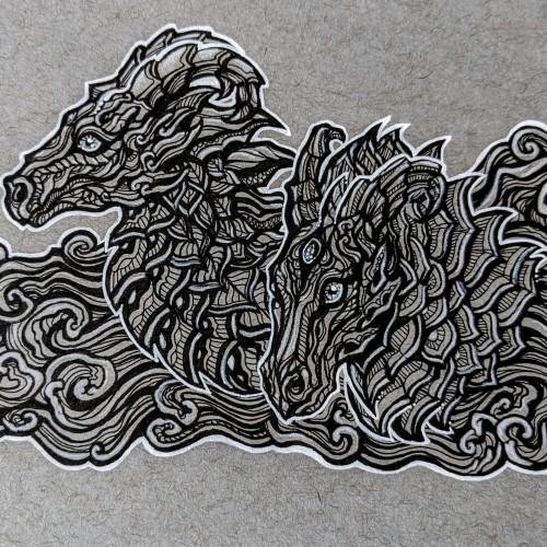
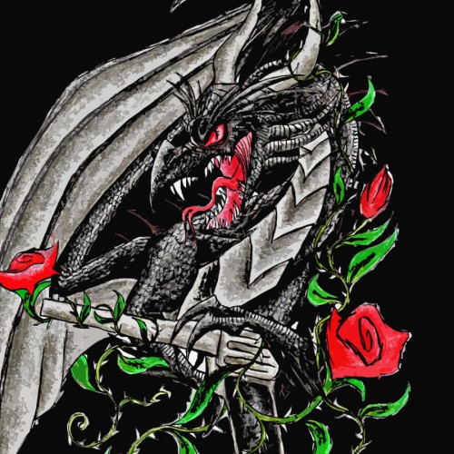
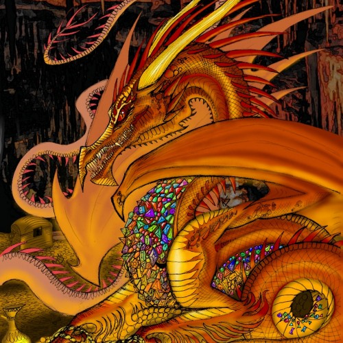
My vision of the character ‘Smaug’ from J.R.R. Tolkien’s ‘The Hobbit’.
Pencil sketch, coloured digitally on IbisPaint X.
Here is a passage from The Hobbit describing Smaug’s appearance: “There he lay, a vast red-golden dragon, fast asleep; thrumming came from his jaws and nostrils, and wisps of smoke, but his fires were low in slumber. Beneath him, under all his limbs and his huge coiled tail, and about him on all sides stretching away across the unseen floors, lay countless piles of precious things, gold wrought and unwrought, gems and jewels, and silver red-stained in the ruddy light. Smaug lay, with wings folded like an immeasurable bat, turned partly on one side, so that the hobbit could see his underparts and his long pale belly crusted with gems and fragments of gold from his long lying on his costly bed.”