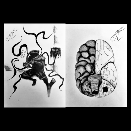
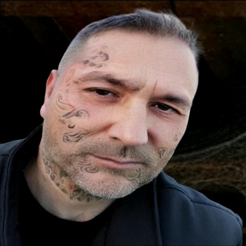
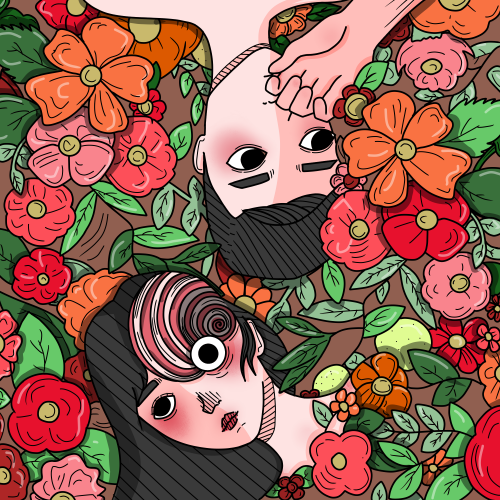
This piece critiques the modern tendency to hide identity behind brands and consumerism.
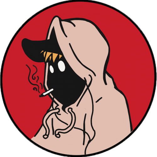
* Visual Focus: The mask is partially obscured by a fitted baseball cap, with the bill pulled down to cover one eye. The cap itself is a symbol of brand identity and fast-fashion culture. The uncovered eye retains an unsettling, almost mechanical gaze.
* Symbolism:
* The Cap: Represents the societal practice of hiding behind brands and allowing consumerism to dictate self-worth and block out unwanted truths. The act of seeing is deliberately curtailed.
* The Mask: Emphasizes that the consumer identity is often a façade-a manufactured mask that prevents others from truly
"seeing" the individual, while simultaneously restricting the individual's full sight of the world.
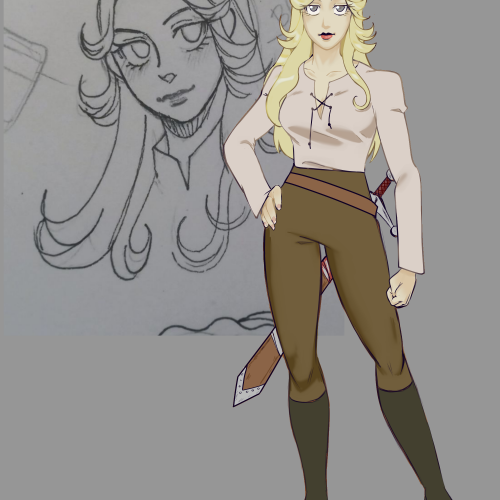
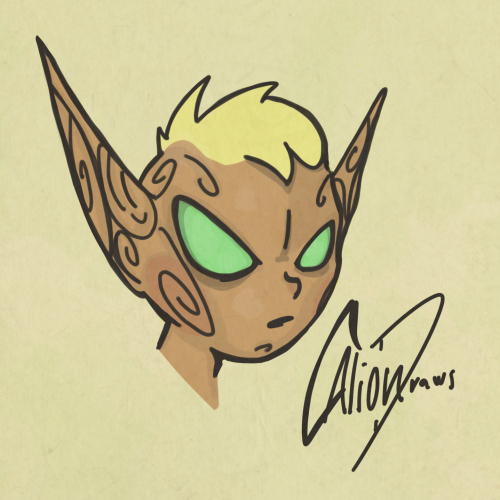
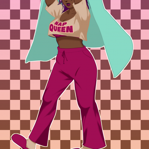
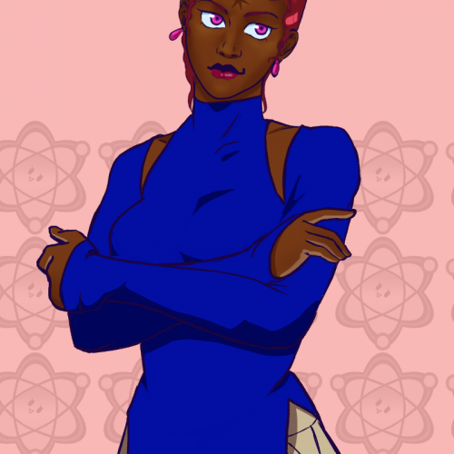
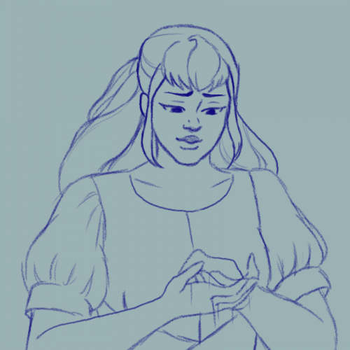
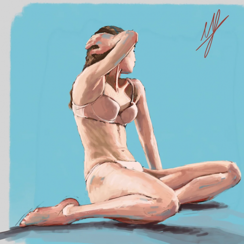
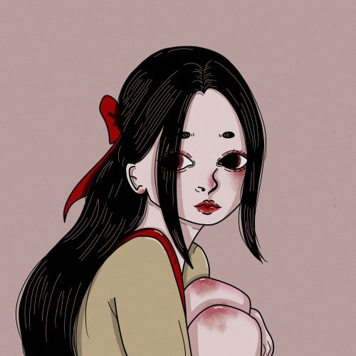
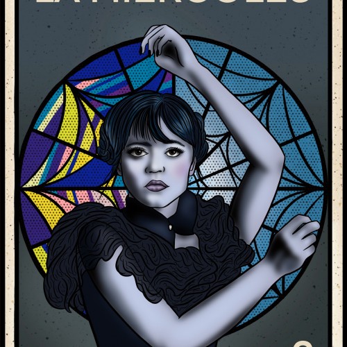
I forgot to post it here. I got better at drawing her. I tried a more '80s anime style recently but will keep at this style since that's how I draw. I love her even though she's not intended to be a main character
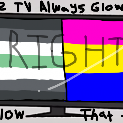
Anyone is welcome to post their own version of this expressing their unique identity, in fact i highly encourage it
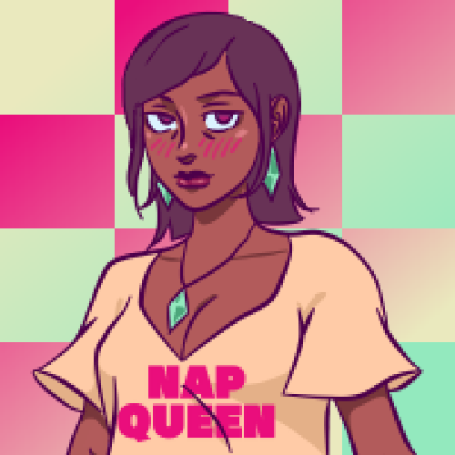
I saw a lot of people posting this on other platforms and wanted to post my own version
This "trend" I guess you could call it, came from the movie "I saw the TV glow". Which is a movie that's a metaphor for trans identities and other queer identities.
3 of 5, She's a witch character I revived. I scrapped her as an MC because her old designs were too hard to replicate and her character background took over the story I wanted her in. She has a seven-pointed star on her forehead that glows when using and detecting magic.
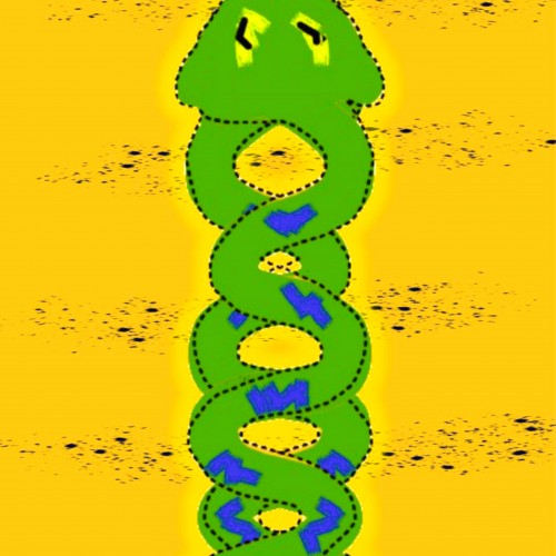
"This digital artwork represents two snakes coiled in a helix, symbolizing the indissoluble union between physical and mystical life. The intertwined shapes evoke the structure of DNA, reflecting the fusion of science and spirituality and inviting reflection on how these dimensions are woven into the fabric of life."
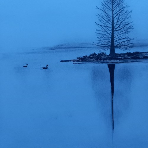
(Done on 110gsm acid free sketch paper. Trees,ducks,land dine with sankura micron pen. All the blurry things done with hints of hard charcoal pencil)
Serenity... the lighting outside seemed to be playful today due to misty weather. Hence this outcome.
I swear i didn't use any filter
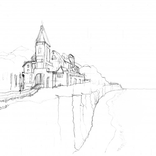
This is a scanned pencil sketch of a picture that I still want to work out. The whole thing is supposed to be a kind of fantasy landscape. The castle depicted does not have to be historically correct either. I will try to work it out in Procreate. It's a great programme, but unfortunately I'm not yet as proficient as I'd like to be ... As soon as there's any progress, I'll post it here!
Regards
Christian
Lois's last book: "The style of Loish. Finding an artistic voice." is just AMAZING! It's:
- inspiring,
- full of tips on how to start searching own style,
- full of Lois's thoughts and experiences on her way to finding the artistic voice.
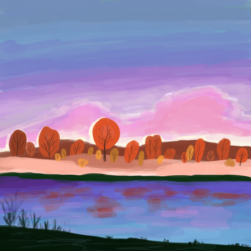
So I wanted to try something new in my digital art journey. I experimented with new techniques. I tried to use a brush type that gives a transparency effect.
I chose one picture from Loish's book as a reference.
And here it is - a colorful landscape.
Thank you, Lois, for creating and sharing your phenomenal and inspiring art!