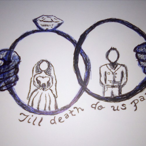
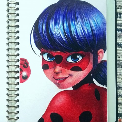
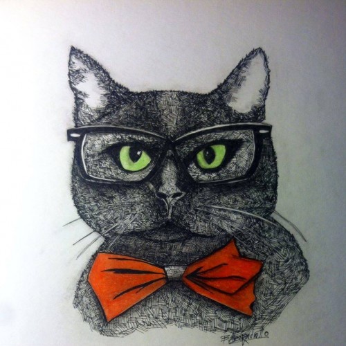
I am a huge fan of this show! The drawing is done with ballpointpens and the skin colour looks a bit strange since I only had a red, blue, black, pink, purple and green pen. Thank you very much for looking at my drawing!!
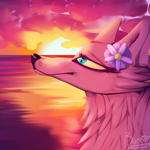
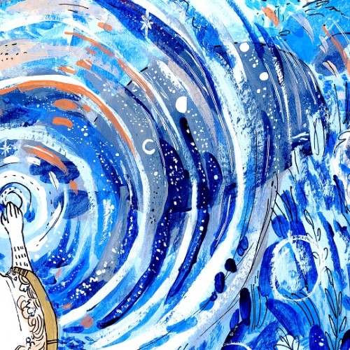
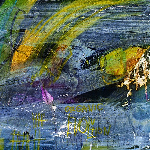
My project for a skillshare course I am taking. I am trying to work on developing more textures and drama to my paintings as well as improving on the composition. Any advice or tips that you can share would be appreciated. Thanks!
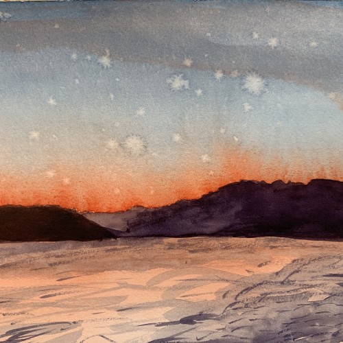
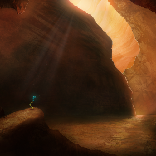
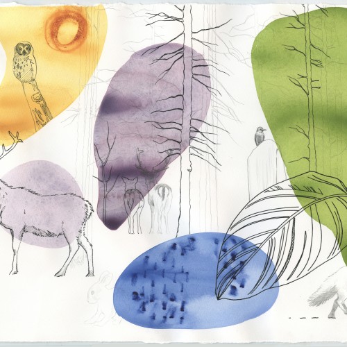
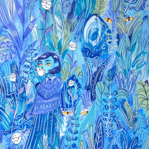
Painted as a project for Painting Environments class: skl.sh/32Khrti
Project parameters:
- Mysterious Cave
- Dark but with moody lighting
- Mostly warm colors but with single blue flower
- Flower is the focal point - use composition to lead eye to flower
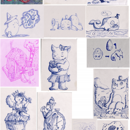
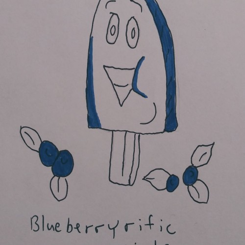
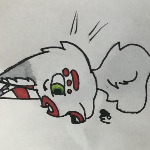
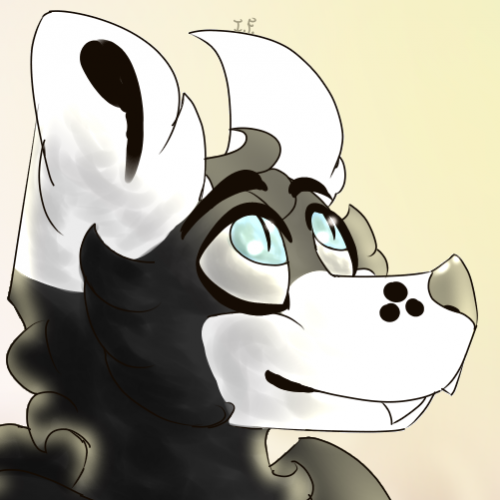
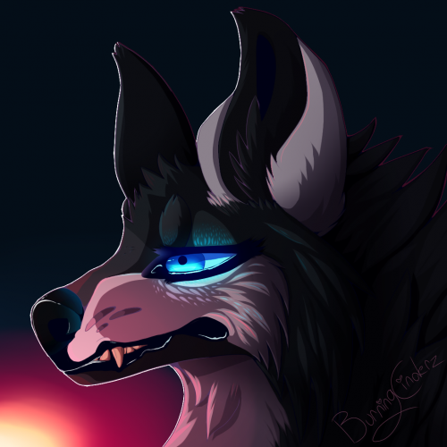
It's Fang! I feel like I should plop down more drawings of my fursona because I do go by his name (and he's my fursona, so, duh) So I'll show a bit of art with him in it! "He Dropped His Ice-Cream" a sad art!
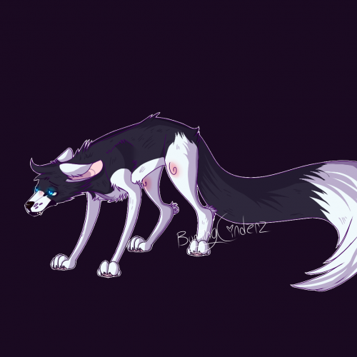
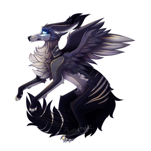
Hey, something that ISN'T a fox! ...Kinda. This is a fox-like canine with wings, not sure what to exactly call their species yet. I'm pretty proud of her design. c:
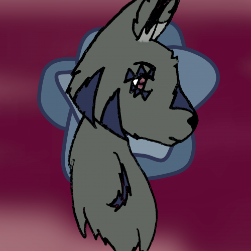
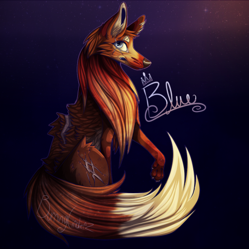
ANOTHER fox design, his name is Blue. Not so proud of this one, as the snout looks quite bulky (for a fox) and the eye is shaded awkwardly. But, you learn from your mistakes. :)
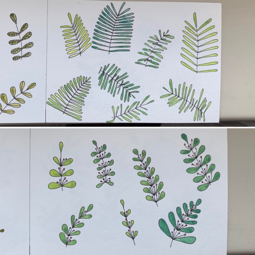
This time, again, two combinations. I believe the hues are very nice and calming. I used yellow ochre as the yellow color (PY 43, PY 1). On the upper part, the cobalt blue (PB 28) is used, on the lower part - it's ultramarine (PB 29).
Again, mixing some colors to get greens: 1) cobalt blue (PB 28) plus cadmium lemon (PY 35); 2) ultramarine (PB 28) and cadmium yellow. Didn’t see much difference. In the first case there seem to be more hues, though. Funny, cadmium yellow medium and cadmium lemon have the same label: PY 35
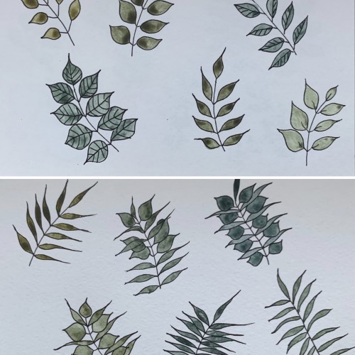
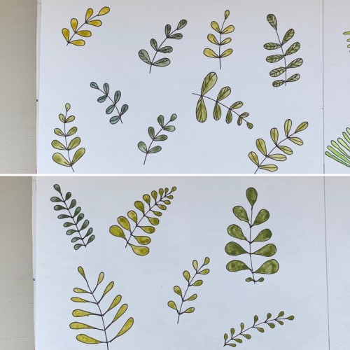
For some reason I tried some floral drawings, of different shapes, and I also used mixtures of different colors to produce hues of green. The first page - it’s a mix of the cobalt blue (PB 28) and cadmium yellow medium (PY 35). On the second one there is ultramarine (PB 29) for the blue color and the same yellow paint. To me, it seems the difference is very little but I’ve got the color closest to the ‘normal’ green using Cobalt rather than ultramarines. The latter gave either to yellowish to olive hues or too blueysh