My first serious project - logo and mascot for Apapers.com service. Done in cold blue pallet. The main character - letter A is supposed to bring more life and a sense of adventure and curiosity to the serious service and give customers, especially students, a sense of empathy and general good spirit about Apapers
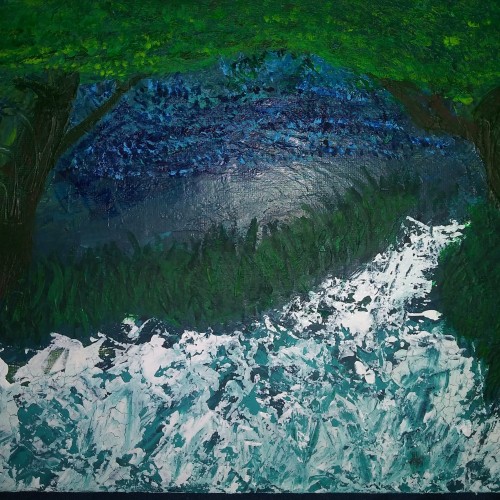
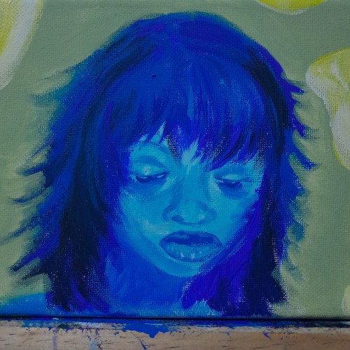
Its funny because this was my first painting and looked very different. Just a bunch of green and a little sky blue blended in that looked like nothing to me. I ultimately gave up on it but revisited it about 2-3 weeks later and turned it into a night sky with rushing water flowing through two trees into a forest. I used a palette knife for most of it which was new for me as well ^^ hope you like. Debating on touching it up a bit...
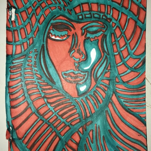
Scans of my old school gel pen on construction paper early loops works. The green and blue are straight up scans. The others are playing around with mirroring and adding effects in Photoshop to scans of drawn works.
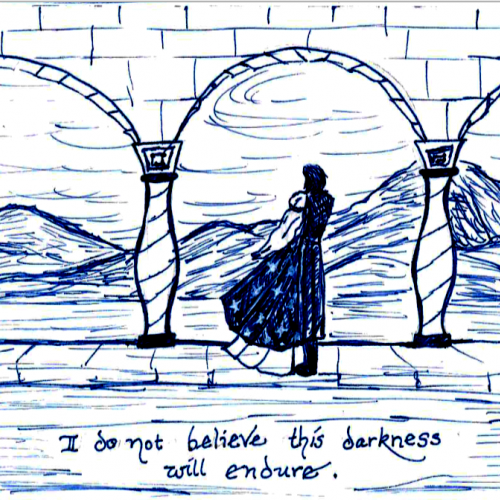
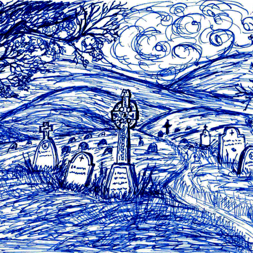
Inktober Prompt: RIP (I suspect that it was rip=tear, but since Halloween is just around the corner, Rest In Peace seemed a timely prompt :-) Shaeffer Tuckaway fountain pen, Hero blue black ink
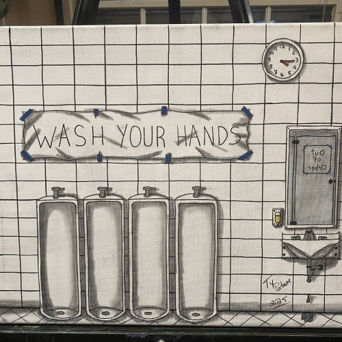
In this memory-driven piece, Patmore reconstructs the bathroom from his third-grade elementary school, capturing the sterile brightness, the tiled repetition, and the institutional reminder to “WASH YOUR HANDS.”
But the scene is not pristine — a leaky sink, an out-of-order stall, and a taped-up sign reveal the quiet decay behind childhood places we assume were orderly and safe.
Patmore blends nostalgia with unease, transforming a simple restroom into a study of what it means to grow up: how the lessons we learn early (“hygiene,” discipline, responsibility) stay with us even after the walls begin to crack. The small pop of blue tape emphasizes the DIY fragility of rules meant to guide us.
This piece stands at the intersection of memory and maintenance — of spaces, of bodies, and of ourselves.
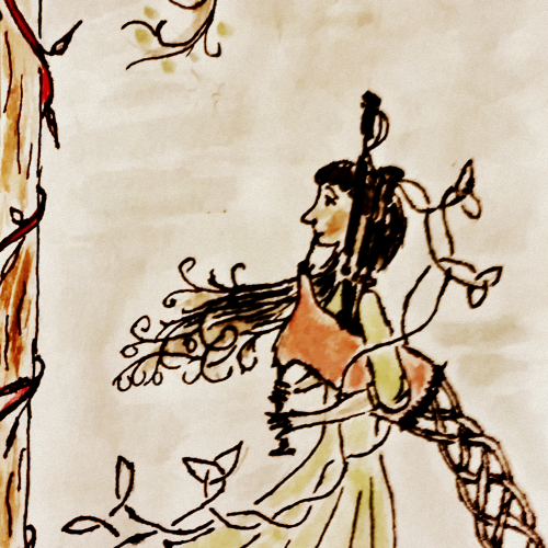
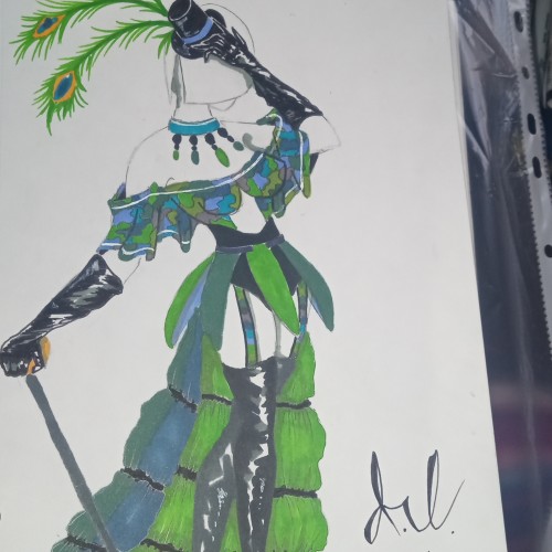
It has been a while since I last felt that I had a good day. Got myself together to draw, and the first thing that came into mind was to continue this character design project.
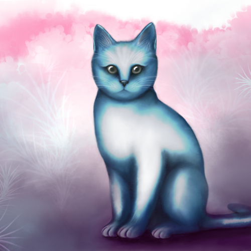
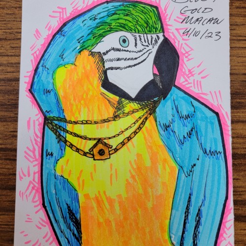
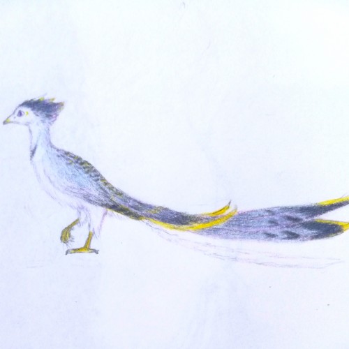
Tried a mix between shades of grey, pale blue, with a tint of purple. Overall, the practice in drawing bird anatomy is slowly getting there. But yea... This is not a Blue Jay... I might have went a little too blue.
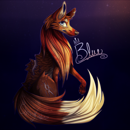
ANOTHER fox design, his name is Blue. Not so proud of this one, as the snout looks quite bulky (for a fox) and the eye is shaded awkwardly. But, you learn from your mistakes. :)