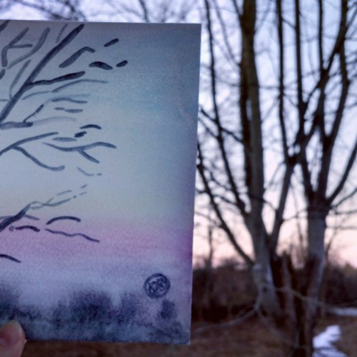
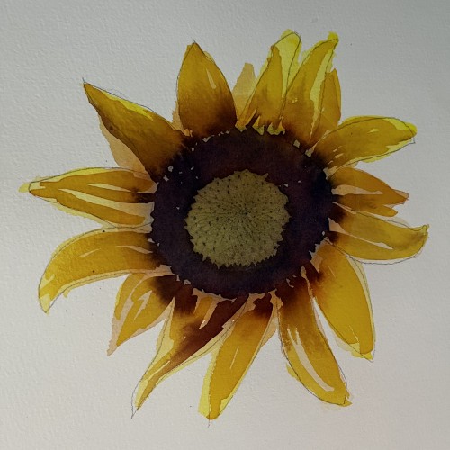
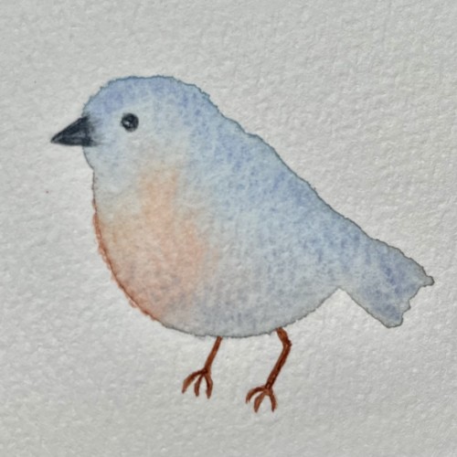
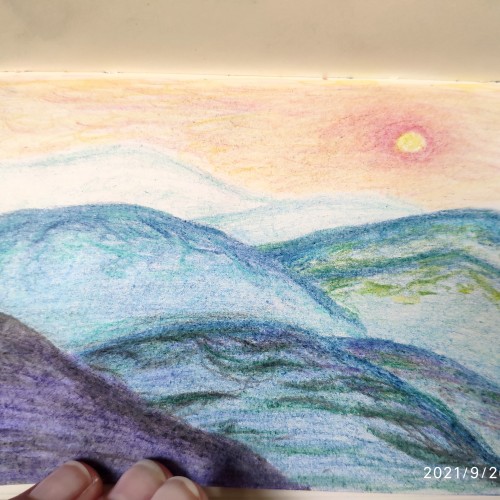
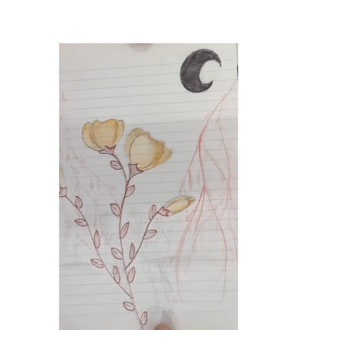
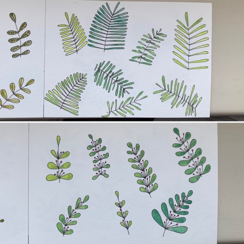
Had fun trying to capture this. Someday I'll figure out how to get the watercolor gradient I want. Meanwhile this was a fun way to practice and I freaking love these Daniel Smith watercolors. I definitely need to get some full tubes of certain colors. (Moonflower, Lunar Violet, Opera Pink, Cerulean Blue, all the Cobalts, i think all the Primateks - I haven't tried them all yet... *Sigh*)
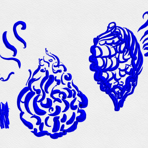
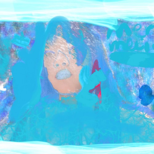
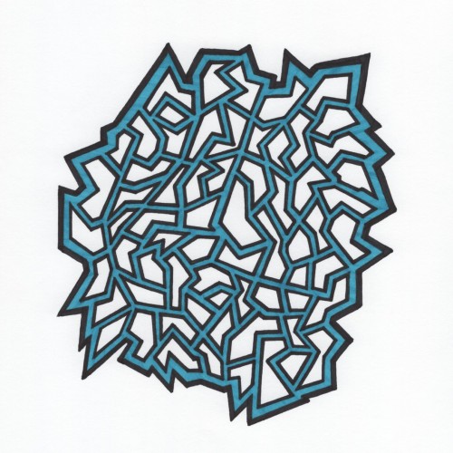
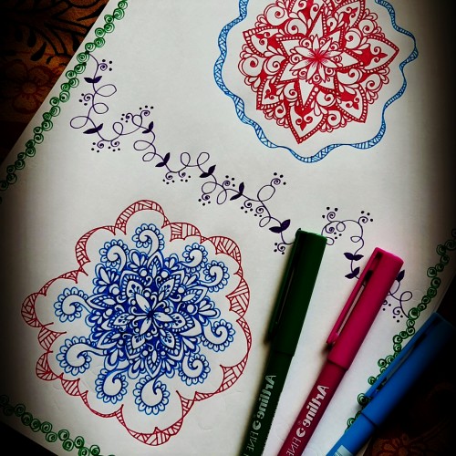
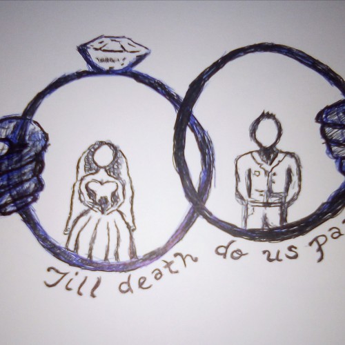
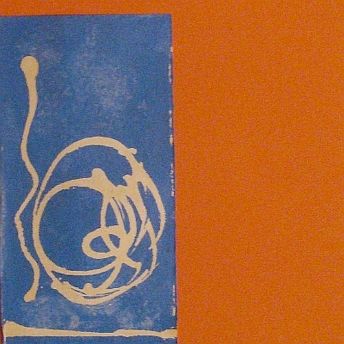
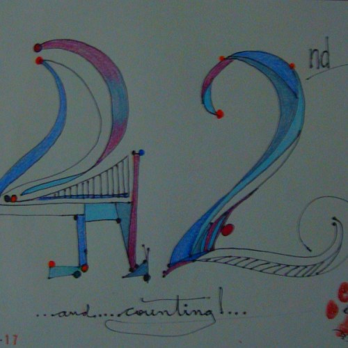
Ink on ultra white background highlighted in blue. Inspired by the challenges in life and compartmentalization of each challenge to better manage them all.
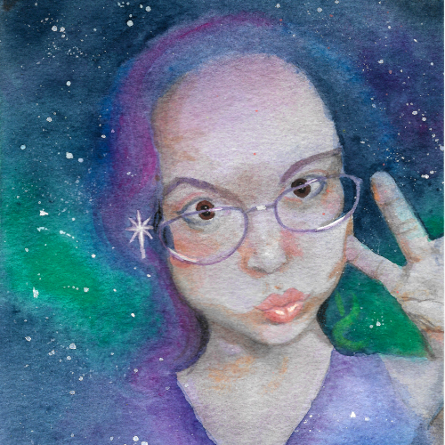
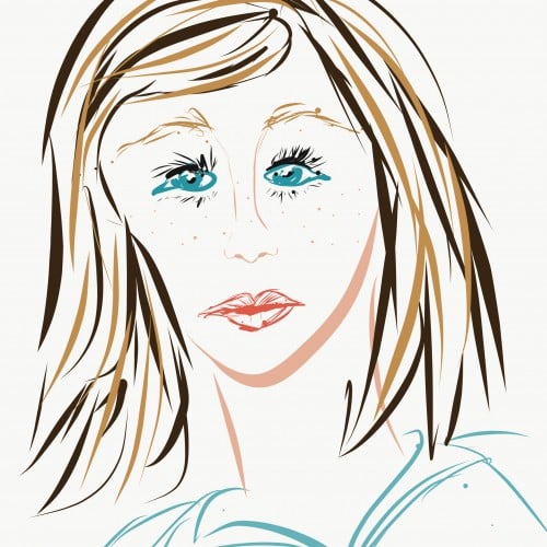
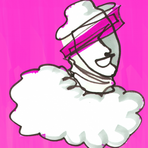
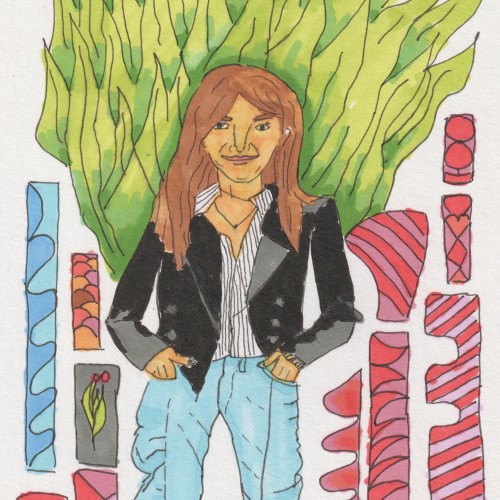
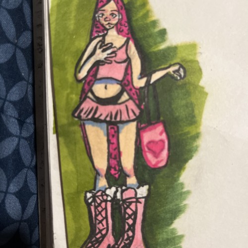
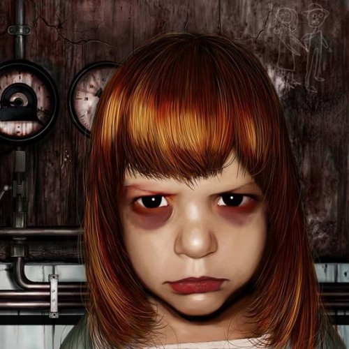
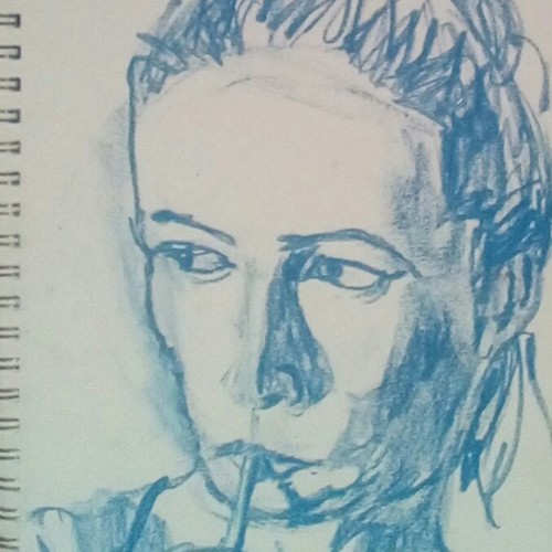
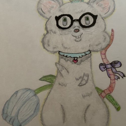
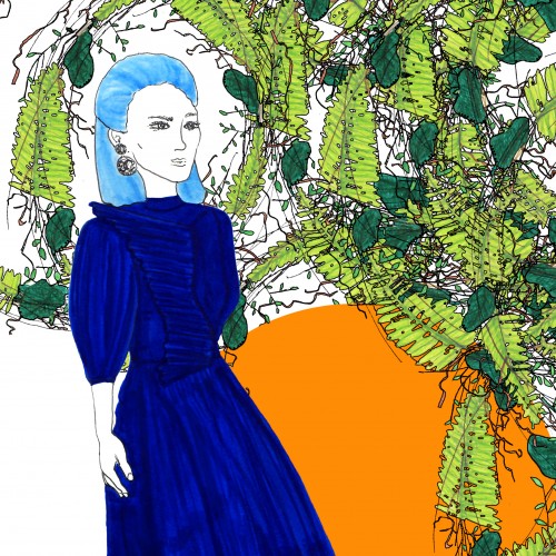
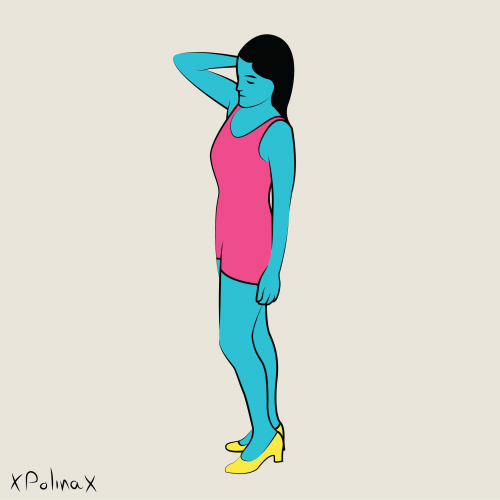
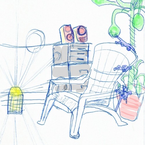
It’s messy, but i’m trying to do new things in my sketchbook and not worry about how “good” it looks. Im trying out new hair styles/looks and i’m working on a medium i don’t use a lot anymore (markers). I also decided to start shading using a blue and i think i really like that and will do it more often.
"When Desiderio mentioned Bluesky to me, he used the oxymoron beauty and fragility and here I was immediately reminded of the essay of the same name by Daniel Mendelsohn.
This immediately brought to mind Daniel Mendelsohn's essay of the same name, which in turn was taken from a scene caption in Tennessee Williams' The Glass Zoo." Chiara Canali
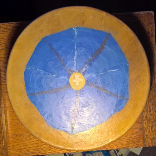
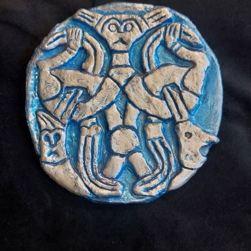
Oseberg Style Norse Wall Plaque. Silver gilding on lustrous blue. Typically animalistic faces in grotesque grins in order to protect individual or household.
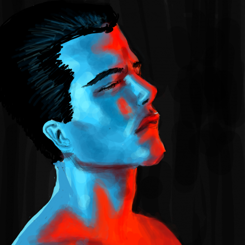
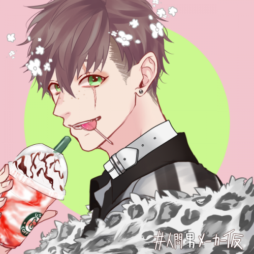
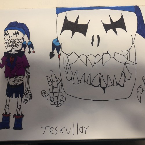
We had to do a technique named 'analogous colour', and the colours that I chose to make this are: red, blue and purple (of varying shades). This character is a villain that I made up for a game that I also made up, hope he seems appealing.
Again, mixing some colors to get greens: 1) cobalt blue (PB 28) plus cadmium lemon (PY 35); 2) ultramarine (PB 28) and cadmium yellow. Didn’t see much difference. In the first case there seem to be more hues, though. Funny, cadmium yellow medium and cadmium lemon have the same label: PY 35