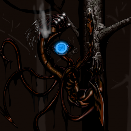
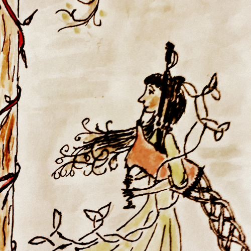
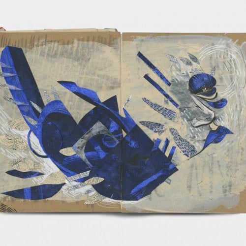
My half of the art trade with OptimisticJerk (https://www.deviantart.com/optimisticjerk). The trade was to draw a monster as made up by your counterpart without seeing a reference image, based only on the description. Here is her half (which is awesome): www.deviantart.com/optimisticj…
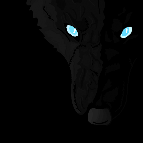
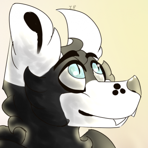
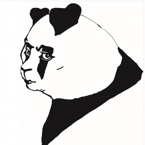
For mine, I had to draw a monster called a "niter" based off of his description:
"Niters communicate in whispers. Nocturnal. Shy away from light. They’re black and oily and emanate a bluish glow. Large, looming 6 foot shadow things with massive hind legs, clawed for climbing trees and they have ‘maws’ instead of arms, claw-like appendages they stab people with and only one gaping blue eye. Their mouths open up and they swallow their victims whole."
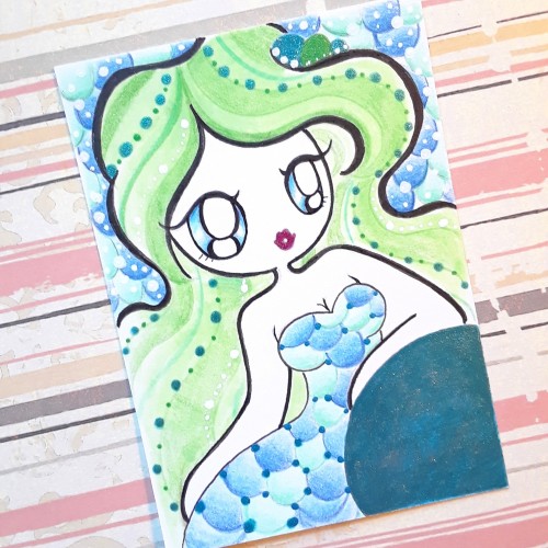
What's funny is that I didn't see the fact that they emanate a bluish glow until now. So, the glow from the eye is purely by coincidence. Figuring out the hind legs of this creature was difficult, and so I sought reference images, and of all things, the koala turned out to be a pretty good reference.
For a while, there, it was looking like Carnage from Spiderman, but I toned down the reddish-hue a bit. The intention was to give the appearance of motor oil.
So, now to find out how badly I failed at drawing this...
This art trade was fun, though, and I would do a similar one, again. But I am le tired.
My first serious project - logo and mascot for Apapers.com service. Done in cold blue pallet. The main character - letter A is supposed to bring more life and a sense of adventure and curiosity to the serious service and give customers, especially students, a sense of empathy and general good spirit about Apapers
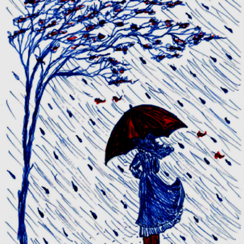
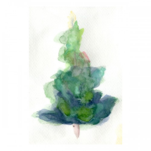
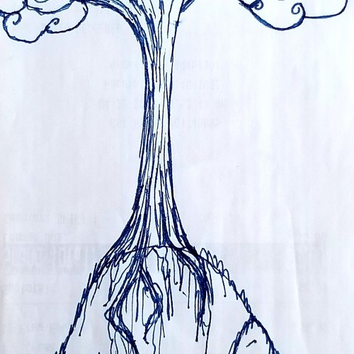
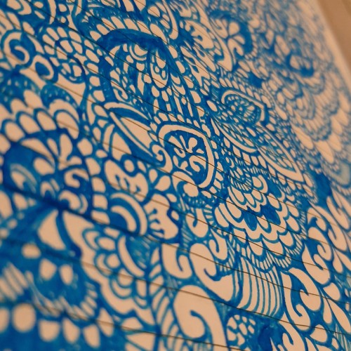
Used a blue pen this time....wanted to add a little coloure. Just trying out a different look for my trees...i kinda like it. Tell me what you think! I would greatly appreciate any feedback on my art, comments, tips, etc.
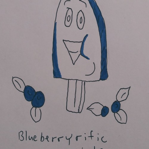
It's Fang! I feel like I should plop down more drawings of my fursona because I do go by his name (and he's my fursona, so, duh) So I'll show a bit of art with him in it! "He Dropped His Ice-Cream" a sad art!
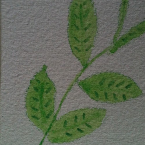
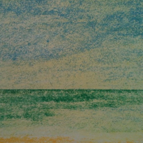
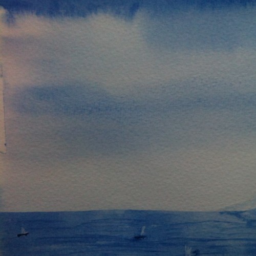
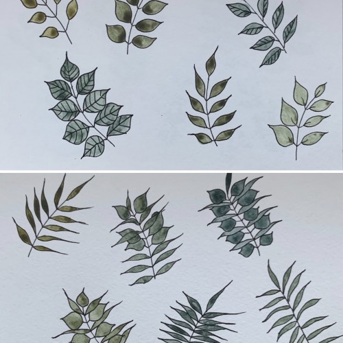
This time, again, two combinations. I believe the hues are very nice and calming. I used yellow ochre as the yellow color (PY 43, PY 1). On the upper part, the cobalt blue (PB 28) is used, on the lower part - it's ultramarine (PB 29).
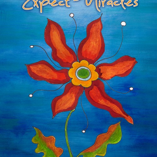
I created this card for someone to bring to a Law of Attraction event. I drew the flower, came up with the phrase, and then set the type. The blue background is iStock.
Connect with Nobody Support Art:
www.instagram.com/martin_balsam
www.twitter.com/martin_balsam
www.facebook.com/needmoney4artsupplies
www.needmoney4artsupplies.myportfolio.com