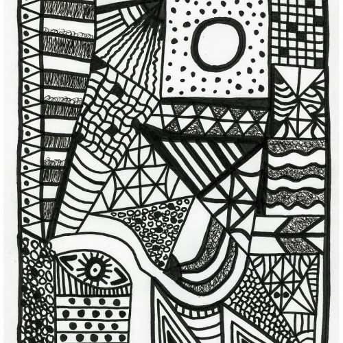
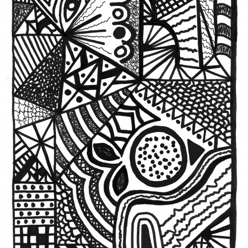
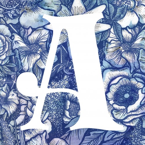
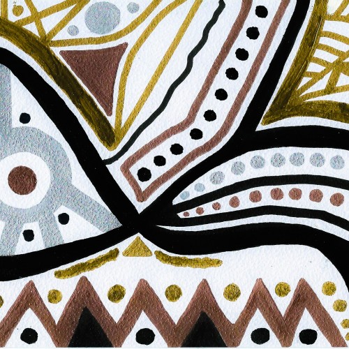
This 11" x 14" bold, dynamic, geometric abstract makes a unique statement. Lines and curves, angles and shapes in stark black and white convey the arbitrary, yet methodical . . . random, yet systematic nature of the universe . . . and our lives.
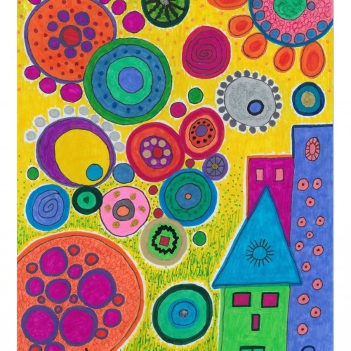
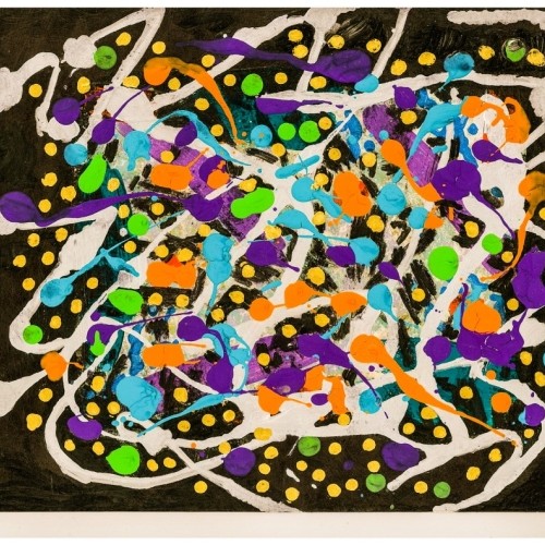
Against a vibrant yellow sky, the boldly colored, circular shapes suggest a multitude of orbs, each with its own unique style and design, floating across the vast universe.
This 11" x 14" bold, dynamic, geometric abstract makes a unique statement. Lines and curves, angles and shapes in stark black and white convey the arbitrary, yet methodical . . . random, yet systematic nature of the universe . . . and our lives.
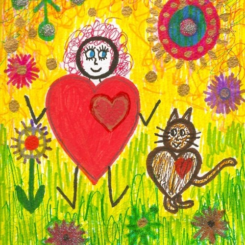
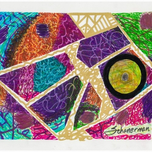
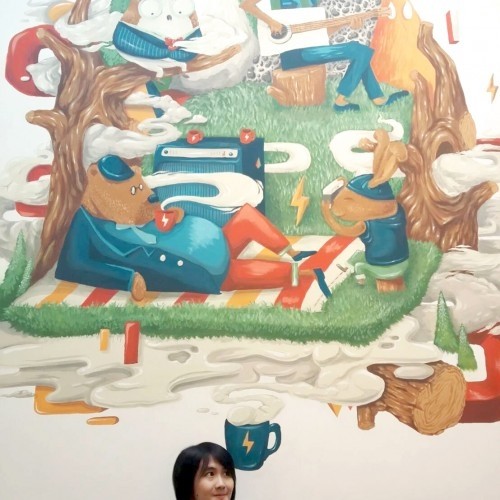
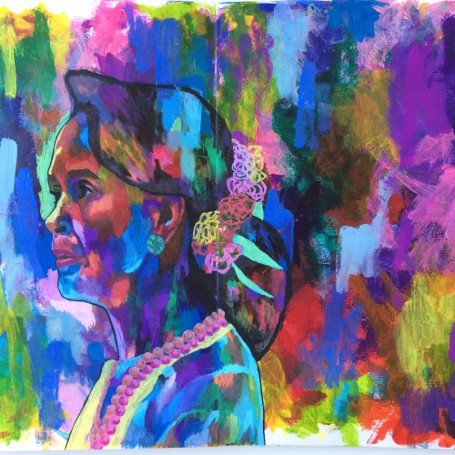
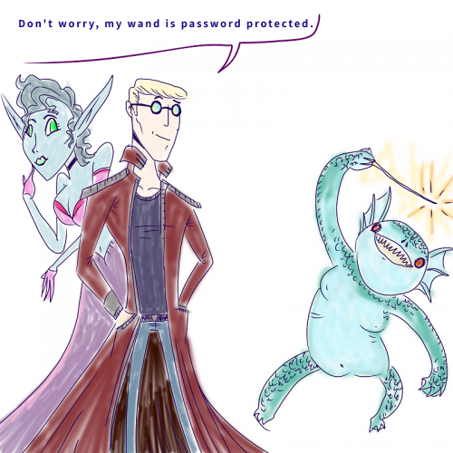
First post on here and I didn't mean for it to be political! But this is probably one of the pieces that I'm most proud of in their use of bold colours. And I've not really been able to recreate it since.
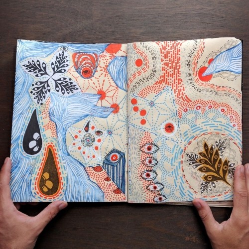
My first venture into artist grade colouring pencils - and I'm smitten! I never thought I could achieve such boldness and blendability with them! I'm still getting used to them and will think about choosing smoother paper with less tooth next time. The texture and weight was more for the water-based gouache along with alcohol inks (which are very unforgiving to even primed heavy paper!). Apologies for the unevenness of lighting between the 2 sides of paper; will correct that when I'm making proper image files.
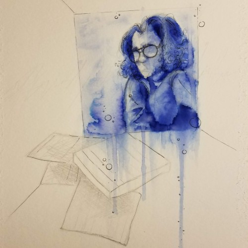
Chromatography is used in chemistry to dissolve a mixture and place it into a "mobile phase," which allows the solvent to carry it and its components up the paper. It shows the layers, exposing deeper, hidden tones and colors, something only seen when a solvent of the same polarity is used. It's odd. Life feels a bit like that, and I'm seeing the colors separate for the first time. It's all there, everything that's been hidden in the inky mess for the past however many years. And now it's smeared. Bold. Clear. But blurry. What's on me and what's on you? Where do we go from here?
The Queer Old Man is a solid wood puppet head created more than 50 years ago if not more. The eyes of the character are a radiant blue and the carved structure of the face is expressive and bold.
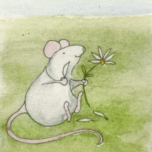
This is an ATC-sized (3 1/2” x 2 1/2”) watercolor. I’m practicing bolder strokes with heavier pigment. Big departure from my usual uber careful strokes
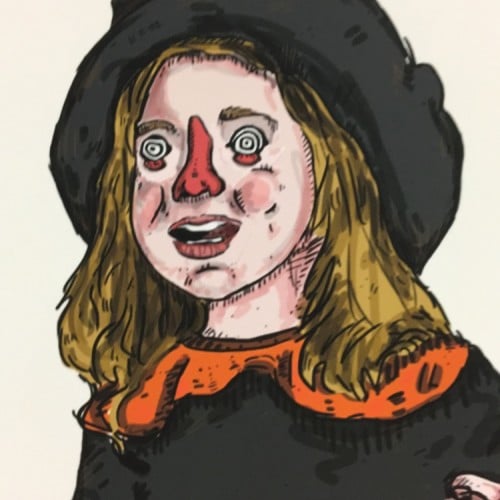
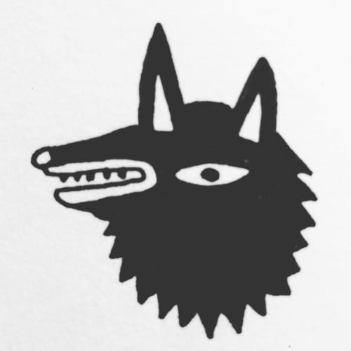
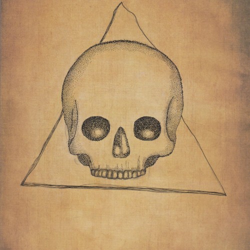
This is was more of an experiment as I wanted to see what black ink would like on paper with an "aged" like background. I think it came out quite nicely but I also think that the black ink might seem a bit too bold. I'm not really sure.
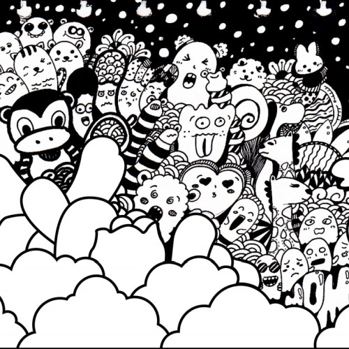
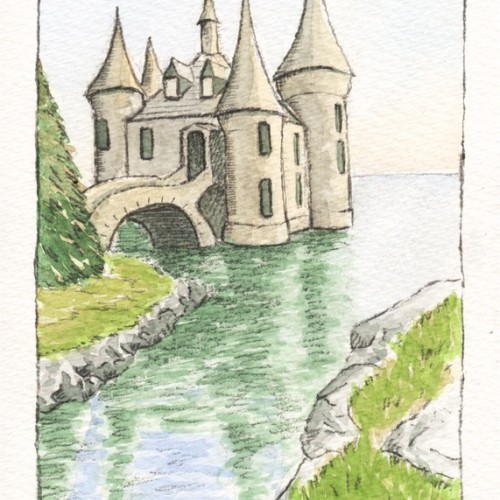
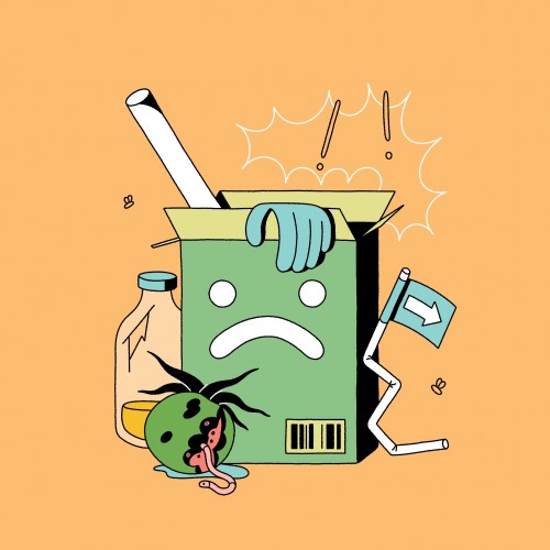
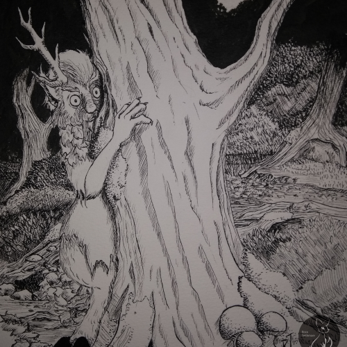
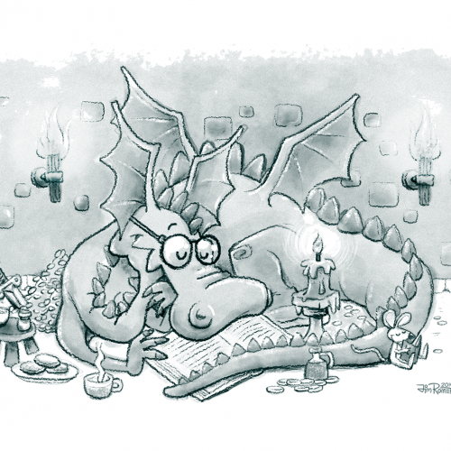
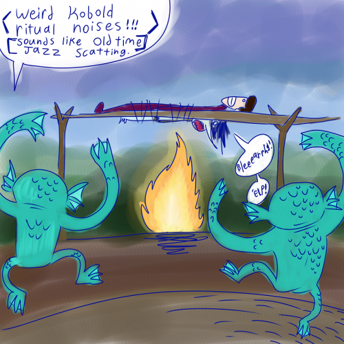
UPDATE: I was working on this illustration a while back, but I had no spare time and had to put it aside. The composition was too busy, but now I think it looks a little better. I made a few major changes, like:
• Made adjustments to light sources
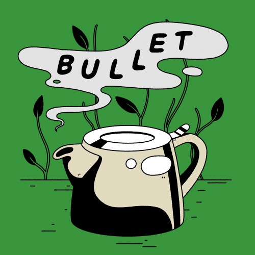
• Created bolder outlines
• Got rid of the Knight reading over the dragon's shoulder