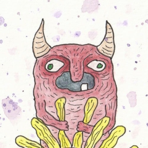
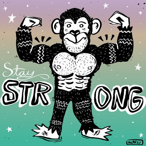
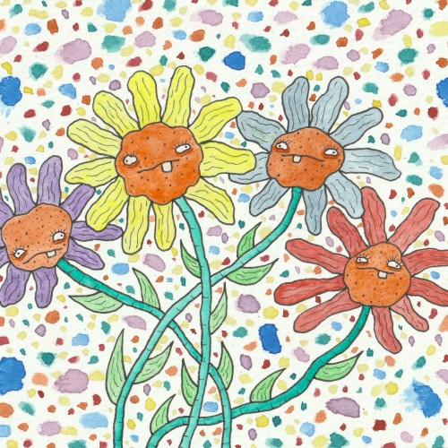
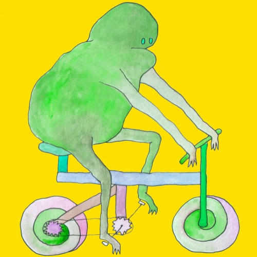
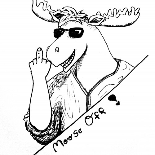
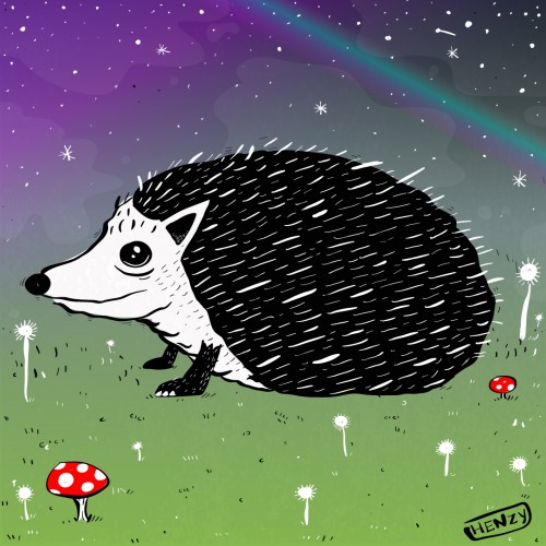
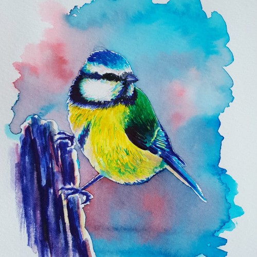
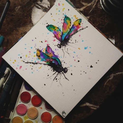
I really liked the style that I used for one of the most recent labels I did for @abominationbrewingco and @snitzcreekbrewery so I decided to mess with it a bit more. Just a quick thing. I want to draw more animals in this style. This is for me, and my wife, and my daughter. Stay strong. This is for everyone. This is for you. Stay strong. No matter what you do on a day to day basis or what you go through. You are a strong person.
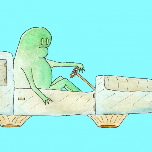
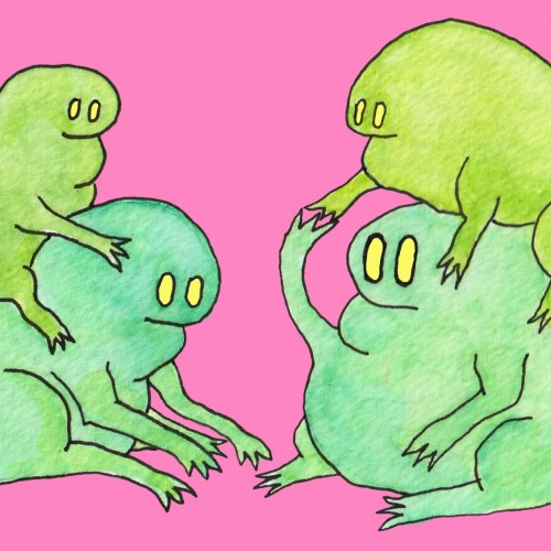
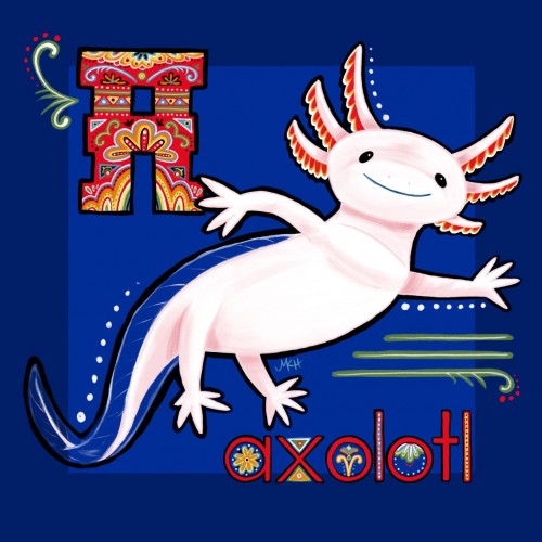
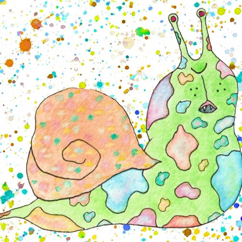
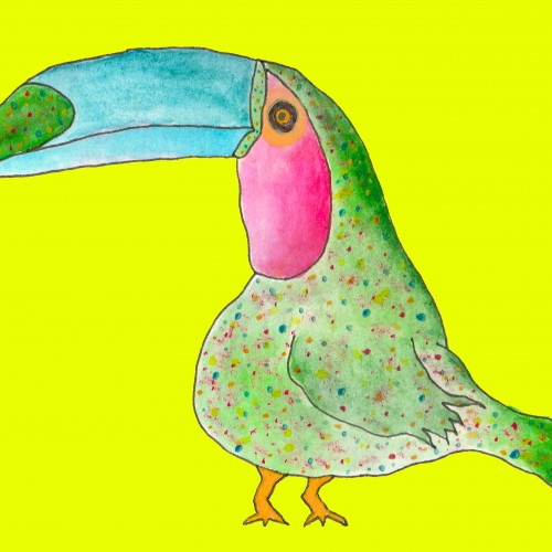
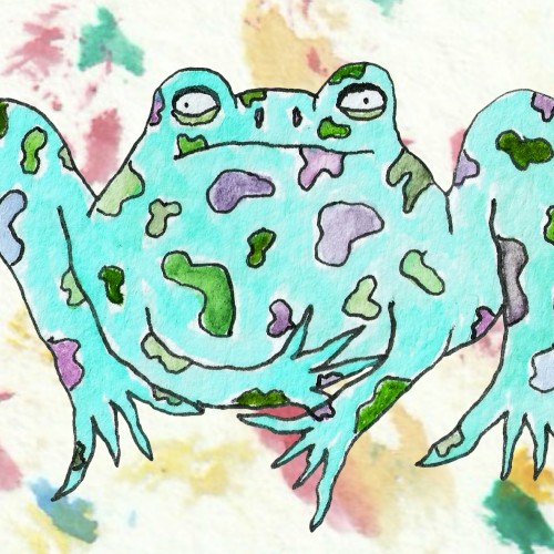
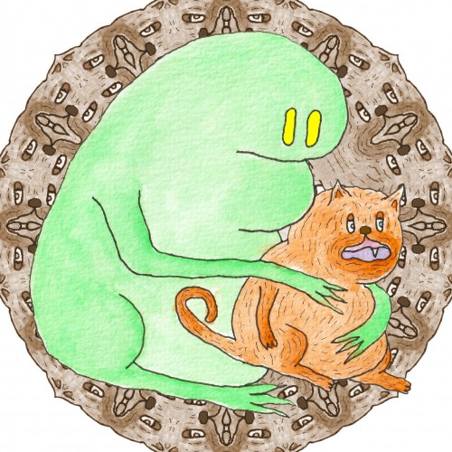
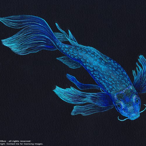
Part of a personal project I'm working on right now, to experiment with new art styles and practice lettering skills by drawing animals. The color palette and symmetrical motifs in this one were inspired by the boats on Lake Xochimilco in Mexico, which is the last remaining place wild axolotls live.
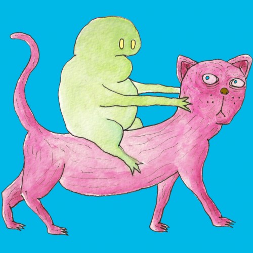
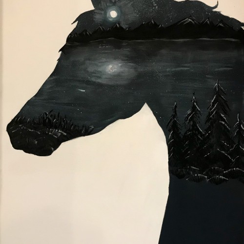
This is my most recent work, just finished. I really had a lot of fun with this one. It didn’t turn out as colorful as I hoped but the contrast is spot on. If you’d like to give me a suggesting, i’m still trying to decide if i should fill the lower right chest area of the horse. It doesn’t make sense to leave it blank but i’m afraid changing it might ruin what I have. Any opinion is welcome! :)