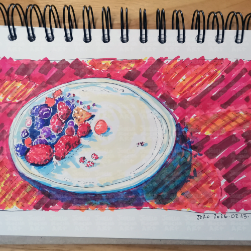
A vibrant fruit bowl filled with a variety of colorful mix of red fruits like strawberries, blueberries, and raspberries. The bright, bold colors create a striking contrast against the background.
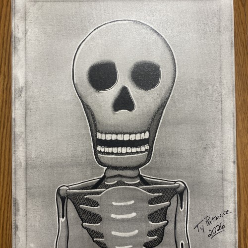
Stripped of skin, status, and story, what remains is the truth beneath it all. Bone Deep is a minimalist skeletal portrait rendered in graphite and ink on canvas, built through cross-hatching, stark contrast, and deliberate restraint. The exaggerated skull and hollow eyes confront the viewer directly — not with fear, but with inevitability.
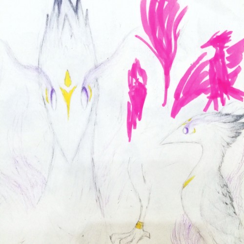
Continuing to consolidate the colour profile of the White Bird. Even if the photo fails to capture it, those pale shades are actually a sophisticated mixture of grey, sky blue, pink, and purple shades, managed with eraser and finished with white.
Have been working on my ability to manage lighting, softening the shades and contrasts. Colouring white things are actually not easy, because you will notice all the minute colouring differences much more easily.
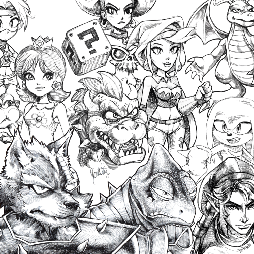
#28 - A collection of ballpoint pen sketches drawn on printer paper & scanned. This is what my lines look like when I'm not using a stabilizer in digital software to get the nicest clean lines. I tried to separate my scanned lines from the various shades of off-white that the scanner picked up. I adjusted the brightness and contrast levels in photoshop but I'm not very knowledgeable on how to achieve the best results.
A solitary rowboat drifts across a muted, restless surface, unanchored and unattended. Rendered in charcoal, ink, and subtle white highlights, the vessel exists in a quiet state of motion—moving, yet going nowhere. The surrounding water is suggested through loose, rhythmic lines, emphasizing atmosphere and isolation over realism.
The boat is sharply defined against the hazy background, its dark contours and interior shadows contrasting with the soft, unsettled environment. Oars rest unevenly, implying recent human presence while reinforcing absence. The name Perditas—Latin for “lost”—is affixed to the hull, anchoring the emotional weight of the piece without explanation.
This work explores themes of solitude, uncertainty, and endurance. With no shoreline or destination in sight, Perditas becomes a reflection on drifting—physically, mentally, and emotionally—inviting the viewer to confront their own sense of direction within an undefined space.
Who hasn't, at least once in their lifetime, fly towards something that seemed reachable?
“With the background, being unity, contrast. Like Venus in the morning”
~Golgaaryol, 2025
KO-FI https://ko-fi.com/tinebress
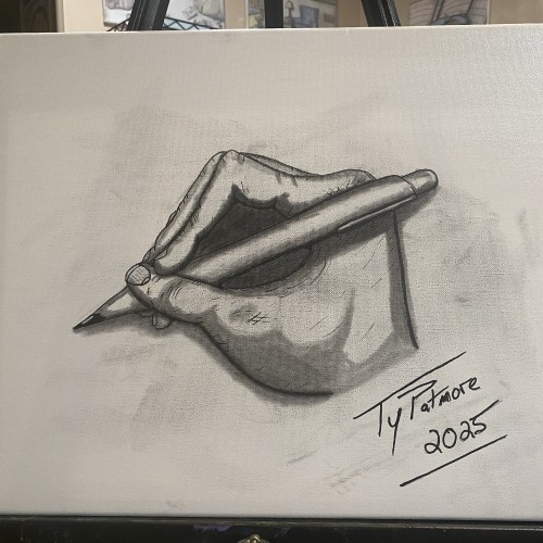
A striking, high-contrast graphite study of a hand in the act of writing. Created in a rapid 45-minute sitting through self-observation, this piece captures the intricate anatomy and focused tension of the artist's own hand as it holds the pen. The tip being pencil the top being pen and finger tips slightly smudged incorporate all aspects of the mediums used to create it.
I honestly don't like using color tones like this. I actually really enjoy the black and white contrast. I have always loved black and white images, cartoons and movies. But I try.
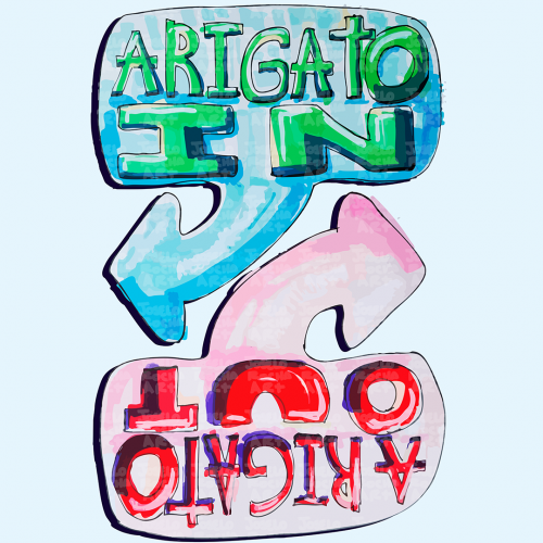
The image features colorful, hand-drawn text with arrows labeled 'Arigato In' and 'Arigato Out'. Inspired by Ken Honda and the philosophy of Happy Money.
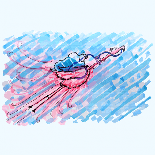
A vibrant pink flamingo bird is depicted soaring across a blue textured sky with a big water container in his back, its pink and blue hues create a striking contrast. The bold strokes and dynamic movement add a playful energy to the scene that reminds us to always stay hydrated.
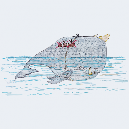
A whimsical illustration of a large horn-whale creature with fangs, an anchor tattoo on his fin, and a tattoo of how many ships he has sunk on his back, with a whale rider perched on its back, is surrounded by gentle waves. The contrast between the massive creature and the tiny rider suggests a playful narrative. The muted colors and simple lines create a charming and imaginative scene.
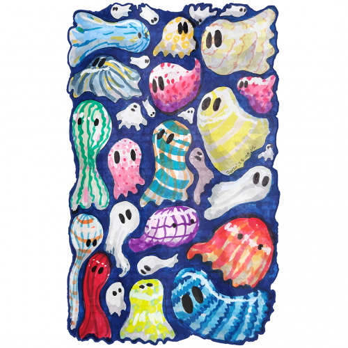
Howcome ghosts only wear white sheets? A group of whimsical, colorful ghosts fills the space, Each figure is unique, featuring different patterns and hues that provide a playful and vibrant contrast. The overall effect is lively and imaginative, evoking a sense of fun and mystery.
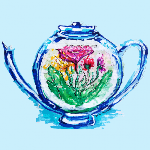
A teapot design features colorful flowers inside. The vibrant hues of pink, yellow, and green stand out, creating a striking contrast with the blue teapot.
A boat floats at the center of swirling, vibrant blue waves, creating a sense of motion and energy. The contrast between the warm tones of the boat and the cool hues of the water highlights the image's dynamic composition.
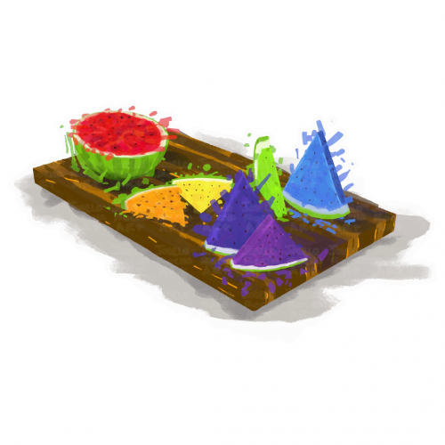
A vibrant assortment of rainbow watermelon slices is arranged on a wooden serving board, featuring colorful triangular and round shapes. The contrasting colors against the neutral background create a lively and appetizing display.
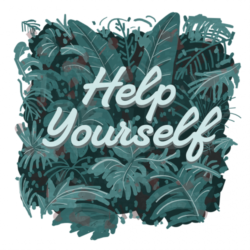
Lush green leaves form a vibrant background, setting a calming tone with the motivational phrase "Help Yourself" in the center. The contrast between the text and the foliage captures attention and invites reflection.
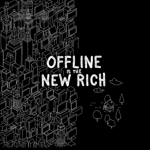
A dense cluster of geometric buildings sits beside the phrase "Offline is the New Rich" highlighting a contrast between urban and online life, and simplicity. To the right, a small house stands alone surrounded by trees and clouds.
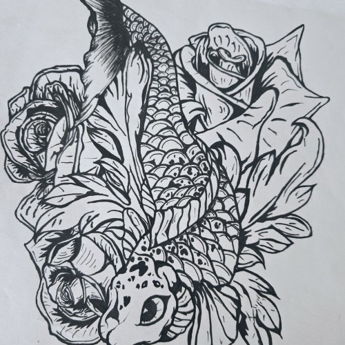
"Pisces Koi" is a bold and intricate black-and-white ink piece that blends symbolism with fluid motion. A koi fish, known for its resilience and transformation, weaves through a bed of blooming roses, creating a contrast between movement and stillness. The fine details in the scales and petals bring depth, making the composition feel alive.
The upward motion of the koi echoes the legend of perseverance—where a koi swimming upstream becomes a dragon—mirroring the Pisces spirit of adaptation and ambition. The roses introduce another layer, possibly symbolizing beauty, personal growth, or challenges that shape us.
This piece captures a sense of quiet strength and fluidity, speaking to those drawn to themes of transformation, water energy, and the balance between struggle and grace.
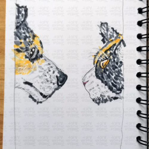
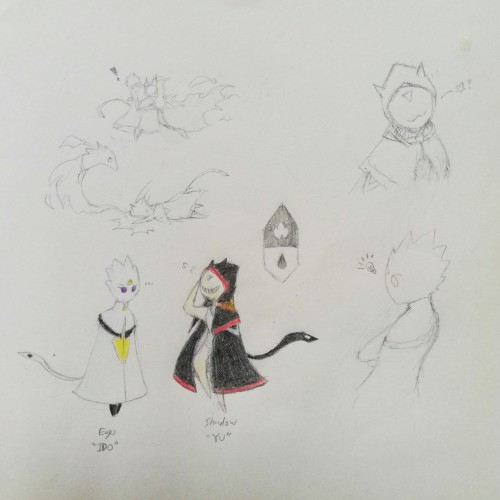
Been developing in a way to free myself from external reference-based OC concepts, which was where I started from in drawing. In a way, exploring how I view characters from my own eyes. Here, is an example of drawing myself in two contrasting counterparts. Personal preferences are actually pretty simplistic by appearance.
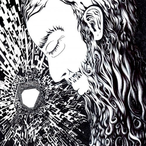
This black and white ink drawing portrays an aged man with a beard lost in deep contemplation within a futuristic spaceship setting. The subtle hints of sadness on his face are contrasted against the vastness of space, where the Milky Way is barely visible in the background. The artwork evokes feelings of isolation and reflection, inviting viewers to ponder the human experience amidst the cosmos.
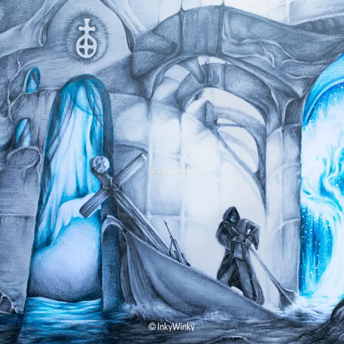
Journey presents a surrealist setting where a man is rowing his boat through a wondrous landscape, surrounded by buildings and stones with strange symbols and runes. A bright heavenly light illuminates the traveller's origin while a stark contrast is made with the vibrant blue light, from behind the walls, of this mysterious sunken building. This artwork is for sale on inkywinky.com.au
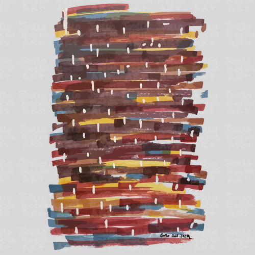
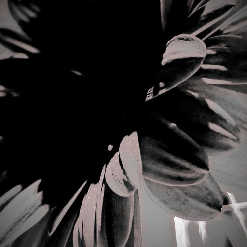
Capturing the spaces in between and amplifying them with a play on exposure and contrast to bring forth the beauty I see within the layers. This particular play is a flower I saved from a very special event I attended. I then dried the petals of this beauty. These special petals make their way to various projects, including oil and acrylic paintings and resin on canvas. More to come :)