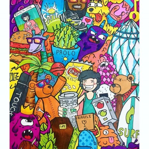
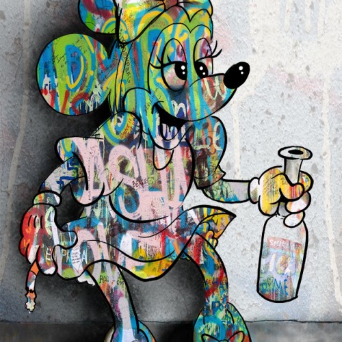
This doodle depicts a transitional phase in my college years. Illustrating one of my favourite rappers, drinks, snacks and one of the iconic buildings in London; this doodle is full of colours varying in throughout the page and popping out with contrast.
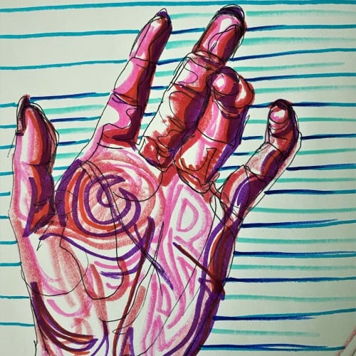
Pop art ink drawing in red, pink, and violet hues. The subject is the palm of a hand and curled fingers. The background has blue, green, and turquoise stripes contrasting the colors of the hand. This artistic drawing style uses non local color to create form in the palm hand drawing.
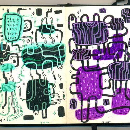
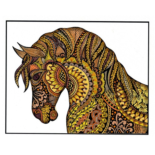
I printed my black and white zentangle drawing on marker paper and colored it with alcohol markers. At first it was a bit to garish with too much contrast, so I painted a warm grey over the whole piece. That gave me what I was looking for. Of course, THEN I completely undermined that with making a bunch of wild colored ones (two shown here) by playing with them in Photoshop. I shall be using this (along with my Zentangle koi posted la while back) for printing blank cards that we sell for charitable (mostly foodbanks) organizations.
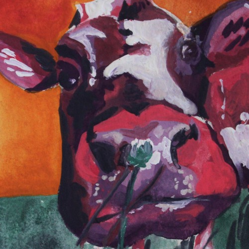
This colorful painting was created using gouache paint to give an illustrative design feel. The subject is a cow painted using non-local colors like pink and violet, contrasting the orange sky background. I love the small clover flower the cow appears to be smelling in the foreground of this piece. For more in my gallery, please visit ArtsyDrawings.com!
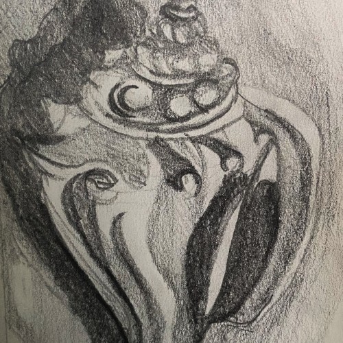
This is a graphite pencil drawing of a conch shell I found on the beach in Florida. I used this sketch as a base for a intaglio print I made. The sketch features the cool textures and forms of the shell in a harsh contrasting light.
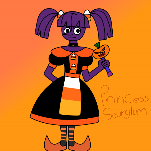
Like her name,she's sour but she's more angry than glum,I really don't like how her dress turned out but I really couldn't try anything else since I'm drawing with my finger again.. hopefully I'll redesign the dress soon and use less orange.Duchess RavenWaves is my inspiration for her.She is a purple licorice princess albeit evil (you know how a lot of people hate licorice?) Instead of having simple sweet candy decorations on her dress she has candy corn decorations (no one likes candy corn) she is really bitter,evil, selfish and ruthless often enslaving many candy people with her father who works as her advisor.her wand isn't alive like Sweetnette's wand it still has powerful magic like Sweetnette,she has to dance and sing to transform, there's a jester form and a military leader form.she is taller and thin,and has a circular face in contrast to Sweetnette's square face.she often uses demonic magic,which sometimes backfires.
Found him sitting on a wall in the park where I go for a jog since pandemic started. Was so mesmerised by this magnificent beast. I couldn’t stop staring at him every morning. The contrast between the white fur and black skin. So shiny yet so peacefully he sat doing his job.
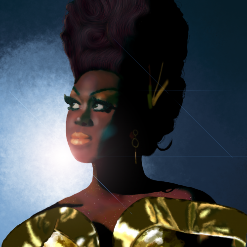
Bob the Drag Queen is a legendary performer and personality. She is one of my favorite people. I kept the composition simple to focus on shading and facial dimensions. I paid close attention to not lightening her skin tone and respecting her heritage but also contrasting the gold dress and blue background.
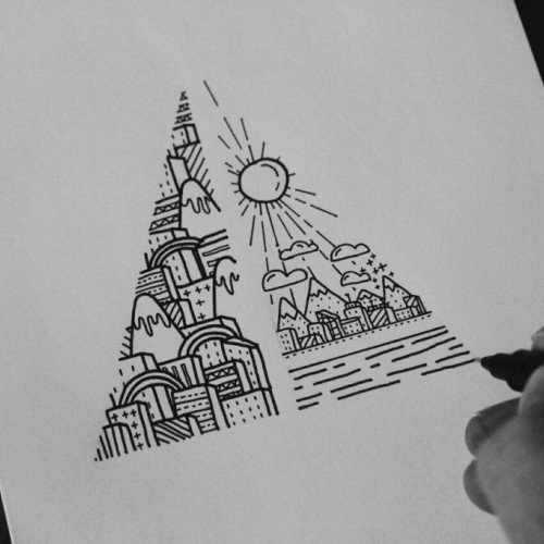
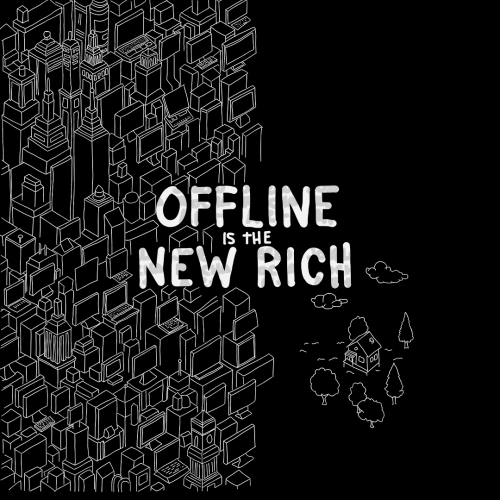
A dense cluster of geometric buildings sits beside the phrase "Offline is the New Rich" highlighting a contrast between urban and online life, and simplicity. To the right, a small house stands alone surrounded by trees and clouds.
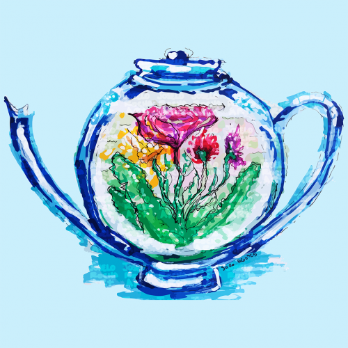
A teapot design features colorful flowers inside. The vibrant hues of pink, yellow, and green stand out, creating a striking contrast with the blue teapot.
A little o' this, a little o' that. All on 8.5X11 heavy white card stock. Some colored pencil. Using photoshop only to render contrast, no other manipulation.
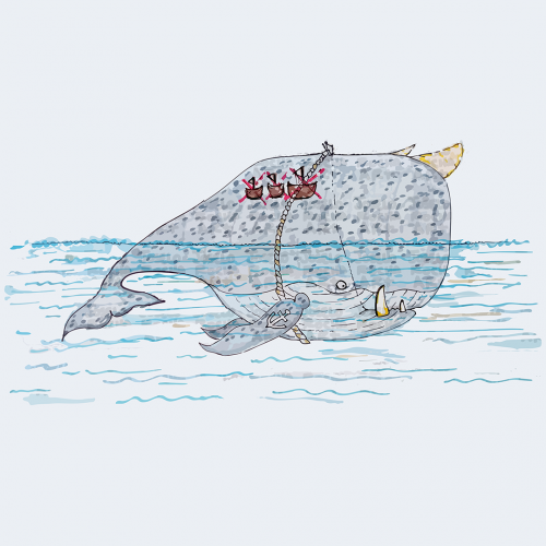
A whimsical illustration of a large horn-whale creature with fangs, an anchor tattoo on his fin, and a tattoo of how many ships he has sunk on his back, with a whale rider perched on its back, is surrounded by gentle waves. The contrast between the massive creature and the tiny rider suggests a playful narrative. The muted colors and simple lines create a charming and imaginative scene.