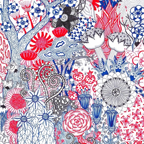
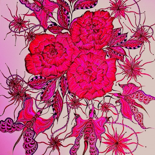
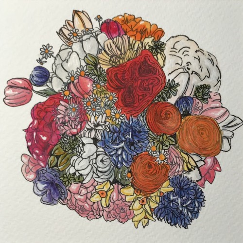
This is my second shot at a full page floral abstract. “Trippy Forest” is my extra-colorful one, but this one is focused on details done in red, blue, black.
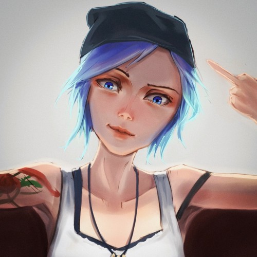
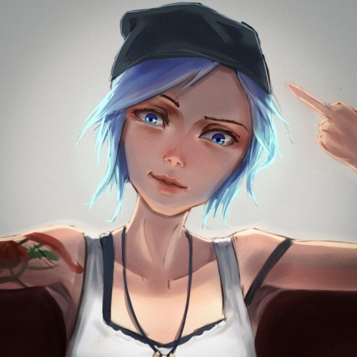
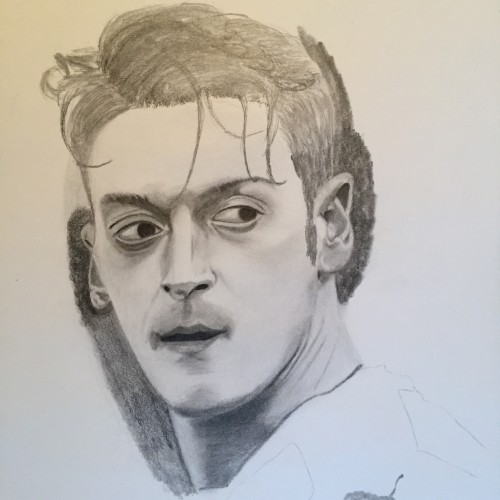
Just a fanart. Lazy detail. Still learning to draw hands. ~3 hours. I’m new here btw :p Looking for critiques, opinions, suggestions. (ah damn, uploaded wrong pict. this one is cropped, should be half body)
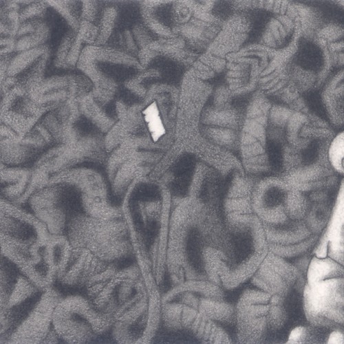
(B grade pencil on 125mm x 75mm notecard) Another dreamscape image. With this one, I decided to pick out points of detail whilst having the rest shaded in the background. It works well, even with minimum elements highlighted.
I do like a good mondegreen, that much is true. See the radio edit of Royksopp’s ‘Remind Me’ for more details (I might not be mishearing the lyrics, but it’s still quite the earworm): https://youtu.be/XEQcWbbkyPY
It was both fun and challenging to compose this doodle around the letters of Google. I hope that I get to create more such artworks.i used watercolour on cartridge paper detailing with micro tip pen.
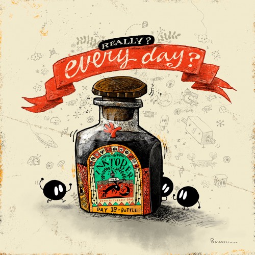
I intended to do quick little spot illustrations for Inktober this year, but nooooooo! Now Jimmy is drowning in digital ink and lots of doodle details. This was way too much fun to go simple. I also included the original sketch this time.
India ink on tissue paper. I had never used ink on this kind of paper before; I really liked the results! There are some folds and wrinkles on the paper that give the pattern some interesting details. The paper is also super absorbing, which plays nicely with the quantities of ink. Since it's very thin, there can easily be overlays between textures. And finally, when trying to use less ink (so that it wouldn't seep through and cause a big dot - the absorbing quality is nice, but it was also somewhat of a challenge!) I used very little ink on the lettering, causing a scratchy, dry look.
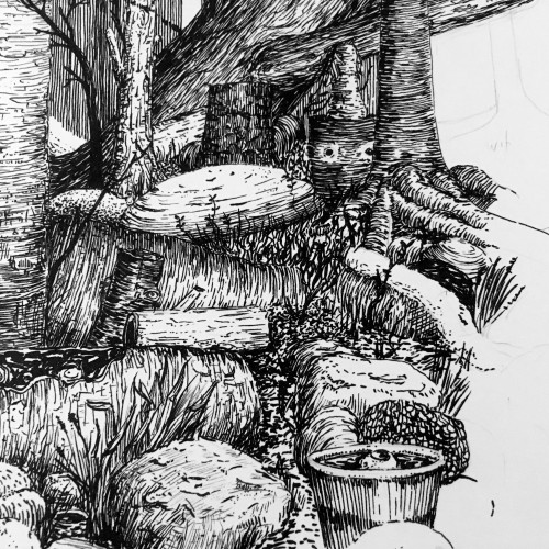
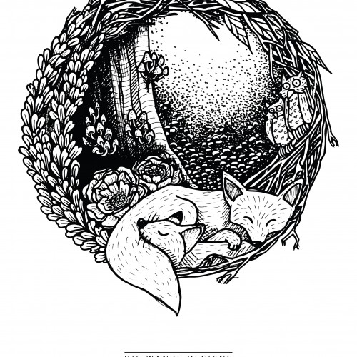
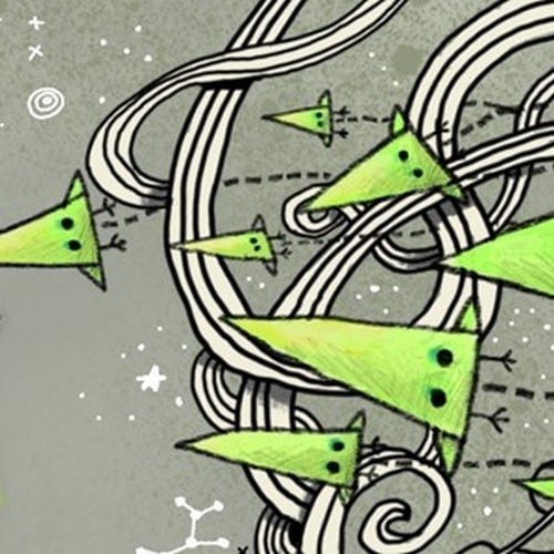
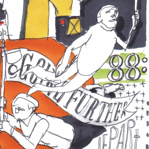
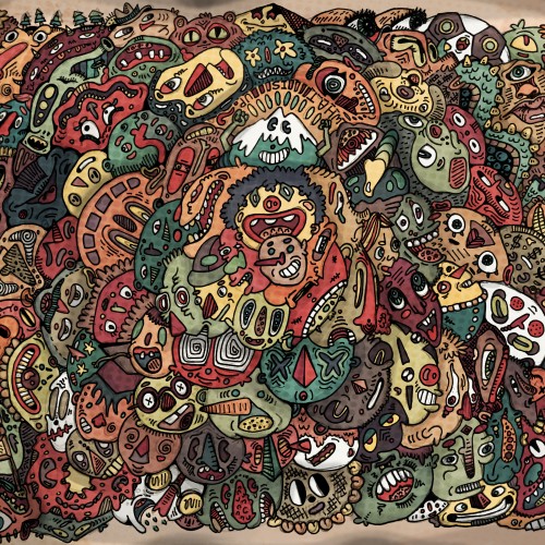
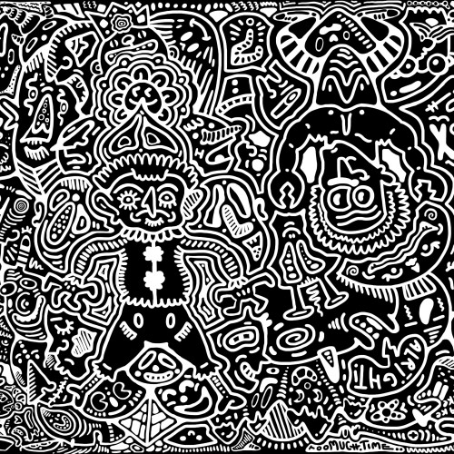
An old-style doodle, with many parts to look at! This took a few days, from the initial drawing, to inking, to uploading to my computer and digitally coloring and adding textures and detail! Lots of fun, and definitely different from my normal doodle-style. Thanks for viewing!
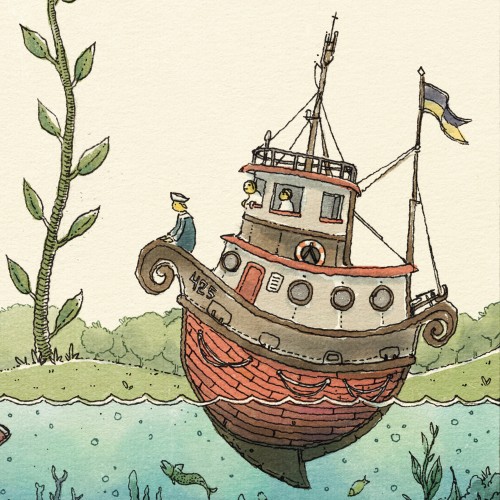
"Floaty Boat Waves In" -- Another WIP detail shot. You can see the magic of Rebelle in these close up shots... bringing the fountain penned ink to life with color.
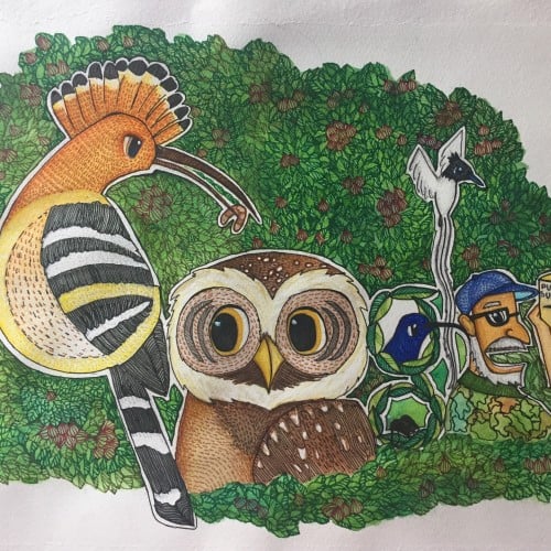
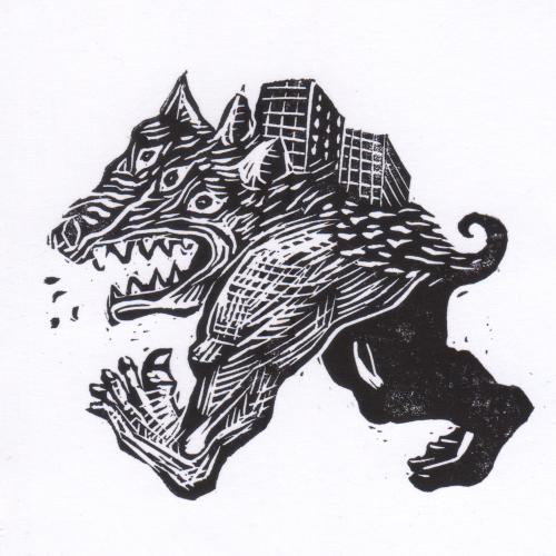
Sometimes I like to challenge myself and draw something completely different and full of details.... this was a bit tedious :) but I am glad I did this, it was a great workout for the brain!
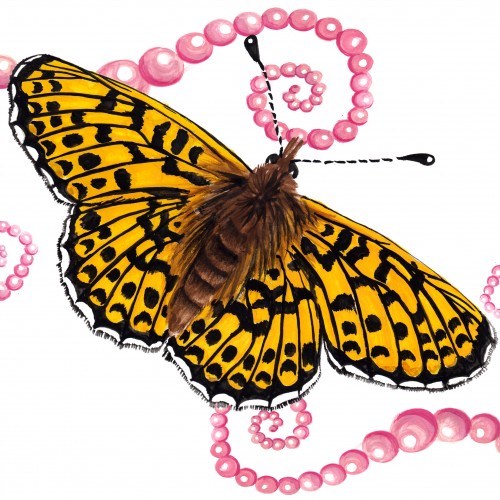
The (i think) 12th and final butterfly for the Literal Butterflies Project. Wow! thats a lotta flutterflies. This one was certainly tedious with such elaborate markings, she wasn't easy! ... That said, none of them were. With such beauty, and intricate wing pattern and design, butterflies are a very difficult subject to work with. But somehow we managed to get through all 12 with some of my hair left! Loved every step of this journey :)
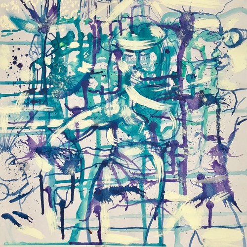
This painting/ drawing is started in the Abstract with forms created organically. I used Acrylics and applied them liberally as you might use in watercolor techniques. I love challenging myself to create in this form, as I do in finding the figures which may form themselves in the process. I then detail the figures in a drawing style to enhance and bring it forward. It’s part of a three piece series I made in this color story and can also be seen on my ArtFinder page, available for purchase. @adrianajgarces
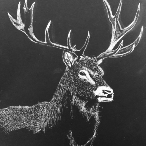
Interesting to try to capture the detail in this image using different media for different items. It took a while, but I was pleased with the result. From a magazine photo.
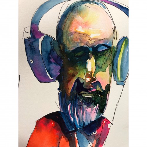
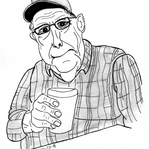
A quick sketch of a man holding a cup of coffee. This was drawn from a reference photo. Lately I've been practicing portraits. Trying to limit myself to 20 mins or so and just draw the basic form as best I can. Otherwise I'll fiddle with the details and spend hours trying to adjust things. Sketching in ink helps also since I can't erase. Need to get more comfortable sketching faster, but I like the way this turned out.