This painting was done with the Tuscan style in mind. The Tuscan style favors a rustic look. To me this never goes out of style because it’s as if the new and the old have found a common medium and have agreed to blend so well. There’s plenty of green, beautiful grass. The windows are complimented by the various colors of flowers that are perfectly placed below them. I love how there’s a table set outside of the building with a string of lights (even more beautiful at night) for people to enjoy the scenery as they eat some tasty, authentic Italian cuisines. There’s a group of people walking past the wall of yellow flowers and vines on the way to the inside of the building. In this scene, the ladies are wearing some long, beautiful dresses with gentlemen by their side to accompany them. This gives the impression that this group is out to have a good time. The white birds tops it off in this painting by giving it an inviting feel...”a moment to remember” feeling.
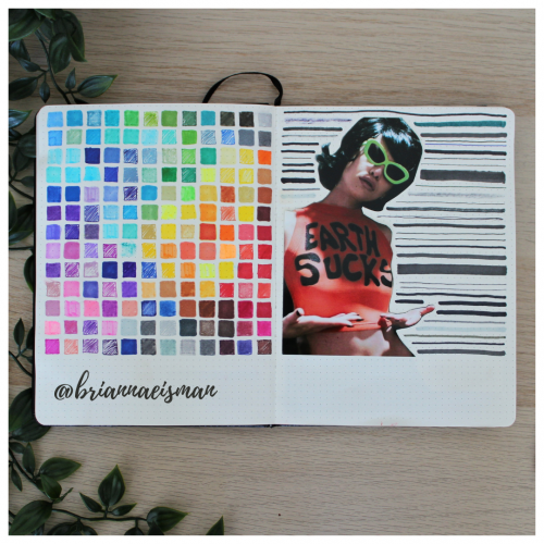
About once a year I set aside a page in my sketchbook, or bullet journal, to do a marker test. I go through every pen I own including Sharpies, highlighters, Bic Permanent Markers, Crayola markers, Stabilo pens, Expo dry erase markers and everything in between. I document the quality and determine whether to keep or toss the utensil. I find it’s easy to collect art materials, especially when you’re like me and switch mediums regularly. It’s important to know that when I reach for a certain pen or marker, it’s going to work the way I want it to. I do keep a page at the back of my sketchbook open for testing mediums, but it’s an important part of the process of creating art to go with the flow and just draw.
"My possibly late husband never learned to appreciate modesty and humbleness, im afraid." Being married to a pirate in the kings service comes with a lot of material perks, but makes it difficult to host a fine ladies party. im just glad to have finnished, i sat for three days painting patterns.
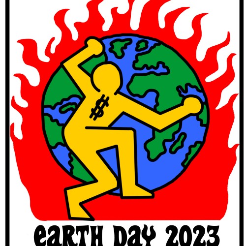
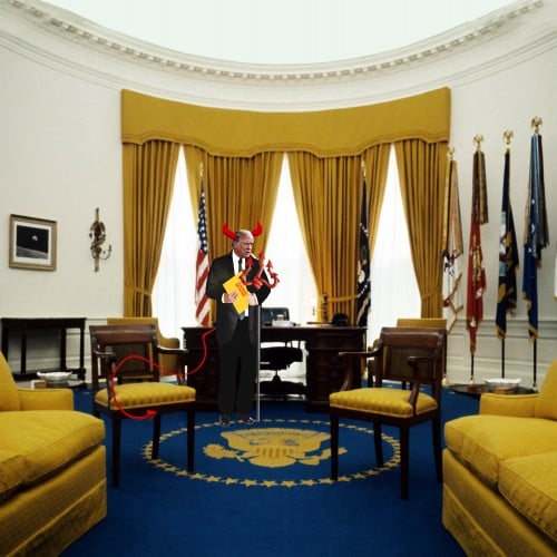
The devil, Donald Trump, stealing Top Secret documents from the Oval Office.
Available at Fine ArtAmerica https://fineartamerica.com/featured/the-devil-stealing-top-secret-documents-from-the-oval-office-karen-sullivan.html
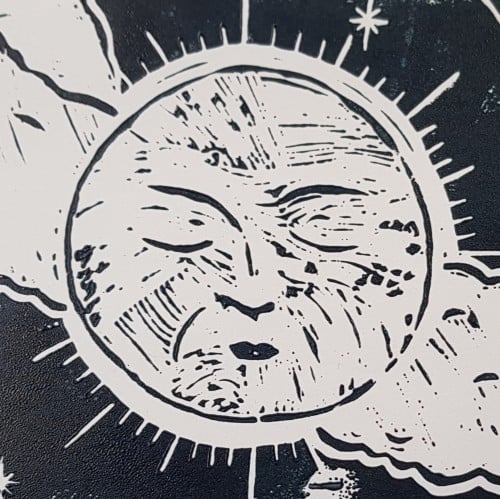
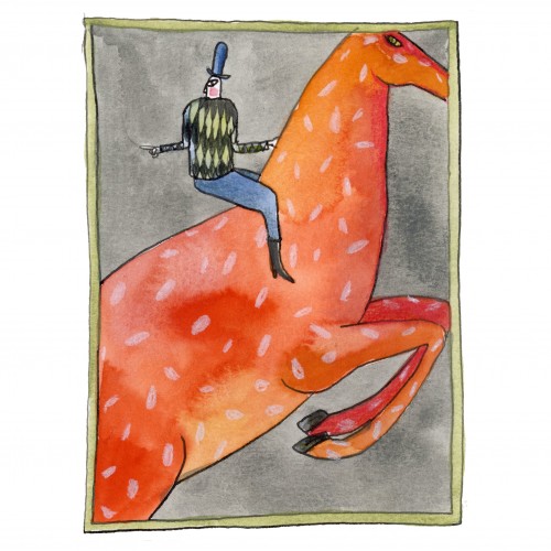
It was unclear whether there were flames or what was going on tbh. It appears that she sits on a horse with a smile. There may be others in her party. Be warned.
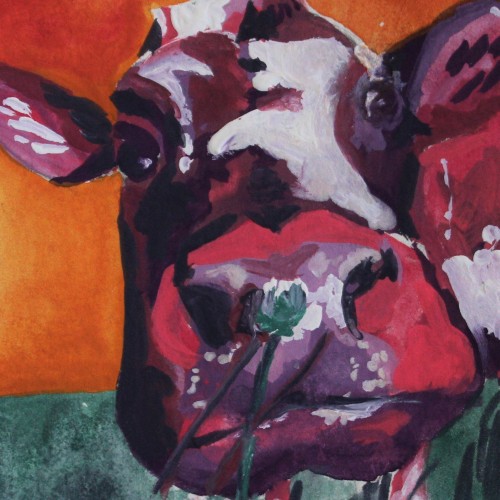
This colorful painting was created using gouache paint to give an illustrative design feel. The subject is a cow painted using non-local colors like pink and violet, contrasting the orange sky background. I love the small clover flower the cow appears to be smelling in the foreground of this piece. For more in my gallery, please visit ArtsyDrawings.com!
This is the beginning of a piece I did earlier this year. I wanted to show the progression of graphite to ink. The next picture I post will be showing the rest of the ink and completion of this piece.
Created using pen and ink, this drawing mimics a fine art painting I saw in a museum. I loved the figures and their fluid movements, so I doodled it down in my sketchbook and later inked it in for a refined black and white artwork. Check out more on my website ArtsyDrawings.com!
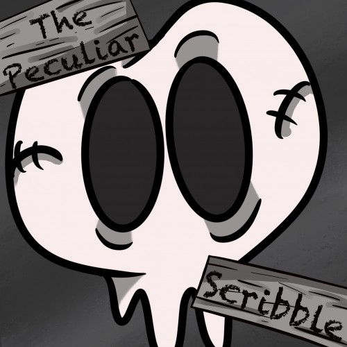
This is a new logo I created for my Webtoon, The Peculiar Scribble. It is about Scribble and his adventures in a place called, The Realm. Scribble is a heartwarming comic that is suitable for all ages. If you would like to read more below is the link to the comic: https://www.webtoons.com/en/challenge/the-pecuilar-scribble/list?title_no=866623
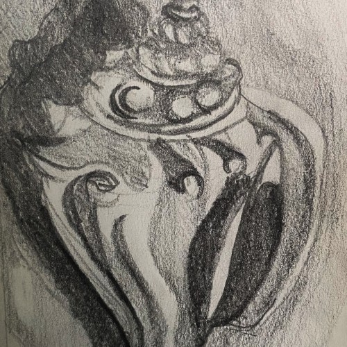
This is a graphite pencil drawing of a conch shell I found on the beach in Florida. I used this sketch as a base for a intaglio print I made. The sketch features the cool textures and forms of the shell in a harsh contrasting light.
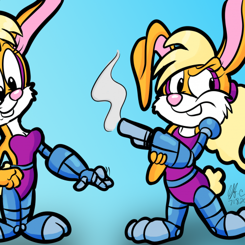
16 (or 17) years ago, I've done some fan art of Bunnie Rabbot from the "SatAM Sonic" series. Now, she's back in my fan art roster and I must say, I like how I drew her.
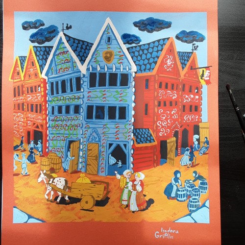
This looks simple, but i spent days researching to get the buildings and clothing right. There was also a lot more layers than i planned for. This buildings are still in use, there are different shops in them now. Sadly they no longer have those colorful decorations,
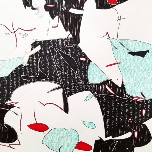
Whether the script in the background is an actual sutra is not the concern, even if it is, would it be readable to most? I question the use of lines in Calligraphy. Without the recognition of the exact words or meaning, can we still appreciate the quality and skills involved? Armed with a Chinese writing foundation, I adapted the use of the eight strokes (the basis of construction to Chinese character). The `writings’ resembles Chinese/Japanese writings but in fact, they are not. I needed a texture. With language as a symbol of culture, by visually adapting these kind of lines endears us to the image.