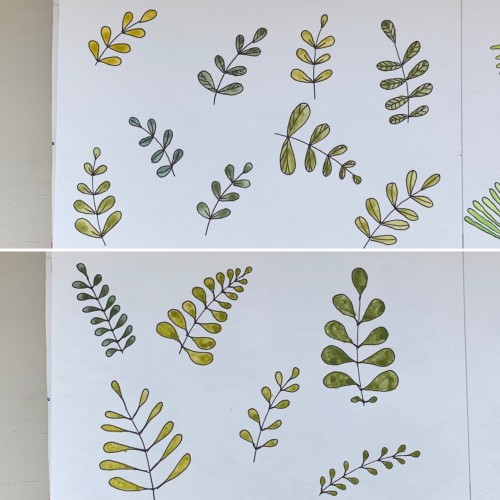
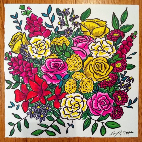
For some reason I tried some floral drawings, of different shapes, and I also used mixtures of different colors to produce hues of green. The first page - it’s a mix of the cobalt blue (PB 28) and cadmium yellow medium (PY 35). On the second one there is ultramarine (PB 29) for the blue color and the same yellow paint. To me, it seems the difference is very little but I’ve got the color closest to the ‘normal’ green using Cobalt rather than ultramarines. The latter gave either to yellowish to olive hues or too blueysh
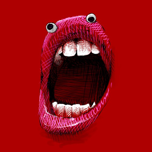
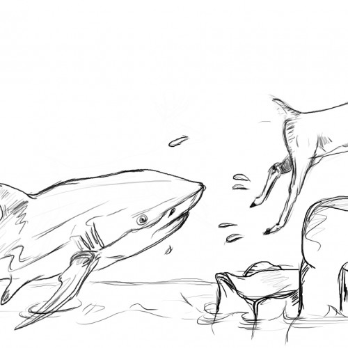
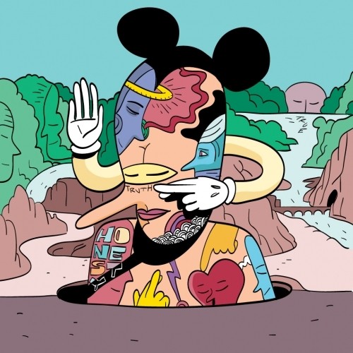
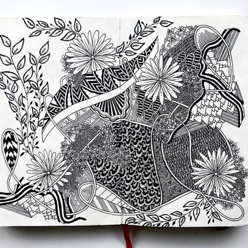
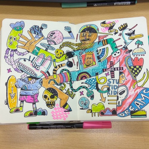
This is part of my daily Sketchgrind day 11. That's how I felt when I quit my job working in a highly competitive office job in the financial sector and started to work full time as an artist. One oft he best decisions I have ever made, I flourish and develop every day, living life on inspiration. I also made a mini animation https://youtu.be/9aMjPPK5yCc .
If you want to see more check out my Patreon Page https://www.patreon.com/uliunique
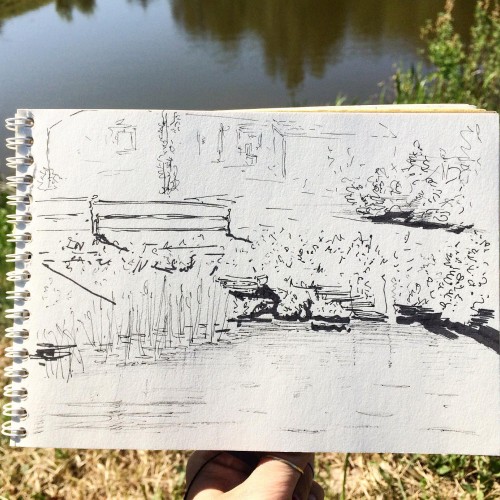
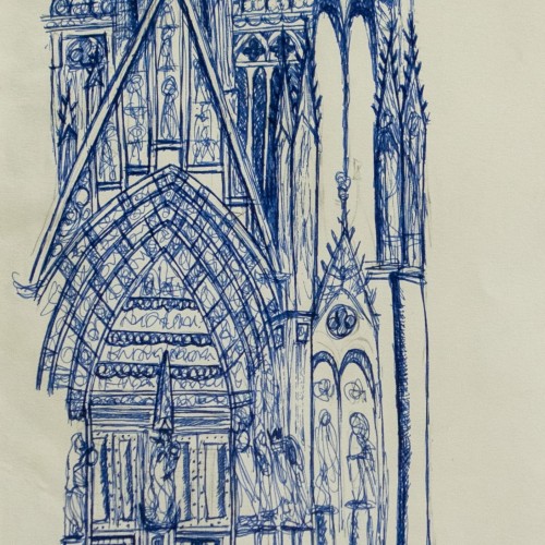
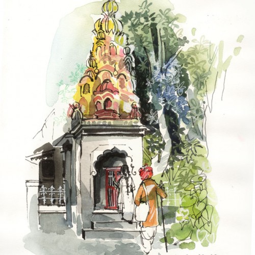
The observational sketch was done in ink. One of my few urban sketches. The grandeur of the entire cathedral was too large for me to capture in my drawing but here's a little of what I did.
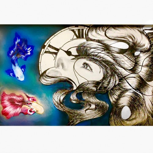
In this photo I drew two Betta fish, a clock and a female in a dark background. Drawing this picture was more of a self expression. The two betta fish expressed conflict; the clock expressed running out of time and the female I guess would represent myself. I was in a dark period while drawing this, but happy to say, I’ve managed to pull through my obstacles =)
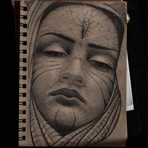
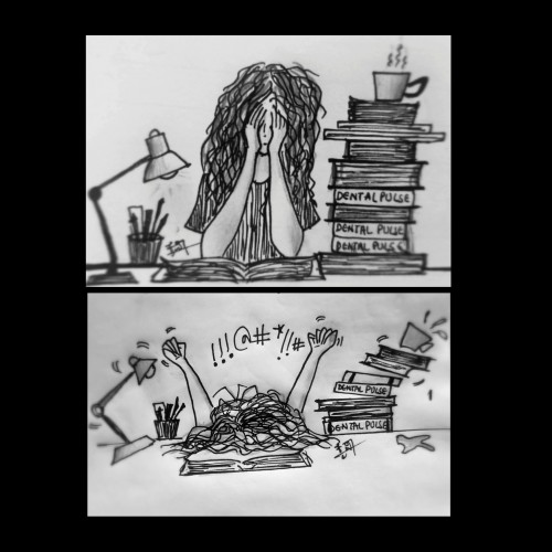
When frustrated to the core and you wait for the one and only day, December the 14th,time goes slower than the usual and you can't do anything about it.
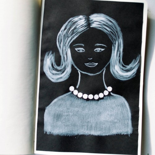
The idea for this portrait came to me when I was looking at a packaging of soap - it was very glossy and it looked like it could look like pearls. As well as the soap packaging, I used white ink mixed with acrylic paint (for opacity) on black paper.