The inspiration for this collection came from a conversation I had with the Founder and Executive Director of the Underprivileged And Underserved Foundation (UAUF), George Goodwine. While discussing race and whether or not every opportunity was fair based upon someone’s familial structure or “starting line,” I was asked the following questions. How does someone overcome these hurdles? How can the playing field be leveled to make things fairer, when others may only have 50 hurdles to overcome in the same competition?
My response was simple. “The person in front of 150 hurdles has two choices. They can either get discouraged before they begin, or start jumping. In the midst of the race they might get tired, unsure, or discouraged, but if they press on to the finish line they may become more physically fit than the person who jumps over 50.”
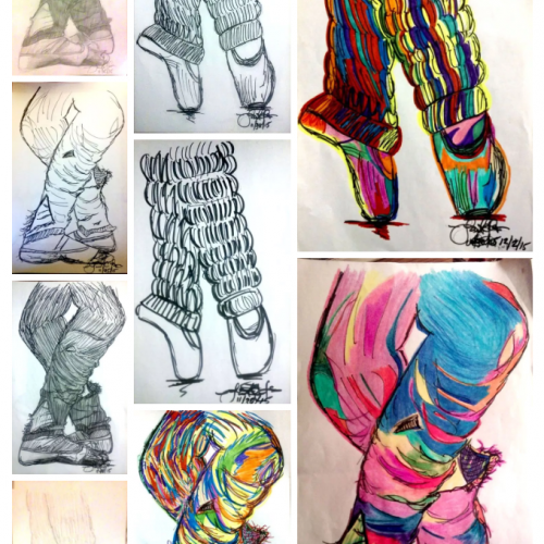
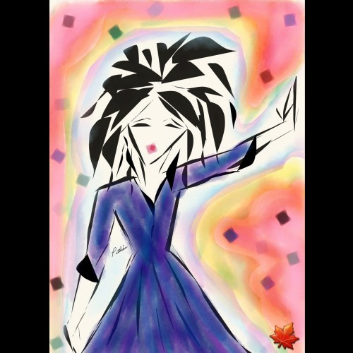
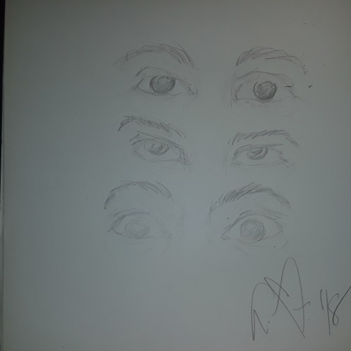
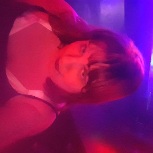
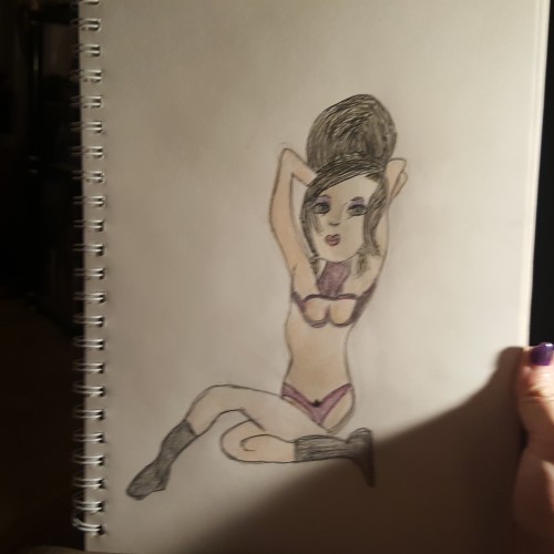
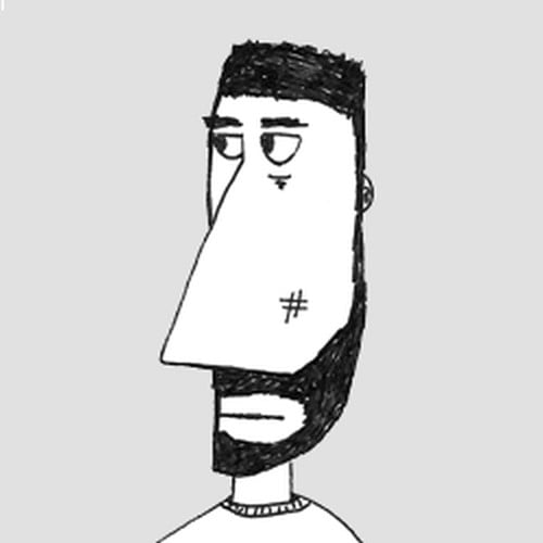
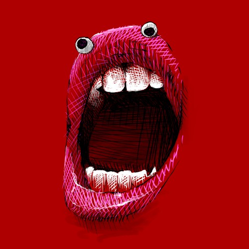
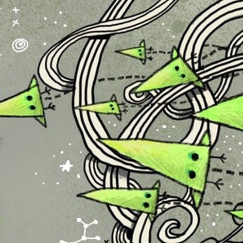
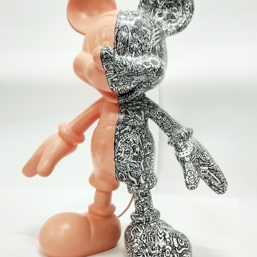
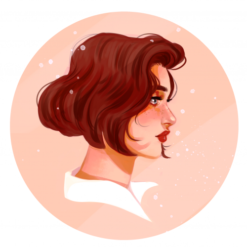
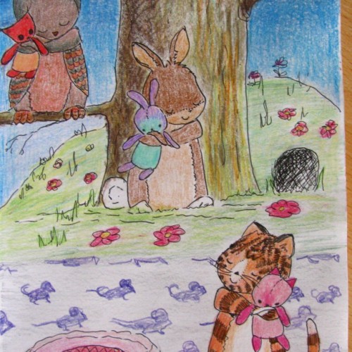
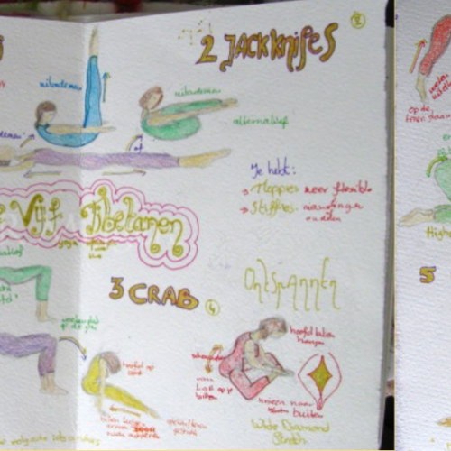
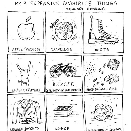
I used to dance ballet and at the time, there were a lot of hurdles I had to overcome solely based upon inconveniences that came with being raised in low-income, single parent home. Above are pencil sketches and sharpie drawings that I have drawn from actual photos. I plan on making these images my own by adding more abstraction and vibrant color to them.
Over the course of the project, stay tuned to see how these pictures will transform into a work of ART!!! Check out my artwork at theservingartist.com
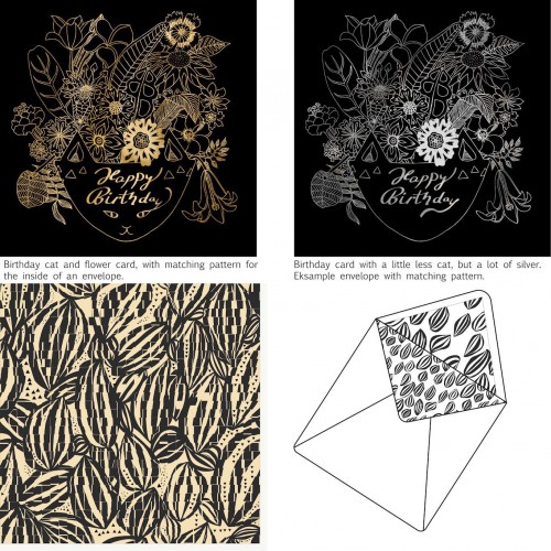
Things people like, cats and flower. Here combined in a gold foil exclusive birthday card. I am trying out different styles for cards with matching patterns. The hope is to sell it and become full time card, placement and surface designer. I just craw all the time and forget about selling. Now I need to get into business and act some more. Do you think it has a chance, and do you even have an idea of where to sell it?
Mixed media. Acrylic, pencil, digital. This is a piece from the book “Mail Me Art - Medium Without A Message” by @littlechimpsociety. I think it was the second call for entries/book.There are now 4 books filled with awesome art drawn and painted on outsides of envelopes and packages by artists all over the world who then mailed them to the UK totally exposed to the postal service. The original was all analog. I brought this into Procreate and reworked it. I may do more when I get a chance but I’m pretty satisfied with it now.
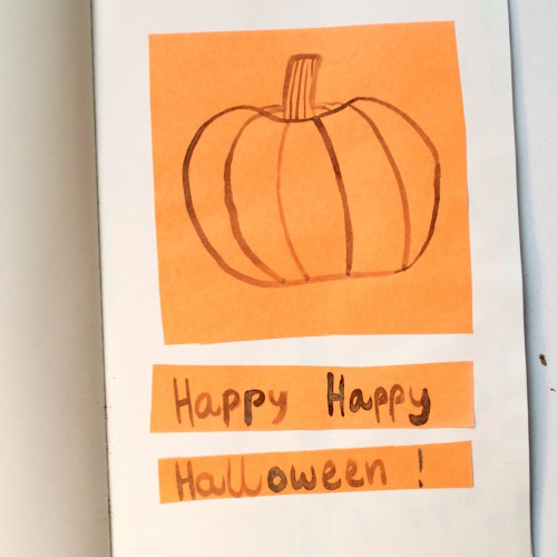
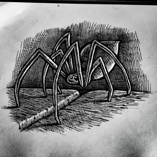
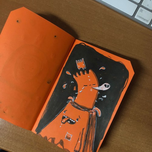
For the last day of Inktober, I drew a pumpkin with black india ink on orange paper. I had never done an Inktober challenge before, and I really liked it! I'm definitely doing it next year, too. I got very good ideas for new projects, I played with different textures and colours, and I used a calligraphic pen to draw, which I had never done before and which I loved.
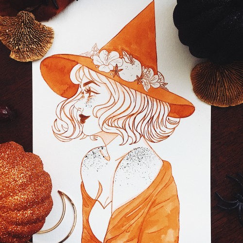
Congrats to anyone else who took part in inktober this year! I focused on combining witches inspired by different types of teas and I had so much fun! I’m conquering my irrational fear of side profiles and I think it’s working, I’ve been really liking side profiles lately and finding them easier to do. I experimented on this piece with adding freckles (they’re a feature in all of my inktober sketches but I haven’t liked how freckles have looked when I’ve dotted them in with a pen or brush) and uh, I guess it was kind of a success? Next time I’ll use my lighter shading colour for them, as I used the ink I use for my lines and it turned out really dark and concentrated, but I think they’re cute! (and I have ink sprays everywhere)
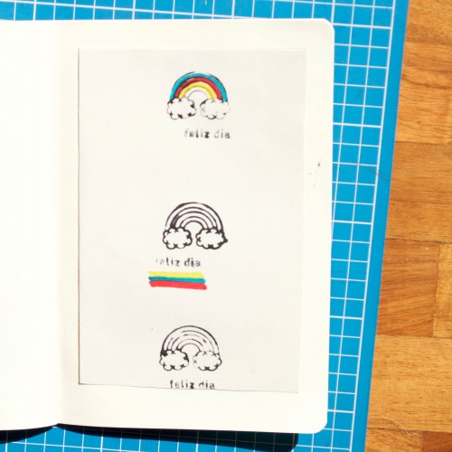
For Inktober 25, I played around with a rainbow rubber stamp and markers. Simple but it was a lot of fun! And isn't Inktober all about experimentation and practise?
55 mins
“I Never Noticed The House Was On Fire” This is a painting for an upcoming group exhibition about memories. When I was a kid I grew up in a household where my parents were functioning alcoholics. They gave me toys, put me in front of the tv, and sent me outside to play to keep me distracted from what was going on. When I look back almost all of my childhood memories revolve around these things. I became obsessed with these imaginary worlds and I learned to draw by copying my favorite cartoons and characters from children’s books. It was not until I was much older, that the truth could no longer be hidden from me. The imaginary world of cartoons and books kept me shielded from the harsh realities of home. As I grew into an adult that form of coping grew with me as I created my own imaginary places inspired by the ones I loved as a child. A healthy place to escape.
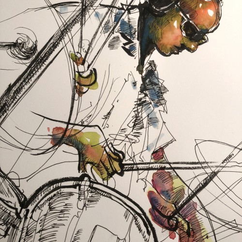
Wow! I was invited to spend the day in the recording studio drawing the creation of a jazz album. I will be going back to my studio to create the album cover art for the project. Included are few photos of my process drawings from the session. It was an amazing experience to spend time with these incredible musicians. I will share the final results at a later date.
India ink on tissue paper. I had never used ink on this kind of paper before; I really liked the results! There are some folds and wrinkles on the paper that give the pattern some interesting details. The paper is also super absorbing, which plays nicely with the quantities of ink. Since it's very thin, there can easily be overlays between textures. And finally, when trying to use less ink (so that it wouldn't seep through and cause a big dot - the absorbing quality is nice, but it was also somewhat of a challenge!) I used very little ink on the lettering, causing a scratchy, dry look.