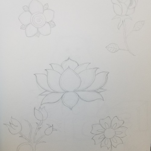
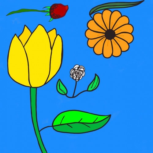
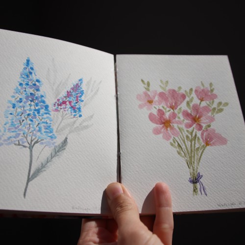
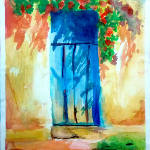
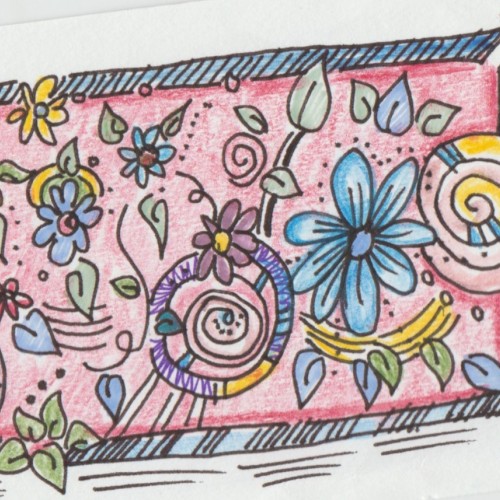
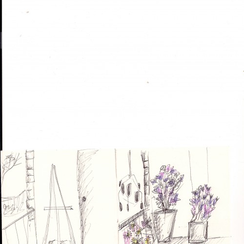
I painted these watercolor florals a few months ago. I love both color pallets, which I used - on the left side cold colors: blue and gray, and on the right side, some warm green and pastel rose.
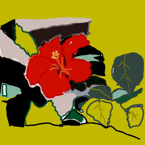
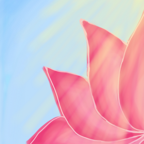
Based on a photograph of a hibiscus flower enjoying its last day in the garden before being brought back home before the Canadian fall and winter. I imported the photo in Procreate and the rest is history.
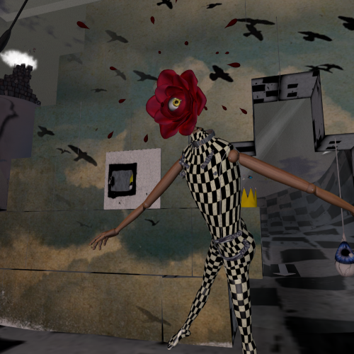
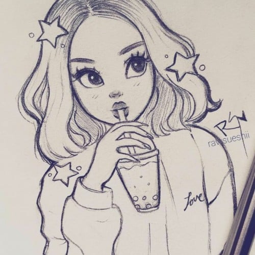
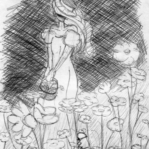
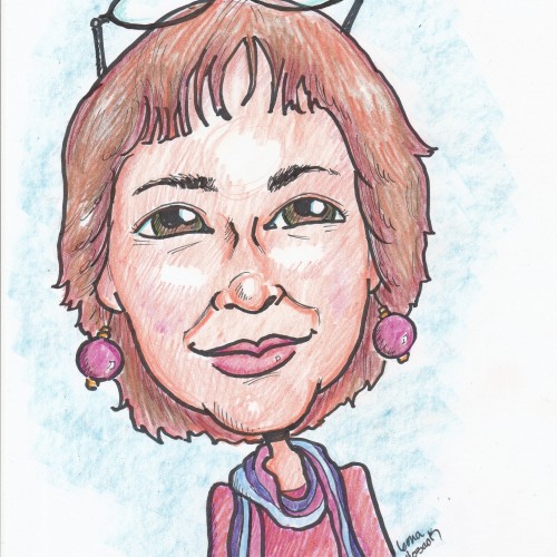
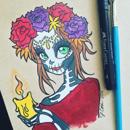
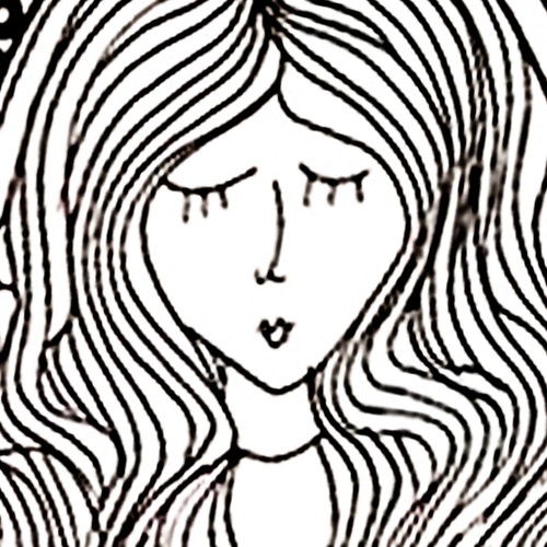
Soo...This was actually supposed to be alot more happier and brighter. But I accidentally made a mistake with her face, and since I was using a pen, I couldn't fix it...so I decided to go with it fully and make the background behind her dark as well to fit the mood.
I'm still happy with how it came out :) it's just...way different then how I planned it in my head.
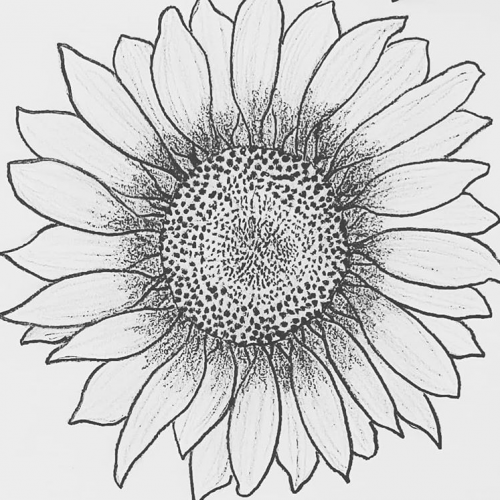
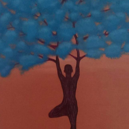
My project for a skillshare course I am taking. I am trying to work on developing more textures and drama to my paintings as well as improving on the composition. Any advice or tips that you can share would be appreciated. Thanks!
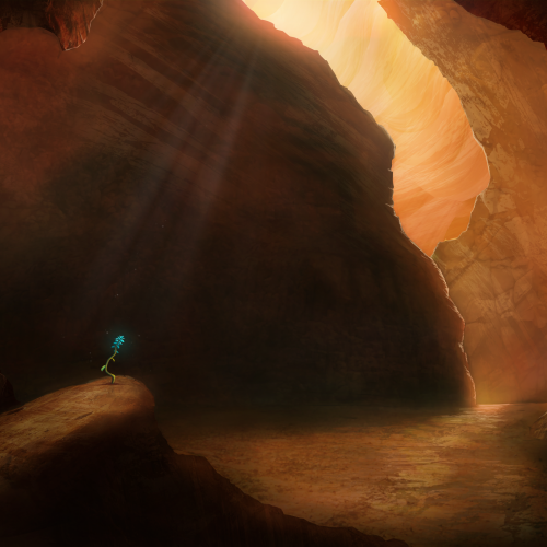
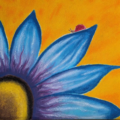
Painted as a project for Painting Environments class: skl.sh/32Khrti
Project parameters:
- Mysterious Cave
- Dark but with moody lighting
- Mostly warm colors but with single blue flower
- Flower is the focal point - use composition to lead eye to flower
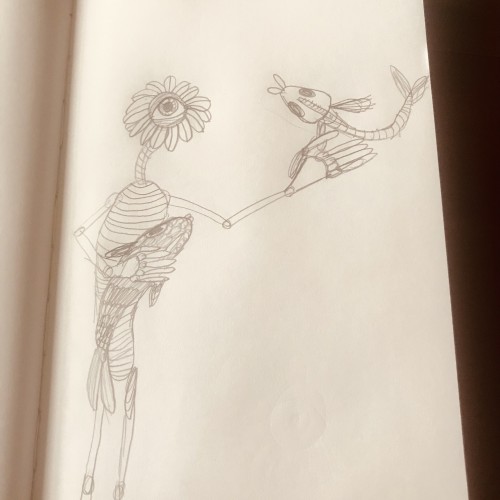
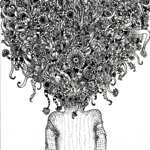
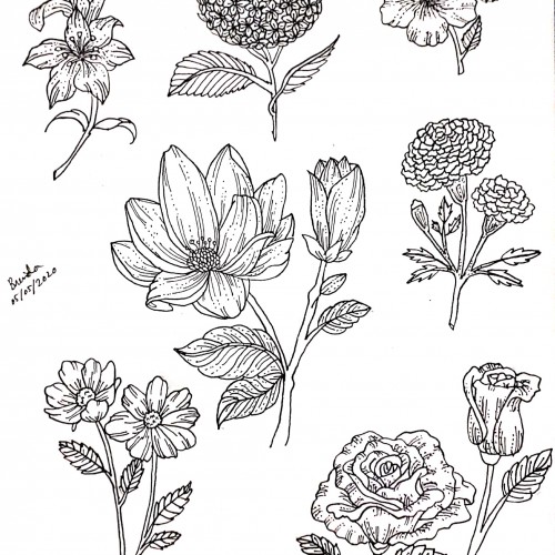
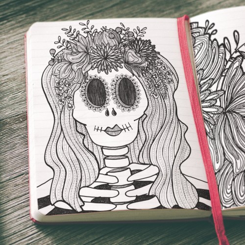
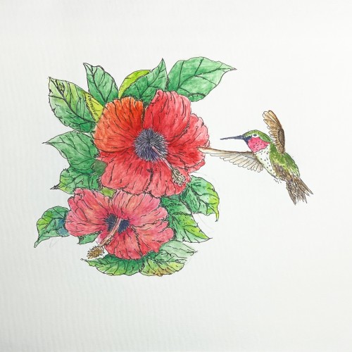
Drawn with papermate inkjoy gel pens. For custom commissions reach out to art.by.alisonlove@gmail.com, and check out my facebook page (facebook.com/artbyalisonlove) and society6 shop (society6.com/artbyalisonlove