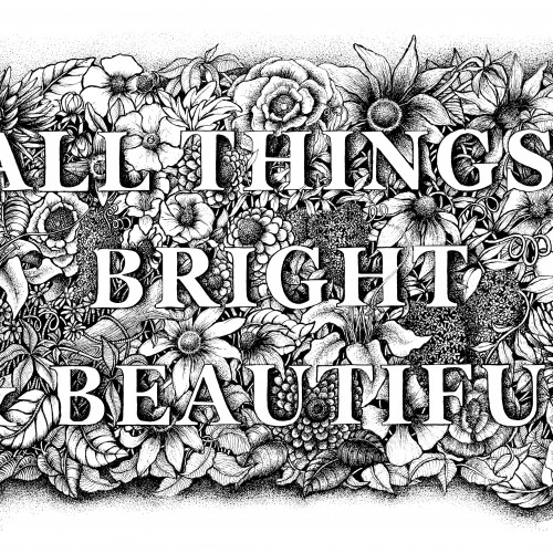
A floral botanical illustration around the words of the famous poem and hymn by Cecil Alexander "All Things Bright & Beautiful'. Drawn in pen & ink with another on the way...'All creatures great & small.
Working on tan paper. If you'd like to see my process there's a video of me painting this over on my Youtube: https://www.youtube.com/watch?v=k9jc-09Sjzs
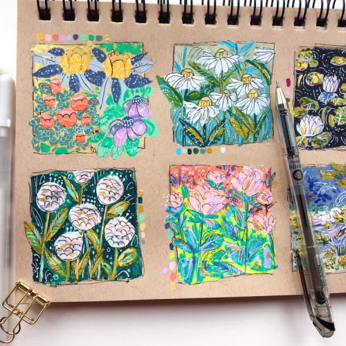
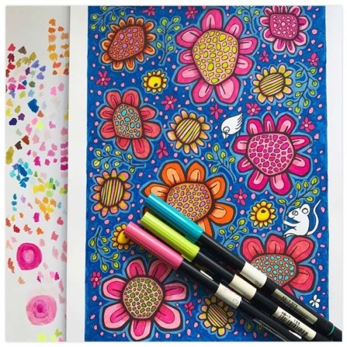
I've started a new mixed media sketchbook. Which is often times unexplainably daunting. To get over it I just dive in with lots of color. Then the fun begins.
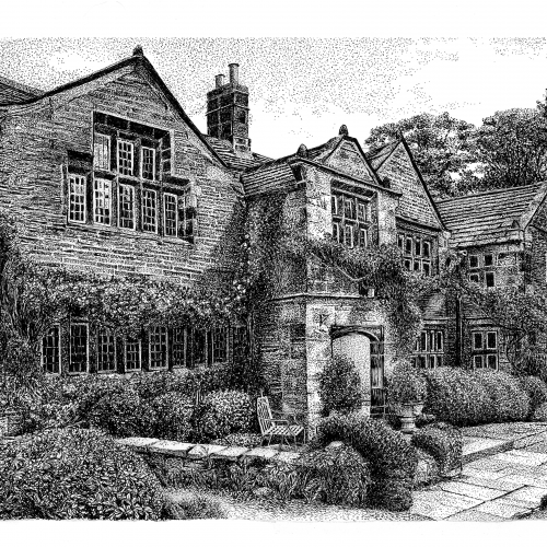
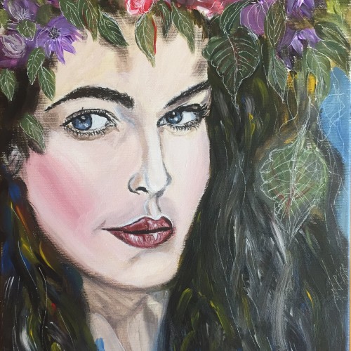
I actually finally got round to framing this piece I did and hanging it up on my wall the other day, which made me really happy :).
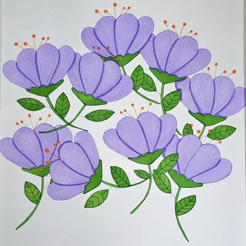
Tool used: acrylics, colouring pencils, posca markers on brown A4 card.
Every day in 2017 I drew in a Moleskine Japanese (Accordion Fold) Album (pocket size) with the goal of completing one continuous drawing all year. I filled up nearly six complete sketchbooks, completing a drawing that is 5.5 inches high and more than 600 inches wide. Now, what do I do with it?
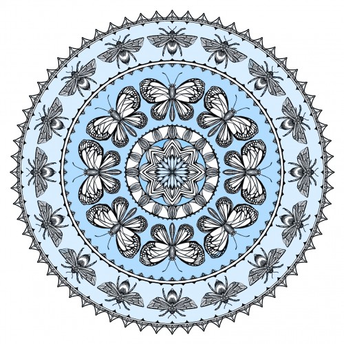
What's more comforting than a summer day with butterflies flitting and bumblebees tumbling amonst the flowers in the meadow? My husband felt that blue was most comforting for him. Me, I liked the salmon. The mandala is drawn in Spirality...which takes the designated "wedge" and repeats it around the circle. Colored in Photoshop (given there is a 20 min. time given for this challenge---otherwise, I would have colored it by hand).
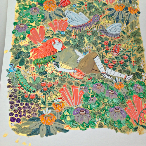
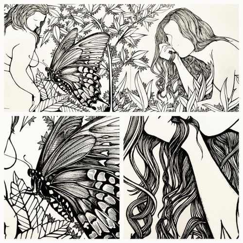
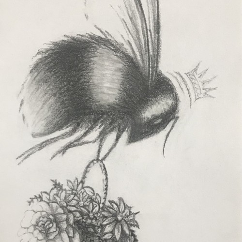
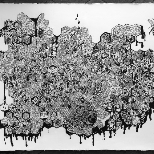
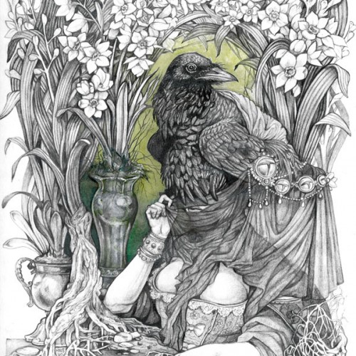
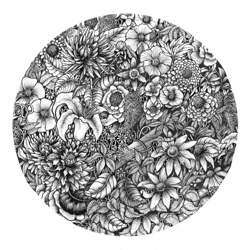
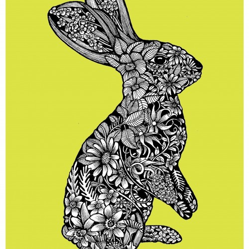
Sensuality, power and fertility - meditative layers and tangles of flowers, weeds, and grasses. A bee emerges, free! Ultimately a positive message of hope!
It's an odd feeling to reexperience the old anger and frustration I thought I had overcome, but, in all reality, I've been letting it creep back in for a while now. There was a moment of fear, it's still in the back of my mind, I'm afraid to slip back into the mental place I was a couple of years back. I'd like to say I've finally realized that it's ok to be afraid, and even a bit frustrated, but it's a matter of how I handle those emotions and my own reactions that make the difference.
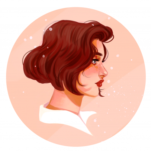
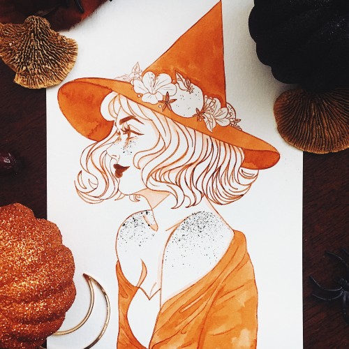
Congrats to anyone else who took part in inktober this year! I focused on combining witches inspired by different types of teas and I had so much fun! I’m conquering my irrational fear of side profiles and I think it’s working, I’ve been really liking side profiles lately and finding them easier to do. I experimented on this piece with adding freckles (they’re a feature in all of my inktober sketches but I haven’t liked how freckles have looked when I’ve dotted them in with a pen or brush) and uh, I guess it was kind of a success? Next time I’ll use my lighter shading colour for them, as I used the ink I use for my lines and it turned out really dark and concentrated, but I think they’re cute! (and I have ink sprays everywhere)
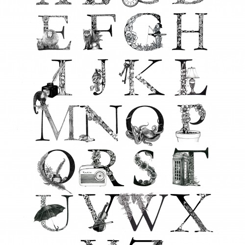
My Illustrated Alphabet letters were born out of a project in 2016. Each was drawn with pen & ink and each letter is illustrated with either an object, flora, fauna or wildlife that begins with that letter.
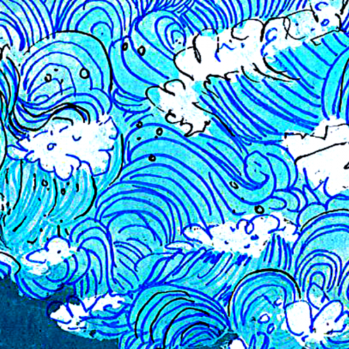
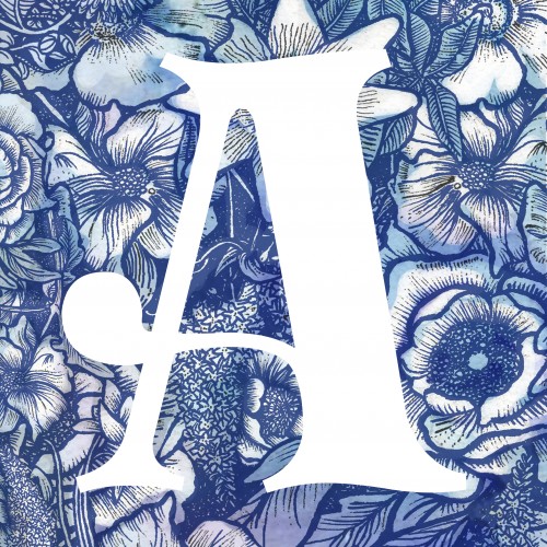
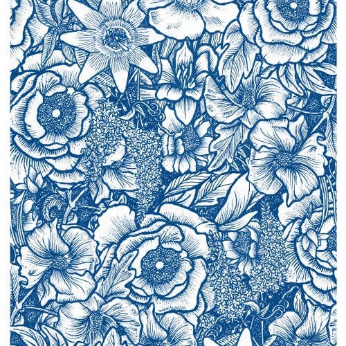
My Vintage blue floral pattern print was designed for fabric. Originally drawn in black & white line, the blue adds a vintage feel and reminds me of the blue and white china of yester year.